Email newsletter landing page limits viewer to one action
Morning Brew’s landing page does one thing really, really well: it forces a single action. There’s no scrolling, no menu, no distractions—just a clean email signup form and a clever headline.
Marketing analysis
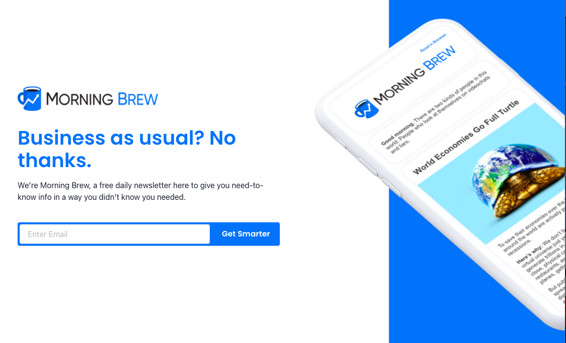
This “above the fold only” page removes every obstacle between a visitor and the opt-in. The vague-but-confident headline grabs attention, and the mockup of the newsletter builds trust by showing exactly what you’ll get.
Why it works
- One goal: collect emails. Zero clutter.
- Headline teases curiosity, subhead clarifies value.
- Visual proof of the product experience.
- Bright button with benefit-driven copy (“Get Smarter”).
- Brand familiarity allows minimal detail.
Examples
- The Hustle uses a similar single-field signup page.
- Robinhood Snacks mirrors this minimalist format.
- ConvertKit’s homepage once tested a single CTA and saw double-digit conversion lifts.
- Superhuman used invite-only minimal landing pages to build exclusivity.
Analyzed by Swipebot
Loading analysis...
