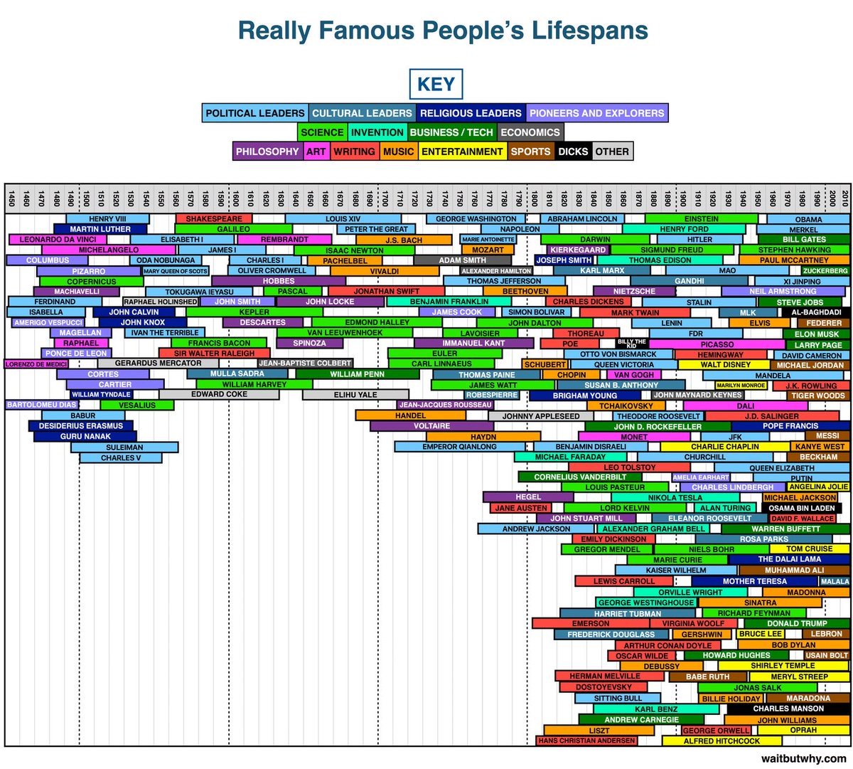
Look at this beauty: a massive block chart mapping famous people’s lifespans across history. It’s data visualization at its best — tons of info made instantly digestible.
The Marketing Principle at Work
This chart takes an overwhelming amount of data (centuries’ worth of famous people) and turns it into a one-glance story. No spreadsheets, no droning paragraphs. Just color-coded, timeline clarity.
Why It Works
- Simplifies complex data into a visual story
- Uses color to create meaning and guide attention
- Makes scrolling fun — you want to explore it
- Gives context you can’t “unsee” once you get it
Examples
- Spotify Wrapped: turns year-long data into pretty visuals
- Google Trends charts: show shifts faster than text ever could
- The New York Times’ election maps: one glance, total understanding
Analyzed by Swipebot
Loading analysis...
