Obesity Rates By States and Territories Infographic
Updated on
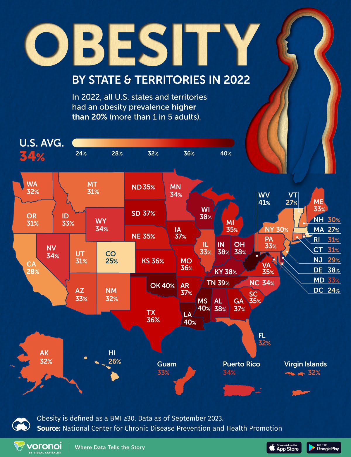
This obesity map hits hard at a glance. Without reading a single number, you instantly sense the problem. That’s smart visual marketing disguised as data.
Marketing Analysis
The map uses a warm-to-hot color scale to show obesity rates, turning data into emotion. The deeper reds scream “problem,” while lighter shades calm things down. Your brain reacts before it reads — that’s the power of color-driven communication.
Why It Works
- Color coding creates emotional urgency
- Simple legend keeps interpretation fast
- Every state’s label gives it personal relevance
- Negative space and contrast guide the eye
Examples
- Airbnb heatmaps show booking density with red “hot zones” that drive action
- Spotify Wrapped uses bold color gradients to visualize listening habits
- Uber’s surge pricing map leans on color intensity to communicate demand instantly
Analyzed by Swipebot
Loading analysis...
