Stress Levels and Performance Curve
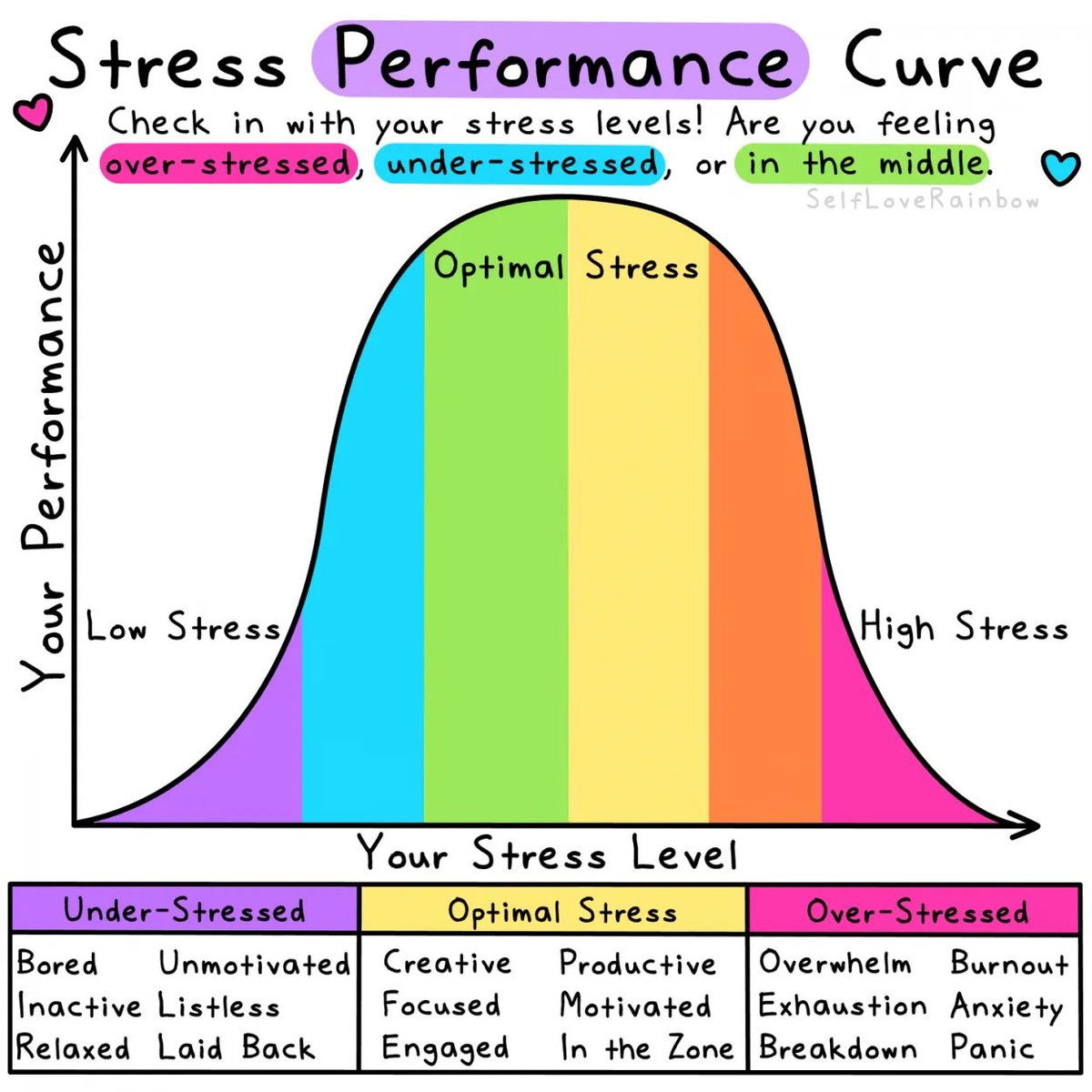
This chart nails something every marketer feels: stress can make or break performance. Too little, and you’re bored. Too much, and you’re panicking. The magic happens right in the middle — where you’re motivated, creative, and in the zone.
Why It Works
- Moderate pressure boosts focus and creativity.
- Too little stress kills urgency.
- Too much stress kills ideas.
- The “optimal zone” keeps your dopamine and deadlines balanced.
Real-World Examples
- Agency teams often hit peak output one week before a deadline.
- Creators who post on a steady schedule perform better than those doing “marathon” content binges.
- Campaigns run with short, controlled sprints outperform never-ending ones by up to 40%.
Manage your marketing stress curve — don’t flatline or fry.
Analyzed by Swipebot
Loading analysis...
