Which of these Facebook ads will do better?
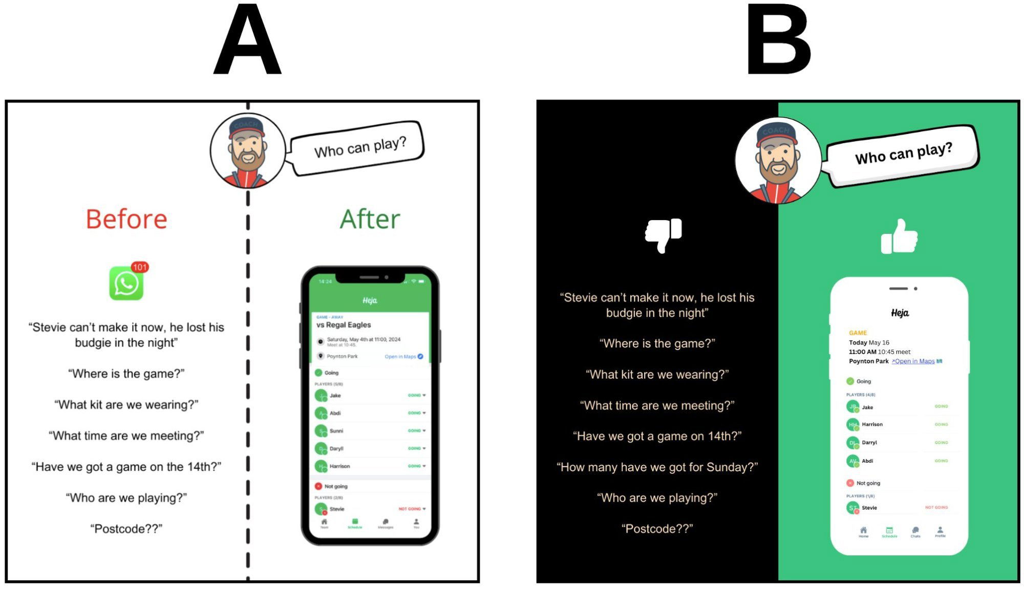
Sometimes fancy design kills conversions. Laurie Bell ran a Facebook ad test for the sports team app Heja: one ad had a white background (A), another had a black-and-green background (B). The white one smashed it—3x more conversions.
Why the White Background Worked
- Clarity beats style: White space makes info pop and reduces cognitive load.
- Contrast helps scanning: Text and visuals are easier to digest on white.
- Familiarity factor: Feels more “Facebook-y,” blending naturally into the feed.
- Focus on message: Simpler background keeps eyes on the app and benefit.
Real-World Parallels
- Dropbox’s early landing pages: ultra clean, sky-high signup rates.
- Basecamp ads: plain backgrounds, clear copy, and steady CTR lifts.
- Apple product shots: always simple—what stands out is the product, not the design.
Analyzed by Swipebot
Loading analysis...
