Jebbee One Pager
This Jebbee one-pager feels like a classic startup pitch deck shrunk down to one page. It’s bright, clear, and instantly tells readers what the app does, who it’s for, and why it matters—all before the app even launches.
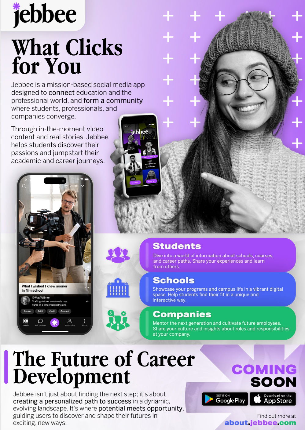
Marketing analysis
The design blends visuals, colors, and short chunks of copy to explain a complex concept fast. It’s not overloaded with features; it sells the benefit—connecting students, schools, and companies. Each section speaks directly to its audience, making distribution to schools and students feel smart and intentional.
Why it works
- Clear audience segmentation: students, schools, companies.
- Benefit-based copy instead of tech jargon.
- Visual hierarchy guides the reader’s eyes.
- “Coming soon” builds anticipation.
- Unified look and message boosts brand trust.
Examples
- Notion used a one-pager for its education plan rollout.
- Duolingo’s campus flyers spoke directly to students with big, bold benefits.
- Spotify used segmented landing pages for artists vs. listeners for clarity.
Analyzed by Swipebot
Loading analysis...
