Whole 30 Rules
Updated on
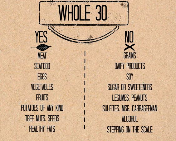
These Whole30 visuals are basically the perfect marketing diet too: clean, clear, and easy to digest. One look and you instantly know what’s allowed and what’s off limits. No overthinking. No confusion.
Marketing analysis
This “Yes/No” format removes friction. It saves cognitive effort and turns a complex system (a 30-day diet) into a one-glance rulebook. The visuals also use consistent color, spacing, and typography to make scanning effortless.
Why it works
- Simplifies decision-making (reduces cognitive load)
- Creates instant clarity and memorability
- Uses visual contrast (green/red, left/right) to guide the eye
- Feeds our brain’s love for binaries: good vs bad, yes vs no
- Reinforces confidence: no room for “maybes”
Examples
- Apple product comparison charts: quick yes/no visuals on features
- Airbnb’s “What this place offers” icons
- Shopify’s pricing tables listing what’s included vs not
- Trader Joe’s fearlessly simple ingredient callouts on packaging
- Duolingo’s “streak” reminders that show what to do (keep learning) vs not (lose progress)
Analyzed by Swipebot
Loading analysis...
