
GoHighLevel Software Comparison & Replacement Chart
This is a super cool chart that shows what GoHighLevel can replace. I love how this is displayed because it...

Compounding growth happens slowly….then quickly
This shows the signups for a startup, and how it compounds over time then suddenly “comes out of nowhere” but...

LockLab "Don't be the guy who goes bald" ad
This ad stacks urgency, social proof, and a freebie. “Don’t be the guy who goes bald” a fear-based hook that...
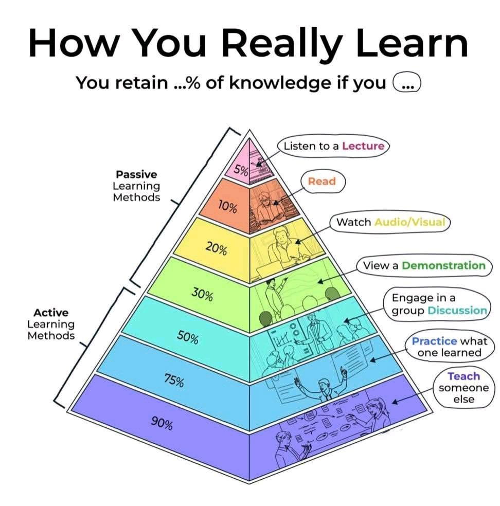
The Pyramid of Learning.
This chart shows that if you just simply listen to a lecture or watch a YouTube video, you do have...
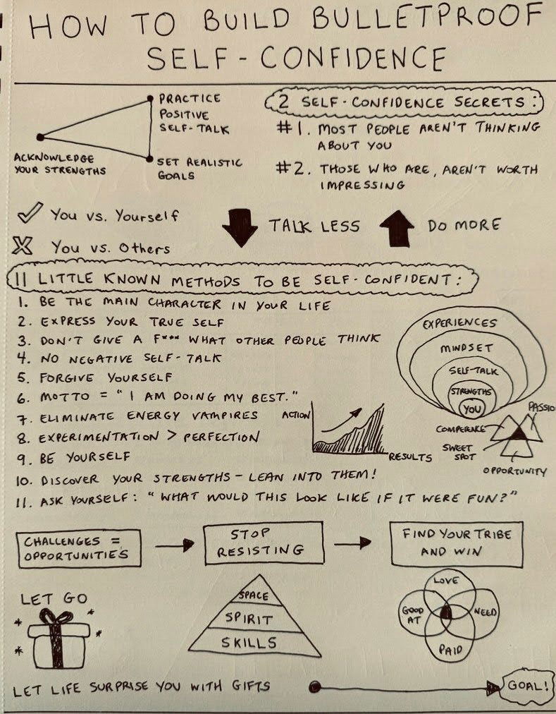
How to Build Build BulletProof Self-Confidence
Matt Gray shares his complete plan on how to build self confidence. Here is what he said: I’m convinced the...
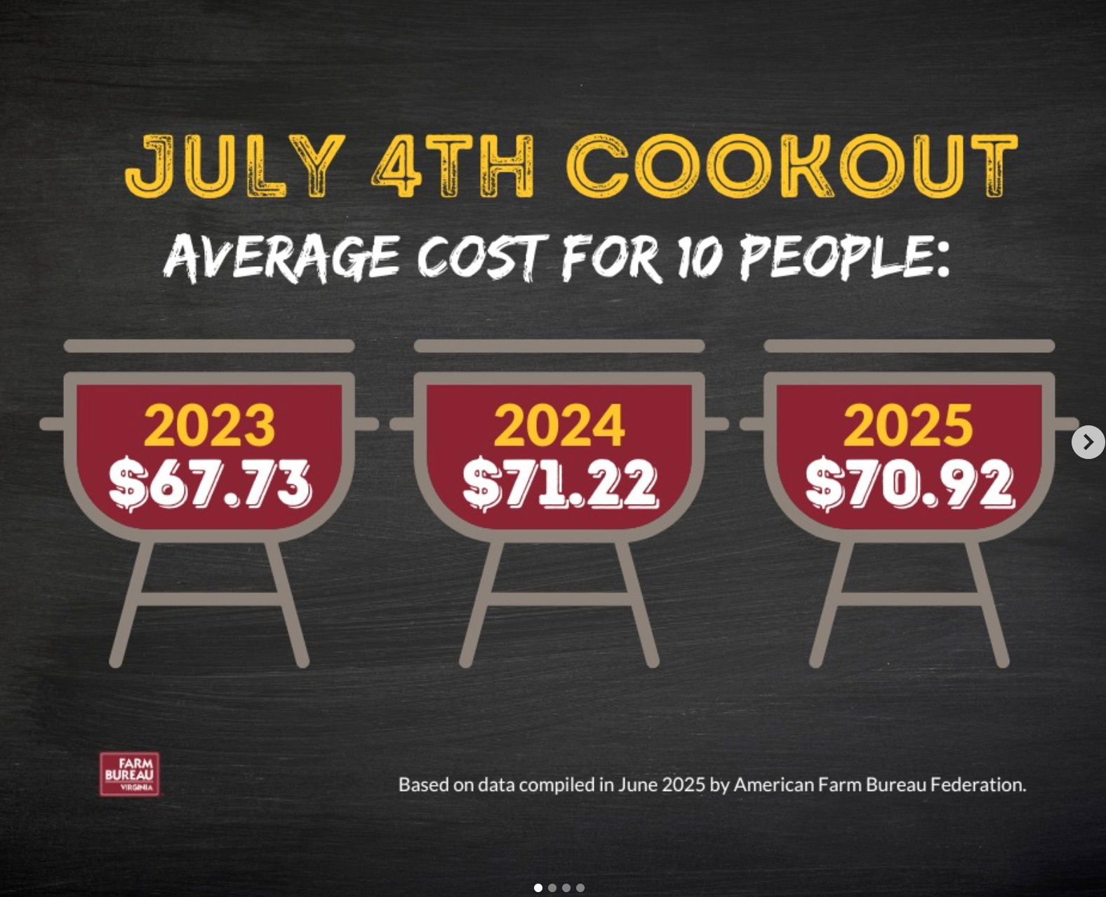
Farm Bureau July 4th Informational Post
Smart July 4th reminder: While you're enjoying your cookout, this ad highlights how little actually goes to the farmers —...
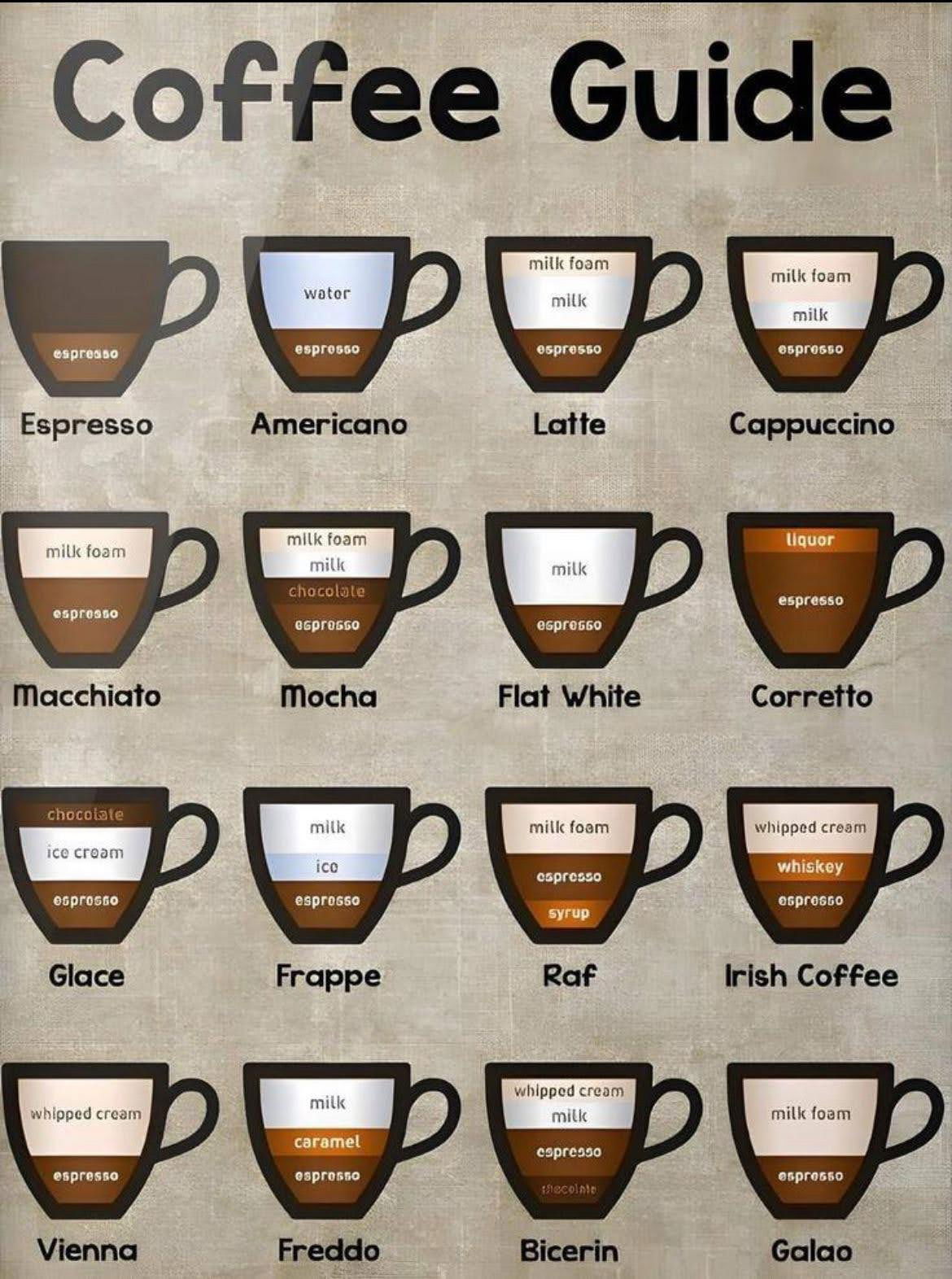
Coffee at a Glance
A simple, visual breakdown of 16 popular coffee drinks. This chart helps anyone order (or make) their perfect cup
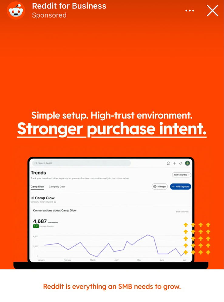
Reddit For Business Ad
Reddit ad showcasing the Reddit for Business interface, paired with a strong value-prop headline:"Simple setup. High-trust environment. Stronger purchase intent."It’s...
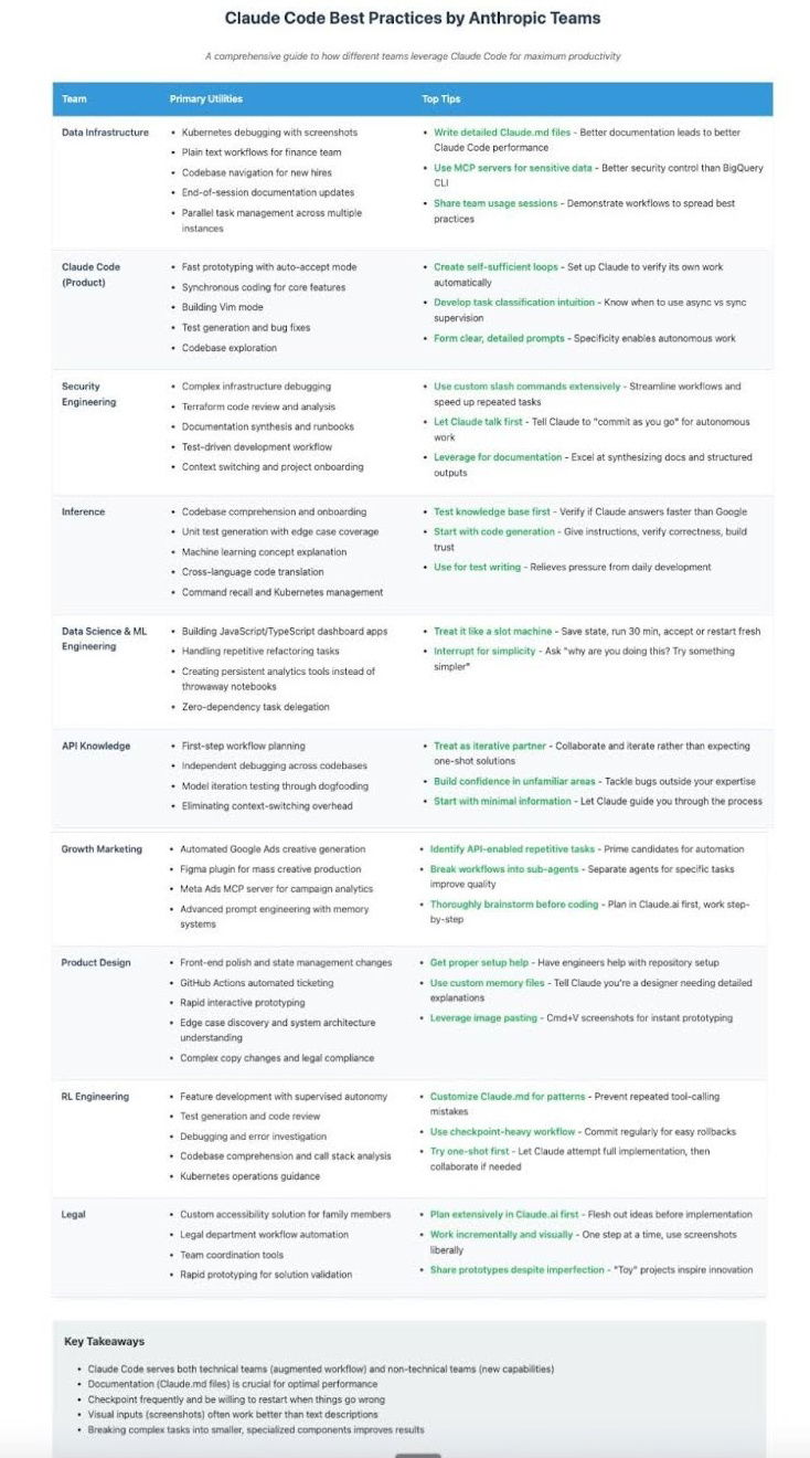
Claude Code Best Practices Cheat Sheet
Awesome cheat sheet showing how different teams actually use Claude to get stuff done — from debugging to brainstorming to...

Time to run an ad campaign comparison chart
I thought this was a cool ad by BeeHiiv that shows how you can save tons of time running an...

The Value Staircase Strategy
This chart shows how to earn trust before selling. Start with free content, then slowly offer more expensive products.

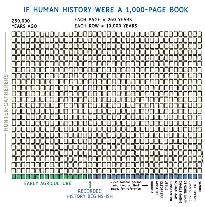
Human History Chart
This cool chart from Wait But Why shows that if human history were a 1000 page book, only the bottom...
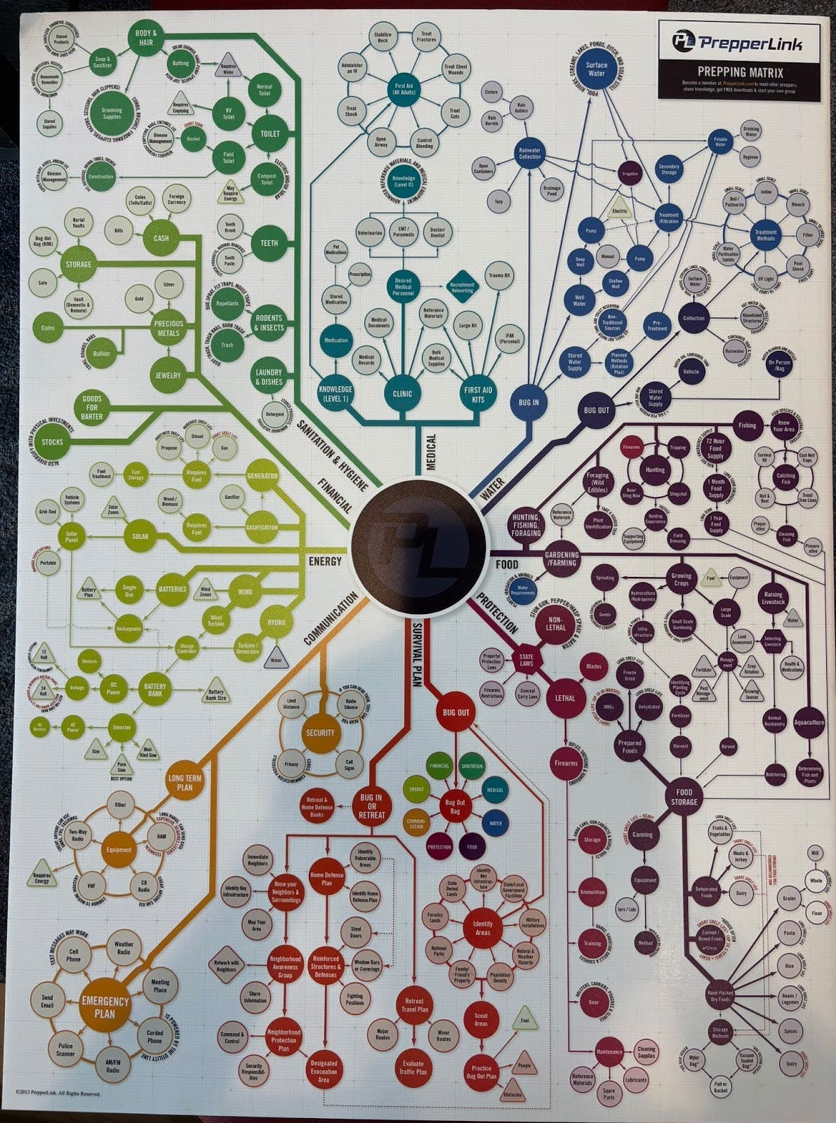
Prepper graph
I didn't actually read through all of these different scenarios, but this is a cool graph for a prepper (someone...
.png?width=3840&quality=80)
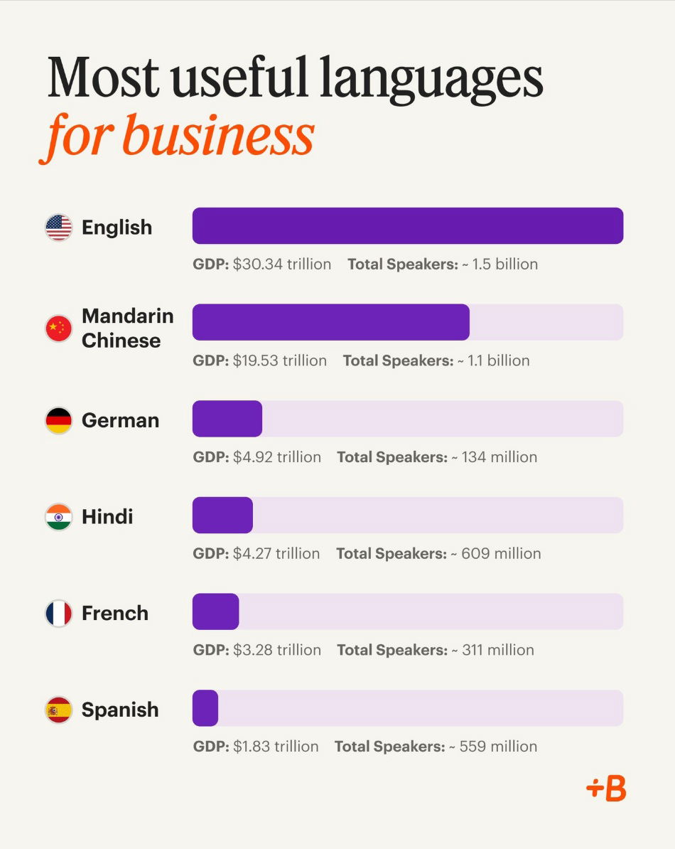
Most Useful Languages For Business
This chart shows the top languages for business. These are spoken in major markets, so knowing them helps companies grow...
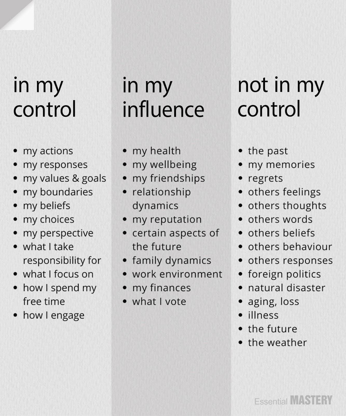
What is in my control, my influence and what is not in my control.
This is a great reminder that you personally can FULLY control certain things, partially influence others, and not control certain...


Massive shift in economy over 30 years
This chart shows how American went from bringing in revenue from manufacturing in 1990 to bringing in revenue from healthcare...

New York Tax Breakdown
This chart shows that the top 50% of New Yorkers paid 99.8% of income taxes in 2023.
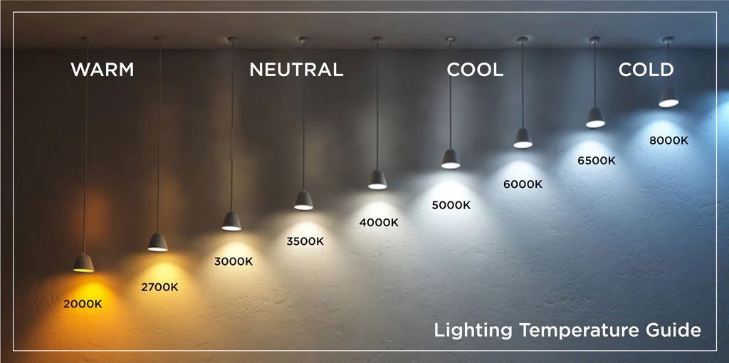
Light bulb temperature lighting guide.
This is a very simple yet very cool guide that shows the difference between warm, neutral, cool, and cold lighting....
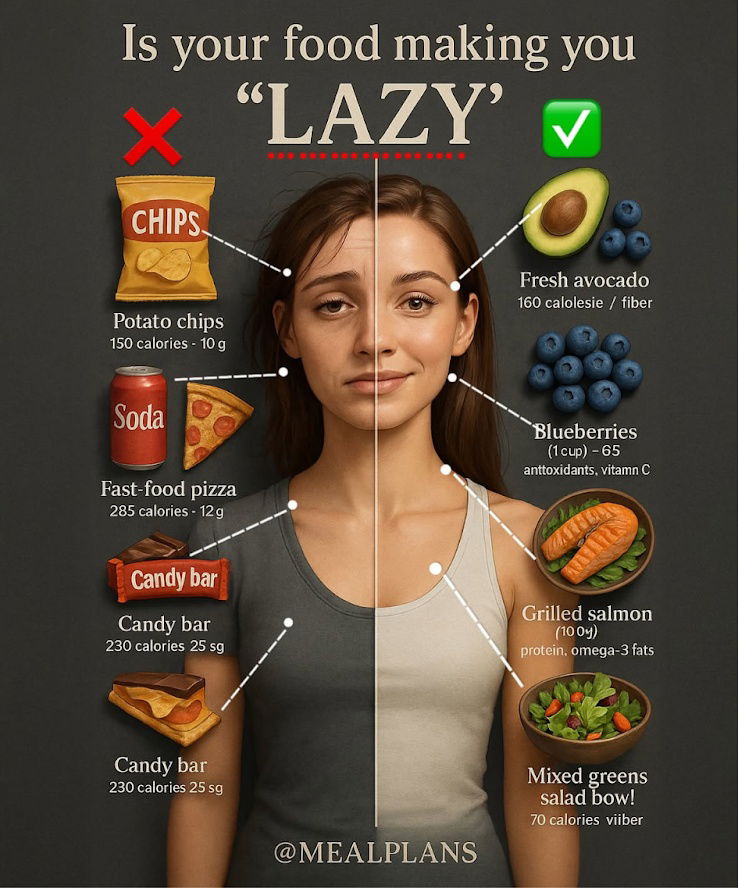
Is your food making you "LAZY" Infographic
Something about this image caught my eye (it kinda reminds me of a YouTube thumbnail).It shows the type of foods...

Earning $228 million in the creator economy
Nathan Barry created this post about "How the Right People Paying Attention Changes Everything". Here us what he said:I've earned...
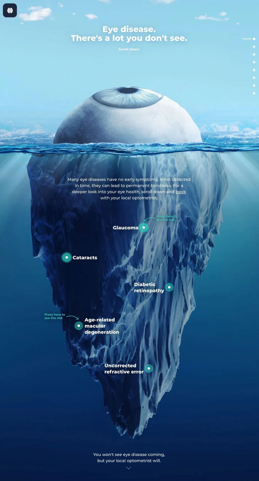
Eye Iceburg with callouts
Great image showing an eye as an iceberg to highlight hidden dangers. Most eye diseases, aren’t visible until it’s too...
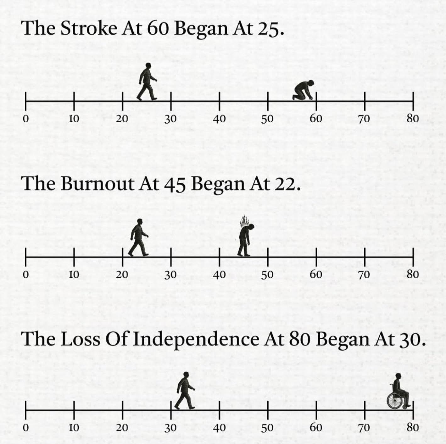
Impactful Timeline of Events
Impactful timeline showing how events progressed. If you take steps earlier in prevention of strokes, burnout and independence.

Headline Only Social Media Ad By Guidde
Killer headline-only ad from Guidde: “30% of your time goes into documentation. With Guidde, it’s only 2%.” No fluff, just...

Earth Creatures Intelligence Chart
Fascinating chart showing the intelligence levels of Earth’s creatures — from humans capable of metacognition, all the way down to...