This is an interesting “Risk Matrix” that goes over all possible cases from natural disasters to wars, and tries best as possible to label them with a percentage chance:
 This one is super cool, instantly showcasing the concept that it took Google a whole slew of successful products to get where they are today:
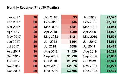
 This graph shows that “timing the marketing” can be very profitable…or a total loss 😳
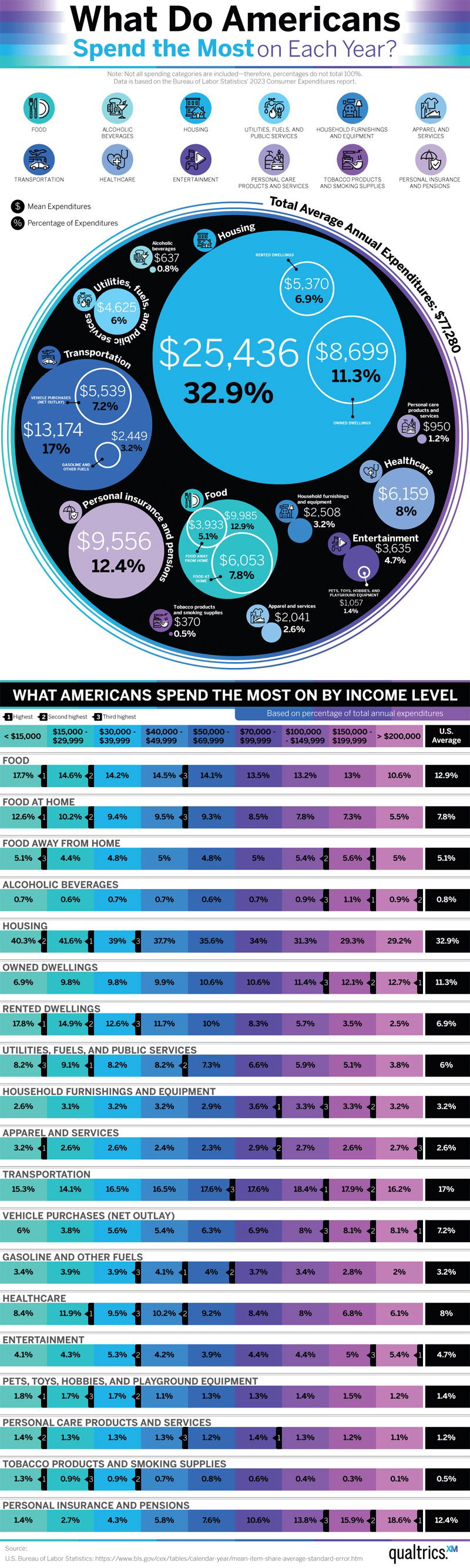
 This graph gives a range of income to be considered “Middle” Class” in different areas:

Image Description
The image is a detailed chart titled "Reasons to Sell," illustrating various economic events and crises over the past 15 years that might prompt investors to sell. It effectively highlights short-term fluctuations and stresses the importance of long-term investment perspectives.
Positive Aspects
This chart is a visual masterpiece in simplifying complex economic phenomena. It provides a quick overview of significant economic events without overwhelming the viewer, making it an ideal tool for understanding market volatility and the rationale behind long-term investments.
Key Takeaways
- Long-term Holding Strategy: The chart underscores the importance of ignoring short-term fluctuations and maintaining a long-term investment strategy, as advocated by Warren Buffett.
- Visualization Power: Complex economic ideas can be swiftly communicated through well-designed images, making them accessible and understandable.
- Inflation Awareness: Other graphs, like the inflation chart, demonstrate how $1 loses value over time, emphasizing the need for strategic investment.
- Risk Assessment: The Risk Matrix provides a visual overview of potential risks, aiding in better financial planning and risk management.
- Market Timing: The market timing graph illustrates the potential gains and losses from trying to time the market, highlighting its inherent risks.
Additional Insights
Investing often feels like navigating a stormy sea, with every news headline being a potential iceberg. This collection of charts serves as a compass, reminding investors that while the surface may be turbulent, the deeper waters are stable. Remember, even Google needed time and many attempts to succeed, as shown in their stock price journey. So next time the market dips, just think of it as a sale on future returns!