Re-designed sleep aid working 5% better
Updated on
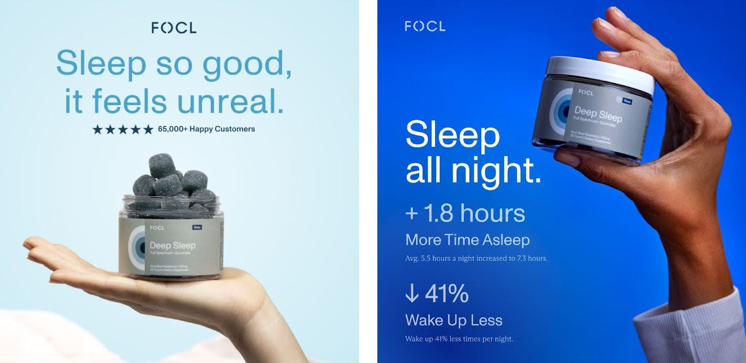
Both FOCL ads sell the same gummies, but the dark blue version wins. Why? It nails the fundamentals of direct-response design and copy.
What’s happening here
The new ad improves contrast, adds hard data, and makes the promise measurable. “Sleep all night” is instantly clearer and more persuasive than “Sleep so good, it feels unreal.” One sounds dreamy, the other sounds like proof.
Why it works
- High contrast = easier to read = more attention.
- Specific stats build credibility.
- Benefit-first headline hits the real pain: bad sleep.
- Visuals show the product up close, matching copy promise.
Other examples
- Oura Ring leads with “Improve Sleep by 25%.”
- Peloton ads show numbers: “Save 30 minutes per workout.”
- Calm uses measurable benefits: “Fall asleep 83% faster.”
- Fitbit highlights “Average user sleeps 14 minutes longer.”
Analyzed by Swipebot
Loading analysis...
.png?width=3840&quality=80)