Dumb = Complex. Smart = Simple.
Man I love this sentiment:Dumb people admire complex language.Smart people admire simple language. The smartest people like Richard Feynman were...

Comfort is the enemy of growth
You definitely notice when you are not HUNGRY for something it’s harder to work hard at it. Pushing yourself to...
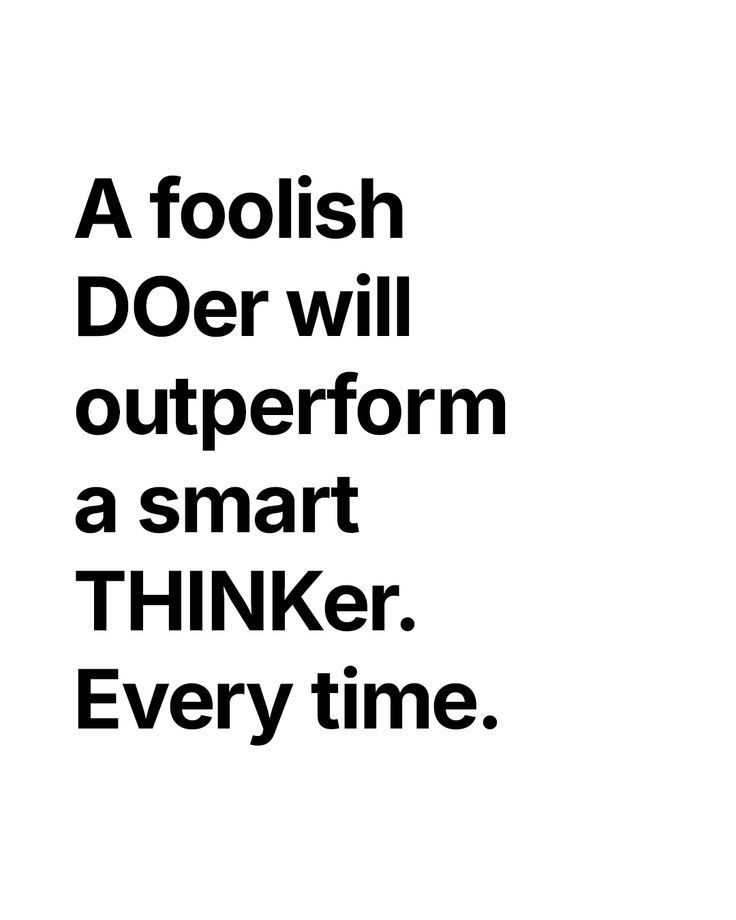
A foolish DOer
A reminder that: A foolish DOer will outperform a smart THINKer. This means if you quickly start on a plan...
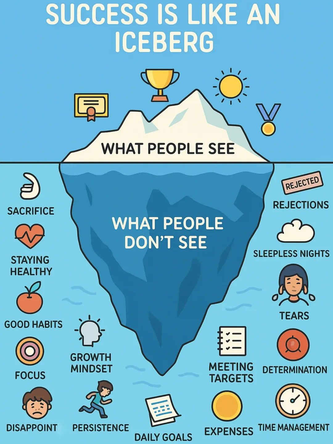
Success is like an iceberg.
It's easy to see someone's success and think it's easy, but then you don't see all the sacrifice, the hard...
Matt Gray’s 10 Year Vision Planning
This is a very simple, very easy, very nice 10 year vision for Matt Gray. You can watch more Matt...
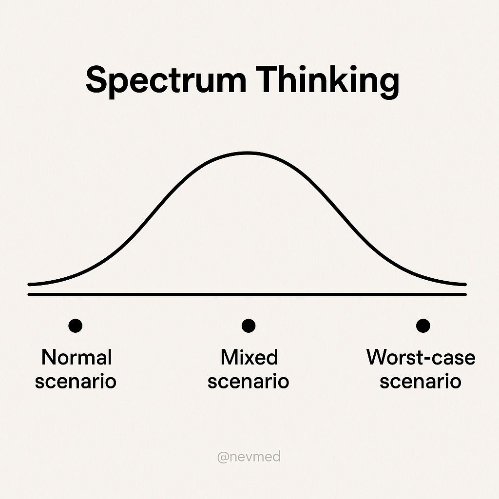
Spectrum Thinking
I was first introduced to this style of thinking I assume is called "spectrum thinking" when I got to have...

Life lesson from Big Panda and Tiny Dragon
A wonderful life lesson from James Norbury’s Big Panda and Tiny Dragon and a beautiful illustration.I've been asked where I...
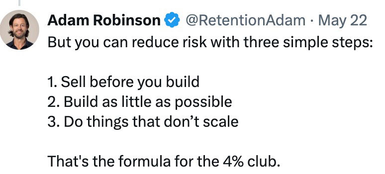
Reducing risk of selling by PRE SELLING
I love the concept of always selling something before you build a big startup around it, so you can prove...
Make sure you're solving an actual problem
This is a great reminder from Jason Cohen, the founder of WP Engine, that you should be solving a customer...
Longevity is earned
It’s interesting to think of longevity as something that is “earned” everyday by making good choices. There might some guy...

Turns out many people aren’t depressed, they just don’t have something worthy to work on.
Humans are unique in that we ruminate on the past, the future, or events that are happening 5,000 miles away...

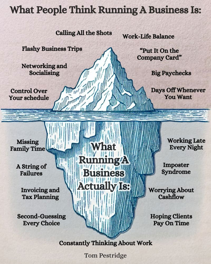
Running a business iceberg image
Great image showing what people see and what we people don't about business owners.
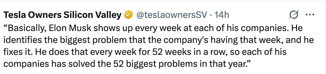
Solve 52 big problem a year
This is a cool concept someone noticed about Elon Musk:He shows up every week and tries to solve a big...
.png?width=3840&quality=80)

5-minute morning routine.
Some days I wake up and I'm sort of grumpy. A great way to get back on track and happier...
Matt Gray Interview: Building personal brands, communities, and media-first startups
This is my interview with popular entrepreneur Matt Gray:[[VIDEO]]🎧 Prefer listening to this? Here's a podcast version! 🎧">Here's my personal...


Promoting your products online
This is a fun reminder from Damon Chen that even the worlds richest man is online promoting his products….so why...

People don’t want tools they want a result
Ultimately people buy tools to achieve a result. So if you’re offering a tool, could you possibly offer a SERVICE...
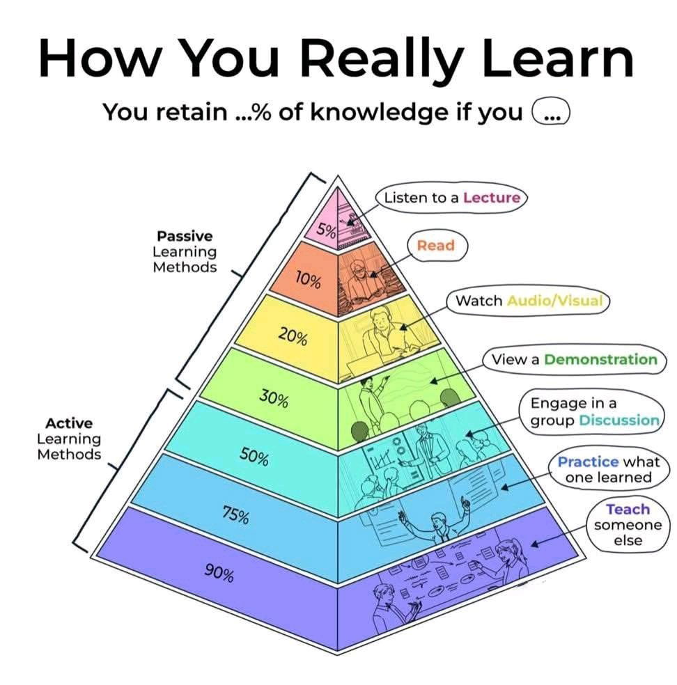
The Pyramid of Learning.
This chart shows that if you just simply listen to a lecture or watch a YouTube video, you do have...

Solve one big problem a week for 52 weeks chart
This is a cool concept someone noticed about Elon Musk and how he operates so many companies:“Basically, Elon Musk shows...

Greg Isenberg recorded 200 podcast episodes from his closet on
Greg Isenberg recorded ~200 podcast episodes from his closet on a box with a crappy mic before it really starting...
David Perell thought about friendship.
Friends should help push you to be the best version of yourself. Here's what David Perell said:If you’re serious about...
4 qualities of a great career
A helpful way to look for a career you like.The 4 qualities of a great career: 1) I enjoy it...
No one cares if your app is AI powered
This is a great reminder from Greg Eisenberg that no one cares if your app is AI-powered. The AI thing...

The Proof Economy - Hiring Builders not Bachelors
This is a really cool article that goes over how people are hiring builders not for bachelors. They don't really...