Anatomy of a hero section
00:00
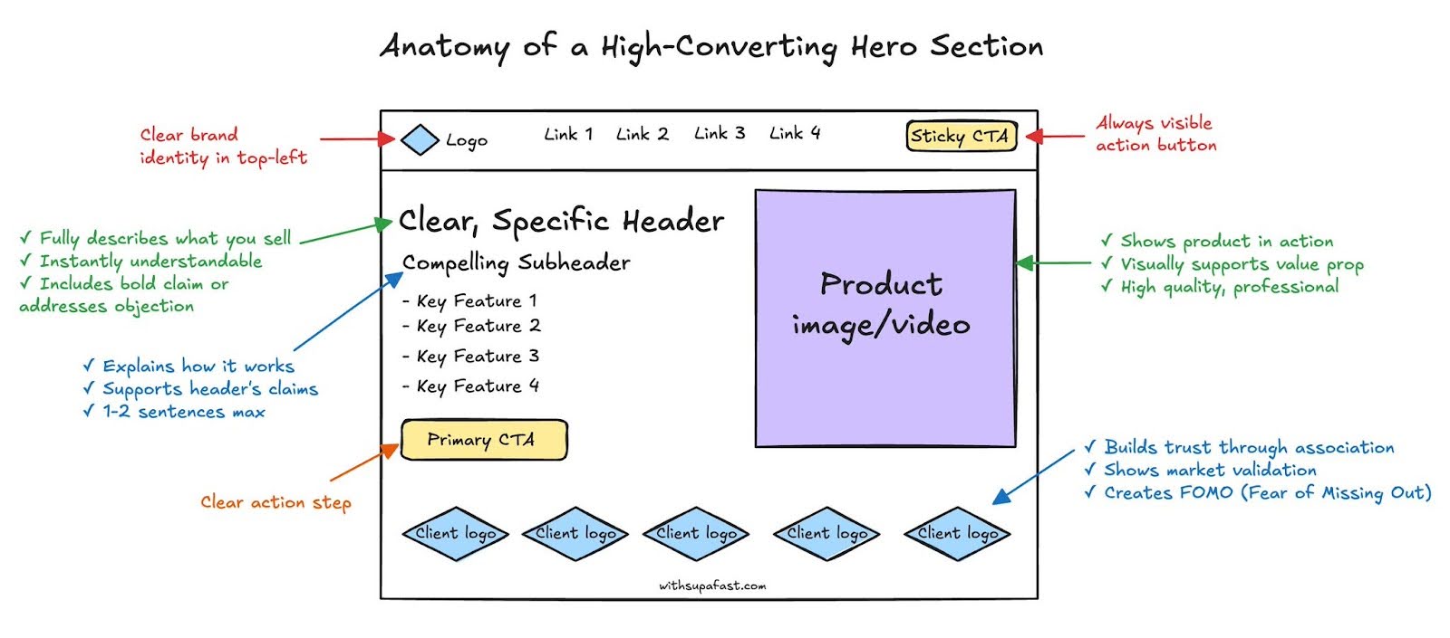
The first few seconds on your site decide if visitors stay or bounce. That’s why your hero section needs to hit hard. This visual from withsupafast.com perfectly maps out how to turn your above-the-fold area into a conversion magnet.
Why this design converts
- The header instantly communicates what’s being sold
- The subheader adds clarity and credibility
- A strong visual (image or video) backs up the claim
- A sticky or primary CTA gives people one obvious next step
- Client logos build trust and FOMO
Real-world examples
- Grammarly: Simple headline + quick demo video = clarity.
- Notion: Clean hero explaining the value prop in one line.
- Shopify: CTA repeats across header and nav (smart insurance).
- Stripe: Product visuals + logos from top brands = instant trust.
Analyzed by Swipebot
Loading analysis...
