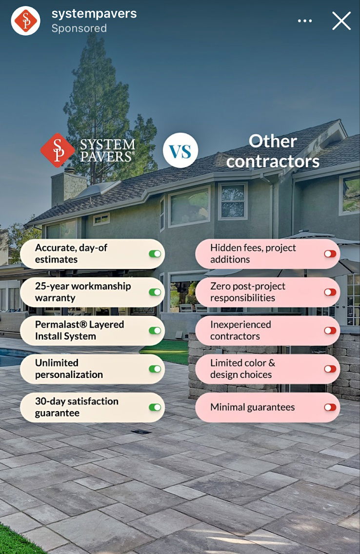
Us VS Them ad for a contractor
This is a cool and simple comparison ad for a house contracting company, showing why they are better than the...
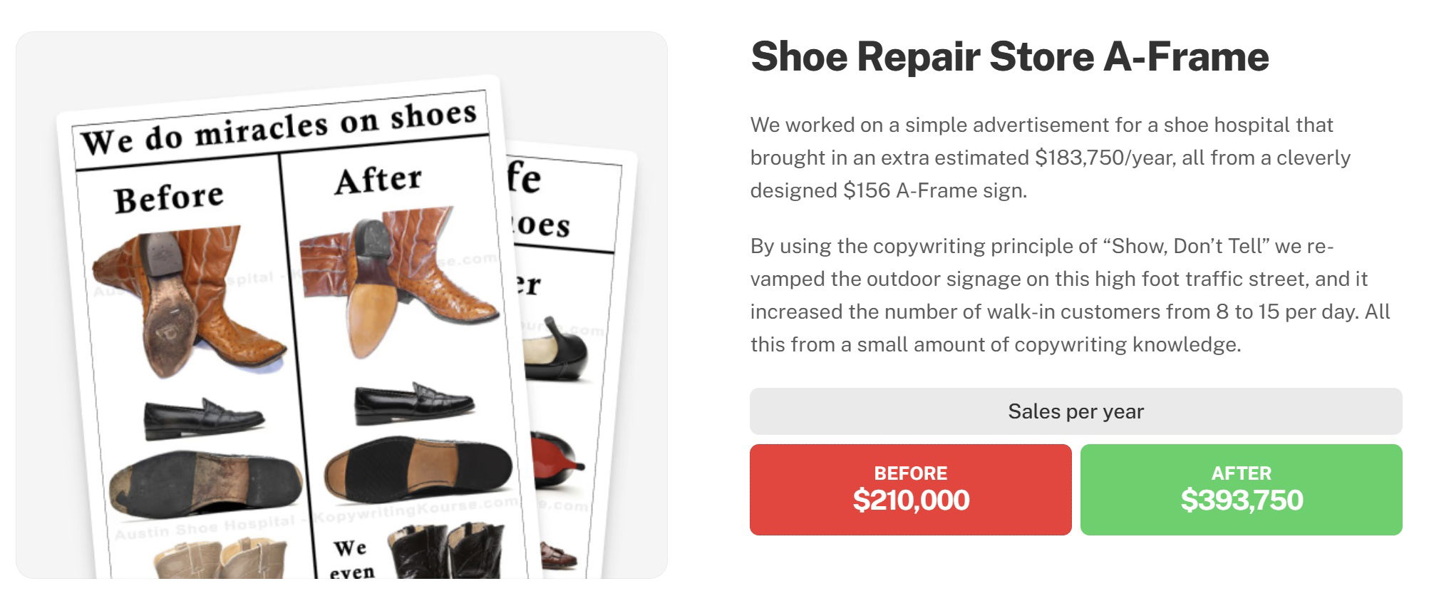
Before and After style results testimonial for a shoe repair store
This is a before and after results testimonial on the Copywriting Course join page. Instead of explaining copywriting, it just...

Instead of this, try this ad
This is an ad run by Austin Netzley from 2X, and it shows a cool "don't do that, do this"...
Before/After Software Ad for Icon
I LOVE the layout of this ad, where it shows alllllll the different softwares you've gotta use for making ad...
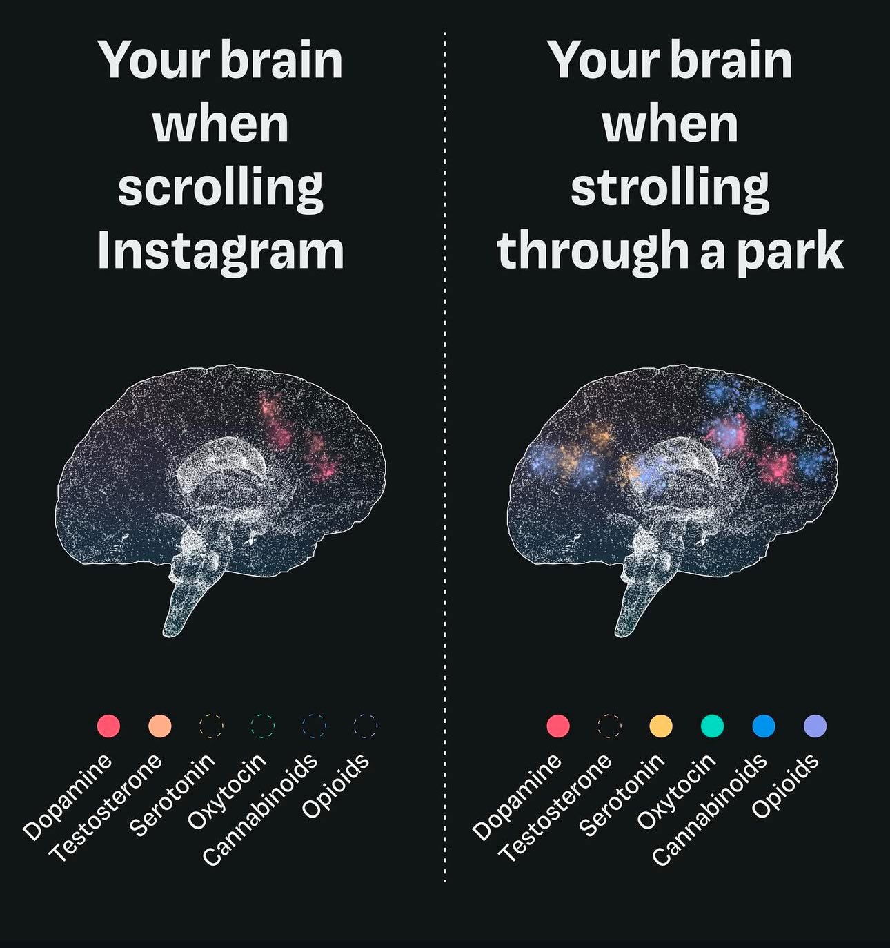
Your brain scrolling Instagram -vs- walking
I have no idea if this random post is true or not, but taking a stroll and walking is definitely...
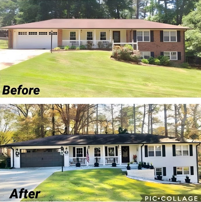
Before and After of a home transformation
This before and after of a home transformation is perfect to post on social media.
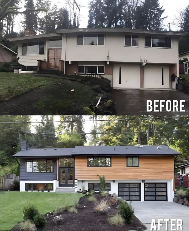
Before and After House Exterior Makeover
This before-and-after image showcases how an older home has been updated to achieve a more modern appearance.The point of this...
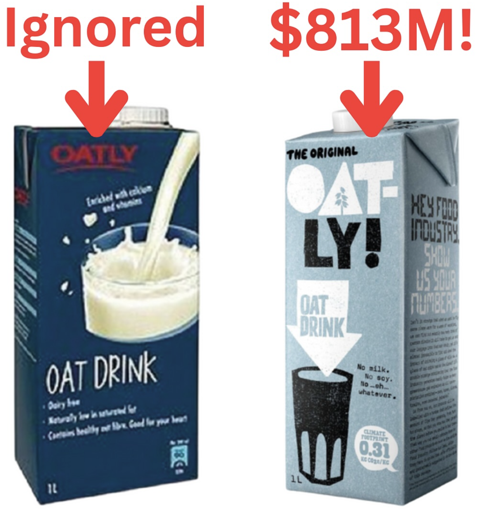
Oatley Milk Before/After Branding
Oatly re-positioned as a proudly dairy free alternative to milk and last year did $813m in revenue.
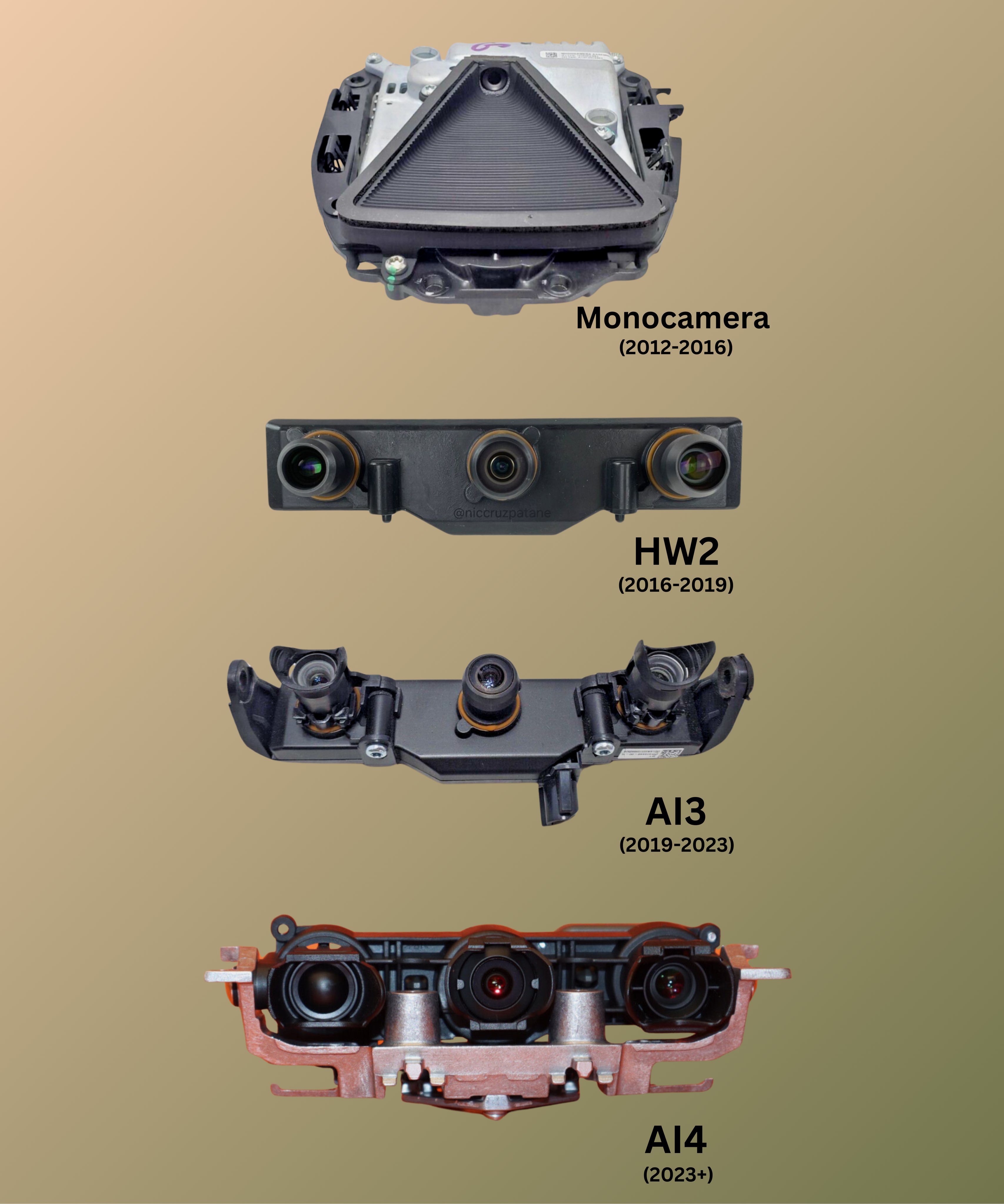
Tesla front self driving camera stack over the years
Love this image of Tesla front facing dash cams evolving over the years.
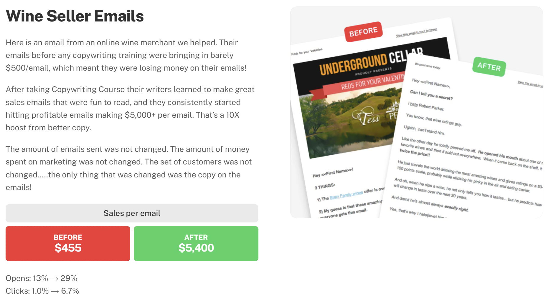
Before and After style results testimonial for a wine seller email
This is a before and after results testimonial on the Copywriting Course join page. Instead of explaining copywriting, it just...
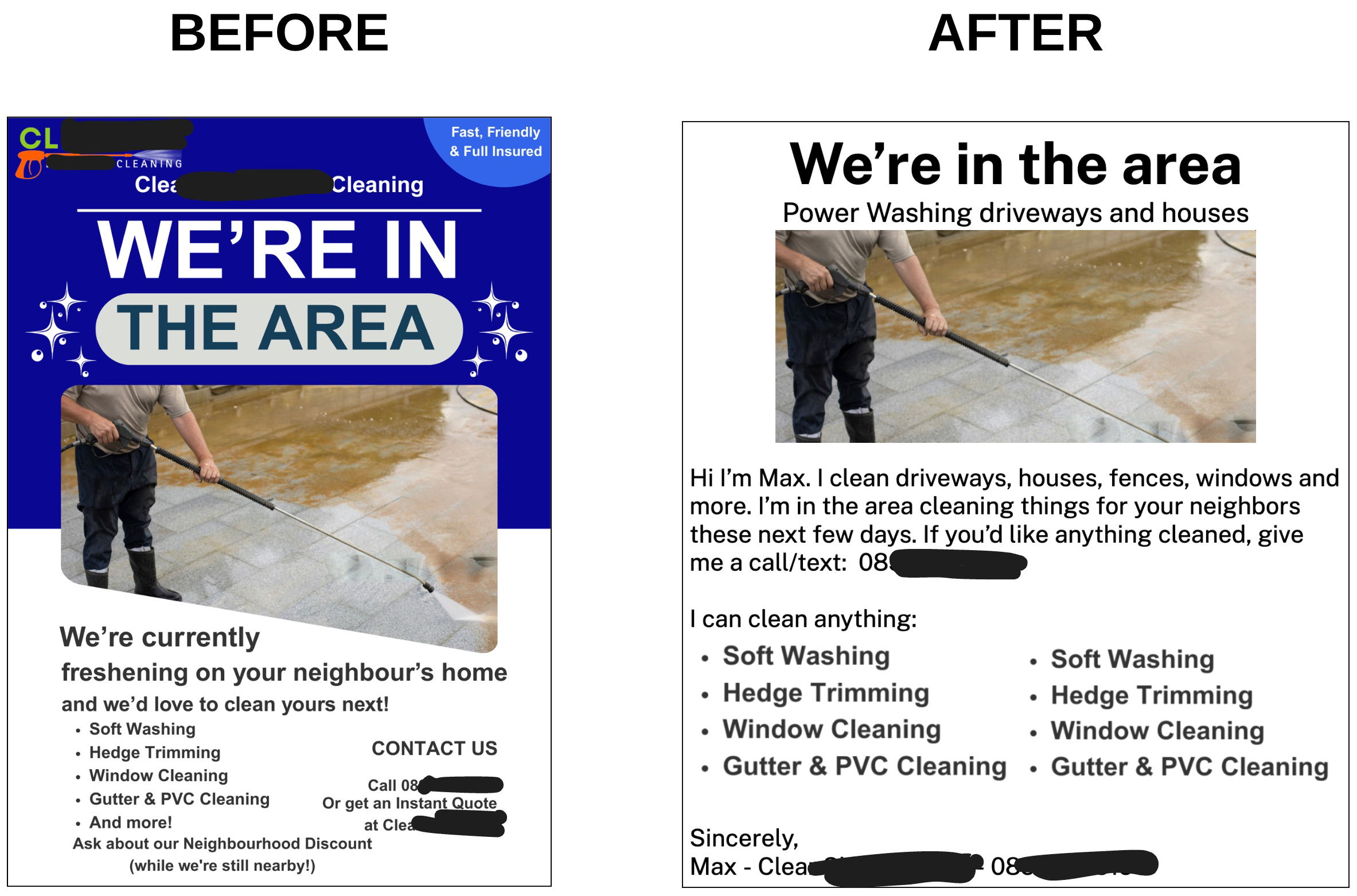
More personal power washing flyer
This "before" ad was an attempt by a powerwashing company to be more professional, but the ad wasn't working too...

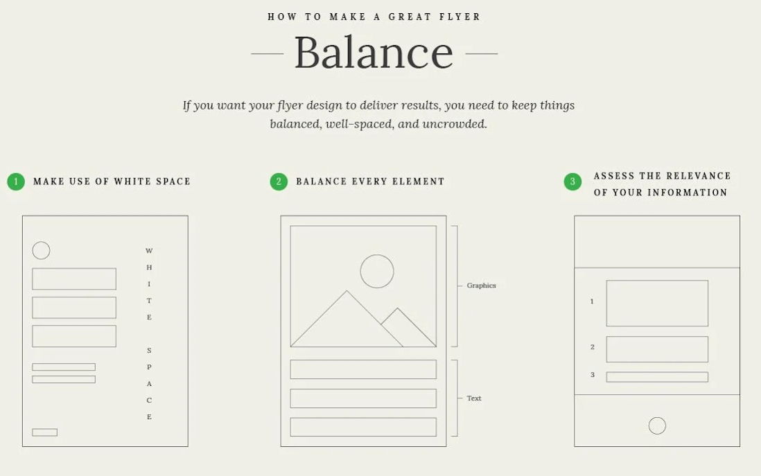
Flyer Design Elements wireframes.
These flyer wireframes demonstrate the design elements that contribute to a flyer’s visual appeal.
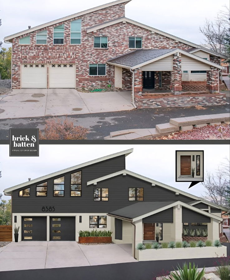
Brick & Batten home transformation
Great use of a before and after showcasing a stunning transformation of a homes exterior
.png?width=3840&quality=80)
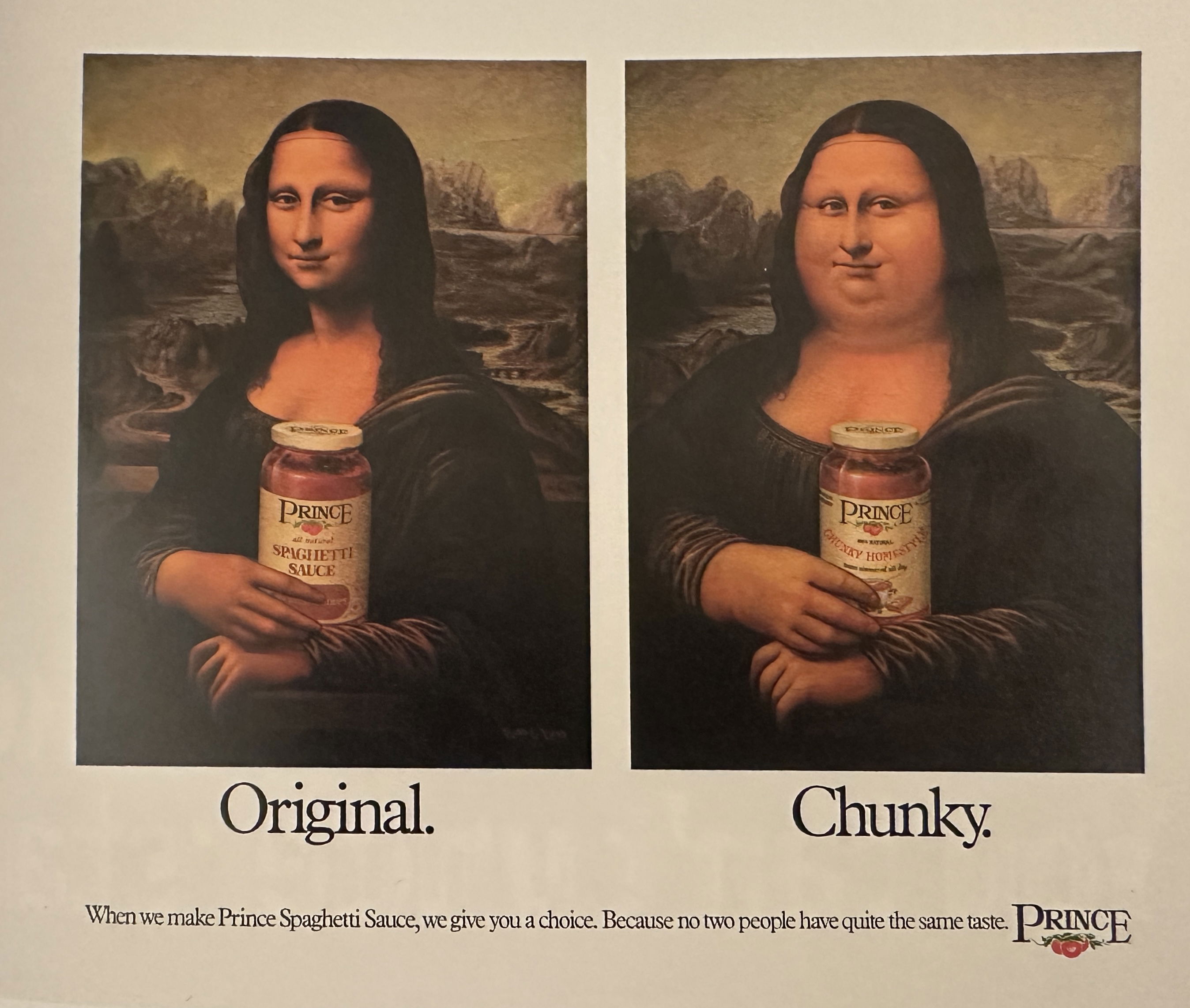
Prince Chunky Spaghetti Sauce Print Ad
A funny add showing normal vs “chunky” pasta sauce with the Mona Lisa.
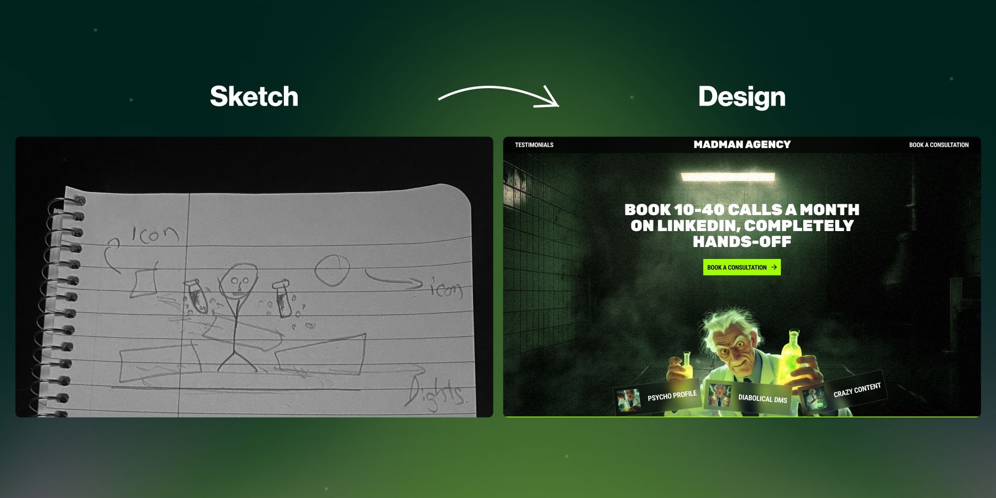
Sketch to finished website design
This is cool to see a hand-drawn mockup of a business idea (a creative agency) to a finished website.

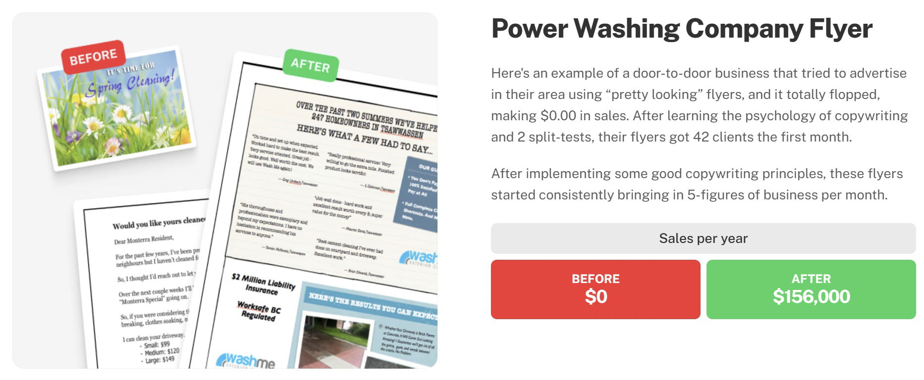
Before and After style results testimonial for a power washing company
This is a before and after results testimonial on the Copywriting Course join page. Instead of explaining copywriting, it just...
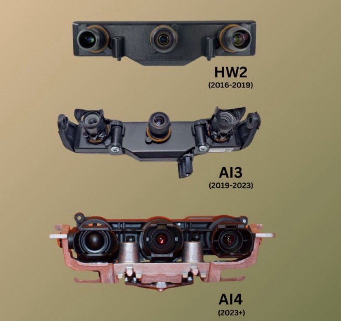
Tesla AI hardware upgrades
This is the front camera set for each successive version of Tesla's AI driving. Notice how they get upgraded every...


Look how fast AI image generation is improving
This tweet by Marc Köhlbrugge showcases a compelling 'Before and After' transformation with the caption "September ‘22 vs March ‘25."...
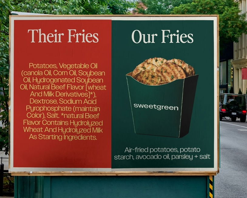
Sweetgreen Fries Ingredients (Us -vs- Them) Ad
This is a GREAT ad by Sweetgreen which shows how many ingredients other fries have versus their own. As people...
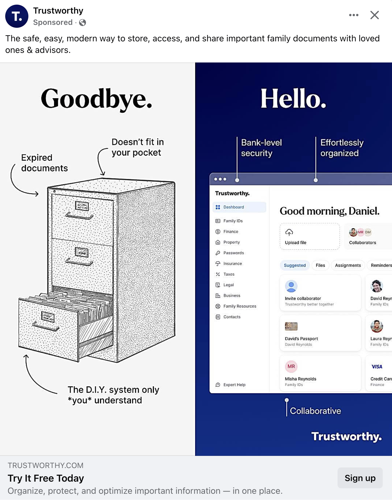
"Goodbye" to old file folders ad
This is a cool way to showcase a service that replaces an old school file folder full of documents with...
Before and After Video Editing
Great example of a before and after video showcasing editing.

Public VS Private Sector Innovations
This is a poignant display of showing the innovation in the private sector versus the public sector. While we NEED...
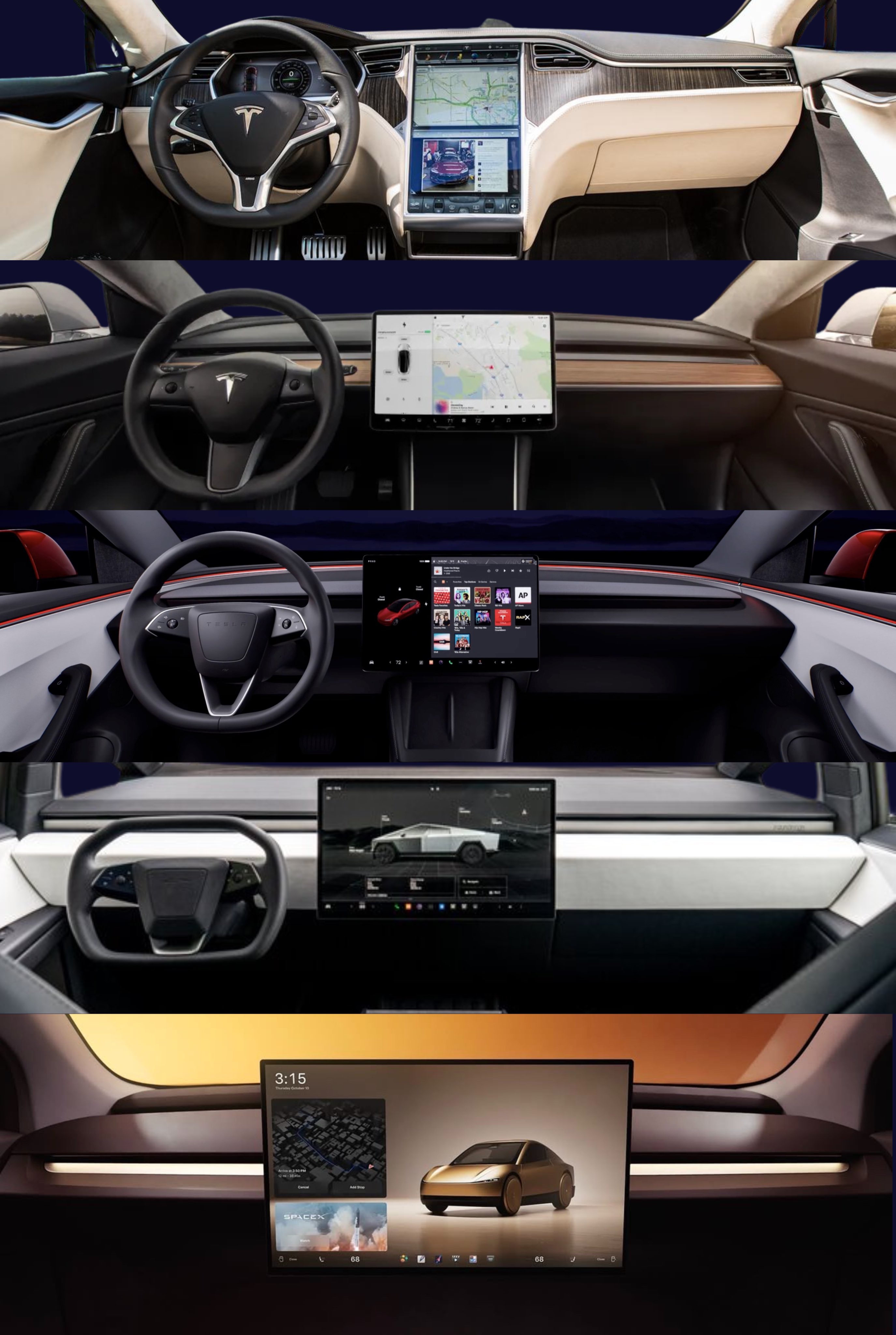
Tesla Interior Refreshes and Simplicity
This is a cool visualization of the extreme simplification happening on Tesla interiors as the cars go from physical +...
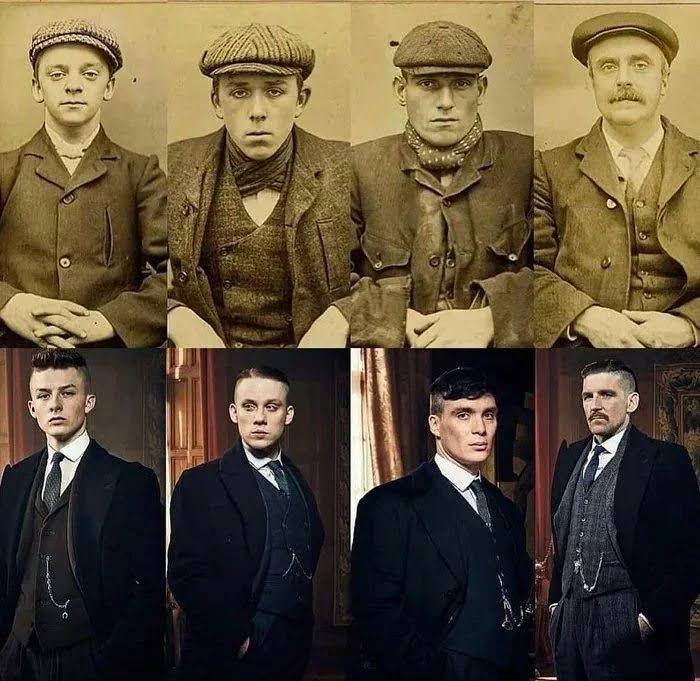
Peaky Blinders Real Life to Characters image
This image compares the real people to the actors who portrayed them in Peaky Blinders.This post isn't really about marketing...