423 Before and After Examples
Discover the power of transformation with our Before and After Examples. See how products and services can change lives, looks, or spaces. From home renovations to personal makeovers, witness the dramatic differences and get inspired by real-life changes.

Brick and Batten Home Before and After Image Post
A simple before-and-after shot can sell transformation better than a thousand words. This image from brick&batten shows how a traditional...
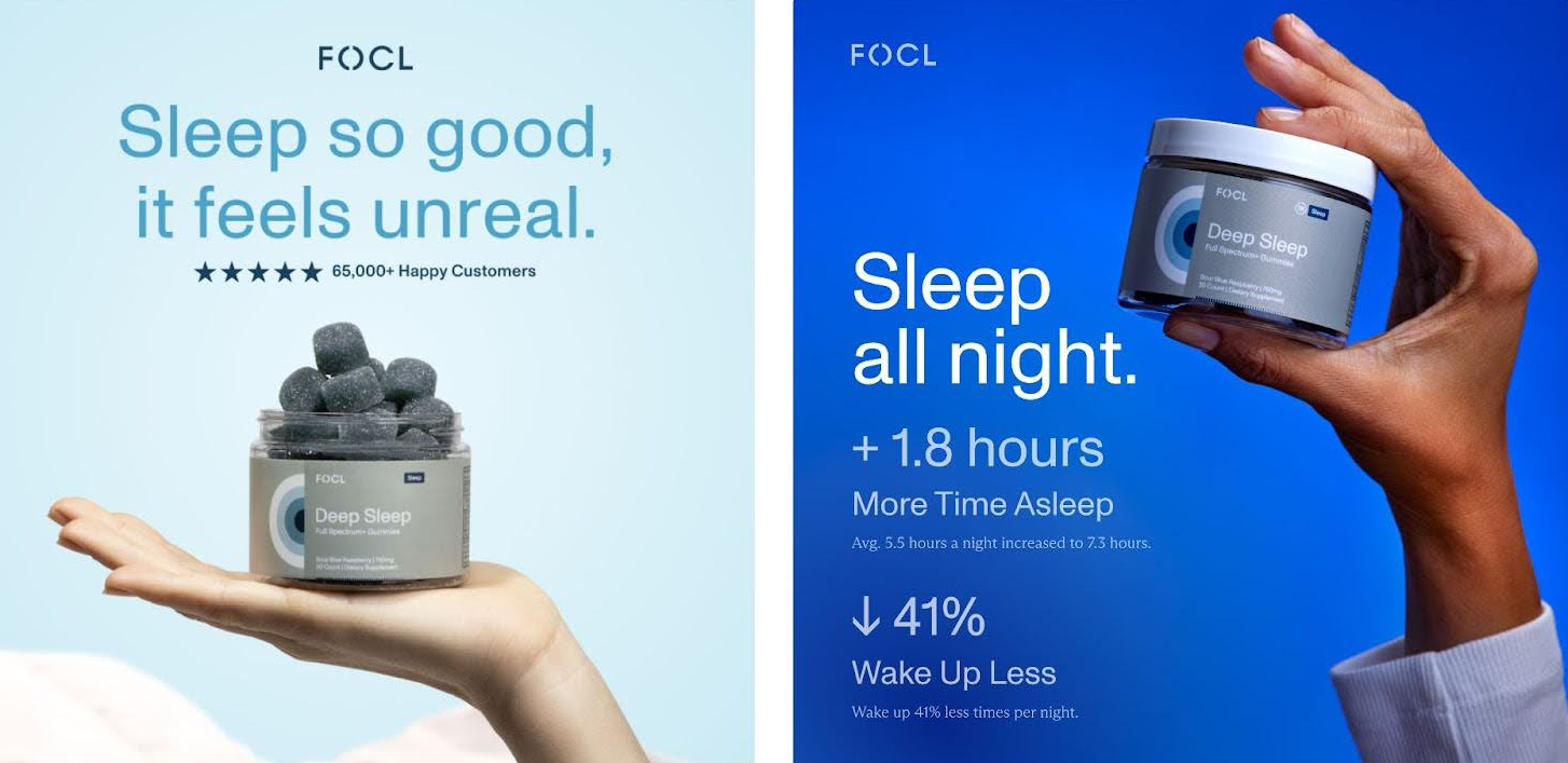
Re-designed sleep aid working 5% better
Both FOCL ads sell the same gummies, but the dark blue version wins. Why? It nails the fundamentals of direct-response...
The Heavenly Before and After ad
Nothing grabs attention like a good transformation. This interior design ad nails it with a simple formula: show the “before”...
People hate landlords
Ever wonder why your rent goes up after the landlord fixes the place? That’s the same logic behind smart pricing...
Peachy Botox Instagram Video Ad
Peachy’s ad kicks off with the most powerful visual trick in beauty marketing: a before-and-after shot. No talking heads, no...
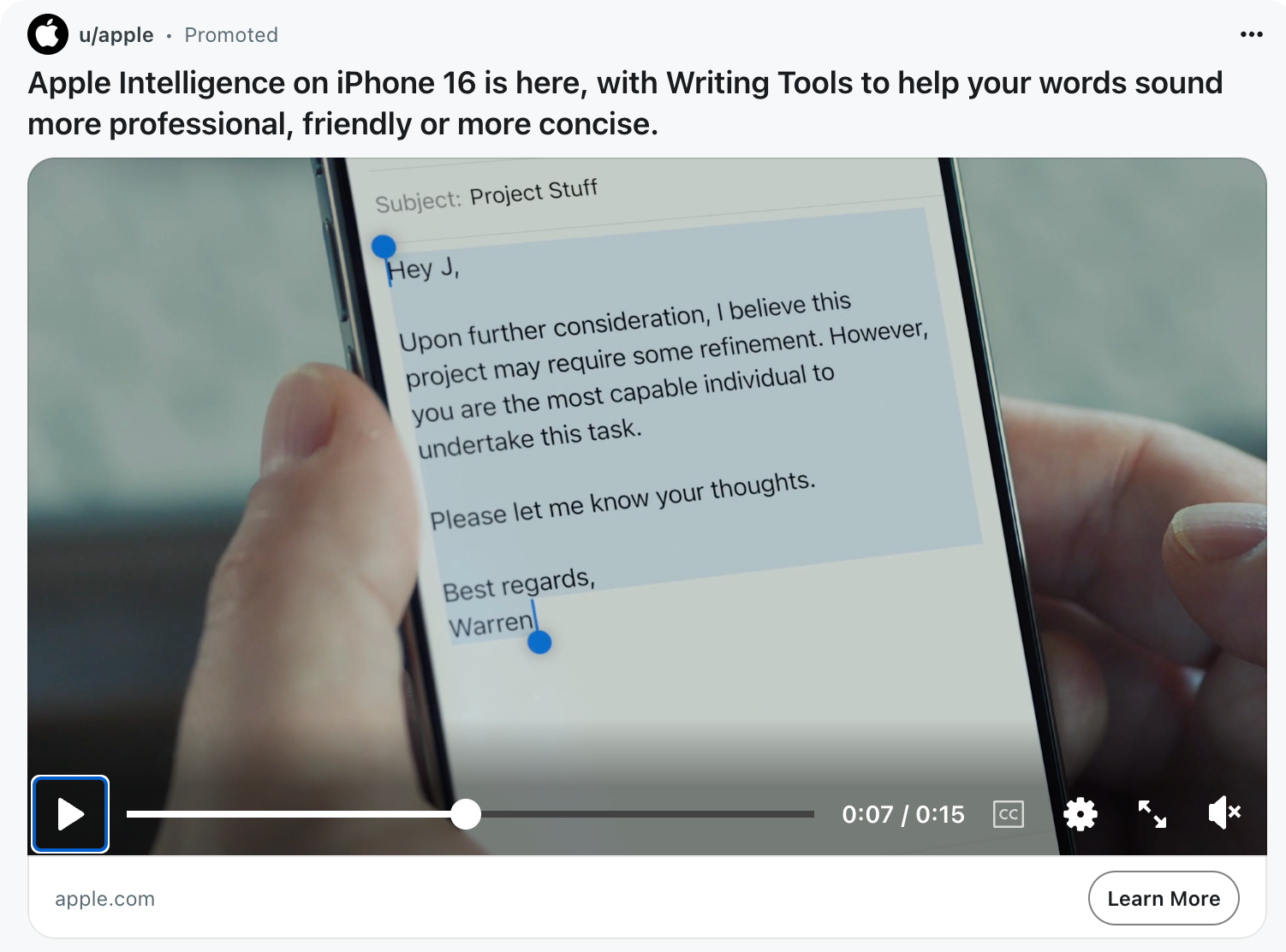
Apple Intelligence allows ChatGPT-like writing everywhere
Apple’s new “Apple Intelligence” ad nails something big: writing help is now baked into your phone. It’s like spellcheck got...

Evolution of the Pepsi logo from 1898 - 2009
Just look at that lineup. Over 100 years of logo evolution from fancy swirls to ultra-clean minimalism. Pepsi’s branding is...
$100m/year framework: “Persona Problem Promotion”
Ayman Al-abdullah shared a great story about how American Express grew huge by simply paying attention. They noticed customers were...

Furniture store using cars to compare brands
Most people can name a car brand's luxury level instantly. But furniture? Not so much. This store nailed it by...
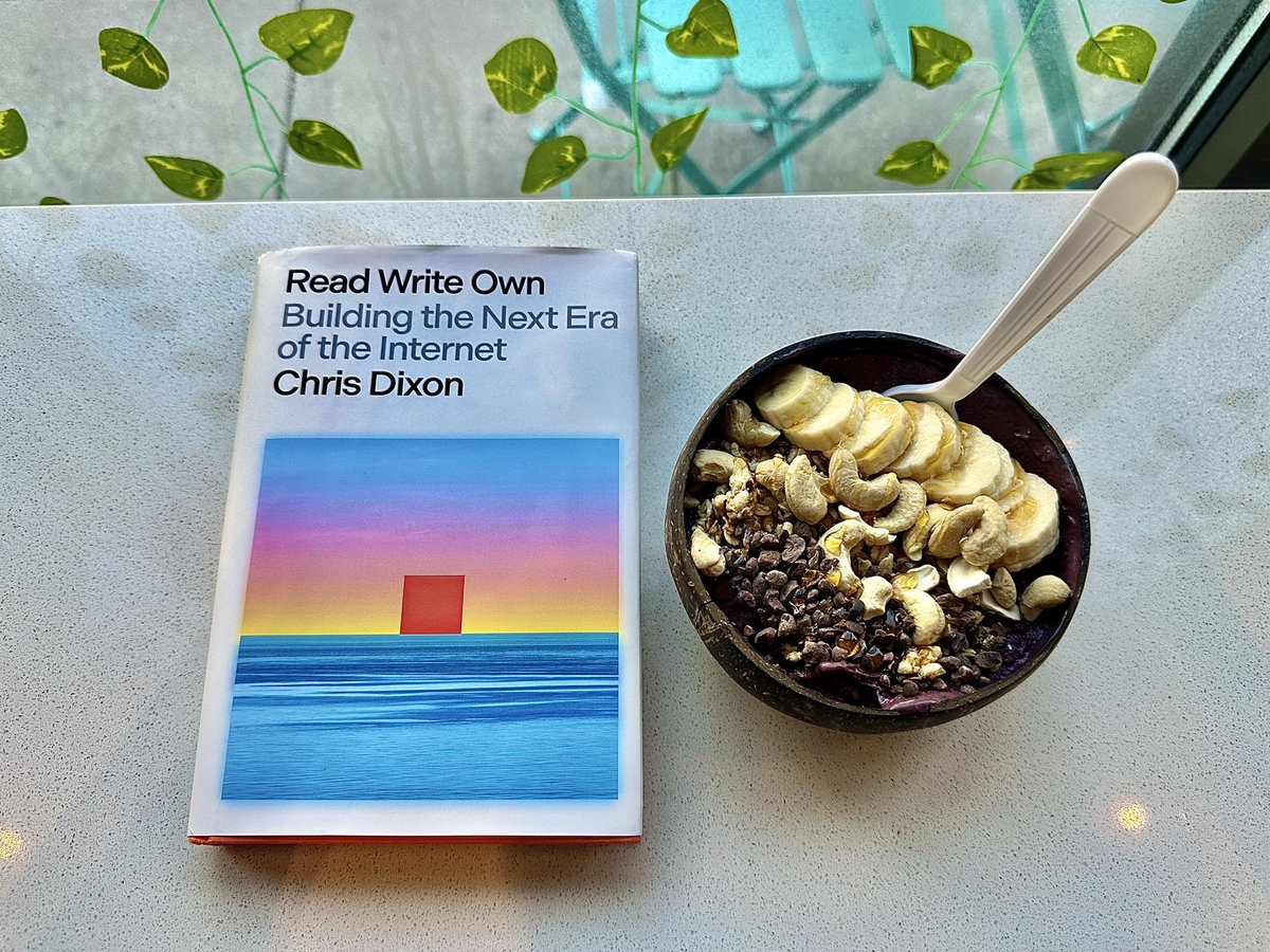
Read Write Own
Chris Dixon nails it with this visual breakdown: the internet has evolved from reading to writing to owning. In the...
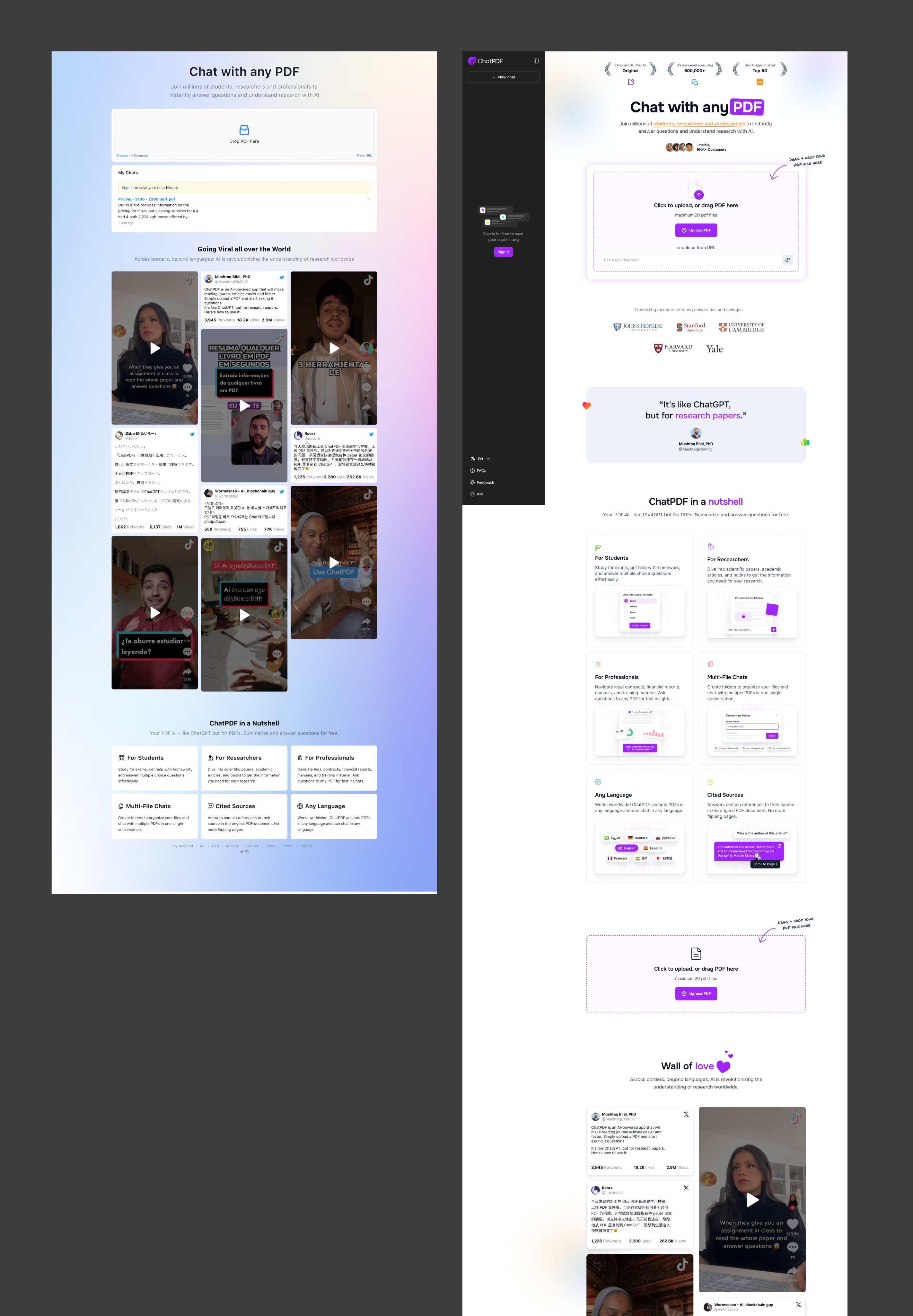
Before and After of Chat with any PDF Sales Page
The new Chat with any PDF site nailed a subtle but powerful marketing principle: clarity converts. The redesign makes it...
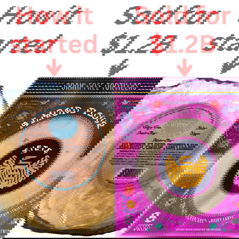
Must B Nutty rebrand to Siete sold for $1.2 billion
A total glow-up. The company once called Must B Nutty rebranded to Siete Foods—and got scooped up by PepsiCo for...
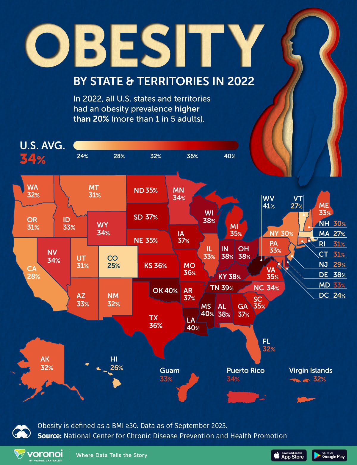
Obesity Rates By States and Territories Infographic
This obesity map hits hard at a glance. Without reading a single number, you instantly sense the problem. That’s smart...

Convert Sail Before and After Sales Page Redo
Convert Sail took a plain honey product page and made it irresistible. The transformation shows how small visual and copy...
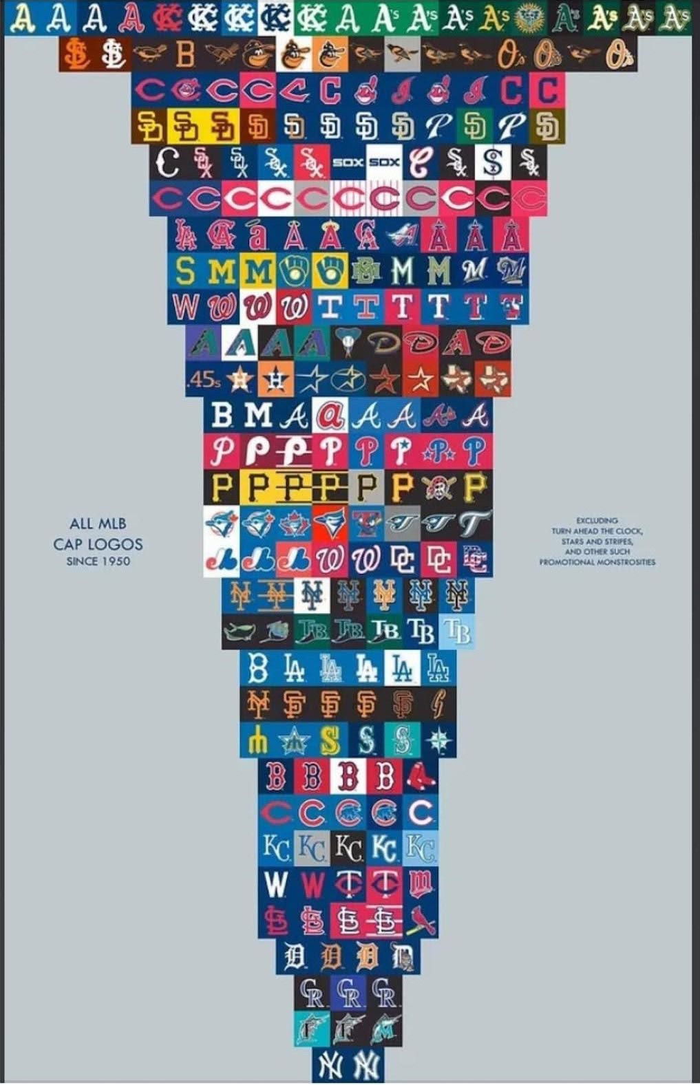
All the MBL baseball cap logos since 1950
This image of every MLB cap logo since 1950 is a masterclass in brand identity. You can literally see how...
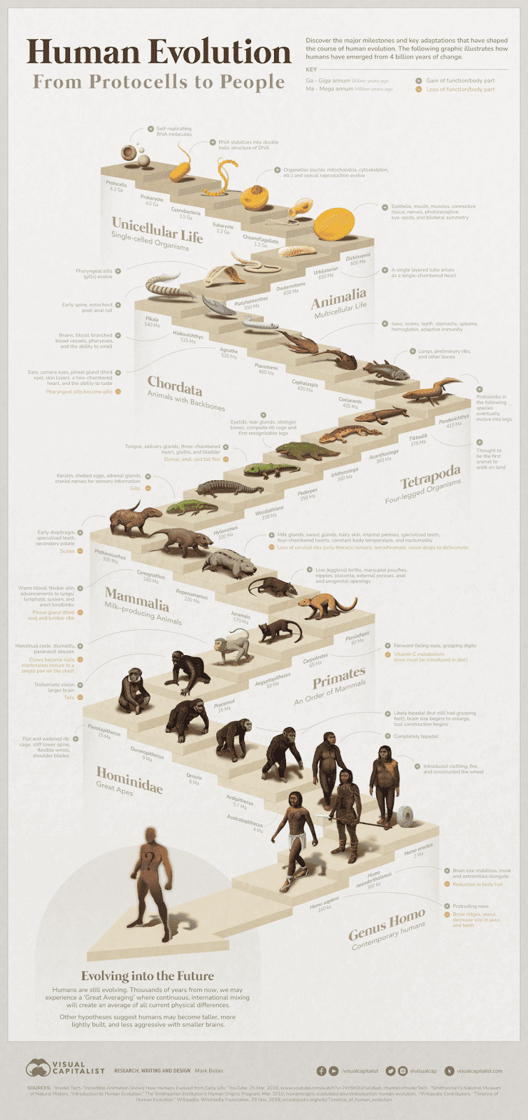
Human Evolution Visual
This visual timeline of human evolution is a masterclass in storytelling. It turns 4 billion years of complex science into...
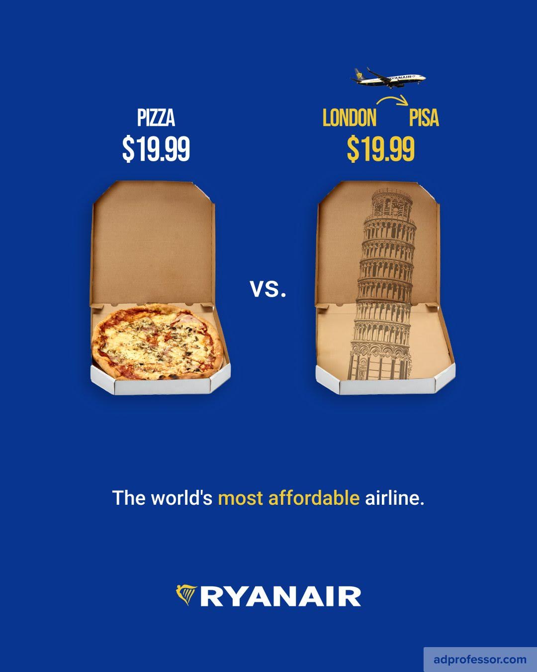
Ryanair Pizza Comparison Print Ad
This ad by Ryanair is genius-level simple. It shows a $19.99 pizza next to a $19.99 flight from London to...
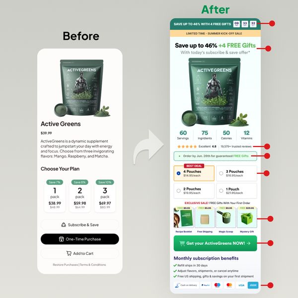
Before and after of product page
The “before” page looks clean but a little too plain. The “after” page screams value, urgency, and clarity. It’s packed...
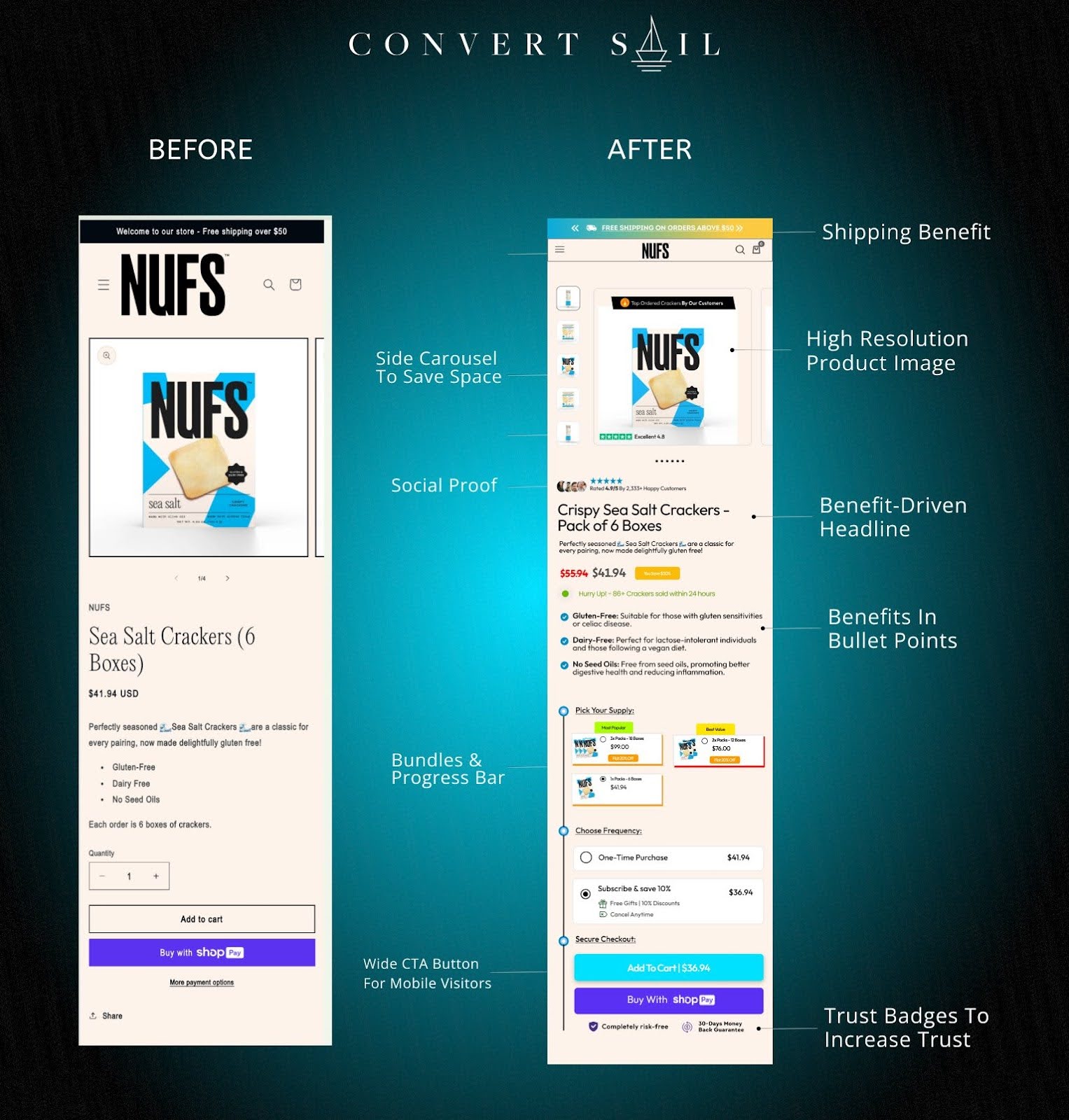
Nufs Crackers page redesign before and after
NUFS redesigned their cracker product page and saw conversion rates jump. The tweaks weren’t fancy—but they nailed basic sales psychology...
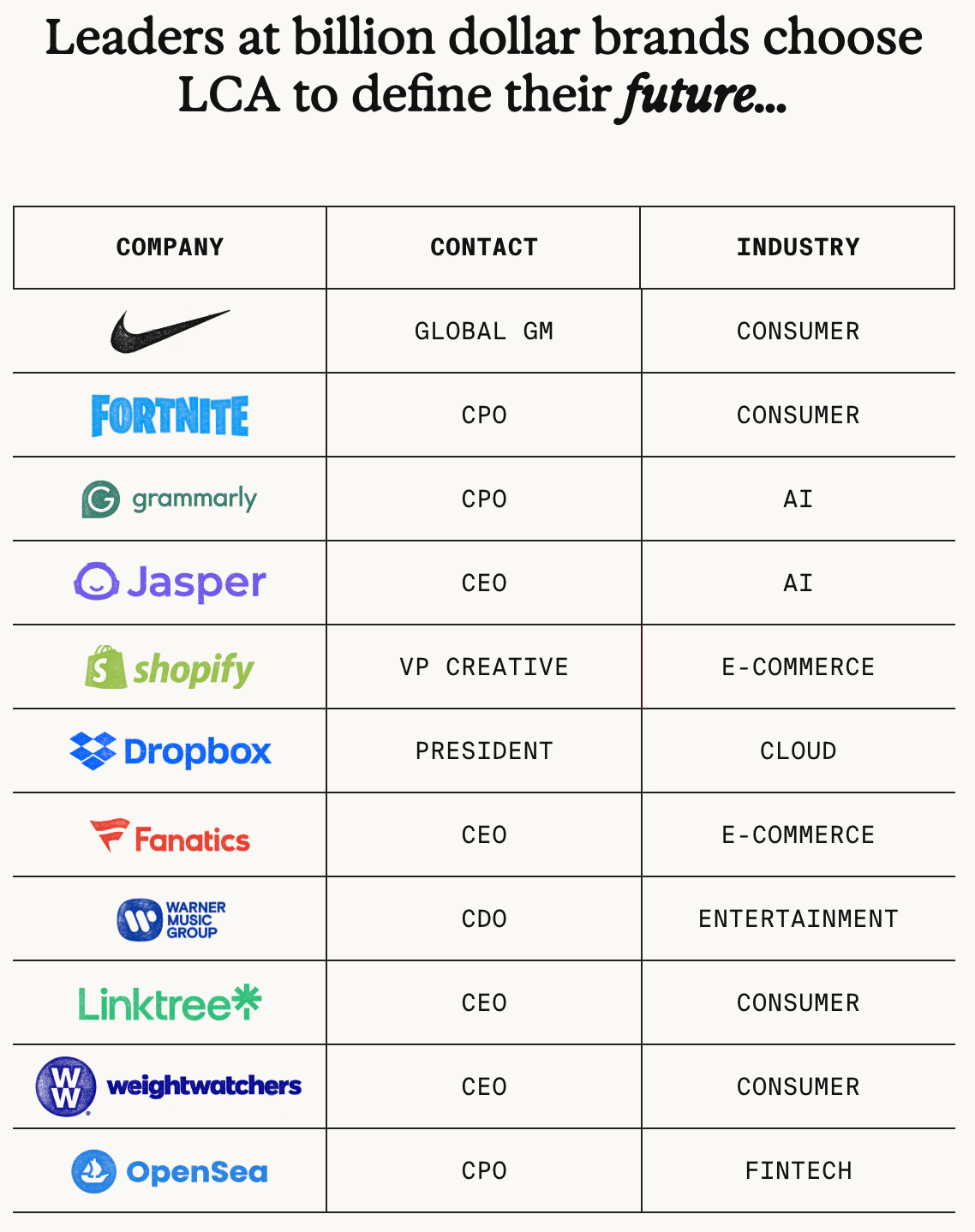
Late Checkout Agency Client List
This agency didn’t just name-drop clients. They turned their client list into a visual leaderboard of credibility. Big logos. Big...

Magic Call Script Signup Form
The “before” version looked nice but didn’t sell. The “after” version adds a simple graphic showing a web page and...
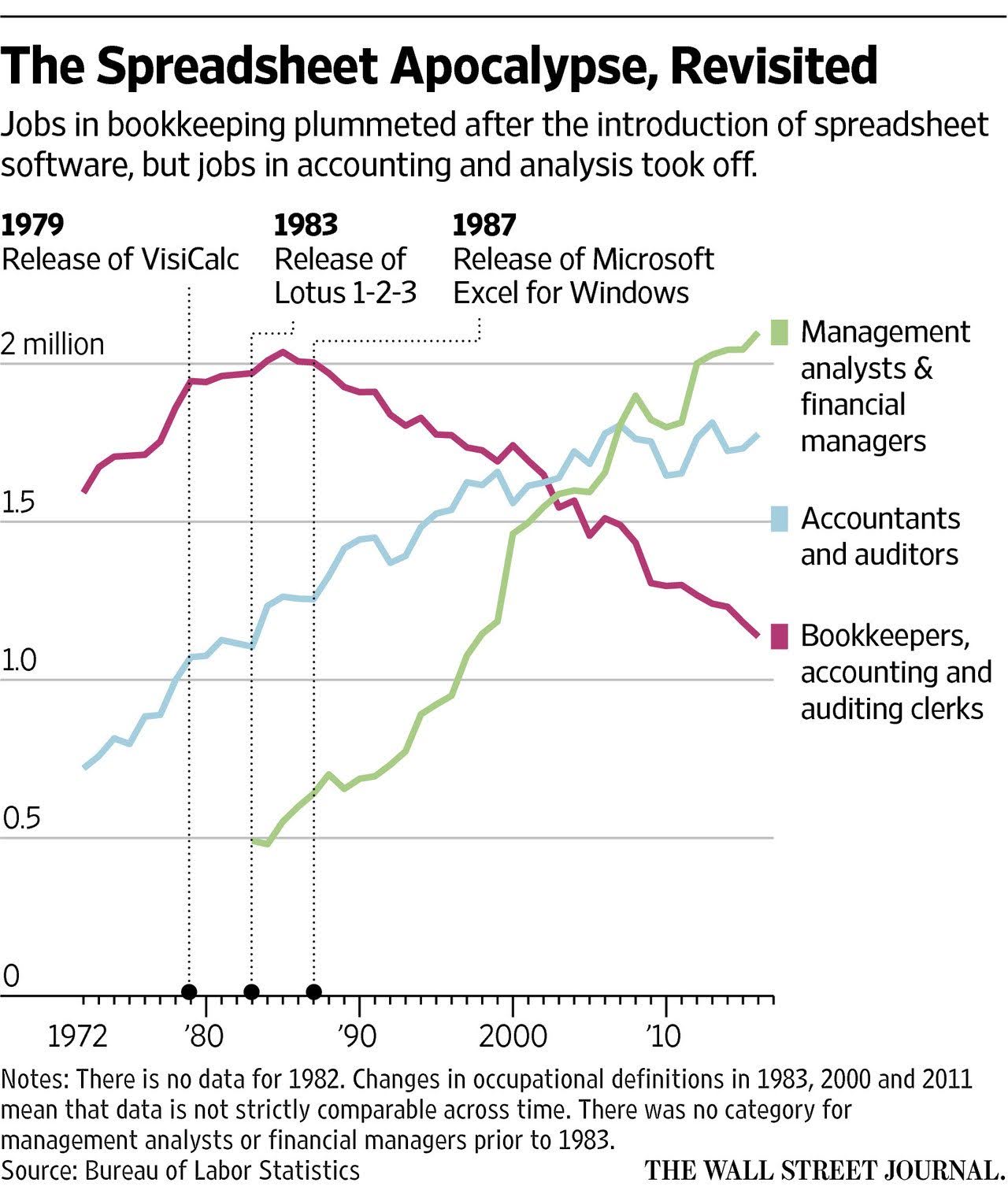
The Spreadsheet Apocalypse Graph
This graph shows how spreadsheets “killed” bookkeeping jobs but unlocked way more high-value roles in analysis and management. Every big...

Hampton Before and After Website Design
The Hampton redesign didn’t reinvent the wheel, but it sure polished it. The site went from dark and formal to...
Small money move vs big money move:
In this YouTube Short, a cleaning company shows a filthy car interior going from gross to spotless in under 30...