423 Before and After Examples
Discover the power of transformation with our Before and After Examples. See how products and services can change lives, looks, or spaces. From home renovations to personal makeovers, witness the dramatic differences and get inspired by real-life changes.

Remodeling Print Ad
This ad from Prime Construction & Remodeling is a masterclass in clarity and trust-building. It instantly tells you who they...

The Streaming Wars Brought Piracy Back From the Dead
This comic sums up the streaming era perfectly. Back in 2012, Netflix made watching shows online simple and affordable. We...

Why Writing Things Down Clears Mental Clutter
This image nails a simple truth: your mind gets messy when you try to store everything in it. The top...

DeArrow's gif for "de-sensationalizing" YouTube Titles and Thumbnails
The image shows a split YouTube feed — the left half packed with over-the-top titles promising the impossible, and the...
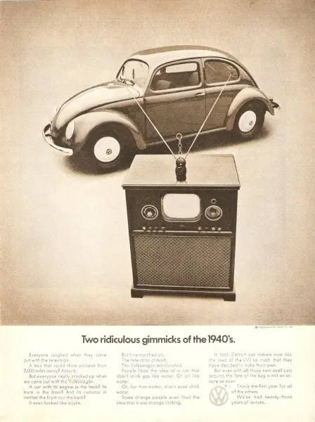
When “Ridiculous” Becomes Revolutionary
This classic Volkswagen ad flips skepticism into admiration. It pairs a Beetle with a 1940s television, mocking how both were...
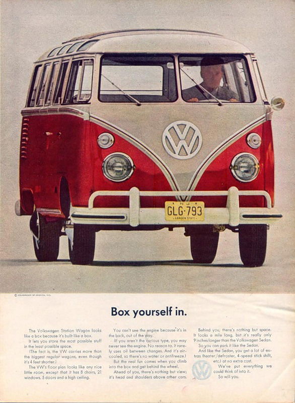
How VW Turned a “Box” Into a Dream Vehicle
This old Volkswagen ad flipped a weakness into a selling point. A boxy van became something people wanted to “box...

Eufy Ad: "No Ladders. No Downtime. Just Click."
Simple headline. Striking visual. Crystal-clear benefit. This Eufy ad nails clarity and contrast in one shot.Marketing BreakdownThe ad splits into...

The Power of a "Hidden Problem" Visual
This Zerorez ad nails attention-grabbing design with one simple trick: showing what’s invisible. The magnifying glass revealing hidden dirt in...

The Chart That Sells: Circle’s Engagement Boost Visual
This Circle ad nails it with one picture. It’s a glowing graph that screams “results” without needing a single paragraph...

Make It Exist First
This image is a perfect reminder for marketers: perfection kills momentum. The top shows a rough start, the bottom shows...

From Concept Car to Curb Appeal
Ever notice how car companies show insane futuristic designs, then the production version looks... normal? This Mercedes evolution perfectly shows...
Apple TV+ has rebranded to Apple TV.
The studio says this is their “vibrant new identity” https://t.co/UhVWeY7ncU


Apple TV+ Drops the Plus: Why Simple Always Wins
Apple just dropped the “+” from Apple TV+. It’s now just Apple TV again. Clean, simple, classy. And that’s exactly...
This graph looks like a handshake 🤝 “I’m gonna take over from here” https://t.co/dG58lypg5a

The AI-Human Content Handshake
That’s not just a graph. It’s the moment AI content shook hands with human writers and said, “I got this...

The $1.26 Billion Marketing Lesson
This image is a wild reminder of how fast tech has evolved. In the 1980s, 32GB of RAM would’ve cost...

Crocs’ Logo Glow-Up: From Cute Gator to Iconic Shape
Crocs just dropped a logo that’s pure genius. They killed the cartoon gator and made the shoe itself the star....
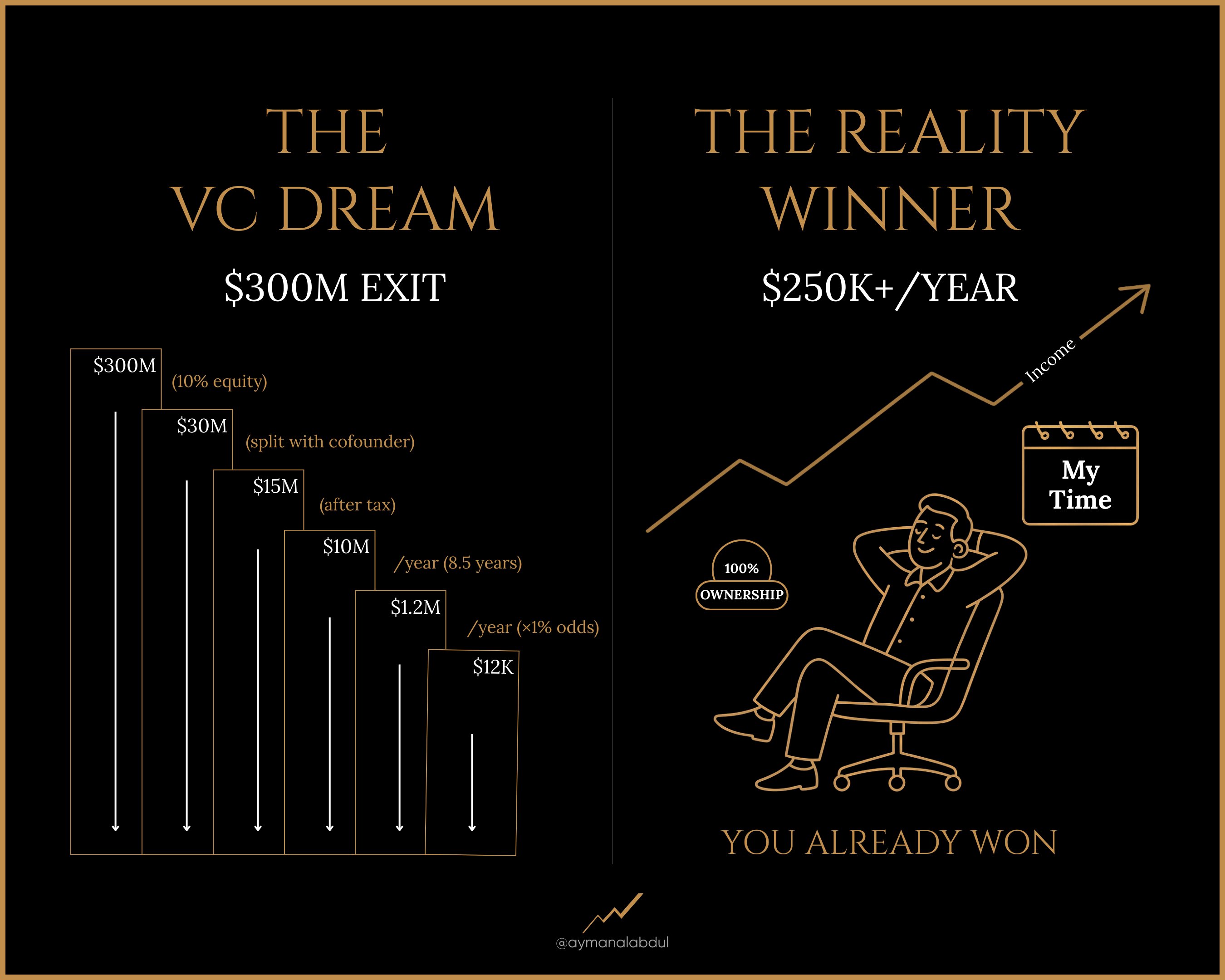
Split Design: Dream vs. Reality
This image nails one of marketing’s oldest tricks: contrast. By splitting the screen into “Dream” vs “Reality,” it instantly shows...

GoHighLevel graphic shows what companies they replace
This image nails what every SaaS founder dreams of showing: one clean funnel replacing a messy pile of disconnected software...

GoHighLevel vs Keap Comparison Chart
GoHighLevel nailed the art of the comparison chart. Their visual layout makes it instantly obvious why their tool beats Keap...

The Evolution of Logo Design: Simplifying for Success
Look at this image: Volkswagen, Burger King, Pringles, Warner Bros. All simplifying their logos. Why? Because in a digital-first world,...

Boost Your Product's Appeal with Comparison Ads
Javy Coffee’s ad is a visual knockout. One side: calm, clean, convenient. The other: pricey chaos with too much sugar....

US -vs- THEM ad with image and reasons
Nutré pulls off a brilliant side-by-side comparison that instantly wins the viewer’s gut reaction. One look, and you already know...

The Art of Naming: Transformative Brand Success
Lenny Rachitsky dropped a spicy truth bomb: bad names kill products, great names create markets. “ProChip” sounds like a microchip...
We launched Tweet Hunter at $9/month.
Seemed smart.
"More people can afford it!"
Every few months, we raised prices incrementally.
...
Pricing Strategy: How Incremental Increases Boost Revenue
Tibo’s Tweet about raising Tweet Hunter’s price from $9 to $49/month is a masterclass in pricing psychology. Instead of seeing...

Effective Visual Comparison: Fresh vs. Dried Peppers
Who knew peppers had secret identities? This chart shows how a jalapeño becomes a chipotle, a poblano becomes an ancho,...