1,913 Images and Illustration Examples That Teach Things
Drawings and illustrations and photography can transmit more information from human-to-human than text can. This board is perfect for designers and marketers seeking visual inspiration.

Yard signs are super effective
This simple stick figure image shows a classic marketing mistake. The seller is shouting 'Checkout the stuff I’m selling' while...
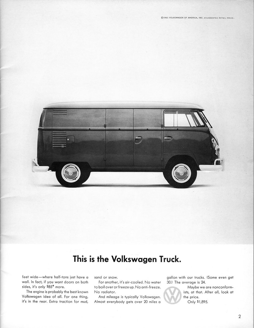
The Power of Understatement: Volkswagen’s Straight-Shooting Truck Ad
Volkswagen nailed the art of boring-but-brilliant with this minimalist truck ad. No flashy headlines, no overblown claims — just a...

Open’er Up and Sell the Story
This classic VW ad doesn’t scream specs. It whispers curiosity. With a simple photo of an open-doored car and an...
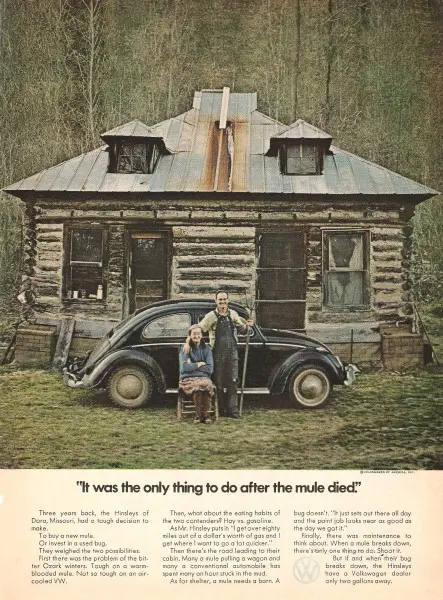
The Volkswagen Ad That Outsmarted Luxury
This old-school Volkswagen ad nails the “anti-ad” approach. It’s not glamorous, shiny, or fast. It’s humble, rural, and features a...
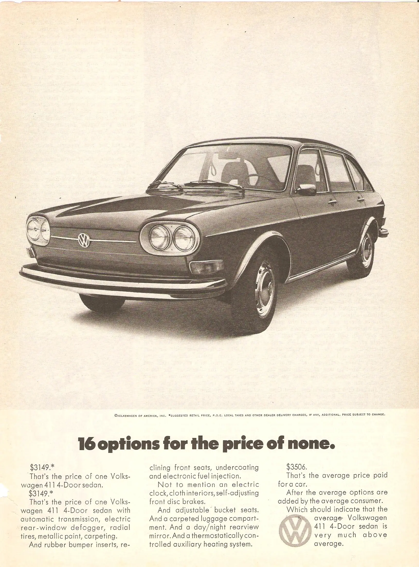
Volkswagen: 16 Options for the Price of None
Volkswagen nailed value-driven advertising with this simple, confident layout. The headline grabs you fast: “16 options for the price of...

The Perfectly Positioned VW Ad That Nails “Just Right” Marketing
VW hit gold with this ad by owning the middle ground. It positions the Volkswagen Squareback as the “just right”...
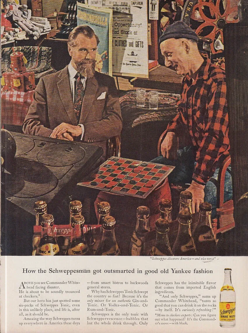
The Schweppesman Gets Outsmarted—And the Ad Wins
This vintage Schweppes ad nails storytelling in a single image. A refined British gentleman faces off with a rural American...
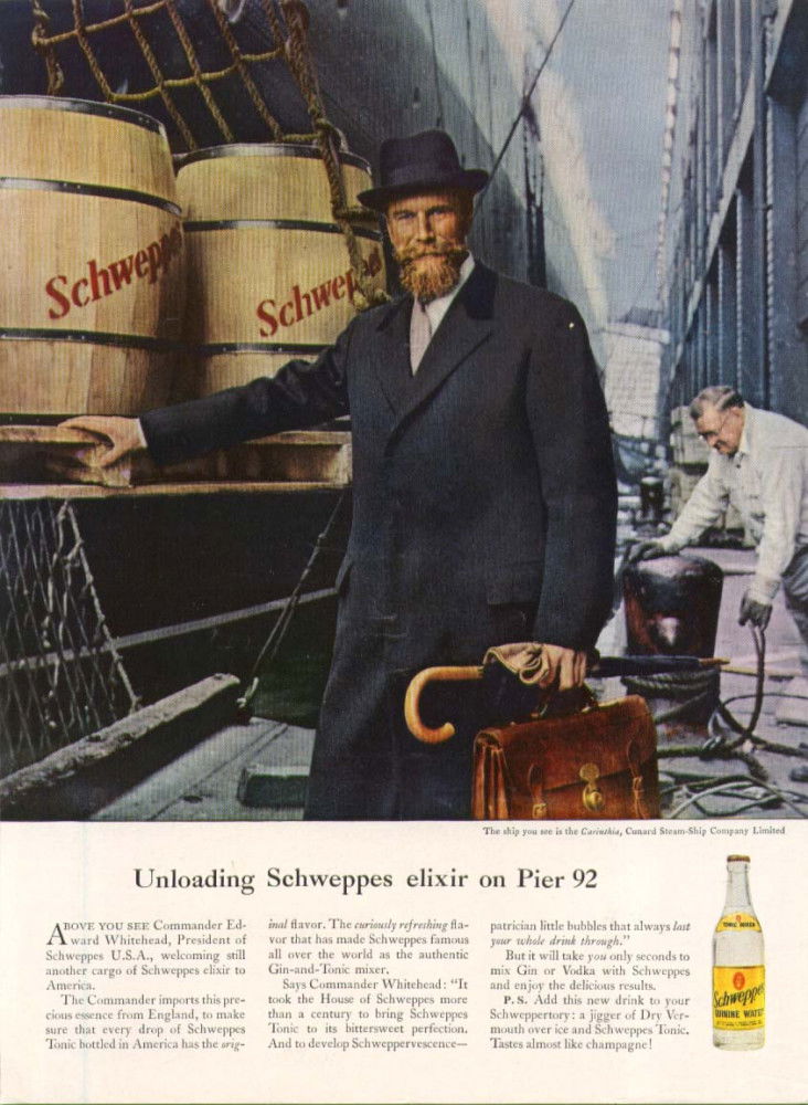
Old-School Luxury: How Schweppes Made Carbonation Feel Classy
This vintage Schweppes ad feels like stepping onto an early 20th-century dock, where gentlemanly sophistication meets imported taste. Instead of...
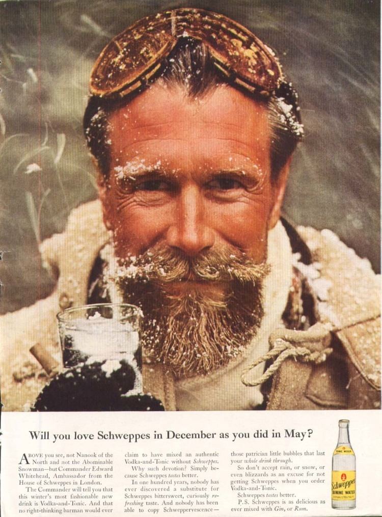
How Schweppes Made Winter Cool
This vintage Schweppes ad nails something timeless—how to make your brand feel both rugged and classy. The snow-dusted explorer staring...
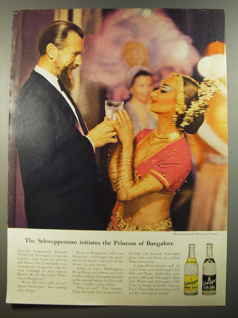
The Schweppesman Meets the Princess of Bangalore
This vintage Schweppes ad captures a glamorous exchange between the suave “Schweppesman” and the so-called “Princess of Bangalore.” The image...

The Oldest Reason for Buying a New One
This Volkswagen ad nails timeless copywriting. It’s not flashy. It’s not loud. It’s quietly brilliant. All it shows is a...

The Ad That Flipped the Script: VW’s “Will We Ever Kill the Bug?”
This classic Volkswagen ad literally flips the car upside down to grab attention. It’s visually jarring, yet instantly iconic. Instead...

When a Glitch Becomes Genius
This image looks like a tech error—but it’s actually a brilliant ad for Volkswagen. The "glitch" immediately grabs attention because...
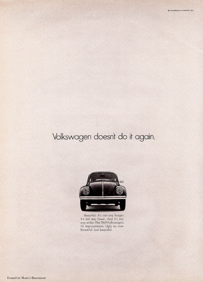
The Power of Understatement: VW’s “Doesn’t Do It Again” Ad
This old Volkswagen ad flips every marketing rule on its head—and nails it. While other car brands bragged about “new...
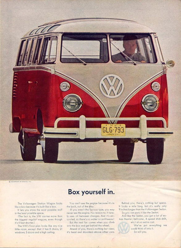
How VW Turned a “Box” Into a Dream Vehicle
This old Volkswagen ad flipped a weakness into a selling point. A boxy van became something people wanted to “box...
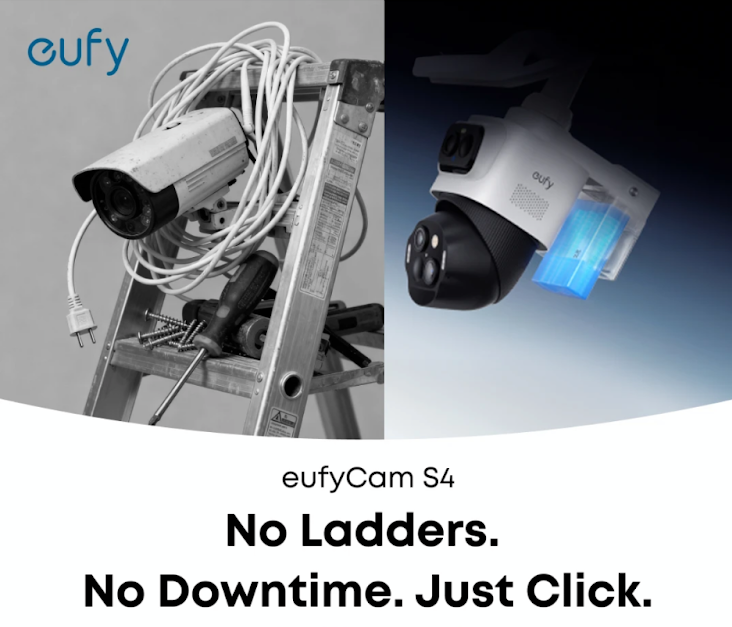
Eufy Ad: "No Ladders. No Downtime. Just Click."
Simple headline. Striking visual. Crystal-clear benefit. This Eufy ad nails clarity and contrast in one shot.Marketing BreakdownThe ad splits into...
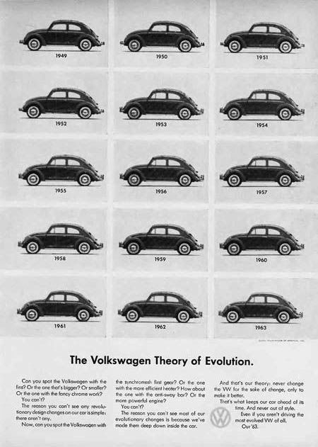
The Volkswagen Theory of Evolution
Hard to spot the differences, right? That’s the genius of this ad. Volkswagen took what most companies fear—staying the same—and...
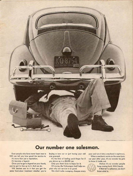
The Mechanic as the Salesman: VW’s Genius Twist
This classic Volkswagen ad flips the usual car ad upside down—literally. Instead of showing the shiny front of the car,...
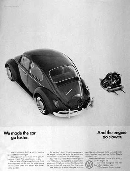
VW’s Brilliant Contradiction Ad
This Volkswagen Beetle ad is a masterclass in copywriting and contrast. It shows a car and its engine—separated—and uses a...
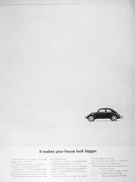
The Ad That Made Small Look Big
This classic Volkswagen Beetle ad flips the script on car marketing. Instead of bragging about size, speed, or luxury, it...
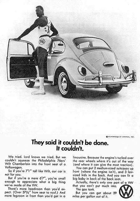
VW Ad: When “It Couldn’t Be Done” Sells Better Than Bragging
Volkswagen’s classic ad featuring Wilt Chamberlain is a masterclass in flipping weaknesses into selling points. Instead of hiding the Beetle’s...
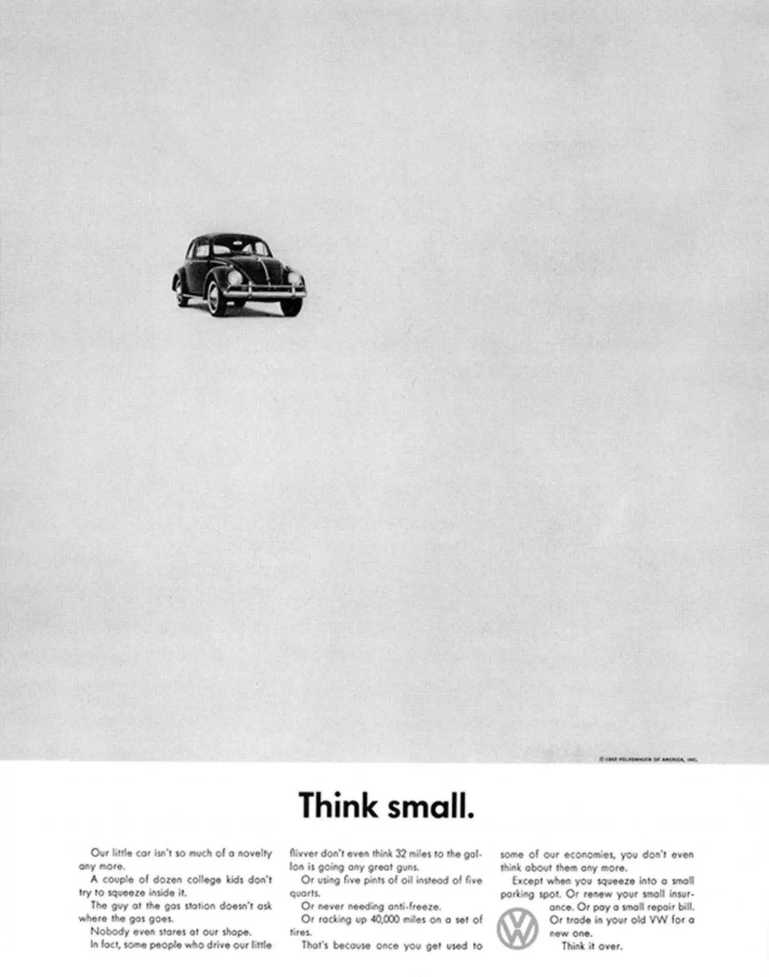
The Ad That Made “Small” Cool
This classic VW Beetle ad flipped all car marketing on its head. While every other brand shouted about power and...
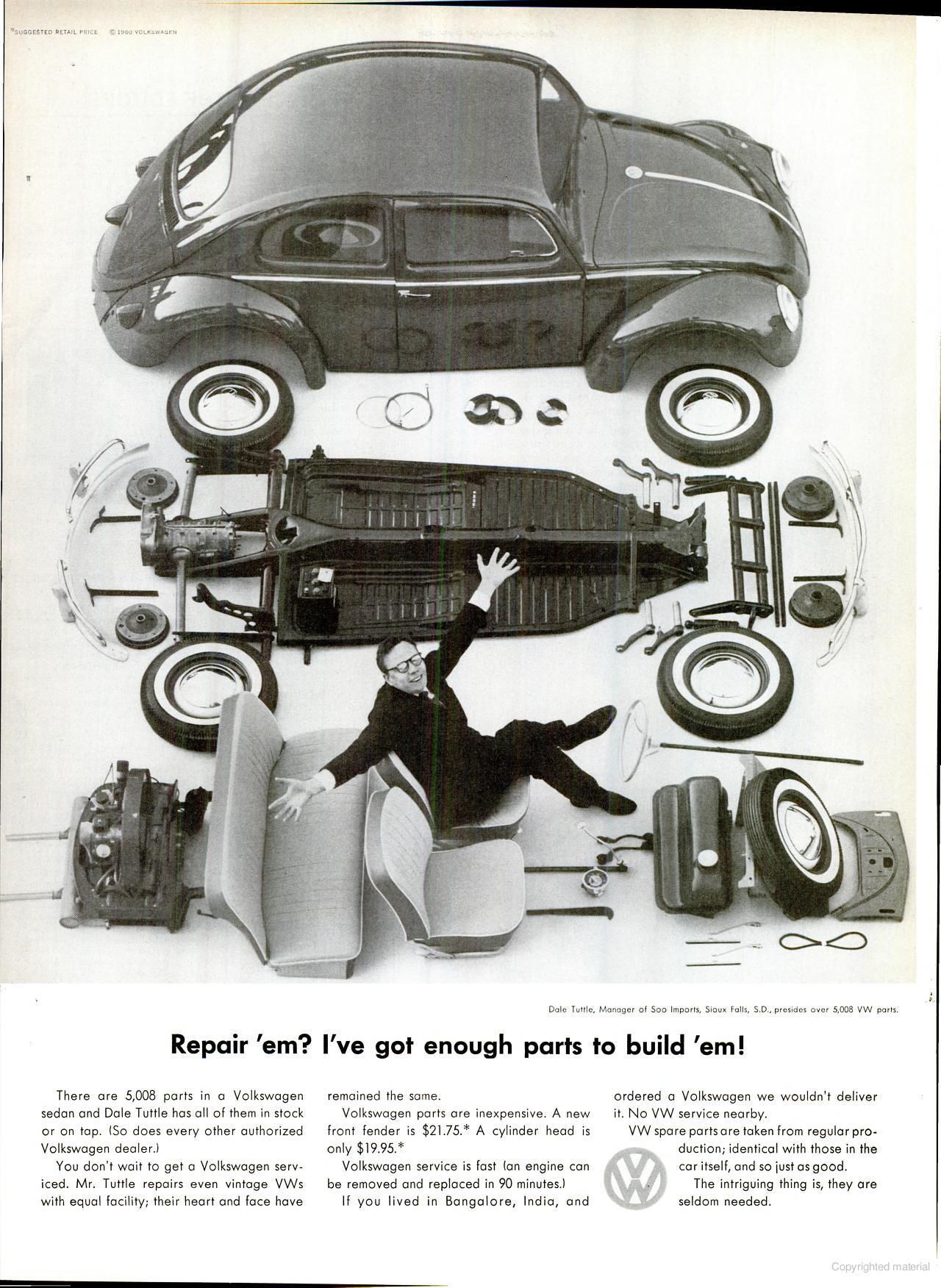
VW Shows the Power of “Proof You Can See”
This vintage Volkswagen ad is a masterclass in visual proof. Instead of just telling people VW parts are easy to...
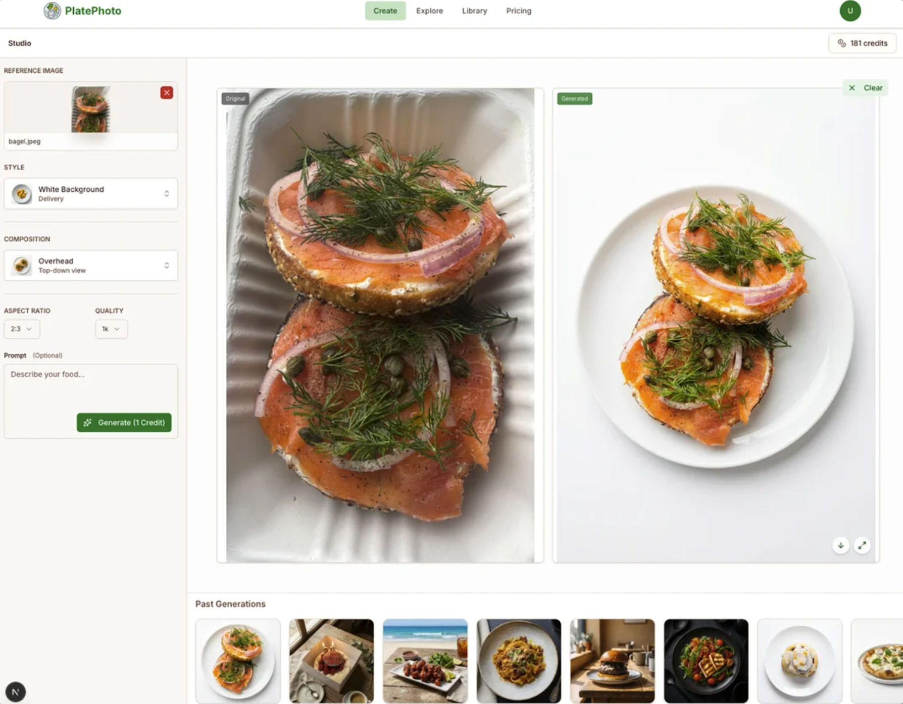
App takes normal photos and uses AI to make “restaurant quality photos”
Ever notice how a quick change in photo style can make the same dish look way more appetizing? This image...