City of Los Angeles crappy designer ad
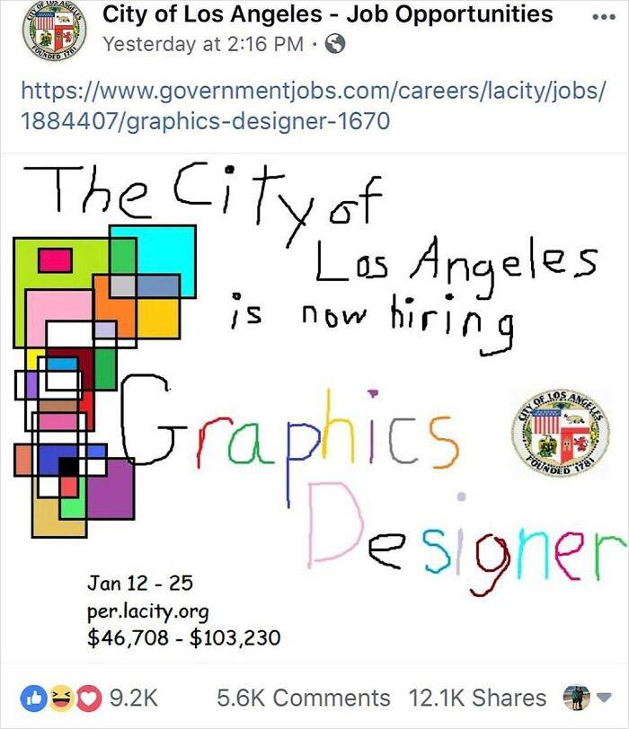
This City of Los Angeles job ad looks like it was drawn during recess. That’s exactly why it works. In a feed full of slick, Canva-perfect posts, this one stands out by being ugly on purpose.
Marketing analysis
The ad uses “pattern interruption.” When everyone else zigs with polished professionalism, this ad zags with wobbly text and mismatched colors. You instantly stop scrolling to figure out if it’s real—and that curiosity gets the job done.
Why it works
- Breaks the pattern and stops the scroll
- Feels authentic, not corporate
- Humor builds instant connection
- Shares easily because it’s funny and weird
Examples
- Kapwing’s “Bad Design” ad got huge engagement using the same trick
- A plunge company’s “Our designer quit” ad went viral for its MS Paint aesthetic
- Duolingo’s rough meme-style TikToks drove massive organic growth
Analyzed by Swipebot
Loading analysis...
