Search for a command to run...
This vintage travel poster nails the art of emotional advertising. No flashy deals. No long copy. Just delight. Ducks crossing...
A boring “Do not steal” sign is easy to ignore. But this one? It stops you with a laugh. “Stealing...
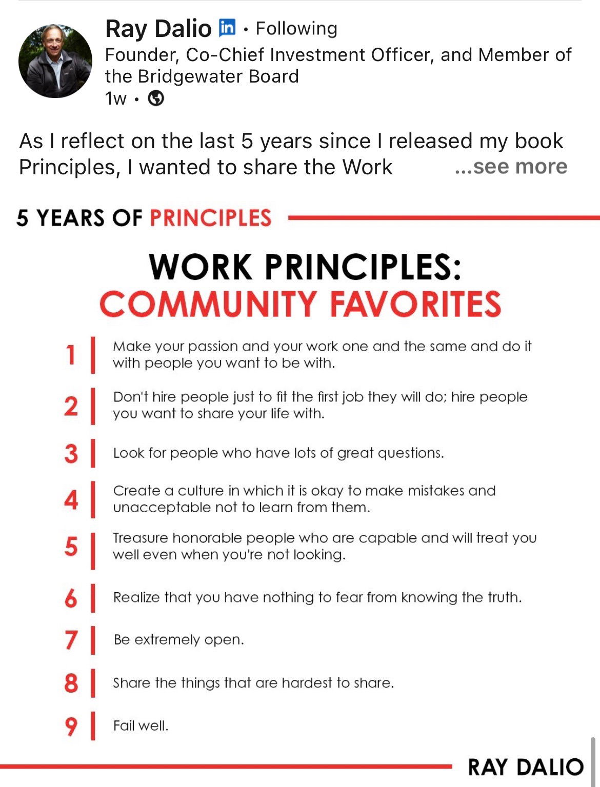
Ray Dalio’s post on his most loved work principles isn’t just leadership advice—it’s a crash course on how to build...
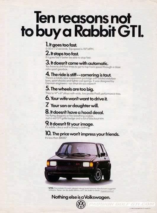
This vintage VW Rabbit GTI ad flips car marketing on its head. Instead of boasting features, it playfully lists “reasons...
Everyone wants to be a creator now. Podcasts, courses, newsletters, communities—it feels like every one-person show is turning into a...
This ad nails visual marketing. Denali Pools doesn’t tell you they build great pools — they show you the kind...
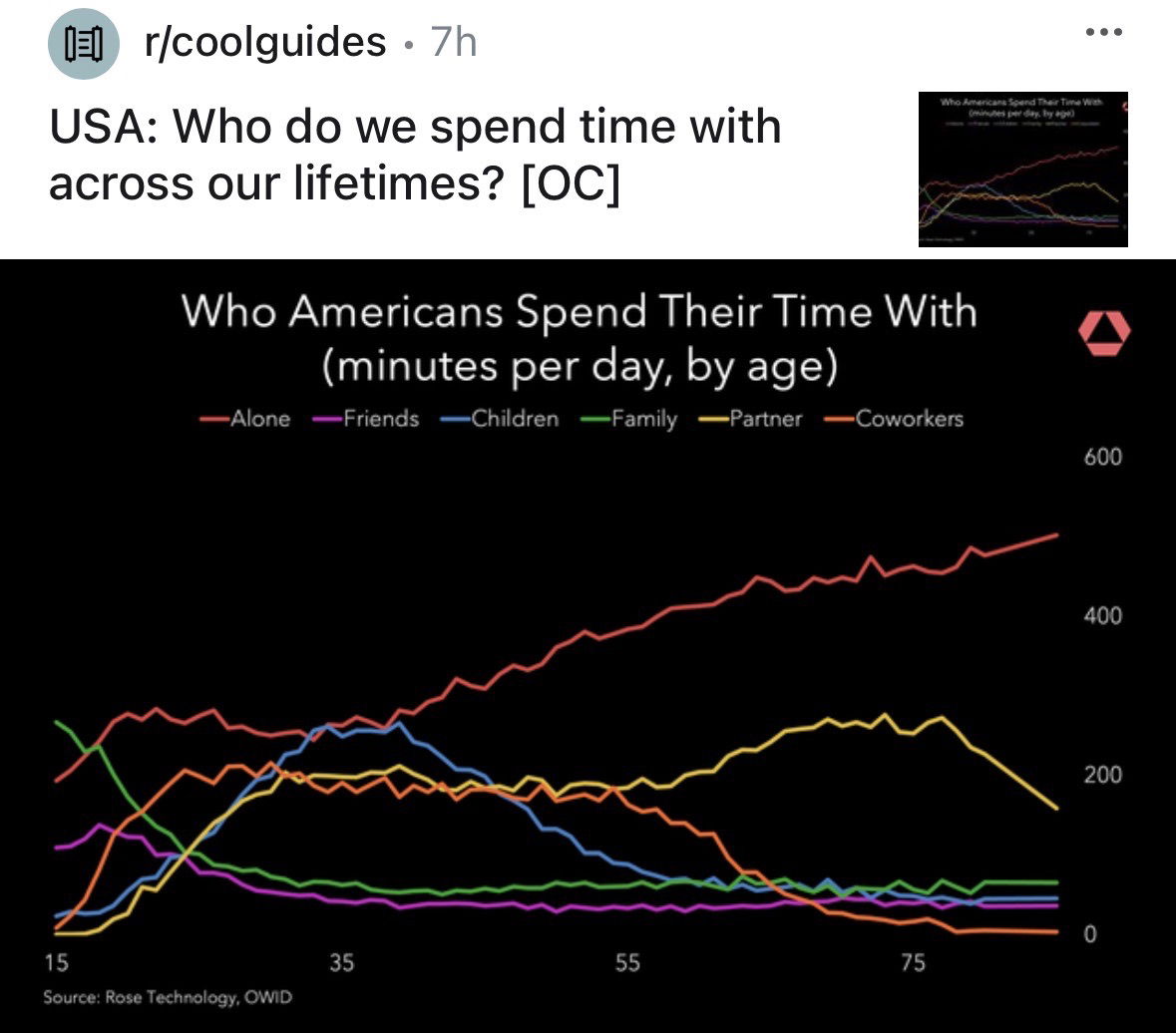
This chart shows who Americans spend their time with at different ages. It’s a great visual reminder that attention shifts...
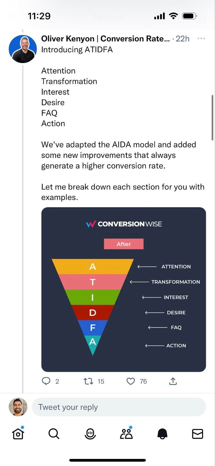
Oliver Kenyon just dropped a fresh twist on the classic AIDA formula called ATIDFA: Attention, Transformation, Interest, Desire, FAQ, Action....
This shoe-and-pant color chart teaches a masterclass in communication: one image explains what paragraphs of text couldn’t. No fluff, no...
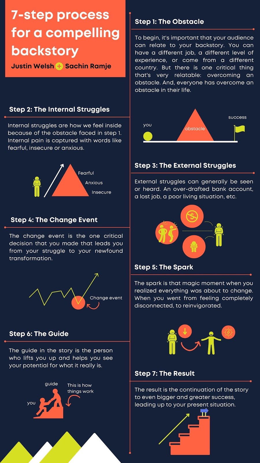
Every brand (and person) needs a story. But too many skip straight to the “success” part and forget the messy...
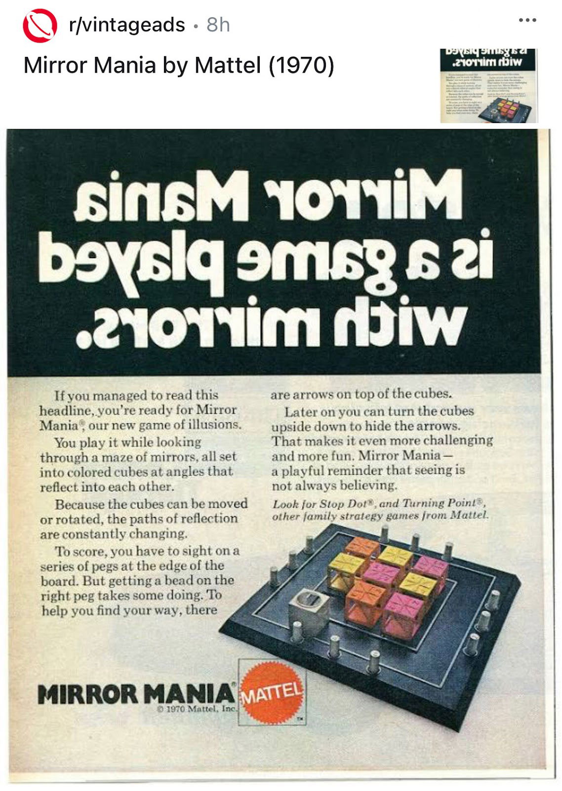
This 1970 Mattel ad for Mirror Mania pulls a fun visual stunt—the headline is printed backward, forcing readers to “see...
This diagram instantly explains something complex: how Big Bird works. No extra text, no fluff, just a visual that makes...
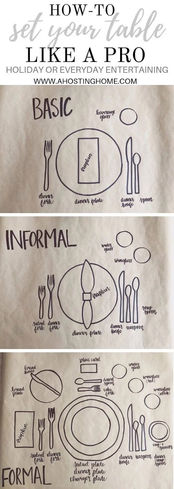
This one image teaches you everything about table settings—basic to formal—in a single scroll. No clutter. No walls of text....
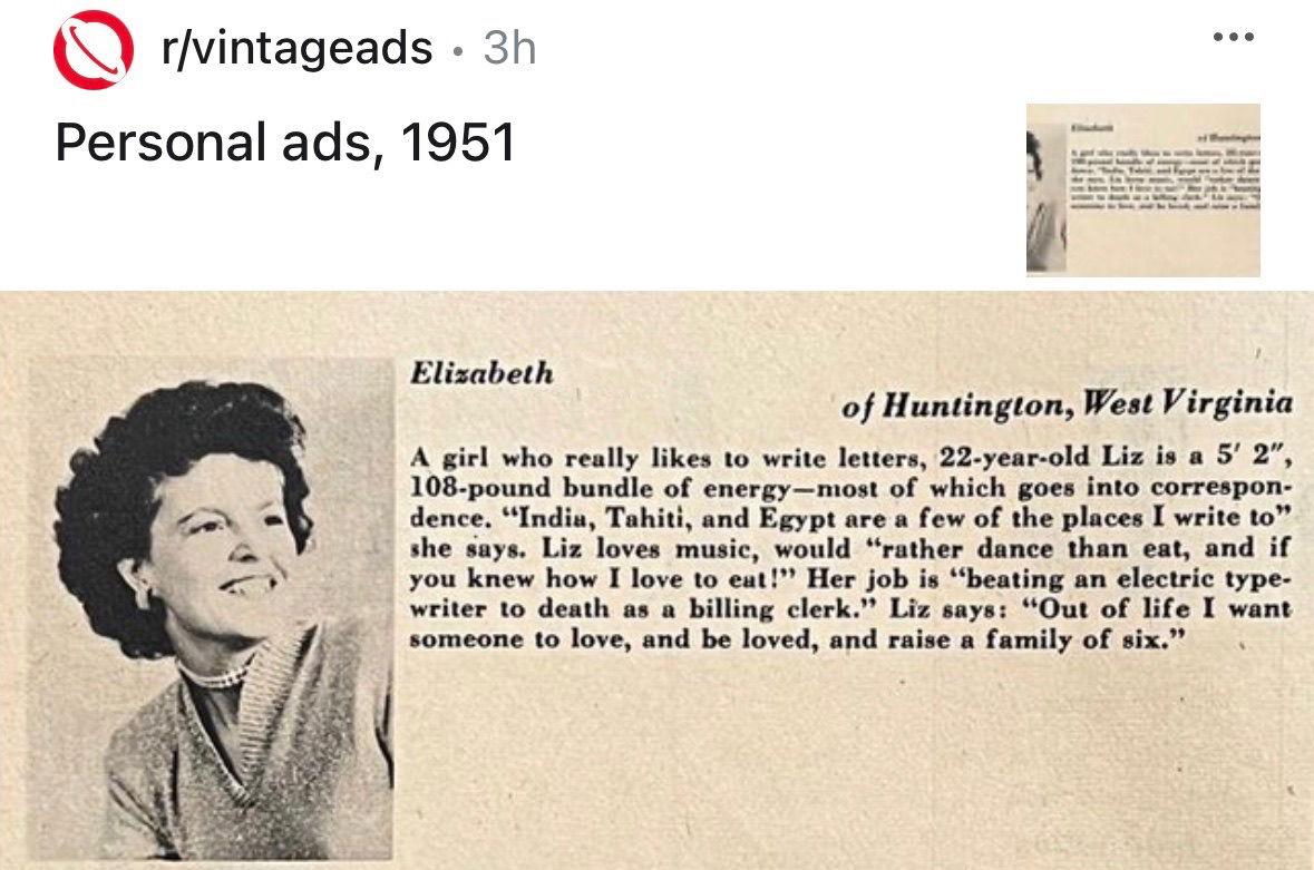
Before dating apps and bios, people paid for tiny ads like this 1951 gem to describe themselves. One short paragraph...
This sign hits deep because it uses money to make time feel tangible. It’s a brilliant example of how a...
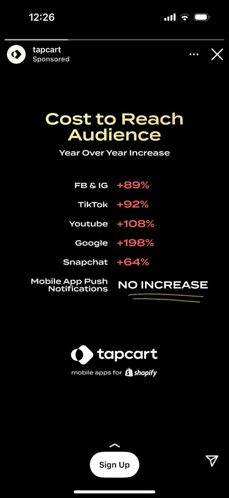
Tapcart nailed this ad by going straight for the logical buyer. Instead of hype or visuals, they use a simple...
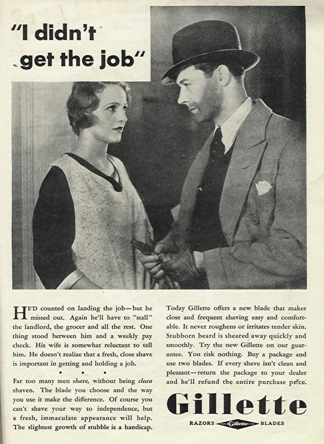
This Gillette ad hits you right in the gut. A man says, “I didn’t get the job.” He’s unshaven. His...
This Slow Boring subscription page nails the art of “clear and clever.” In just a few seconds, readers can decide...
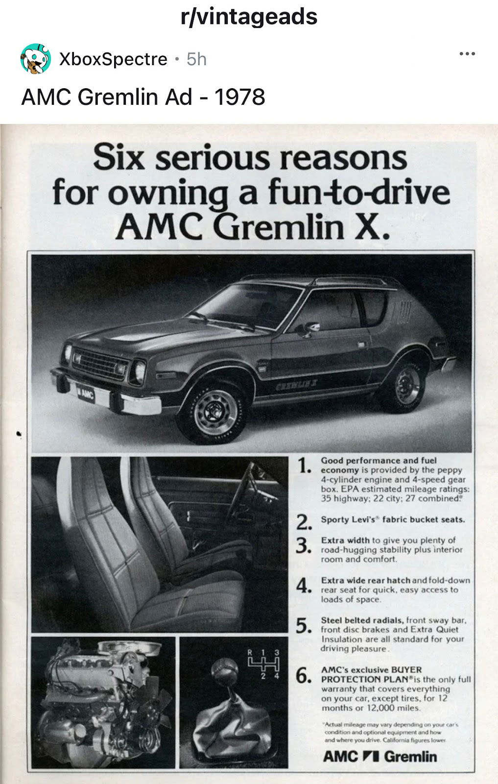
Most car ads try to make you feel something. This 1978 AMC Gremlin ad does the opposite—it makes you think....
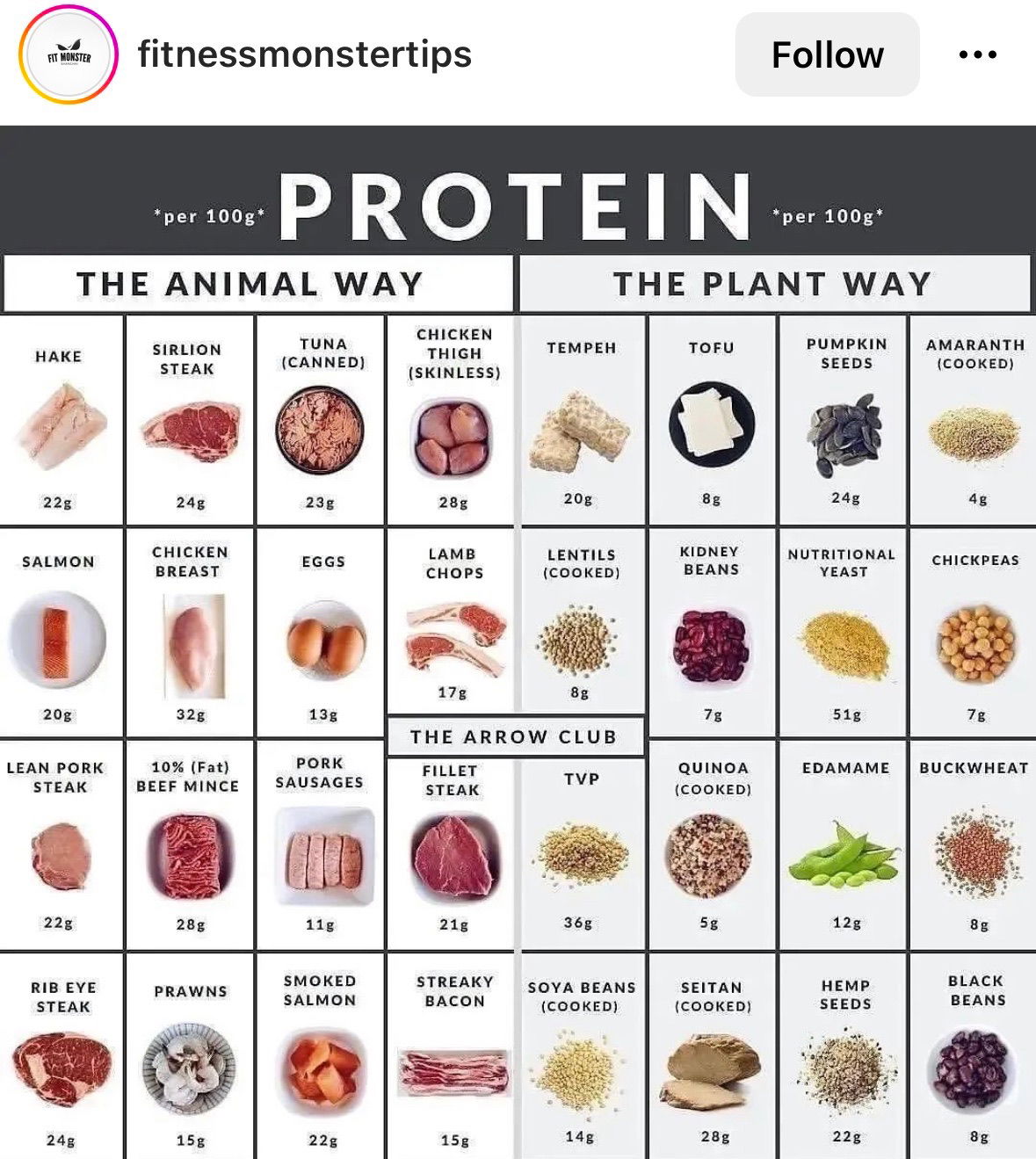
This visual from Fitness Monster Tips nails the basics of communication design. It takes a complex topic—protein content by food...
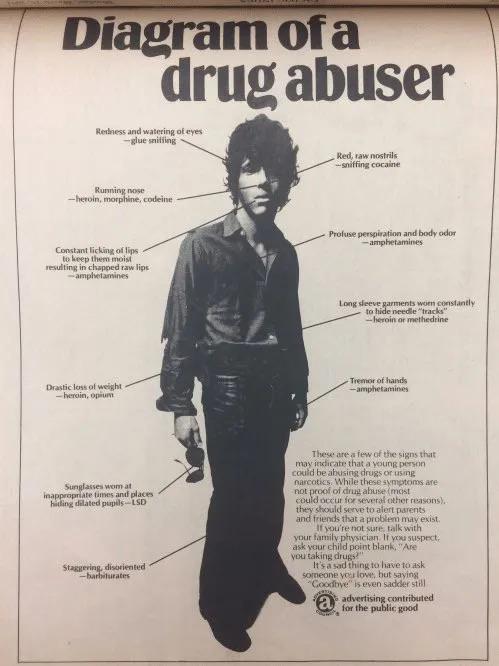
This 1973 anti-drug ad is both outdated and unintentionally hilarious. But behind the retro design is a surprisingly solid marketing...
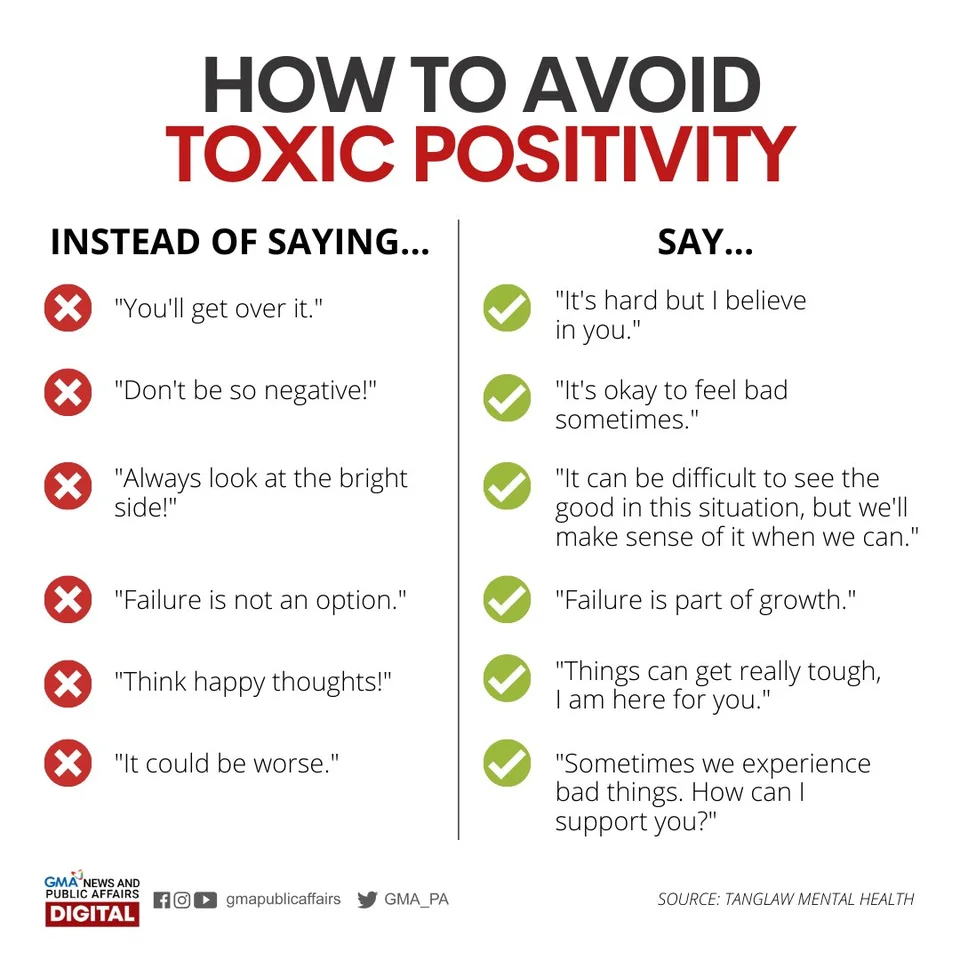
This simple Instagram graphic nails emotional intelligence in marketing. It shows how tiny wording choices flip a message from dismissive...
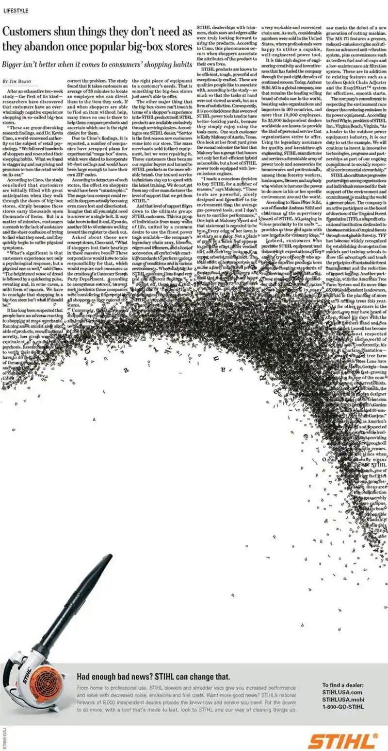
Sometimes the best ads show instead of tell. This STIHL print ad takes a boring newspaper article and blasts the...
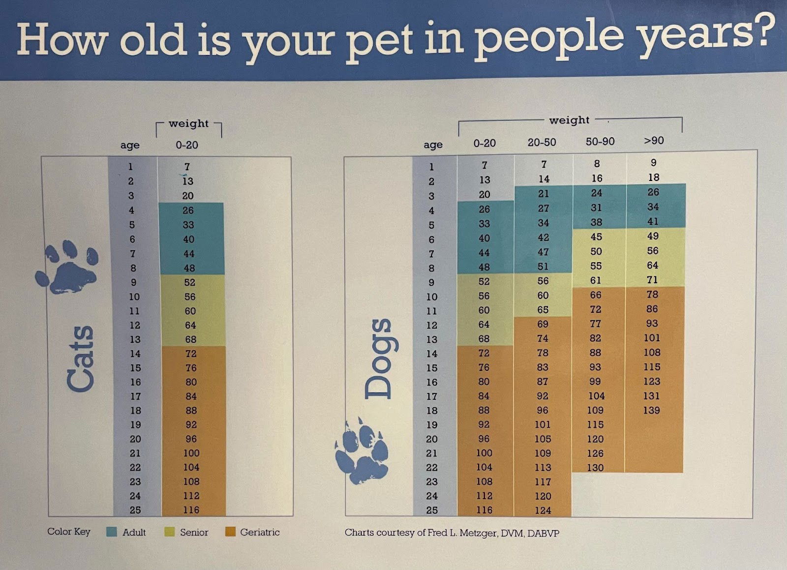
That old “dog years” formula is wrong—and this chart proves it. Instead of just saying “multiply by seven,” it breaks...