
The Ad That Promises Effortless Newsletters
This ad nails it with one powerful question: “Imagine if your newsletter could write itself?” It immediately hooks every marketer...

The Ad That Hurts (In a Good Way)
This OpenPhone ad hits deep for anyone who’s ever missed a call from a potential customer. The image shows three...
Hampton has a Slack channel called sh*t i'm f*cked where people tell stories when they nearly failed.
The channel is our most popular channel.
Its honestly pretty awesome seeing super successful people talk about near-business-death experiences.
Also fun to celebrate these f*ck ups and laugh at it all.
A few highlights (anonymized):
1. $140k payroll due in 6 days. $550k in receivables. $7k in the bank.
...
Learning from Failures: The Power of Transparency in Business
Turns out the most-loved channel at Hampton isn’t about wins. It’s about near-deaths. Sam Parr shared that their Slack channel...

The Rolex Ad That Made Time Feel Heroic
These old-school Rolex ads didn’t scream “luxury.” They whispered “you’re built for greatness.” The setup: black background, bold white text,...

Bluehost Hosting "Ice Cream" Ad
Bluehost grabs attention fast with a delicious analogy: “Hosting is like ice cream. It’s better when you don’t have to...

The $163 Trillion Pie: Who Really Owns America's Wealth
This chart by Visual Capitalist turns a dry wealth report into a pie that literally shows who’s eating best. Each...

Barry’s “Friends with Benefits” Campaign Turns a Referral into a Flirty Hookup
Barry’s took a tired referral idea and made it spicy. Their campaign line “Hookups have their benefits” instantly grabs attention...

The “Hi, I’m Roy” Billboard That Broke the Internet
A giant white billboard in Times Square just says: “hi i’m roy im 21 / this was very expensive /...
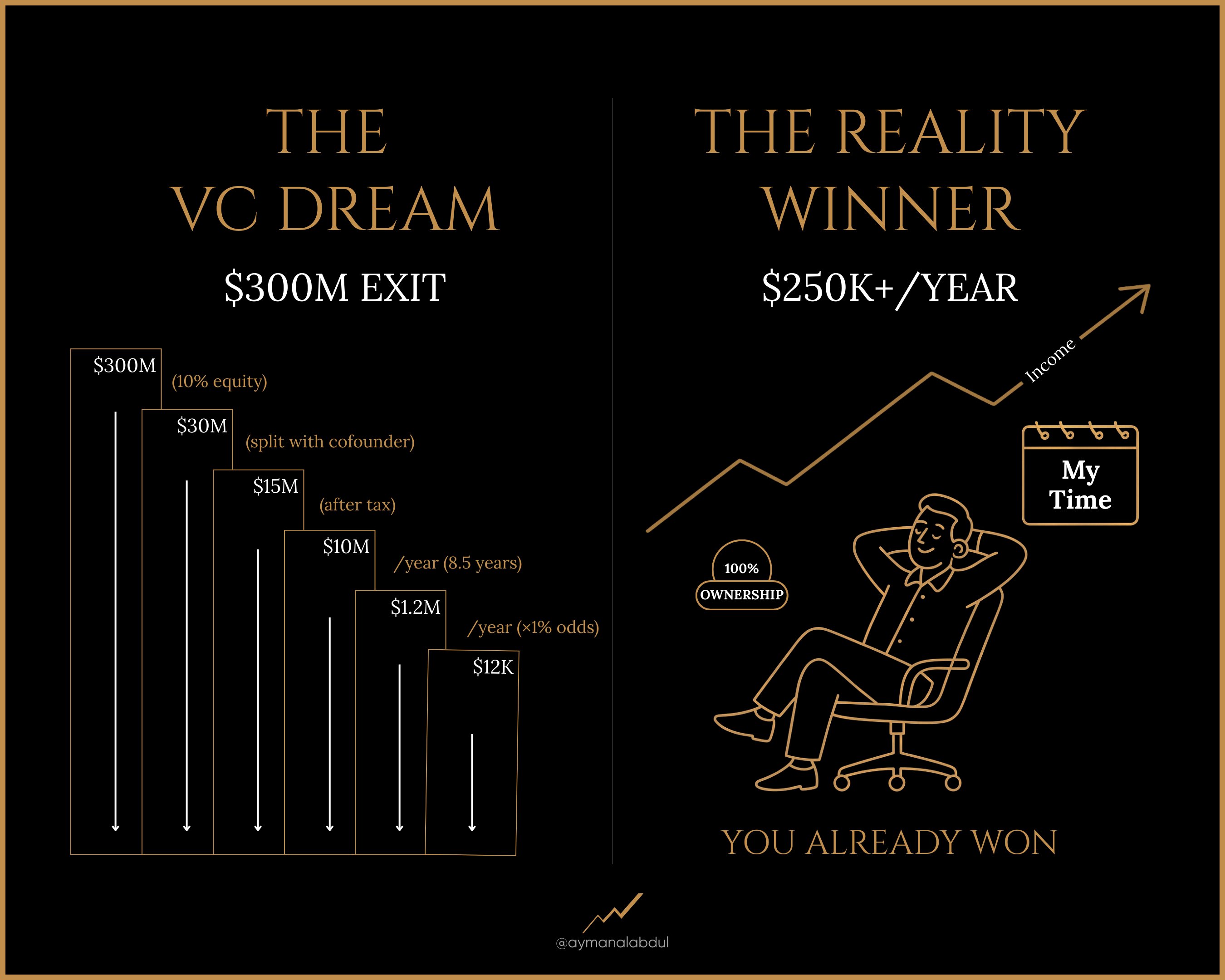
Split Design: Dream vs. Reality
This image nails one of marketing’s oldest tricks: contrast. By splitting the screen into “Dream” vs “Reality,” it instantly shows...

Crafting a Compelling Offer with a Professional Touch
This pricing page screams premium. The dark blue background oozes trust and sophistication, while the white and light blue type...

Faucet Ads - Focusing on Trust
This Moen faucet campaign is a masterclass in building authority through visuals. Instead of shouting “we’re the best,” Moen shows...

GoHighLevel vs Keap Comparison Chart
GoHighLevel nailed the art of the comparison chart. Their visual layout makes it instantly obvious why their tool beats Keap...
Sora videos starting to look crazy real
Sora’s new AI videos look freakishly real. Short, educational clips? It nails those. If you don’t ask it to make...
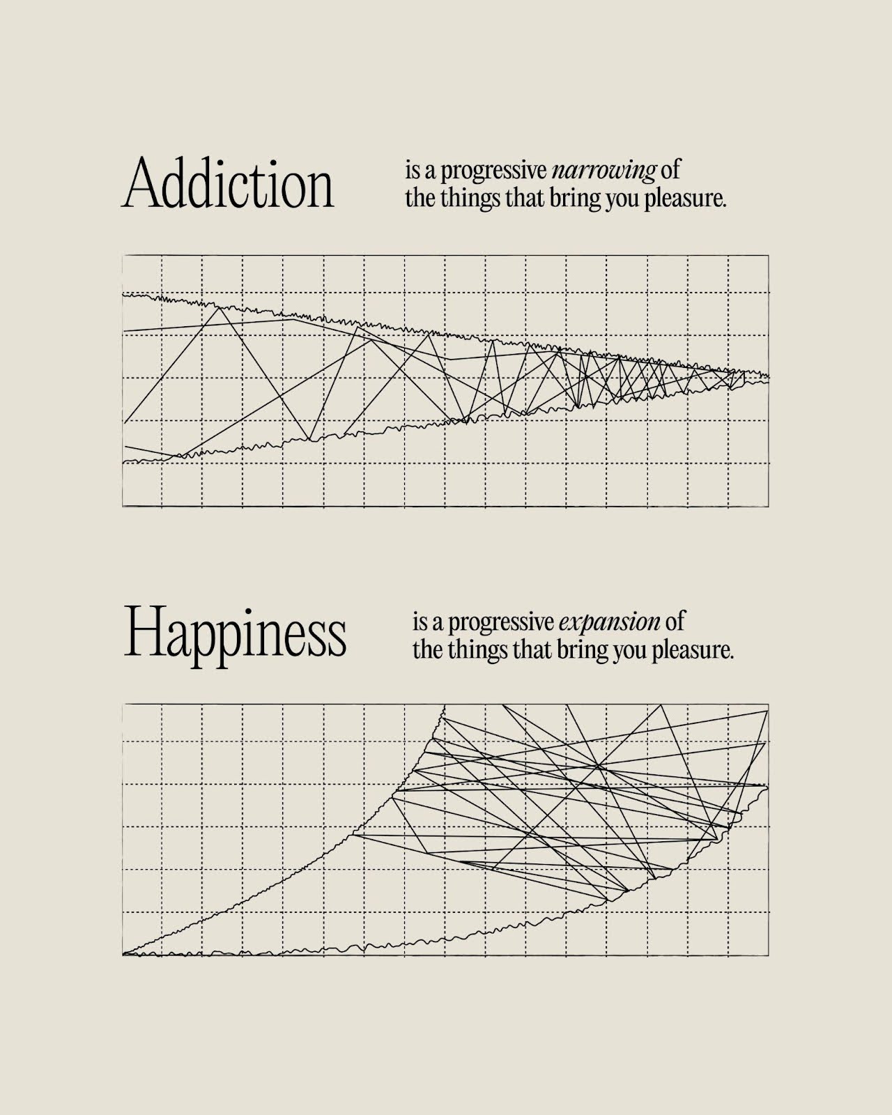
Exploring Contrast: Addiction vs. Happiness in Visual Marketing
This image nails a key marketing principle: contrast sells. Two simple charts — one for “Addiction” and one for “Happiness”...

Crafting Impactful Visuals: Lessons from a Minimalist Design
This landing page nails the art of saying a lot with very little. Just a bold statement, some numbers, and...

Visual Storytelling in Nike's Action-Packed Ad
Nike nails desire in one photo. This two-part image tells a full story without words: a player diving for the...

Unlocking the Power of Clean Design and Direct Messaging in Marketing
This Stan landing page is a great example of simple, high-impact design that speaks directly to creators. One bold headline,...
Tesla's Tax Credit Offer: A Strategic Marketing Push
Tesla’s tweet nails one of the oldest sales tricks in the book: scarcity. By tying its $7,500 tax credit offer...
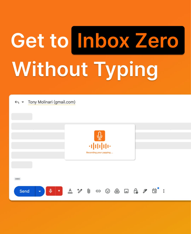
Achieve "Inbox Zero" with Eye-Catching Visuals and Clear Messaging
This ad hits you with a loud orange background and a crystal-clear promise: “Get to Inbox Zero Without Typing.” It’s...

Unlocking the Future of Beauty with LED Therapy
Meet the ad that looks like it’s straight out of a sci-fi movie. The Omnilux LED mask grabs attention instantly...

Elevating Engagement: Humor and Clarity in Escalator Signage
A blue sign at Ipswich Riverlink Shopping Centre turned a boring “out of order” message into a memorable moment. Instead...

Crappy “Graphic Designer On Break” Ads!
These doodle-style ads from Subway, Wendy’s, Pizza Hut, Potato Corner, and Mang Inasal look like they were drawn in MS...

Harnessing Nostalgia and Humor in Marketing: A Memelord Case Study
Memelord’s landing page isn’t just nostalgic—it’s strategic pixel perfection. Every design choice screams “you belong here” to its internet-native audience....

Decoding Overwhelm: How This Image Captures Audience Attention
Ever feel like your brain’s a popcorn machine of ideas but your fingers can’t keep up? This ad nails that...