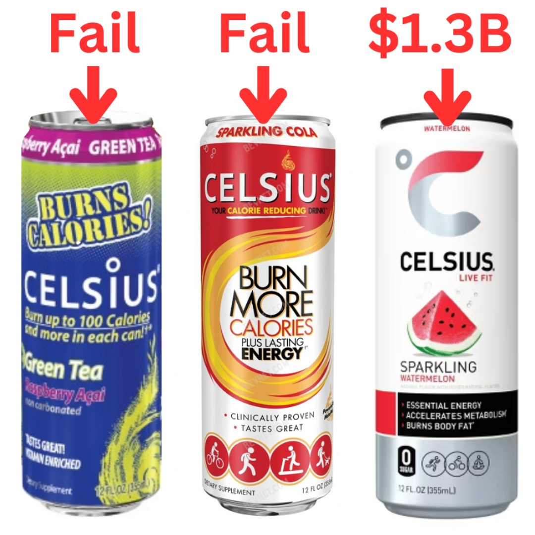
Celsius can design rebrand
Celsius needed two rebrands before the energy drink began to sell. By changing their focus and adopting a cleaner design,...
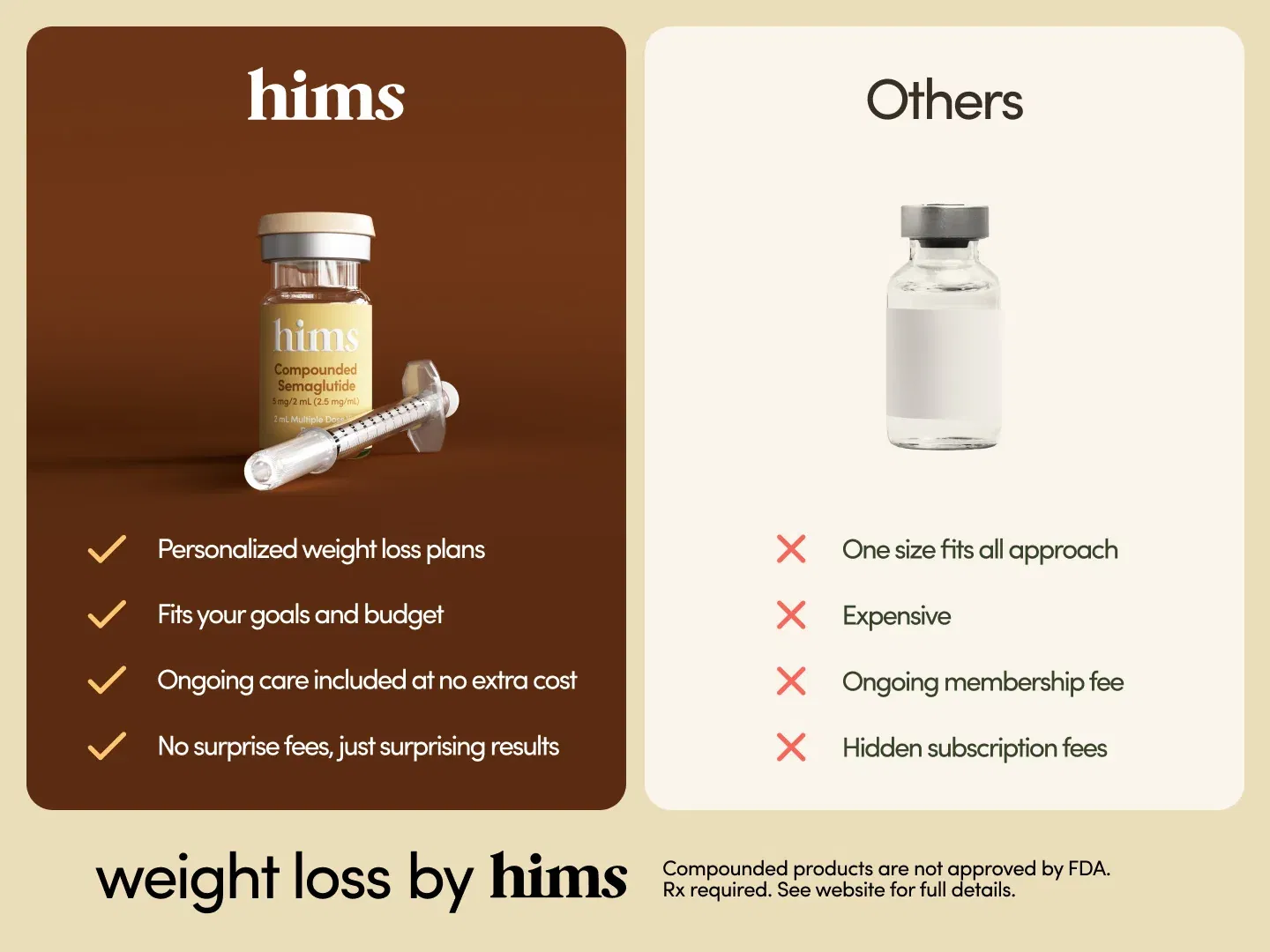
Hims Weight Loss Semaglutide Ozempic Shot Before/After
I thought this ad by Hims was super easy to understand by providing a simple comparison chart between their service...
Create your 2030 goals NOW (you've got 5 years)
Here's why you should make your 2030 goals now. Take a listen! Image Description A handwritten list of the years...
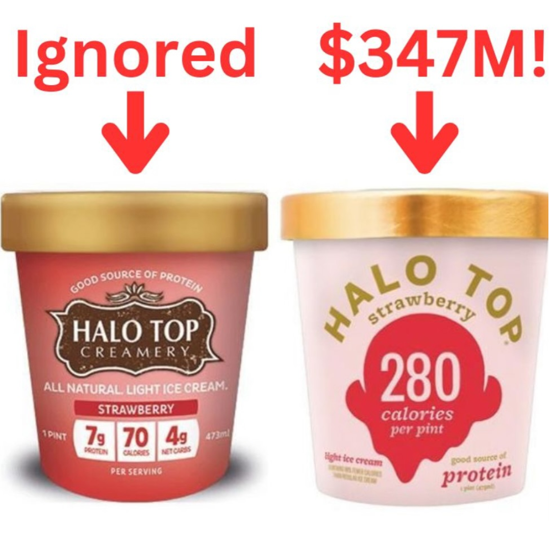
Halo Top Ice cream before and after packaging
Halo Top ice cream led to annual sales totaling $347 million after they stopped promoting the brand as much, and...

Dog Walking Outdoor Flyer with Tabs
This is a great and simple dog walking outdoor flyer. It has all the elements it needs:Pic of the person.Explains...
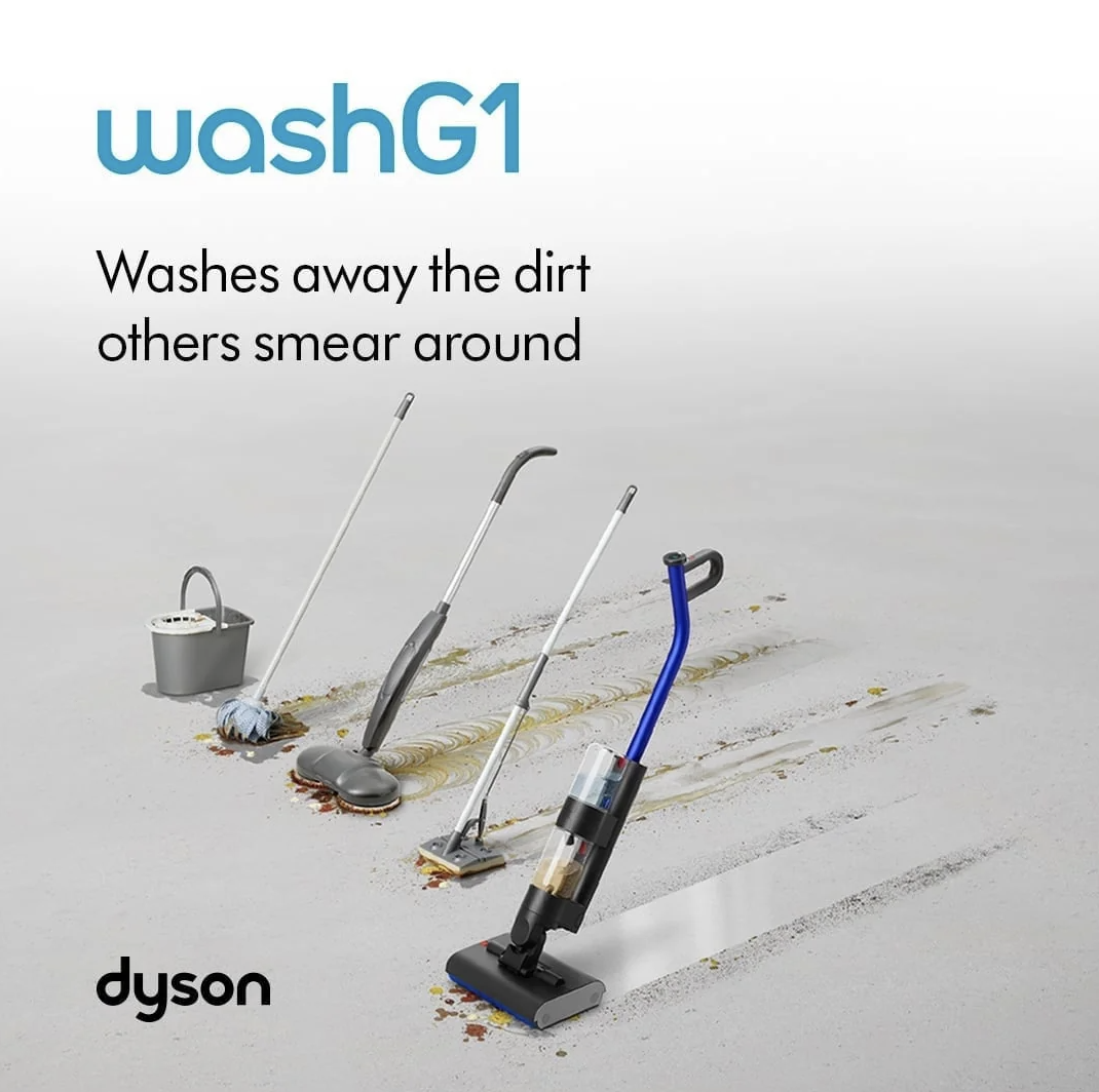
Dyson WashG1 wetvac demo ad
This ad for the Dyson WashG1 wet vacuum kind of showcases "data" from other vacuums and how they clean versus...

Best movies of all time ranking
Love how this chart takes data from the top 7 movie ranking sources, then tallies them up for a final...

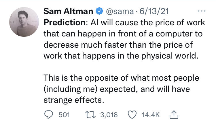
Sam Altman 2021 AI Prediction (it came true)
He was correct about this. Everyone thought AI would take physical jobs because robots were so good, but no one...
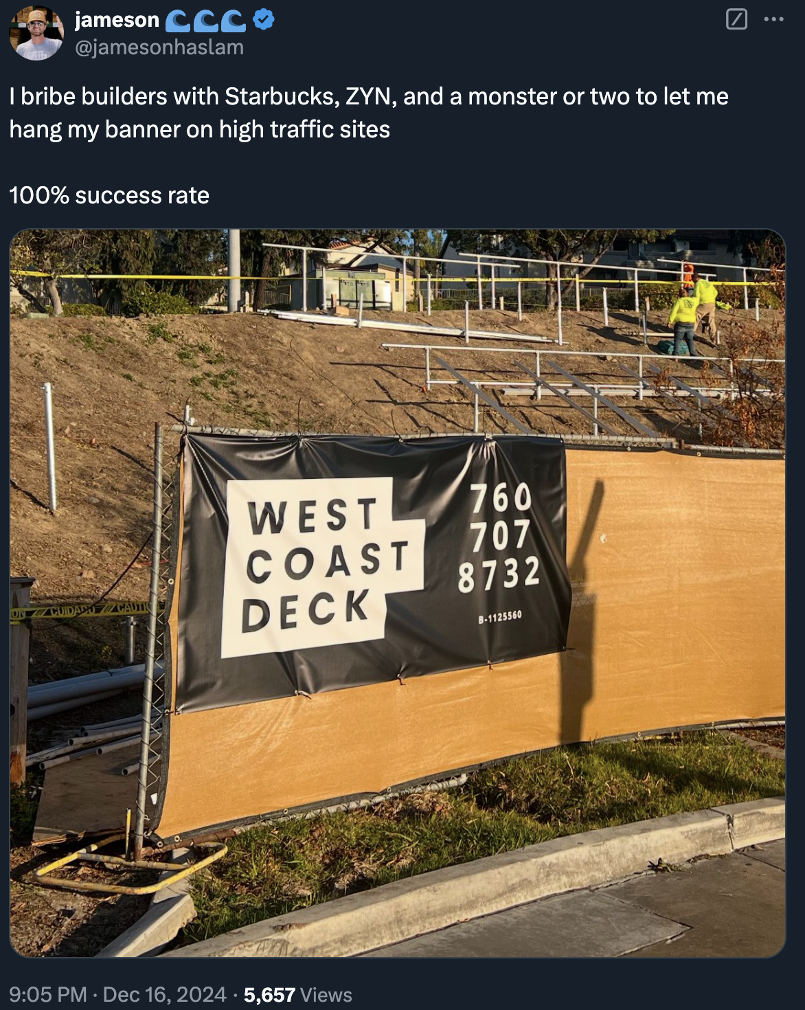
Dude getting free advertising in exchange for Monster Energy drink!
This is funny but effective: This guy Jameson will get free advertising for his deck company by putting up a...

Early internet sites had “trust seals”
I remember paying $200/yr just to put a “HackerSafe” seal on my e-commerce website in the 2,000’s. If you didn’t...
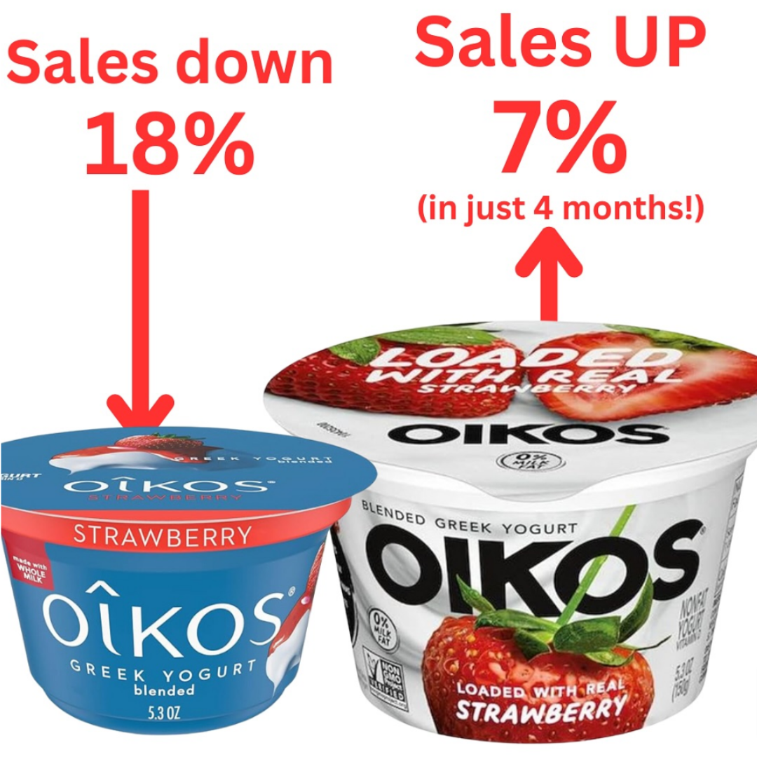
Oikos before and after packaging
This was a slight packaging change, showcasing the contents as real strawberry rather than bland blue packaging. Sales increased by...
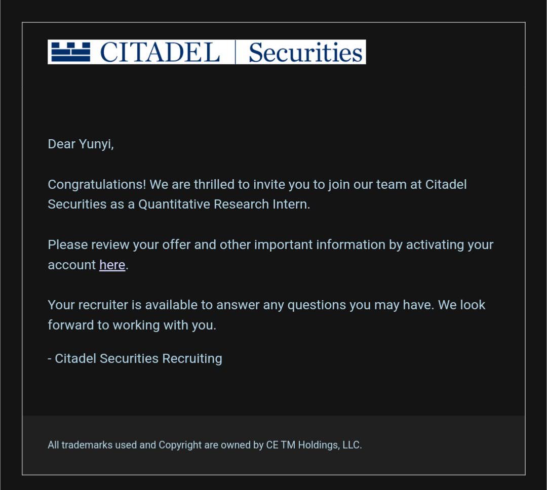
Citadel Securities Recruiting Email
A an incredibly short-and-to-the-point congratulatory email to an intern joining Citadel Securities. Image Description The image is a formal email...
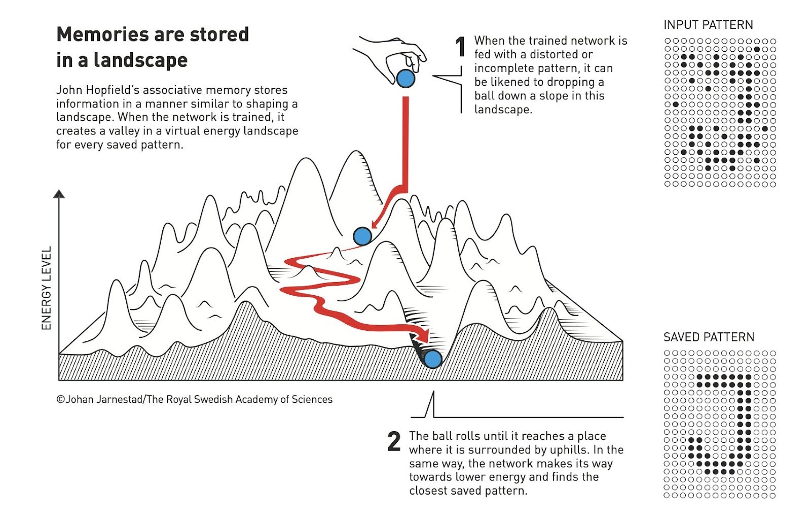
Memories are stored in a landscape graphic
This is an interesting analogy to how memories are made in your brain AND in computers. In your brain well-worn...
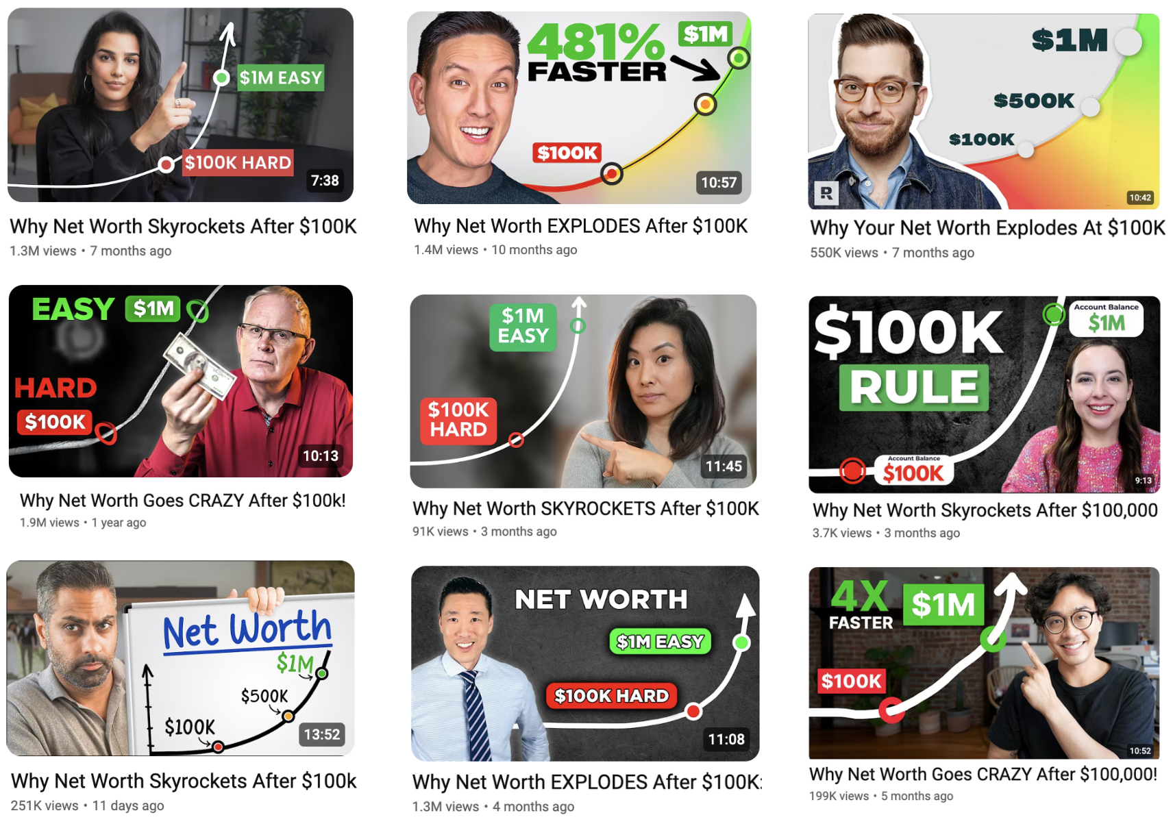
YouTube Trendjacking of Thumnail and Title
This shows 9 thumbnails (though there are MANY more) of YouTube Trendjacking in action for a video called: "Why Net...
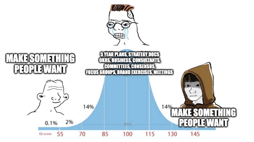
Bell Curve Meme for making something that people want.
This meme illustrates the bell curve associated with product creation, and that smart people and dumb people tend to get...

Tushbaby social media marketing
Tushbaby clever marketing by founder: Giving away free products at the airport and filming the results.Key TakeawaysInteractive Marketing Approach: Tushbaby...

Olgam Life First Time Doners Webpage
Everything you need to know about becoming a first-time plasma donor is on Olgam Life's website. They made it really...
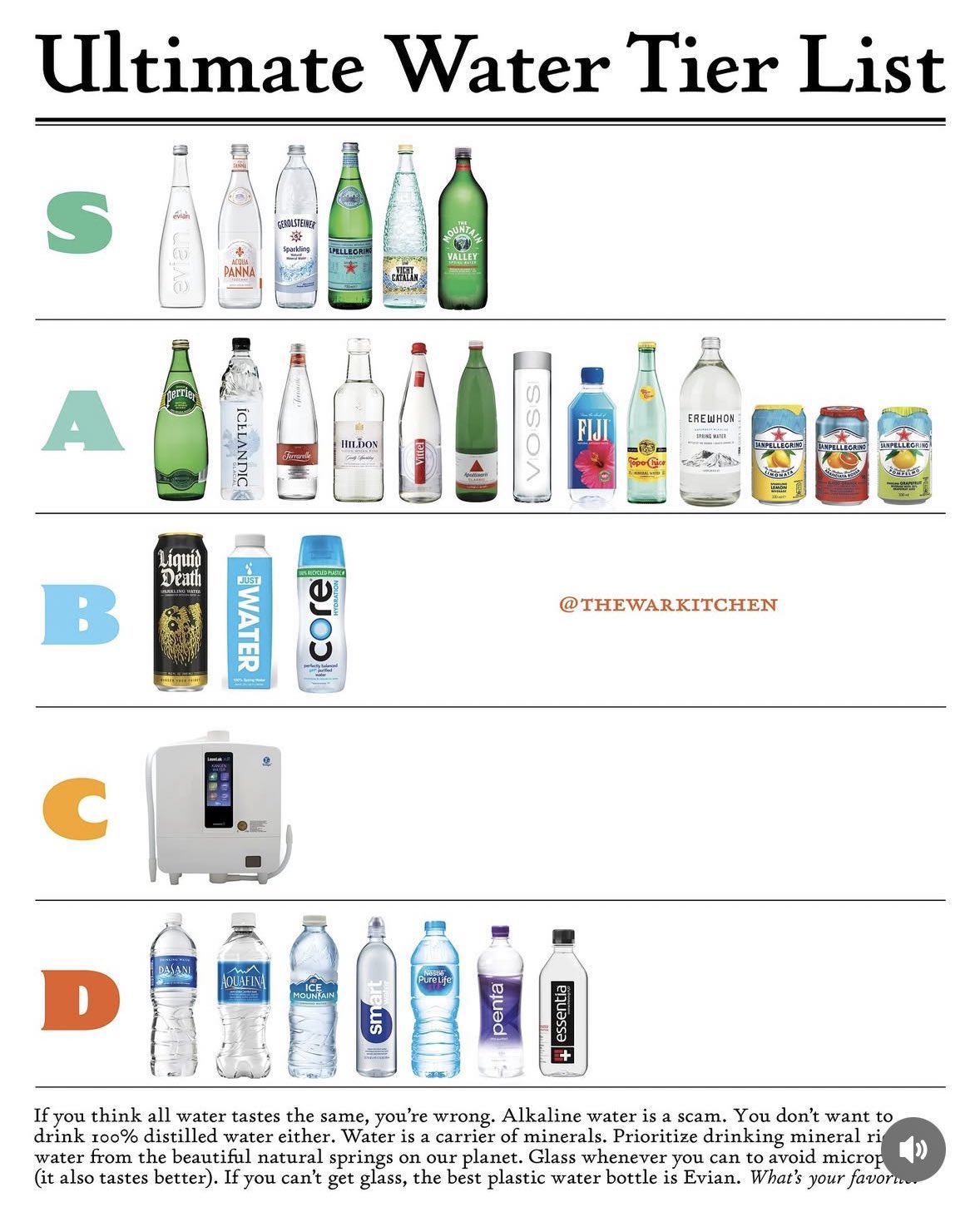
Best Water Chart
According to @thewarkitchen these are the best types of water.I personally have no idea how to rank water, I just...
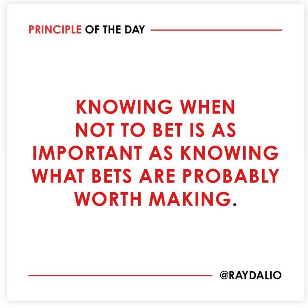
Knowing when not to bet is as important as knowing what bets are probably worth making.— Ray Dalio
If something's not working, change it....no one cares
Advice from Jason Cohen (founder of two billion-dollar companies) says make the big change if you need to because no...