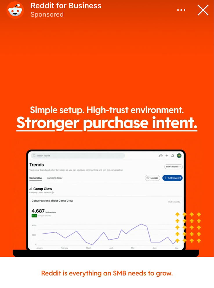
Reddit For Business Ad
Reddit ad showcasing the Reddit for Business interface, paired with a strong value-prop headline:"Simple setup. High-trust environment. Stronger purchase intent."It’s...
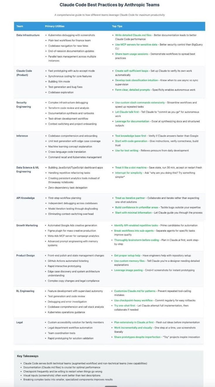
Claude Code Best Practices Cheat Sheet
Awesome cheat sheet showing how different teams actually use Claude to get stuff done — from debugging to brainstorming to...
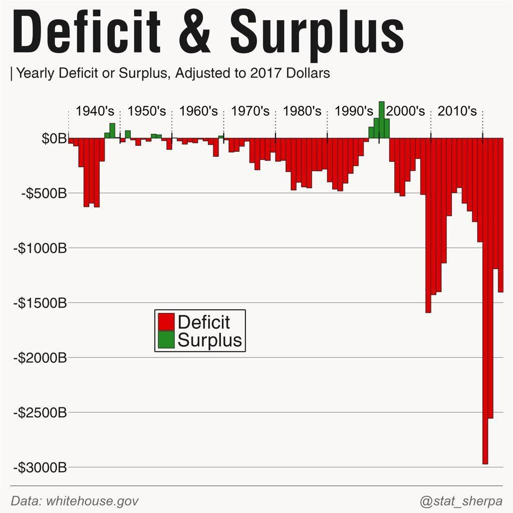
Decicit & Surplus Graph
Graph showing the yearly deficit or surplus since the 1940's. This is a wild-looking graph because you can see, pretty...
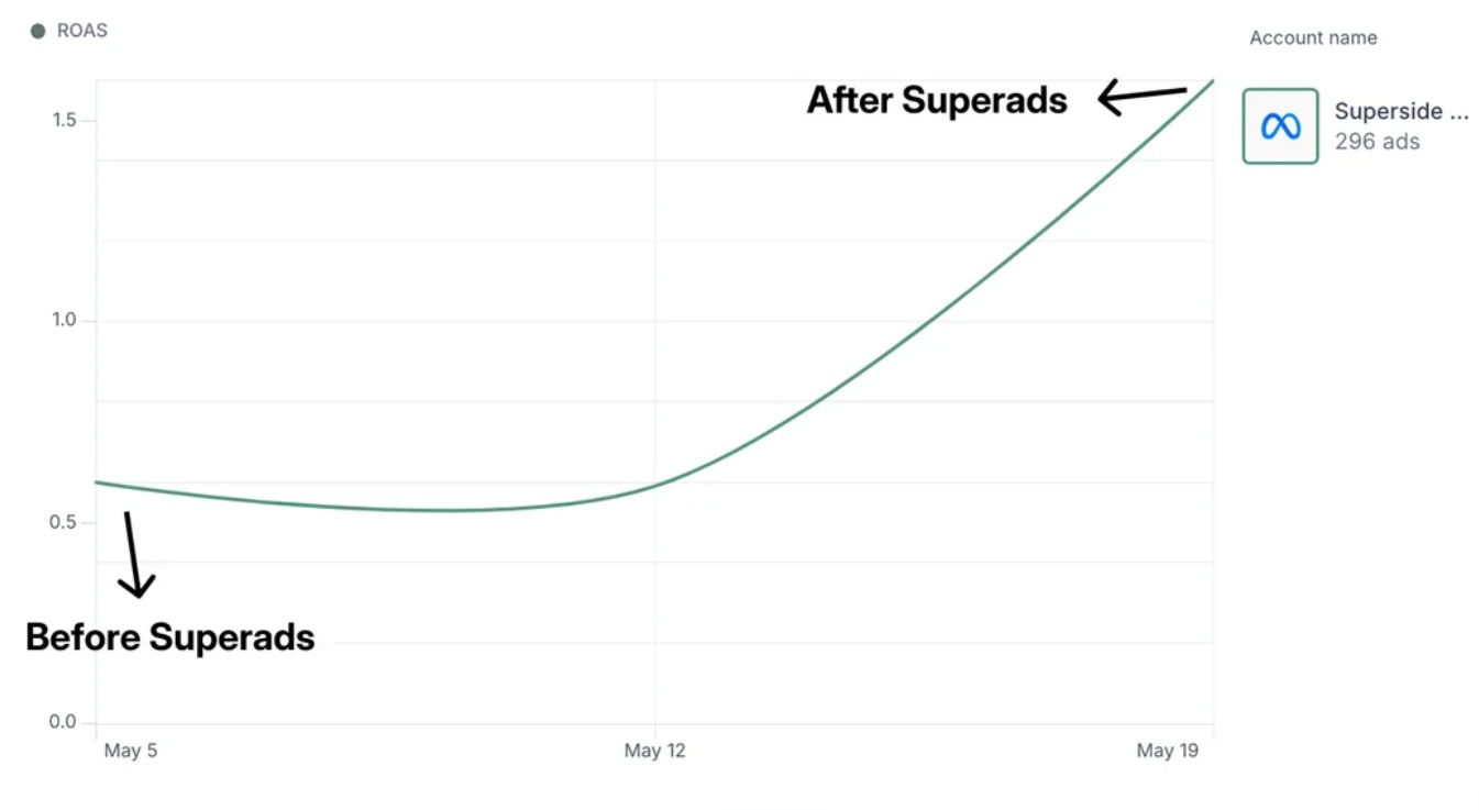
Superads Before and After Graphs
Before and after graph from using Superads.ai to improve your creative.I love a simple chart that goes up-and-to-the-right.
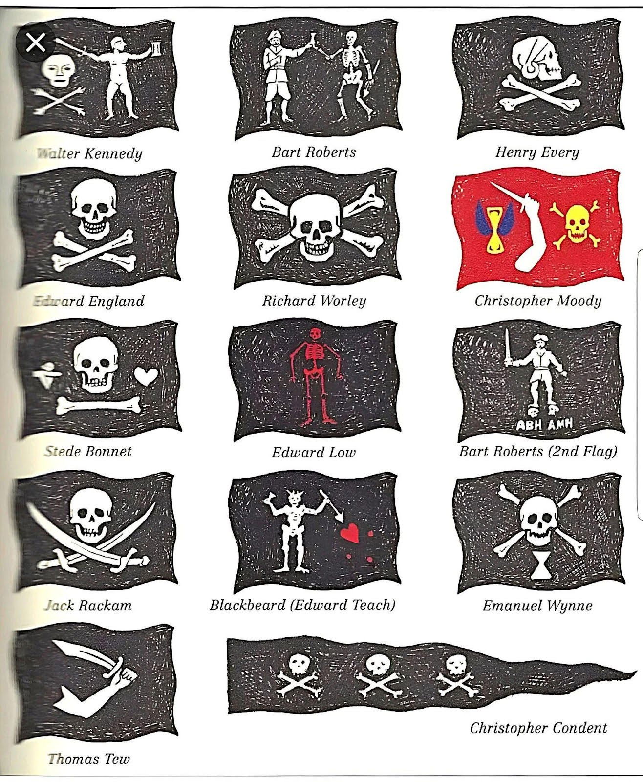
Different types of pirate flags
This simply lists out all the different types of pirate flags that you would find.
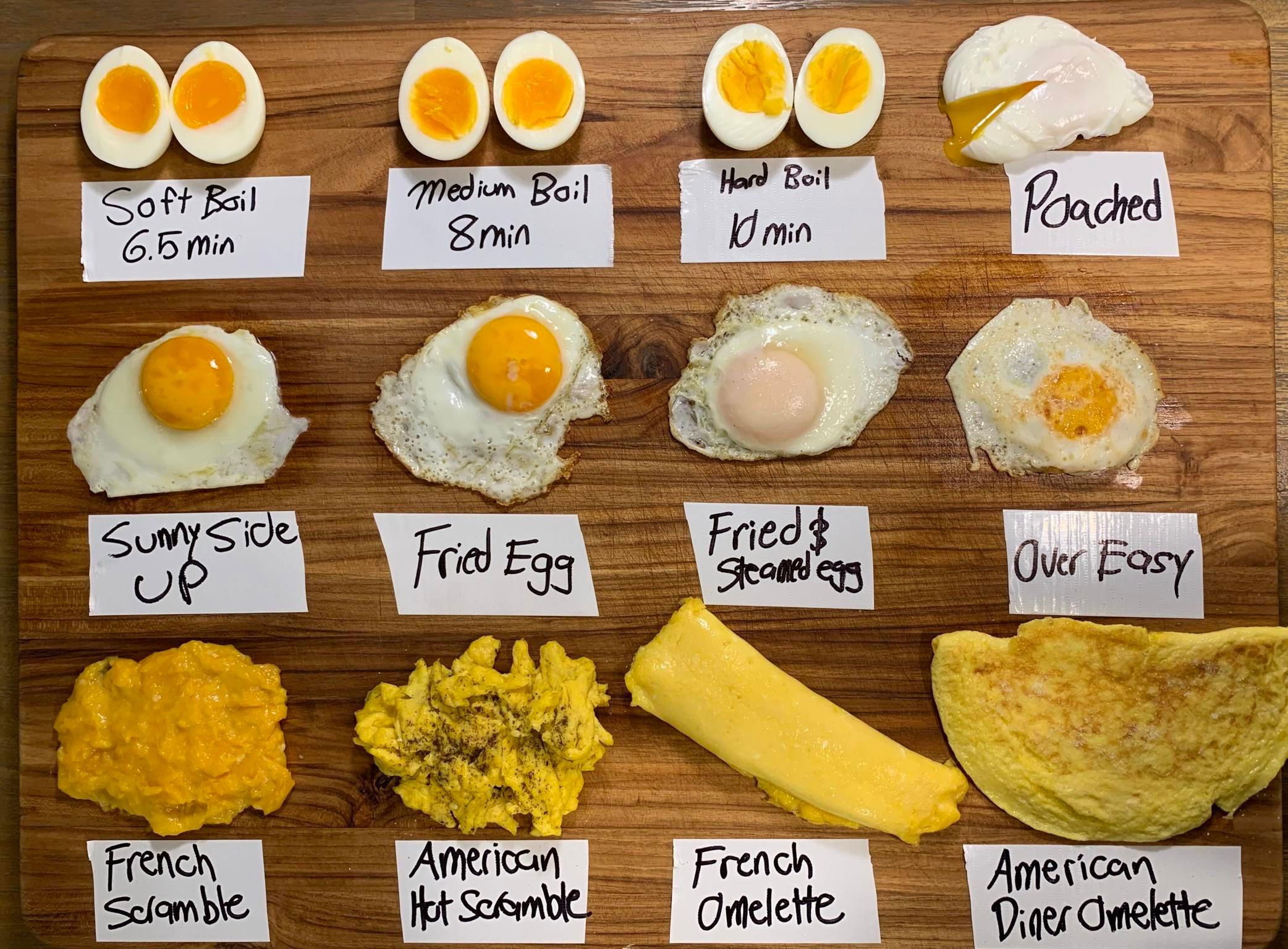
Different ways to make eggs
To me, an image like this packs in a lot of data in a very easy-to-understand method.
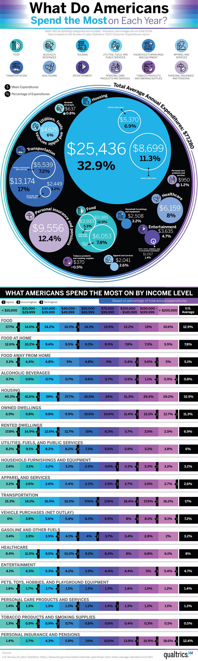
What Do Americans Spend the Most on Each Year
Here is where Americans actually spend their money. This chart also breaks it down by income level
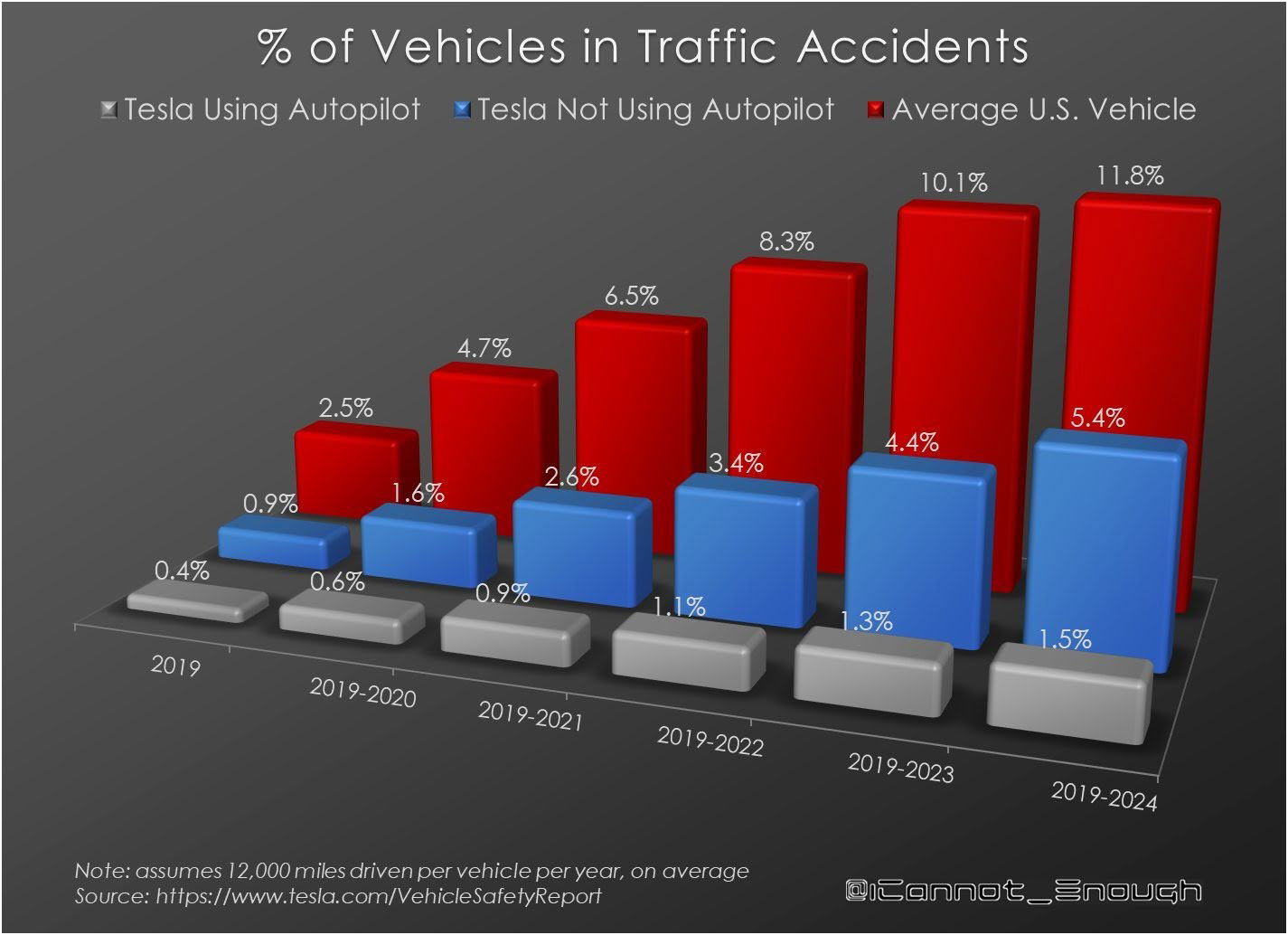
Percentage of vehicles in accidents
Sorted out by year this is the percentage of cars that get in traffic accidents while:- Normal driving (highest)- Driving...
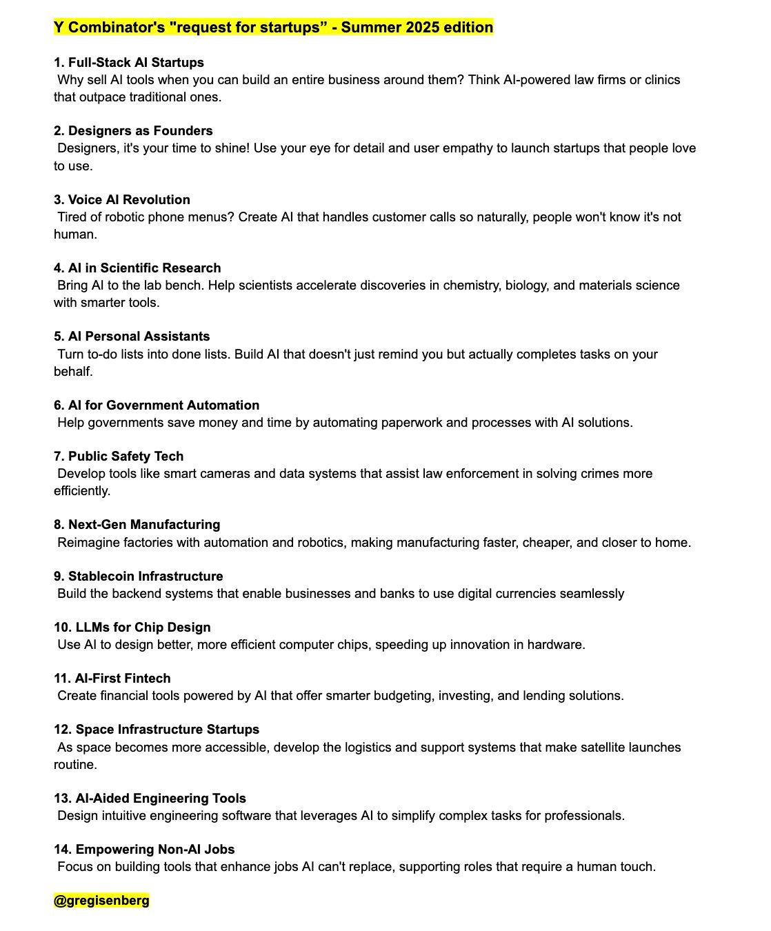
Y combinators investment wishlist 2025
This is a list from Y Combinator showing startups they want to invest in the summer of 2025.They include:1. Full-Stack...
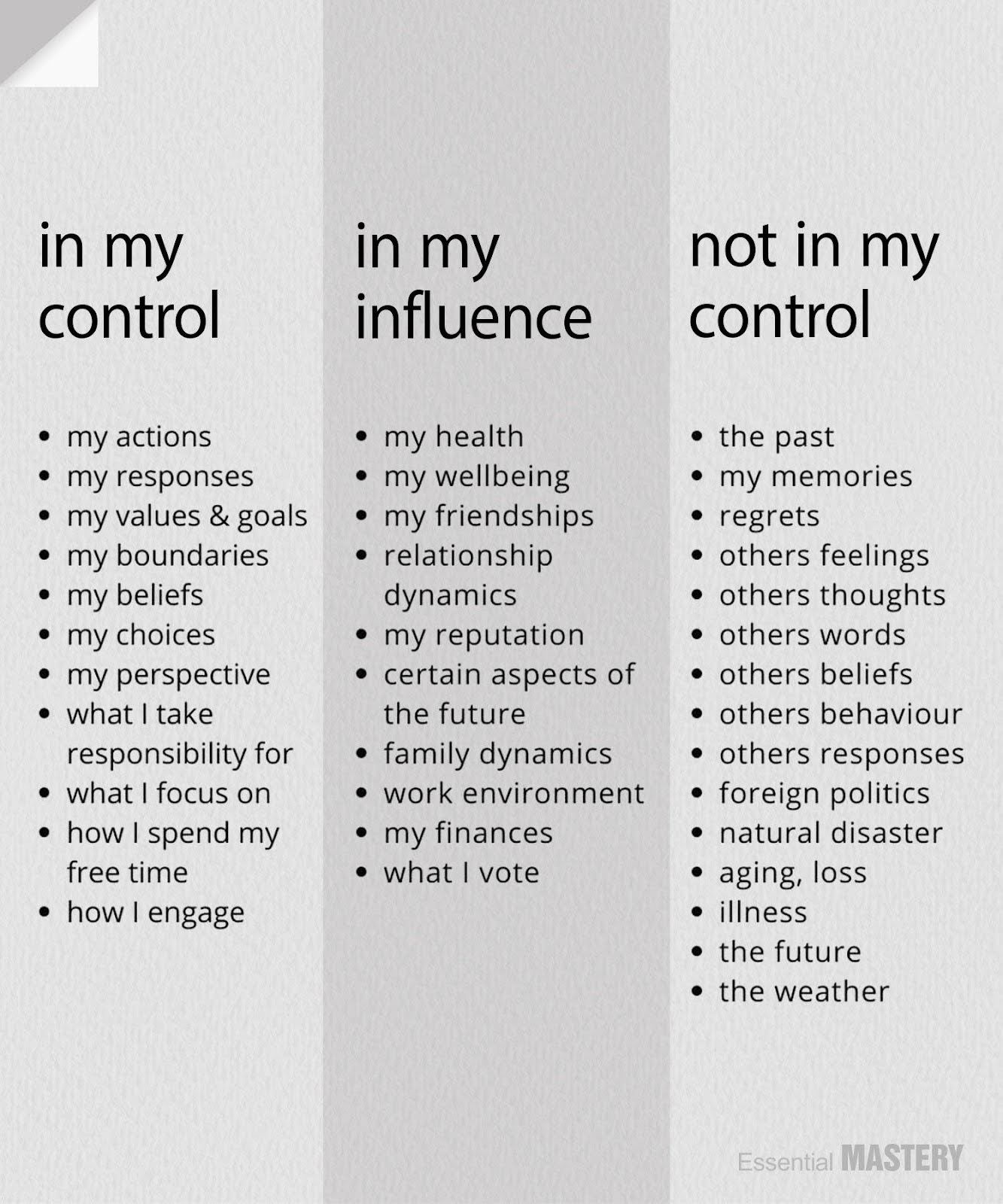
What is in my control, my influence and what is not in my control.
This is a great reminder that you personally can FULLY control certain things, partially influence others, and not control certain...

Earth Creatures Intelligence Chart
Fascinating chart showing the intelligence levels of Earth’s creatures — from humans capable of metacognition, all the way down to...

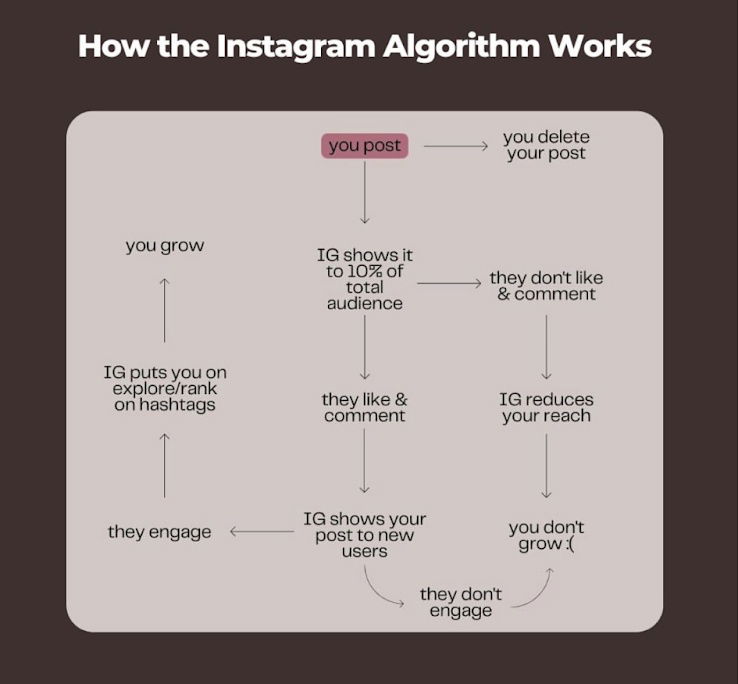
How the Instagram Algorithm Works Flowchart
Here is a quick flowchart showing how Instagram Algorithm works.
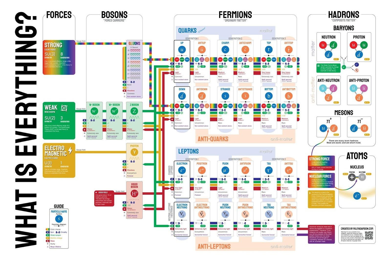
What is everything in Physics
This isn't a very simple graphic, but it shows what everything is based down to the fundamental particles that we...
.png?width=3840&quality=80)
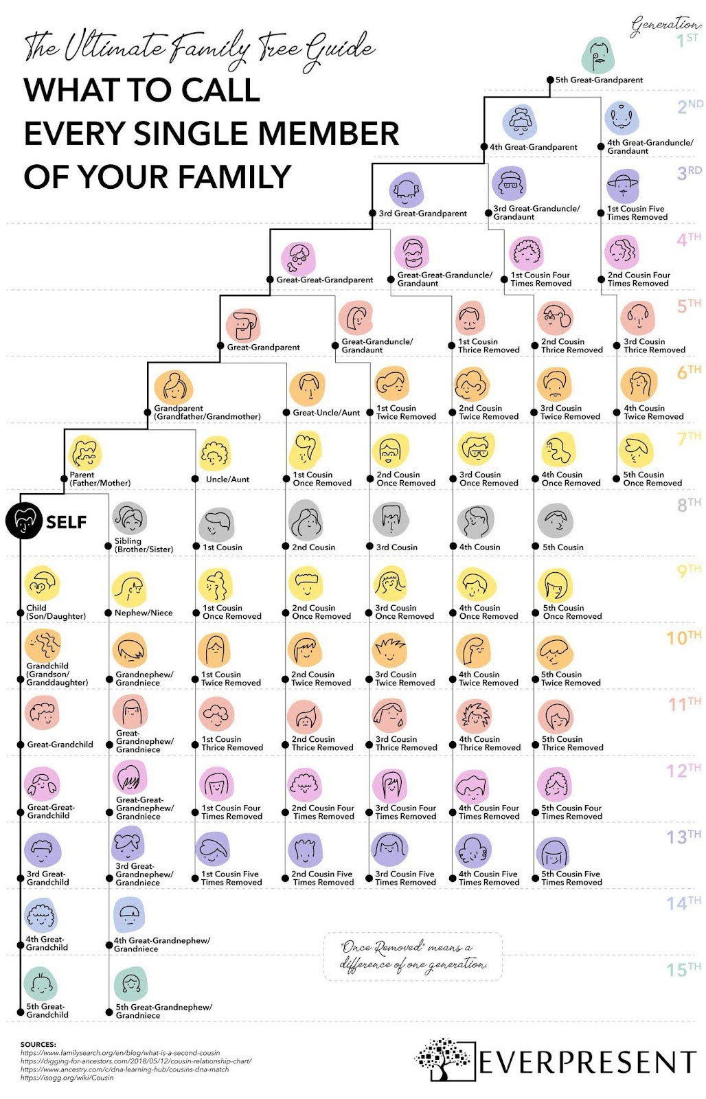
What to call every single member of your family chart
This colorful one-pager breaks down what to call every single family member—across 15 generations.
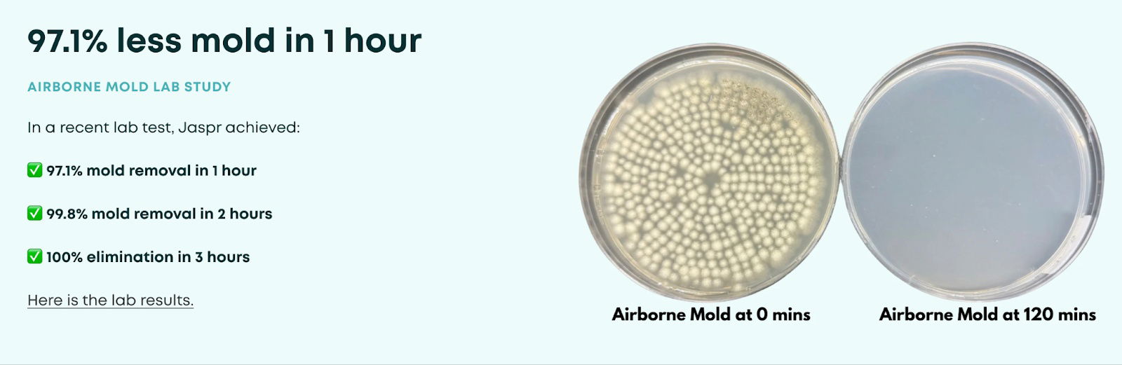
Jaspr Air before/after
This shows a very specific (97.1%) reduction in air mold in one hour with this visual with the Jaspr.


Headline Only Social Media Ad By Guidde
Killer headline-only ad from Guidde: “30% of your time goes into documentation. With Guidde, it’s only 2%.” No fluff, just...
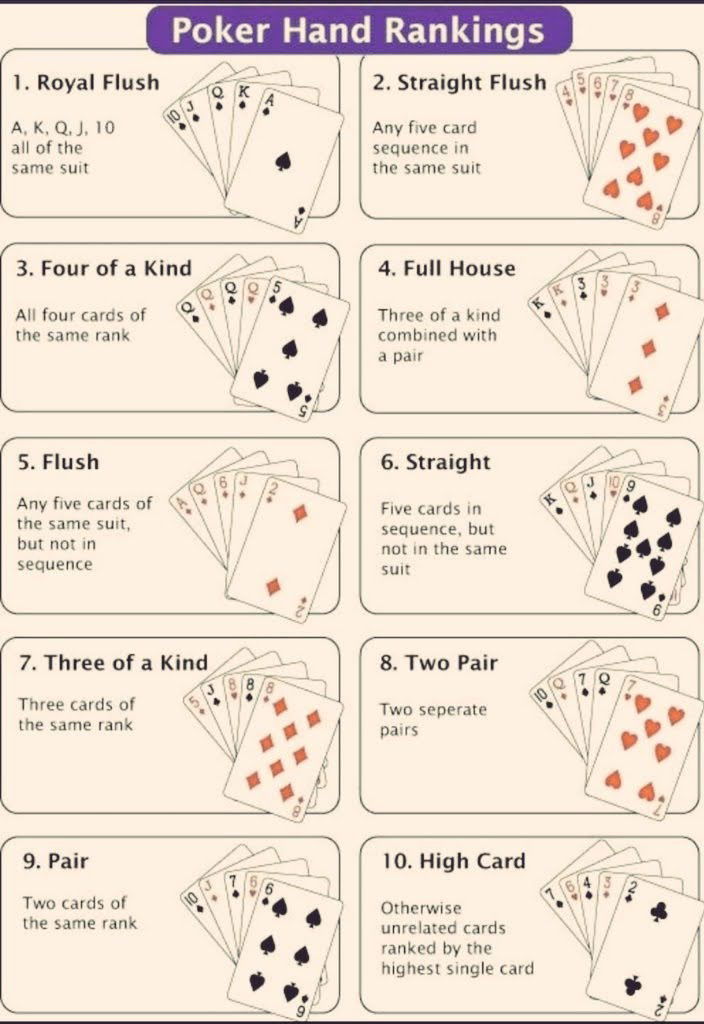
Poker Hand Rankings Chart
A quick cheat sheet of poker hand rankings — from best to worst. I like simple little charts like this...
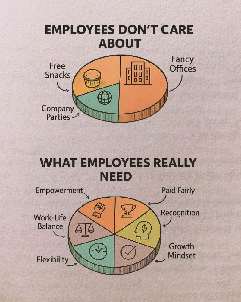
What employees really need
What employees really care about — and what companies keep getting wrong.
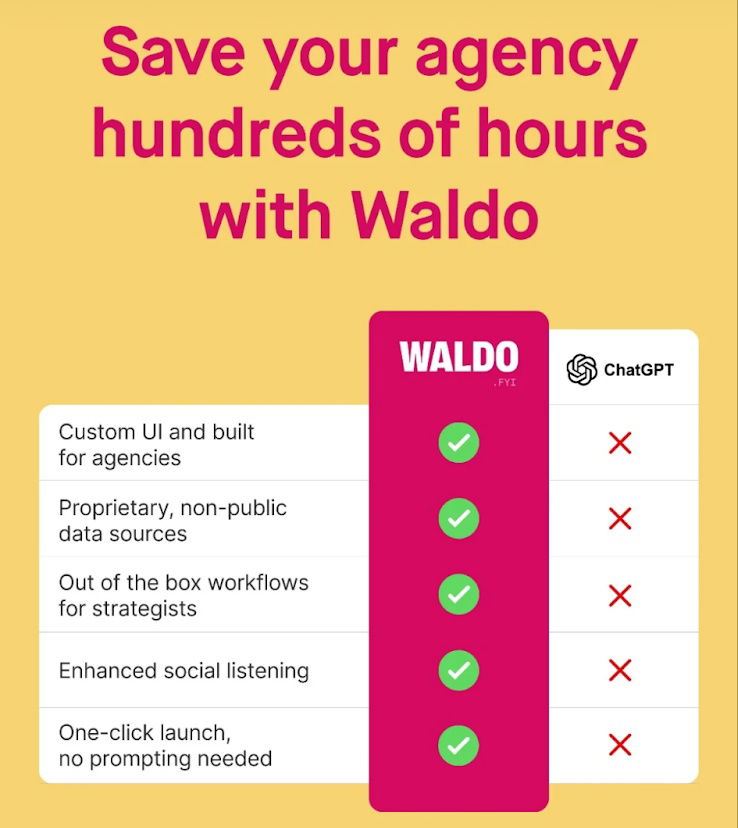
Before & after graph for software.
This is a cool graph that shows with this software what you get vs. what you don't get with ChatGPT.

Design Buildathon Timeline
I like how this Design Build-a-Thon shows its roadmap. That it starts on May 28th and ends on June 22nd....
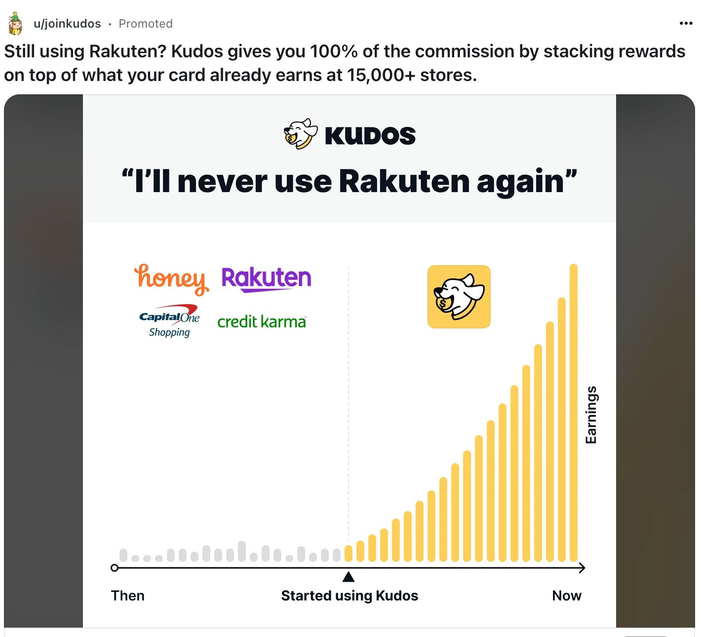
Kudos Earning's Chart Ad Posted on Reddit
A clean, clear chart that crushes competitors and fits perfectly in this ad on Reddit.

Pod 5 new upgrade ad for Eight Sleep
Eight Sleep’s makes a strong case for upgrading from Pod 3 to the new Pod 5 Ultra. It uses a...
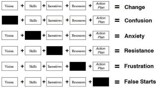
The elements of change: what happens when one is missing
Great chart showing the effects of missing a piece of the elements of change.
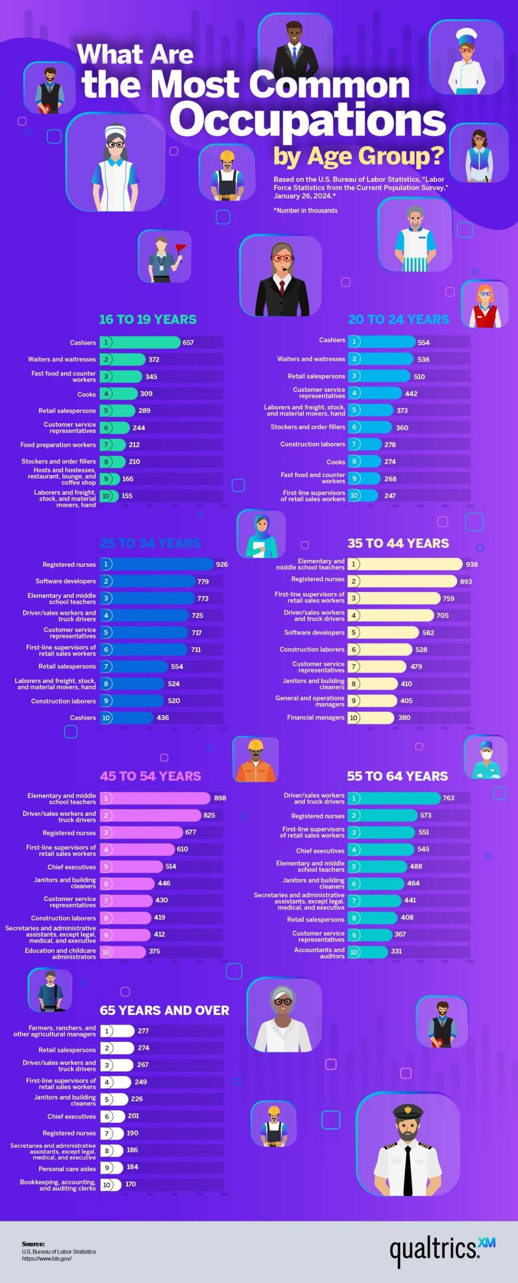
The most common jobs by age group graphic
This was an interesting way to show data of the most common jobs by AGE.The data showed:16 to 24 years:...