We launched Tweet Hunter at $9/month.
Seemed smart.
"More people can afford it!"
Every few months, we raised prices incrementally.
$9 → $19 → $29 → $39 → $49
Expected: angry customers, mass churning.
...
Pricing Strategy: How Incremental Increases Boost Revenue
Tibo’s Tweet about raising Tweet Hunter’s price from $9 to $49/month is a masterclass in pricing psychology. Instead of seeing...

What problems people are using ChatGPT for
OpenAI dropped a juicy stat chart showing how people actually use ChatGPT. Spoiler: it’s not all code and poetry. Most...

Decoding Data: A Masterful Infographic on S&P 500 Returns
This infographic by @MattTheMoneyGuy turns dry S&P 500 returns into a story you actually want to read. One look and...

What kids wanna be when they grow up graph
Gen Alpha doesn’t dream of white coats or corner offices. They dream of ring lights and followers. According to this...
Validating something needs to get traction quickly
Jason Cohen nails it: if you’ve launched and still have zero customers after 2 months, the problem is simple—you either...

11 ways to make money from your email list
Most people see email as a content channel. Smart marketers see it as a business. This ConvertKit graphic breaks down...

Where AI gets it’s facts
Crazy stat: 40% of AI’s “facts” come from Reddit. Not from journalists, experts, or brand blogs—but random humans sharing stories...
Companies having a hard time adjusting to AI
Alex Lieberman nailed it: most businesses want AI, but almost none are ready for it. They chase shiny tools before...

It’s not about who’s first, it’s about who does it best.
A viral chart comparing Tesla and Waymo shows something wild: Waymo spent years growing its self-driving coverage area bit by...
When the time comes to buy, you won’t want to
Shaan Puri tweeted: “When the time comes to buy, you won’t want to.” Great advice for both investing and marketing....

10,000+ simultaneous split tests happening on Facebook
Facebook didn’t guess their way to success. They tested it—again and again—until those “tiny tweaks” added up to a $2...
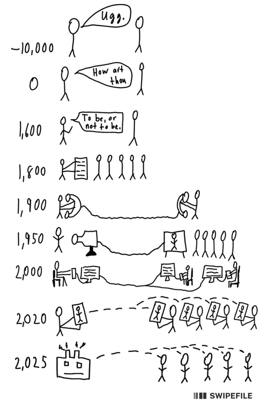
Evolution of communication
From grunts to AI bots, this sketch nails how communication keeps speeding up and scaling out. What started as one...

GoHighLevel "Digital Marketing Engine" Headline and Image
GoHighLevel nailed this visual. They turned the messy, multi-tool marketing stack into one clean “Digital Marketing Engine.” The funnel graphic...

Hampton Network’s 3 Levels of Connection
This simple diagram from Hampton nails what most communities get wrong: structure. It’s not just a Slack group with random...

3 or more amazing testimonials and results from real people
Testimonials are like trust-multipliers. But not all testimonials are created equal. The difference between “They’re great!” and “We increased sales...
A major difference between founder & employee mindset is orientation to problems.
Employee mindset believes problems are bumper-to-bumper traffic. Out of your control & no way through until someone else fixes the problem.
Founder...
Founder vs. Employee Mindset
Most people hit a problem and freeze. Founders hit a problem and get curious. That shift in mindset is a...
Let me tell you about the creator tension.
On Youtube, My First Million episodes mostly get ~60k-300k views per pod lately.
Spotify + iTunes, consistently in the 100k range (haven't looked in forever, but whatever it is, its consistent).
This week Robert Greene was on.
I LOVED recording it. I learned so much. I wanted to go for another 2 hours. He moved me.
But on YouTube, its maybe the worst performing pod in the last 1-3 months.
...

Creator Tension: Fulfillment vs. Performance
Sam Parr nailed a big creator truth. His Robert Greene episode filled him up creatively but flopped on YouTube. Tons...
The sales hack big brands don’t want you using…
Ever seen a pricing table that made one option feel so obvious it was almost impossible not to click “buy”?...

Figuring out where your value is chart
This visual from Nathan Barry is gold for anyone building an audience. It helps you figure out what kind of...

The 80/20 rule happens almost everywhere
Ever notice that some customers make a lot more noise than others? Here’s a wild stat: 78% of all noise...
Running a company in person has benefits
Joe Speiser thought his company, Hampton, was crushing it as a fully remote team. Then they opened an office in...
Why this doctor thinks ChatGPT is better than him
Sam shares how his doctor friend sees ChatGPT transforming medicine. It’s not just a trending tool—it’s becoming a second set...

What starting a business is like today
Alex Lieberman nails it with this tweet. Thanks to modern tools, anyone can launch a business in an afternoon. But...

Social Proof "Your Company In Numbers" Template
Sometimes all your marketing needs is a quick credibility bomb. This graphic nails it by stacking key metrics that scream...