
AI sending over SEO traffic
Organic traffic is shifting fast. The chart above shows a clear trend: search engines are losing ground while AI chatbots...
Negotiate Like A Pro Cheatsheet
This one-pager nails the art of negotiation into bite-size, repeatable moves. It’s a masterclass in how to win without crushing...
Removing homepage and simplifying boosted sales
Jaspr Air didn’t change their offer or design. They just made their site simpler. Fewer clicks, fewer options, big lift...

Chocolate Exporters Chart
This treemap is delicious… and data‑driven. Each chunk of chocolate represents a country's share of global chocolate exports. Germany dominates...
Is this purchase worth it?
This infographic nails a simple money principle that marketers can flip into a messaging trick. It’s all about reframing cost...
Unicorn club list - Private companies over a billion
This graphic by CB Insights shows the 1,249 billion-dollar private companies around the world. That’s a lot of brands flexing...
What to make for dinner?
Ever stare at the fridge and think, “What the heck do I eat?” This brilliantly simple dinner chart cuts through...
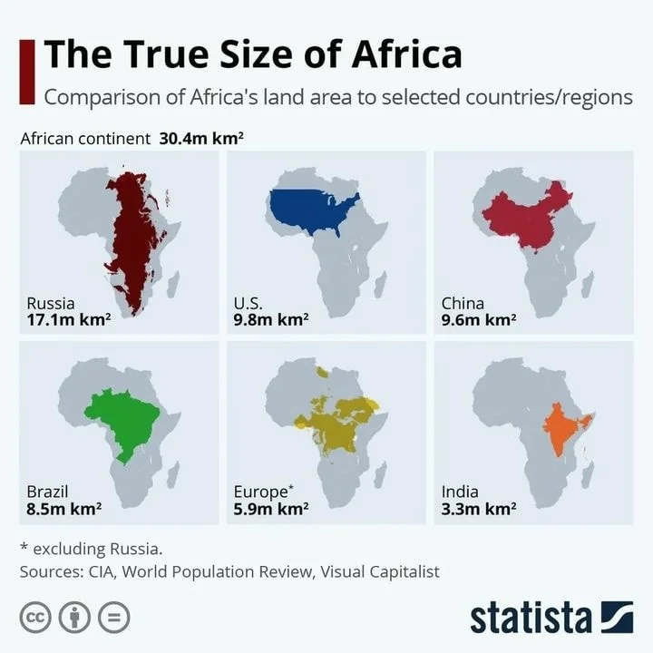
Comparison of Africa's Landmass To Other Countries
This chart hits like a revelation. The entire U.S., China, and India combined could fit inside Africa—and still leave room....

Best TV Shows of All Time Graph
This chart mashes up data from multiple rating platforms to reveal the top-rated TV shows of all time. It’s a...

How to make monthly goals
Neville’s monthly goal formula is beautifully basic: a sheet of paper, the month and year, and three goals. That’s it....
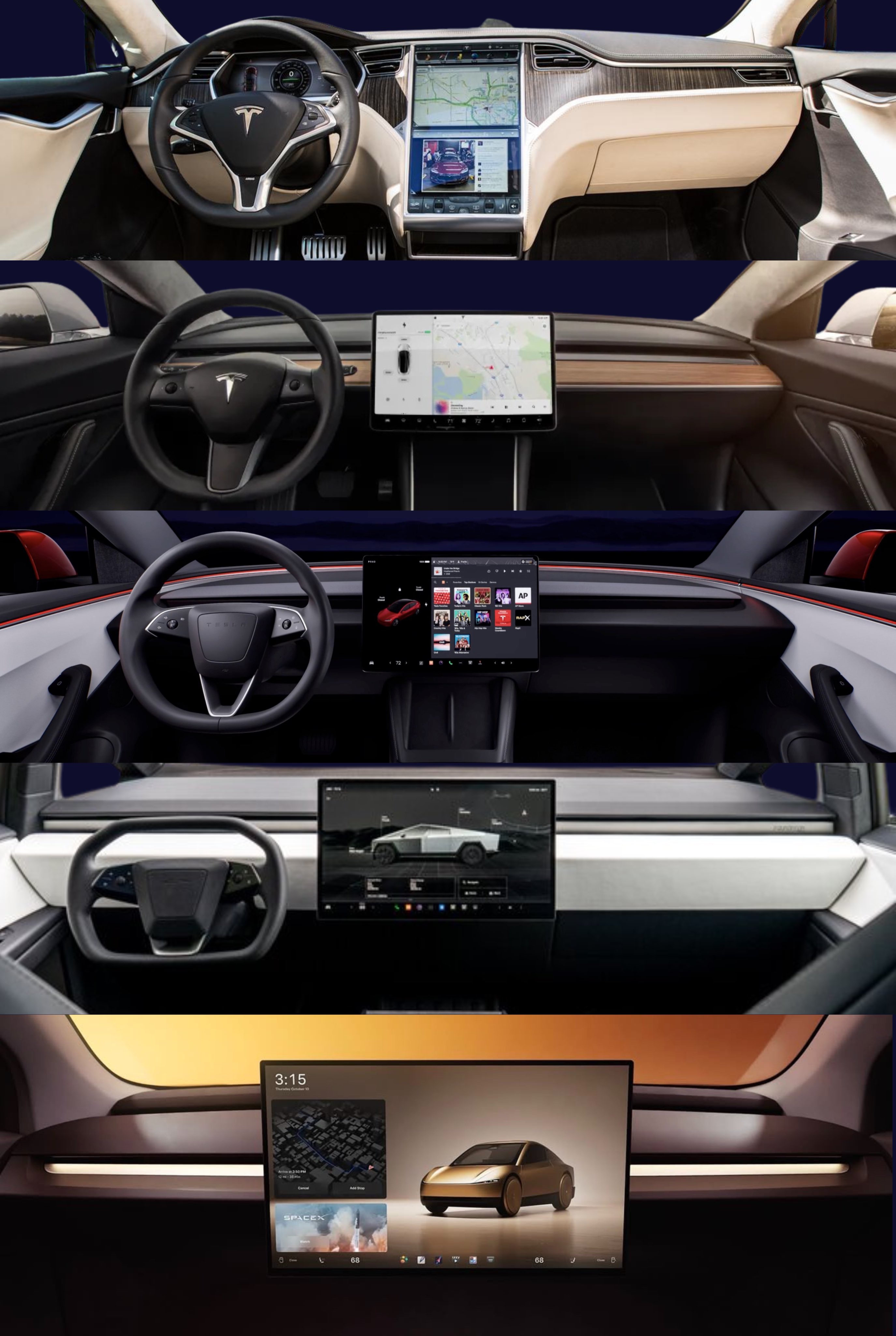
Tesla Interior Refreshes and Simplicity
Tesla interiors started with buttons everywhere. Over the years, they’ve stripped it all away—leaving one big touchscreen and a clean,...
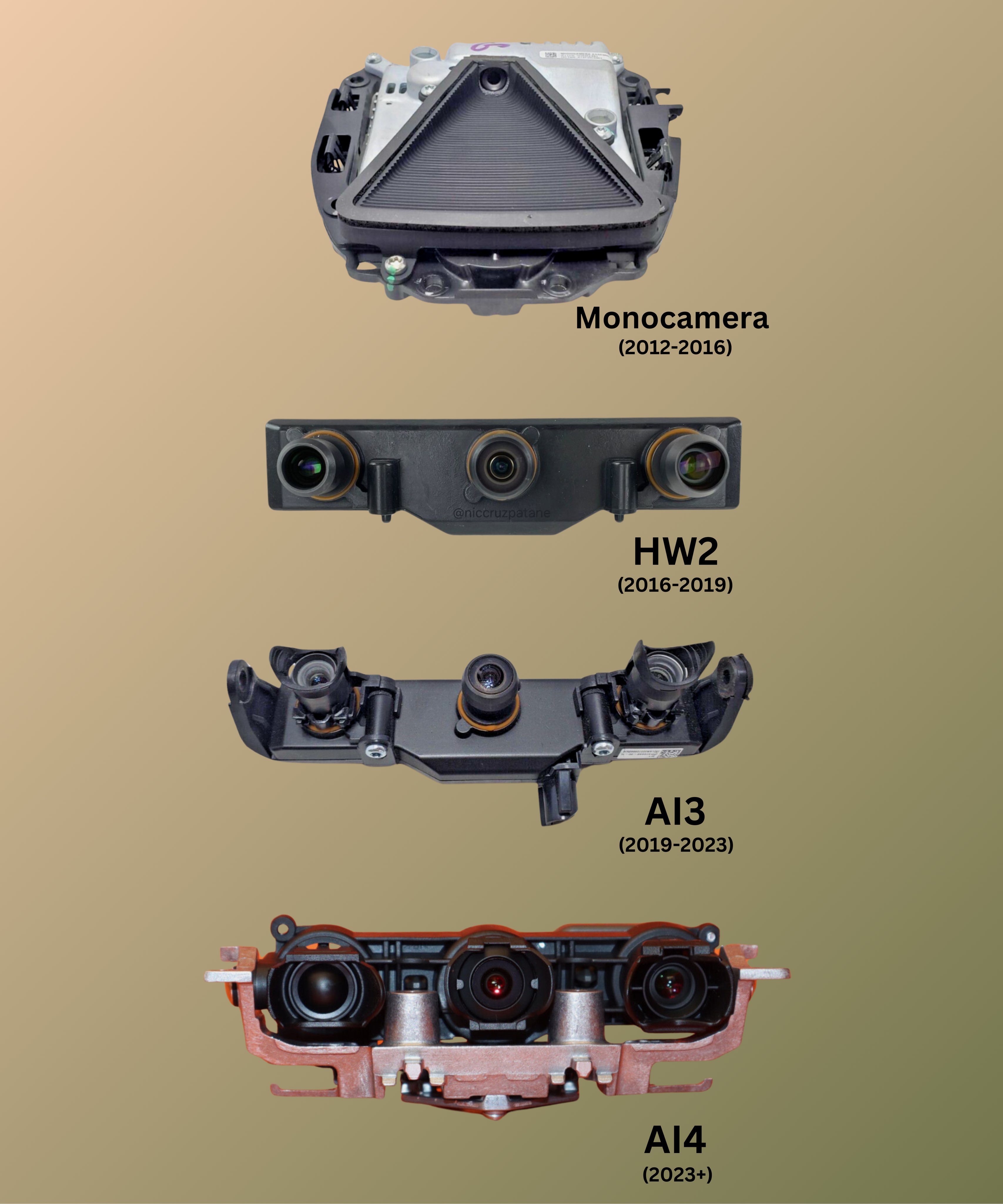
Tesla front self driving camera stack over the years
This image of Tesla’s front-facing dash cams shows one thing perfectly: clear visual progress. Each generation looks sleeker and smarter....

Function Health Lab Test Social Media Ads
This Function Health Instagram ad packs big value into simple visuals. It lists “100+ lab tests,” pairs that with a...
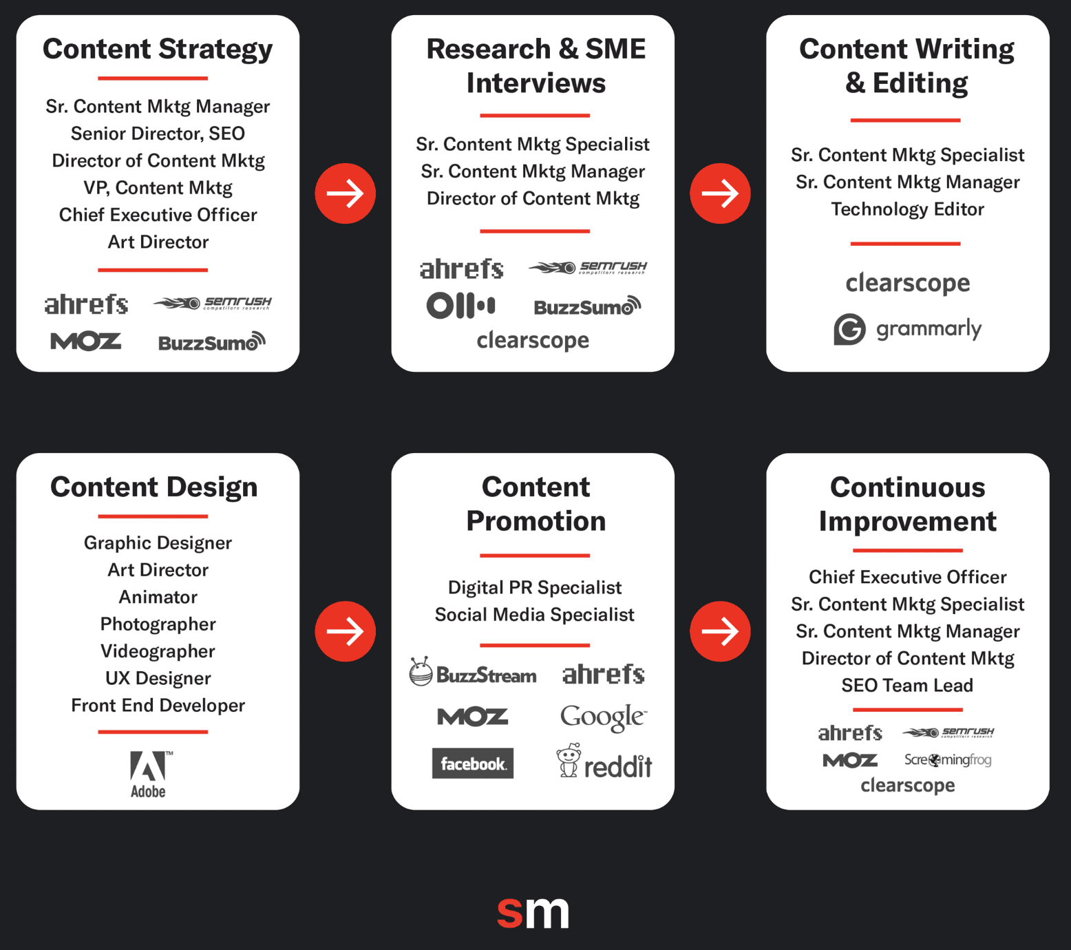
Siege Media's $1,500,000/yr Tool Kit
Siege Media dropped a visual showing exactly where their $1.5M in yearly costs go. Spoiler: people and tools. Every step...
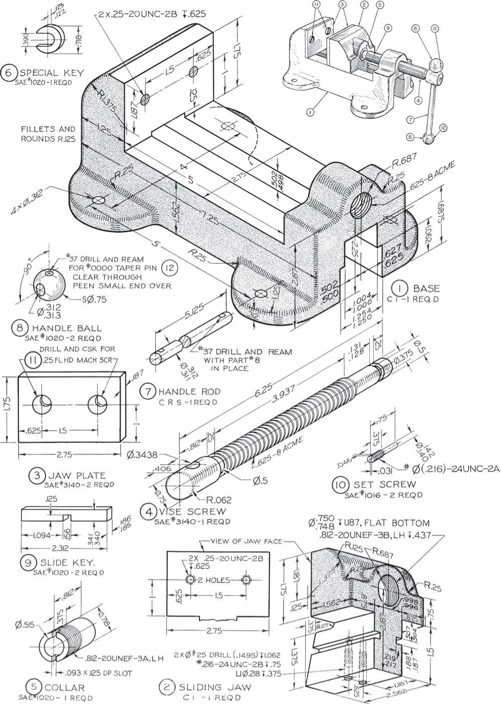
Technical Drawing of Machine Vise
Before computers, every measurement, line, and letter on this drawing was hand-crafted. No undo button. No digital grids. Just pure...

Mac Mini port history image
Check out this image of every Mac Mini since 2005. Fewer ports. Sleeker look. Better experience. Apple didn’t just remove...
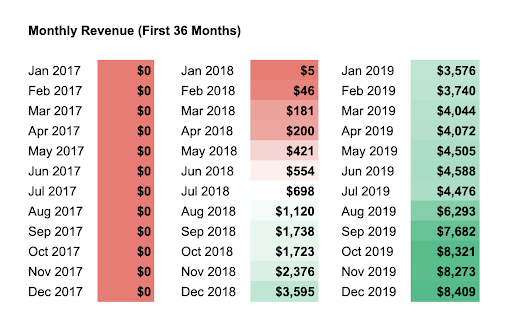
Revenue Replacement graph
At first glance, this chart looks painful. Twelve months of $0 revenue. But that’s exactly what it takes sometimes to...
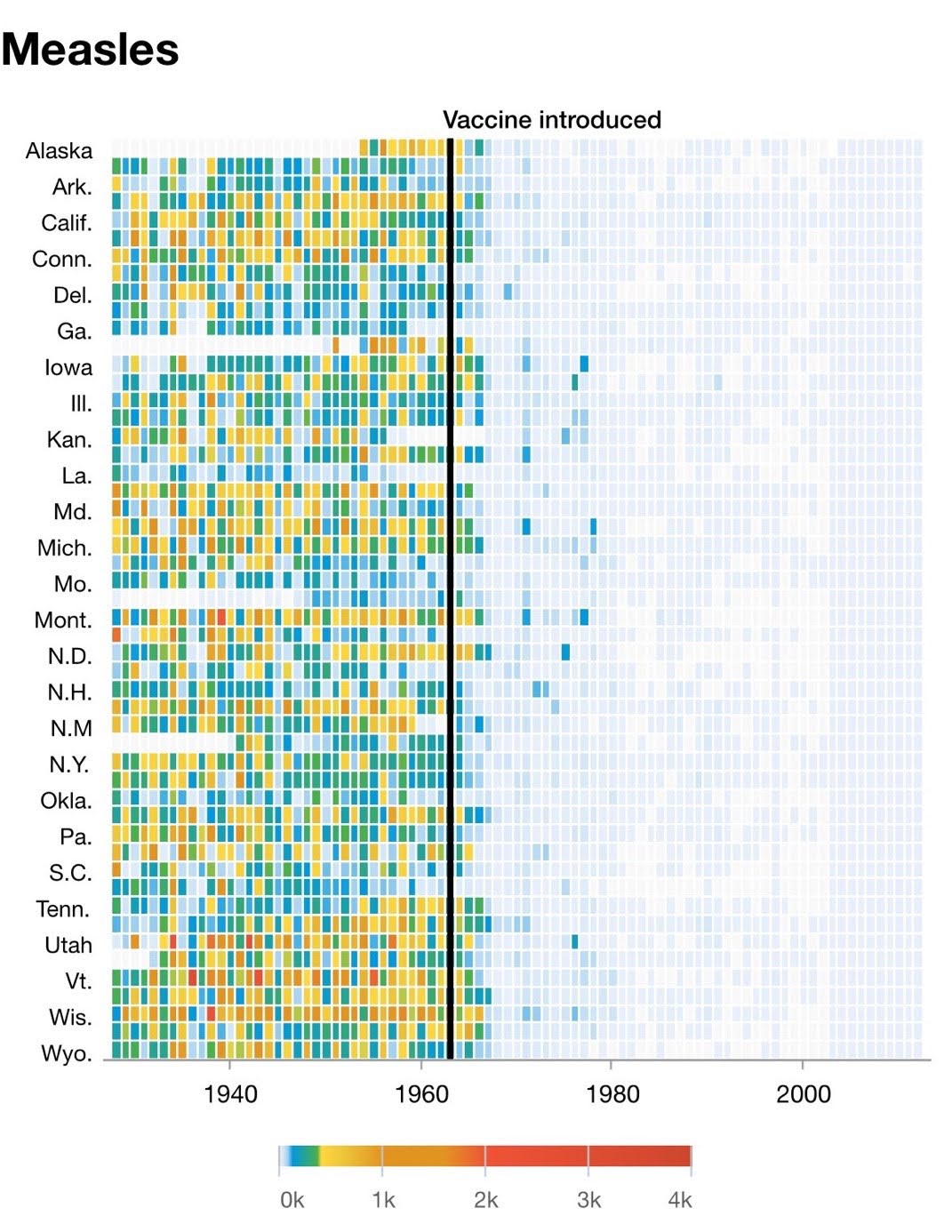
Measles Decline Chart After Vaccine In 1963
This chart tells a powerful story: before 1963, measles was everywhere. After the vaccine? Practically gone. No hype, no slogans,...
.png?width=3840&quality=80)
La Croix Re-branding
La Croix didn’t just redesign a can. They redesigned their category. Instead of trying to look like a fancy bottled...
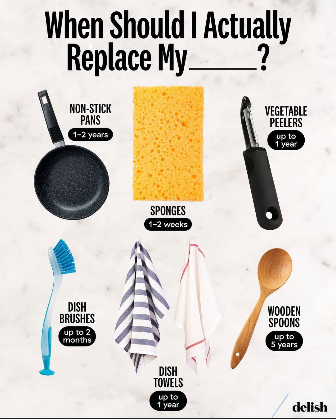
When Should I Replace My [Kitchen Stuff]
This simple graphic nails it: it answers a question people actually have, fast. No text walls. No fluff. Just clear...
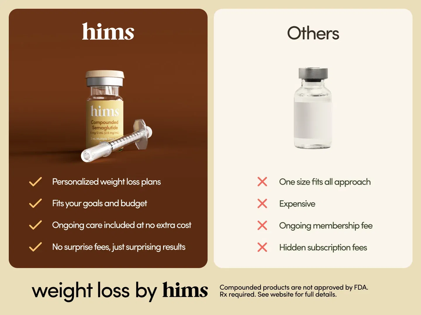
Hims Weight Loss Semaglutide Ozempic Shot Before/After
Ever notice how clear “this vs that” visuals instantly click in your brain? Hims nails this with a clean side-by-side...
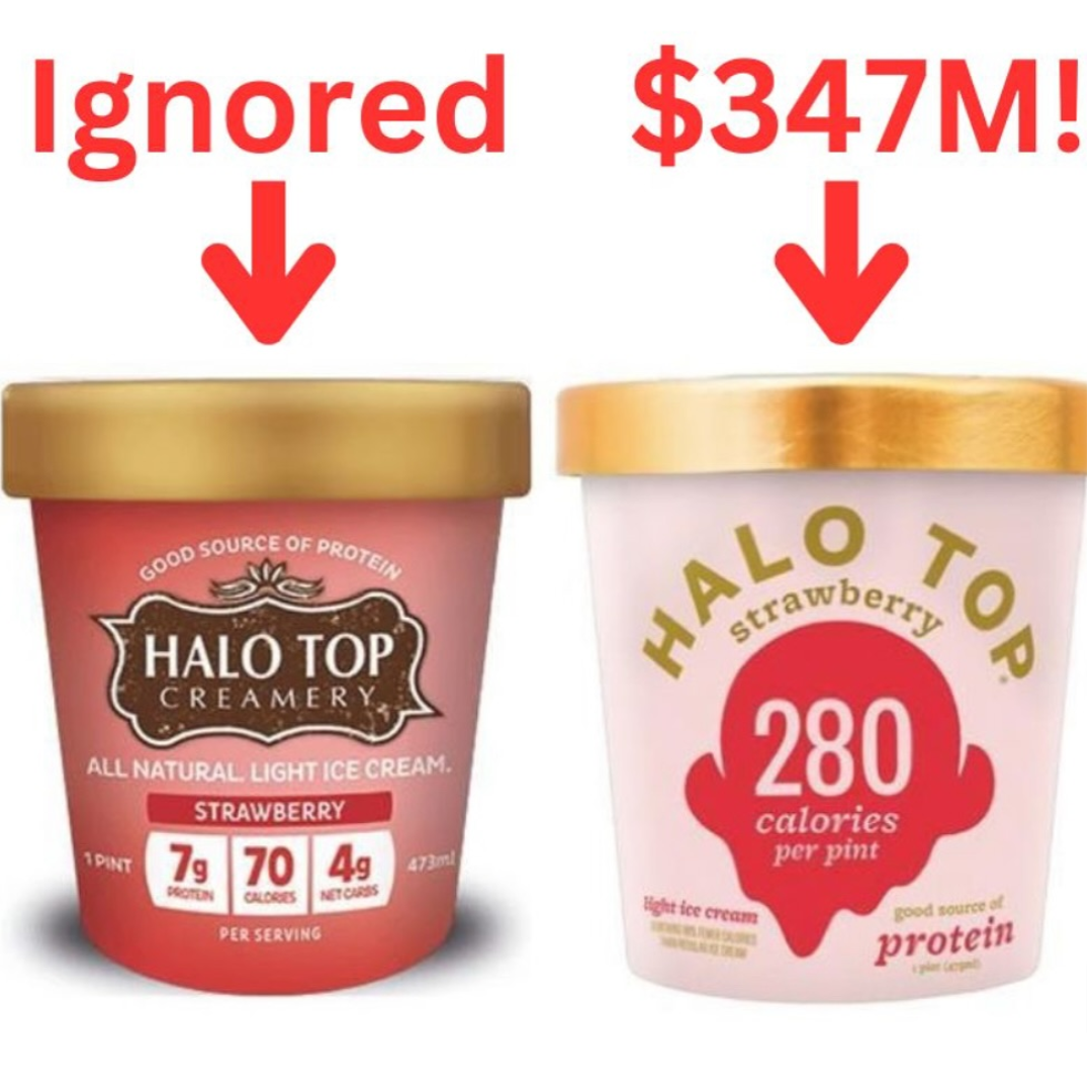
Halo Top Ice cream before and after packaging
Halo Top didn’t win by shouting “We’re delicious!” like every other brand. They won by showing “Only 280 calories per...
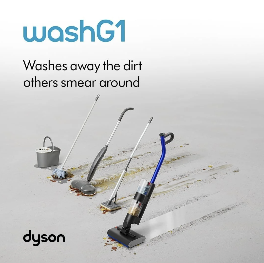
Dyson WashG1 wetvac demo ad
This Dyson WashG1 ad screams quality without screaming at all. No tech specs, no features list—just one visual that instantly...

Best movies of all time ranking
This chart nails a genius marketing move: take data from seven major movie rating sites, blend it, and boom —...