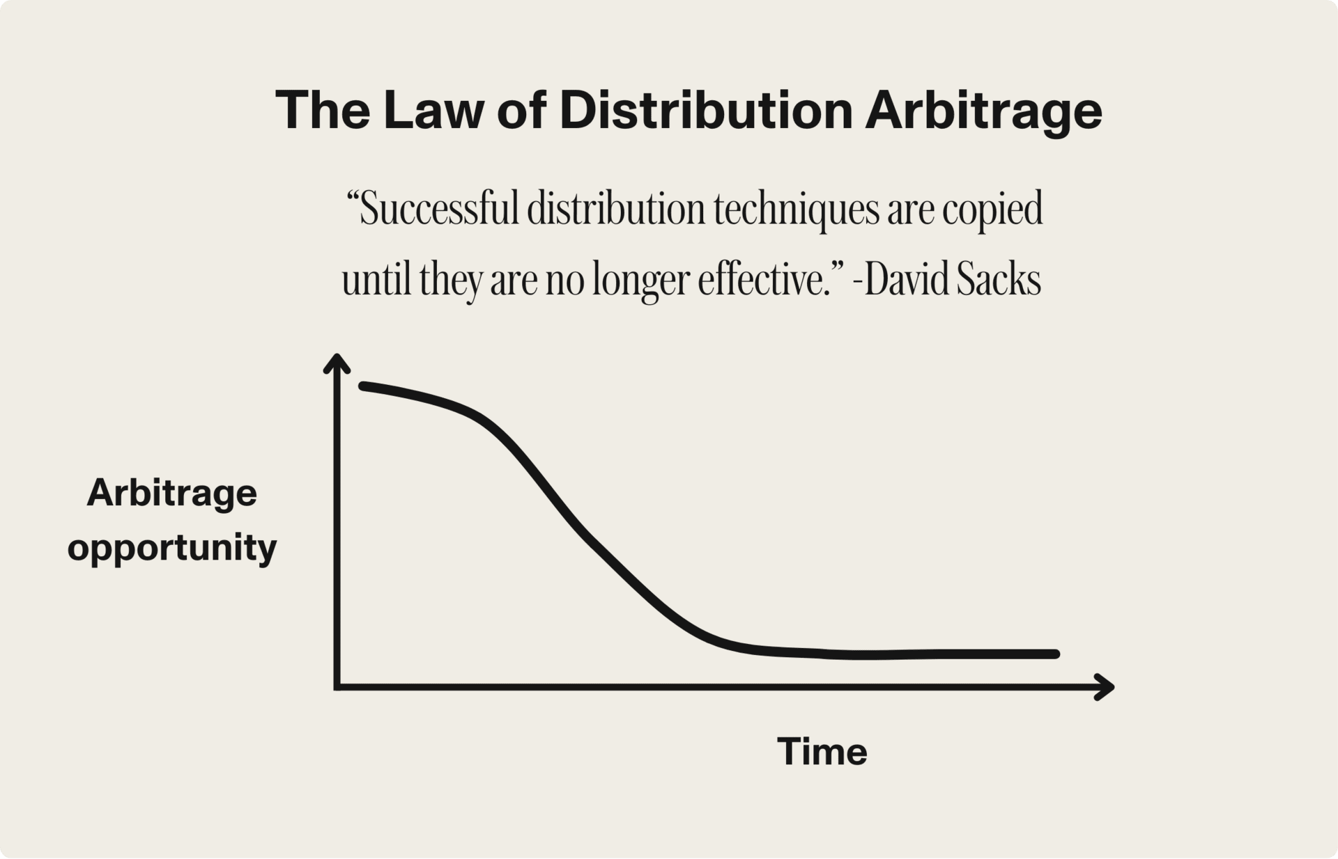
The Law of Distribution Arbitrage
Every marketing channel starts hot, then cools fast. David Sacks nailed it: once everyone copies a distribution trick, it stops...
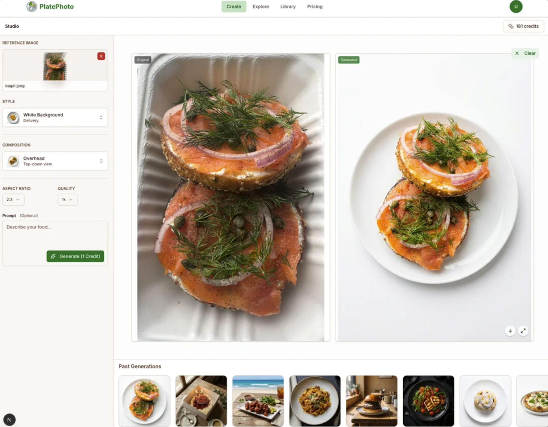
App takes normal photos and uses AI to make “restaurant quality photos”
Ever notice how a quick change in photo style can make the same dish look way more appetizing? This image...
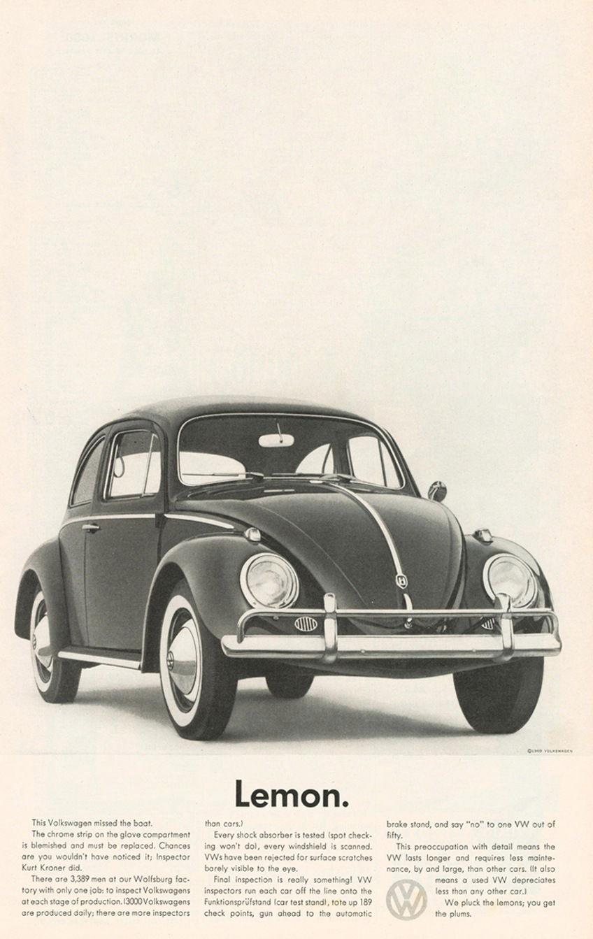
The Ad That Turned “Lemon” Into Gold
This 1960s Volkswagen Beetle ad is one of the boldest headlines ever printed: “Lemon.” It flips a negative word into...
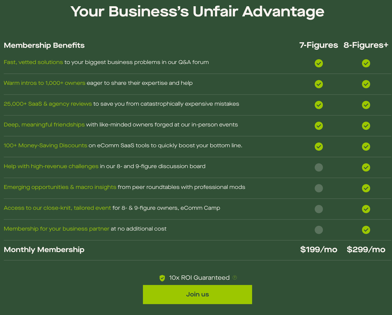
eCommerceFuel pricing page
This pricing table nails how to sell value instead of features. It’s not just a list of deliverables—it’s a transformation...
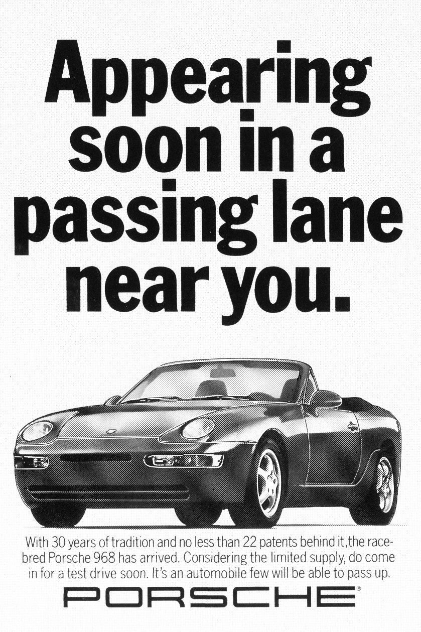
Porsche Ad That Passes Every Test
Porsche nailed this ad by mixing speed, wit, and subtle bragging rights into one perfect line: “Appearing soon in a...
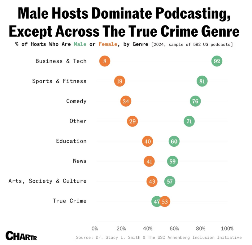
What Podcasting’s Gender Split Teaches About Audience Fit
This chart from Chartr shows a wild stat: while men dominate most podcast genres, women actually lead in True Crime....
Proof luck doesn’t exist. https://t.co/jASU4BZD5B

The “No Luck” Chart Every Founder Needs to See
Marc Lou shared this chart claiming it’s “proof luck doesn’t exist.” It maps hundreds of startups by revenue vs. time...
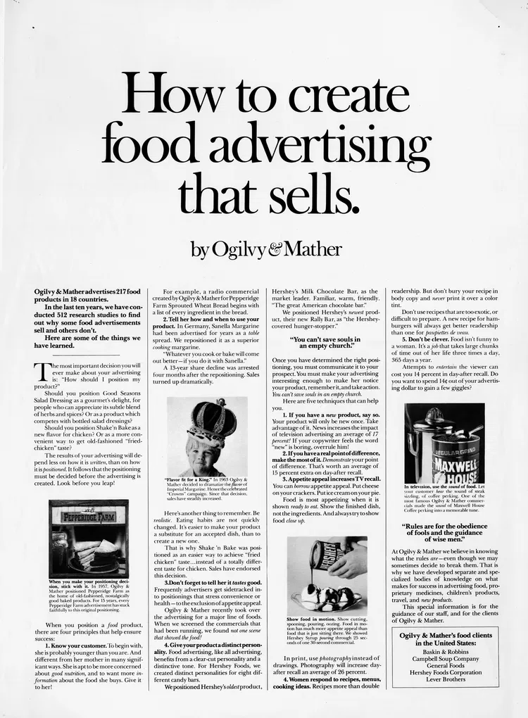
How to Create Food Advertising That Actually Sells
Ogilvy & Mather didn’t just make food ads—they researched 512 of them to figure out what really makes people buy....
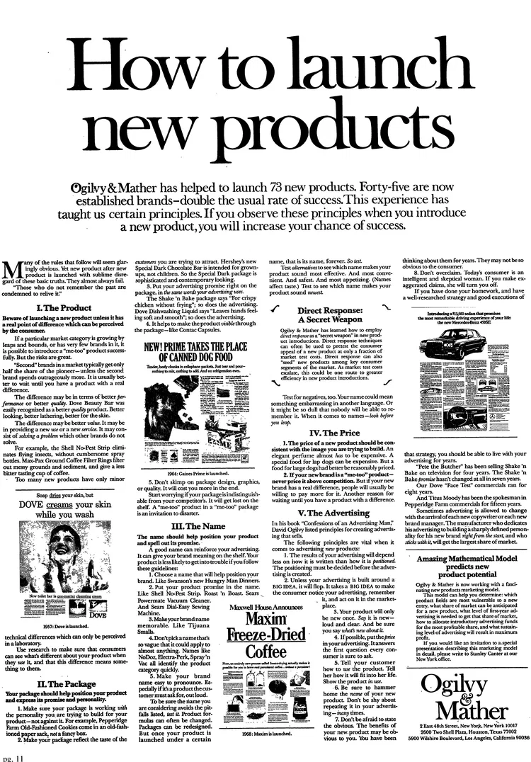
How to Launch New Products Like Ogilvy
This Ogilvy & Mather ad is a masterclass on product launches. It’s not just an ad—it’s a playbook showing how...
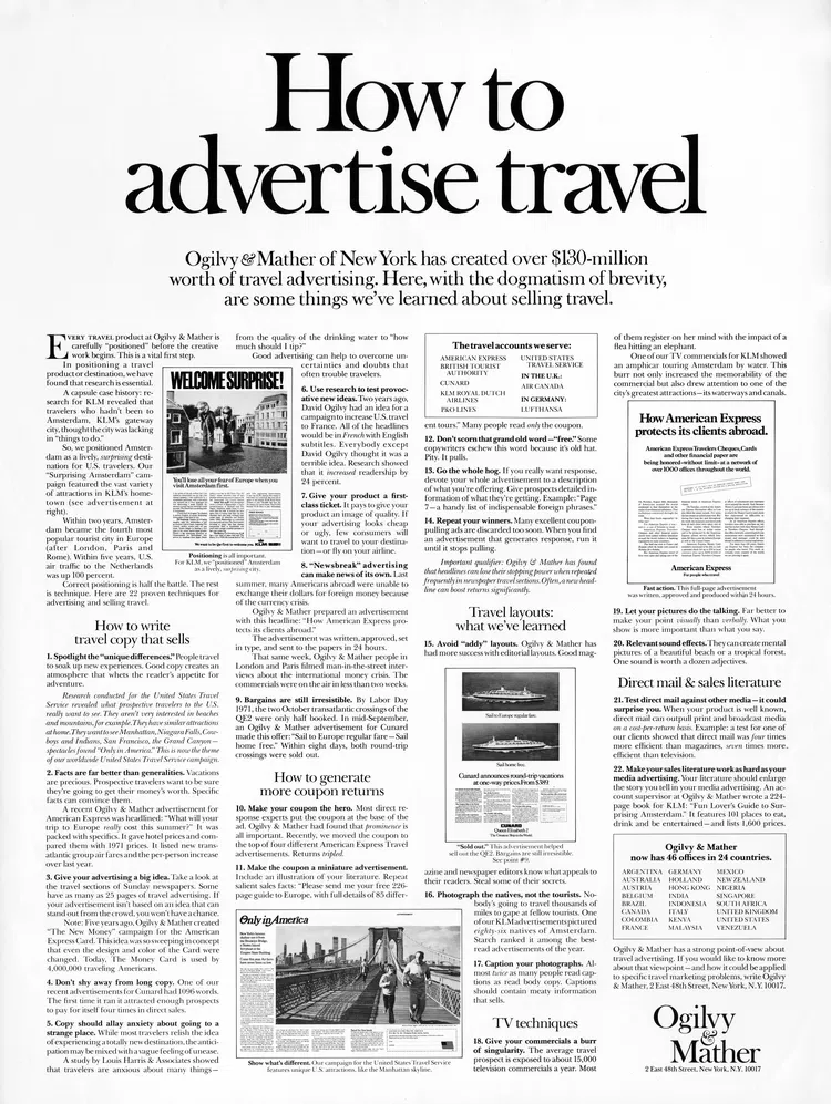
How Ogilvy Sold Travel Like a Pro
This vintage Ogilvy ad is a masterclass in clarity. It’s a full-on tutorial titled “How to Advertise Travel,” and it’s...

The Fish That Proved Zippo’s Point
A lighter pulled from a fish’s belly… and it still worked. That’s the kind of story that turns a product...

The Ad That Made Quiet Powerful
In 1958, Rolls-Royce ran this ad with the legendary headline: “At 60 miles an hour the loudest noise in this...

The Quietest Headline in Advertising History
At 60 mph, the loudest thing about Rolls-Royce wasn’t the engine. It was the electric clock. That single line made...
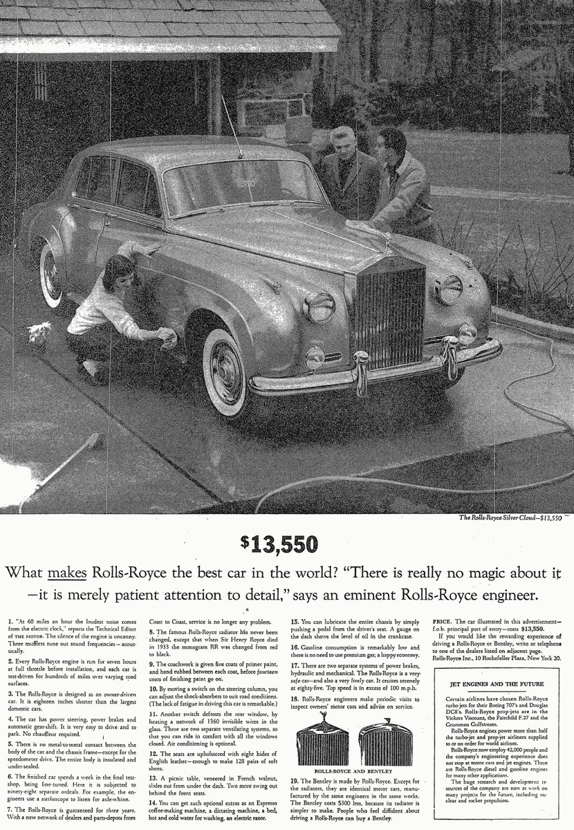
The Quiet Power of Rolls-Royce: Selling Through Detail
This classic Rolls-Royce ad is a masterclass in subtlety. It doesn’t shout luxury—it whispers confidence. The car gleams, the copy...

The Popcorn Pricing Trick That Sells More
Ever notice how movie theaters make the large popcorn look like a “no-brainer” deal? That’s no accident. It’s a pricing...

Cadbury Shows How to Make Chocolate Feel Personal
Cadbury nailed it with these Dairy Milk wrappers. Each bar highlights everyday roles we all recognize—“who remembers everyone’s birthday,” “who...

The Visual Power of Simplicity: Why This “Hardest-to-Kill Houseplants” Chart Works
This chart nails visual communication. At a glance, you understand exactly which plants survive neglect, what light they need, and...

The Formula For Marketing Influence
This image shows a simple but powerful formula every marketer should know: your success = number of people × influence...

20 Lessons from Spotify’s CEO That Every Marketer Should Steal
This note sheet might look messy, but it’s packed with gold. It’s basically the Spotify playbook for building things that...
You can’t say you want to be in the top .1% and not be willing to do things 999 out of 1000 aren’t.
The 0.1% Mindset for Marketers
Everyone says they want to be the best. Few actually do what it takes. Alex Hormozi nails this with his...

The Marketing Power of a Killer Data Visualization
This population forecast map nails what every marketer should learn: turning complex info into something instantly shareable and snackable. You...
Sign at the Chinese restaurant in the middle of nowhere in New Hampshire. Love to see this kind of ownership and hustle.
I texted him and he wrote back (not canned response) wishing 5 minutes. 👏🏼👏🏼👏🏼 https://t.co/2Q4UnmUrhX

How a Restaurant Owner Turned a Sign into a Conversation Starter
This restaurant nailed something most businesses overlook: personal connection. A simple sign with the owner’s face and phone number—“Owner Needs...
Everything We Use to Run Copywriting Course and SwipeFile
I pay for about 14 pieces of software that return 500x their cost, and I run CopywritingCourse and SwipeFile.com on...

Ice Cream Sales and Shark Attacks: The Correlation Trap
Ever seen two charts that line up perfectly and thought, “Aha! They must be connected”? This graph shows ice cream...