
What This Wealth Chart Teaches About Smart Marketing
This chart shows how assets shift as wealth grows—from cars and homes to businesses and stocks. The richer people get,...

How to Test Thumbnails Like a Pro
This visual from Mario Joos breaks down what really happens when testing YouTube thumbnails. Spoiler: it’s not instant results. It’s...

The Chart That Sells: Circle’s Engagement Boost Visual
This Circle ad nails it with one picture. It’s a glowing graph that screams “results” without needing a single paragraph...

Tesla’s $1.4T Lesson in Category Leadership
This graphic hits hard: Tesla alone is worth more than the next 20 automakers combined. That’s not just a finance...

How SpaceX Built a $10B Alumni Network
When a company breeds founders, not just employees, you know it’s doing something right. This chart shows that over 130...

The "Kind Lie" vs "Unkind Truth" Curve Every Team Needs
Ever avoided giving feedback because you didn’t want to hurt someone’s feelings? This visual by William Meijer nails why that’s...
Green Flags of a Company (That Nobody Talks About):
Everyone knows the red flags
But after scaling AppSumo from $3M to $80M+ (and driving $500M+ in growth for my clients), I learned to spot the green ones
The ones that predict success before it happens:
1. Your employees bring their friends
Nobody refers their best friend to a sinking ship
...
Spotting Green Flags for Predicting Business Success
Everyone loves talking about company red flags…but what about the good signs that a company is about to blow up?...
Either sell extremely expensive to a select few or sell something super cheap to everyone. The middle is where people die.
The Dangerous Middle: Why Mid‑Priced Offers Fail
Alex Hormozi nails a hard truth about pricing: the middle is a graveyard. Brands either win by going premium and...

Make Relatable Comparisons - Eiffel Tower
This visual nails a classic marketing move: making big numbers feel real. Instead of saying “a supertrawler net is 1...
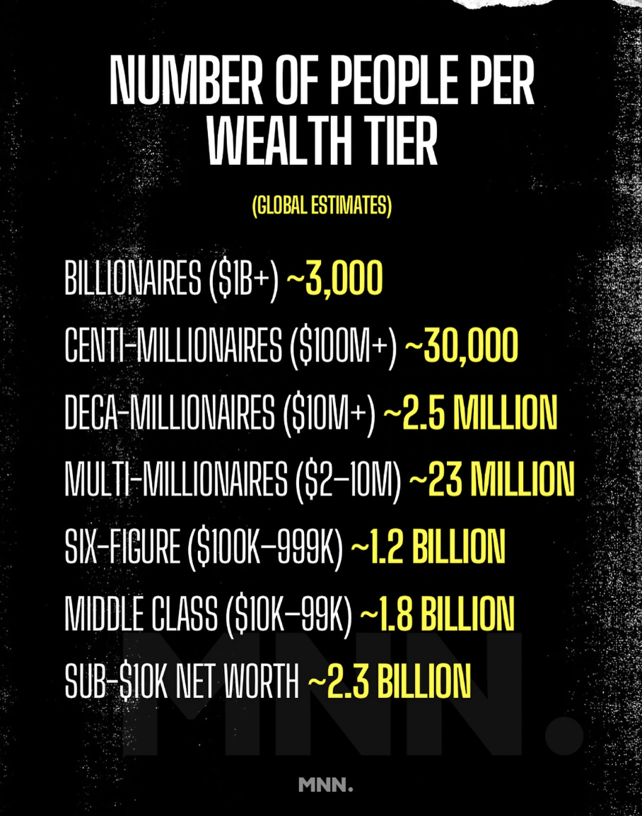
The Wealth Pyramid: Why Market Size Matters
This chart breaks down global wealth tiers by how many people are in each. From billionaires at the top (3,000)...
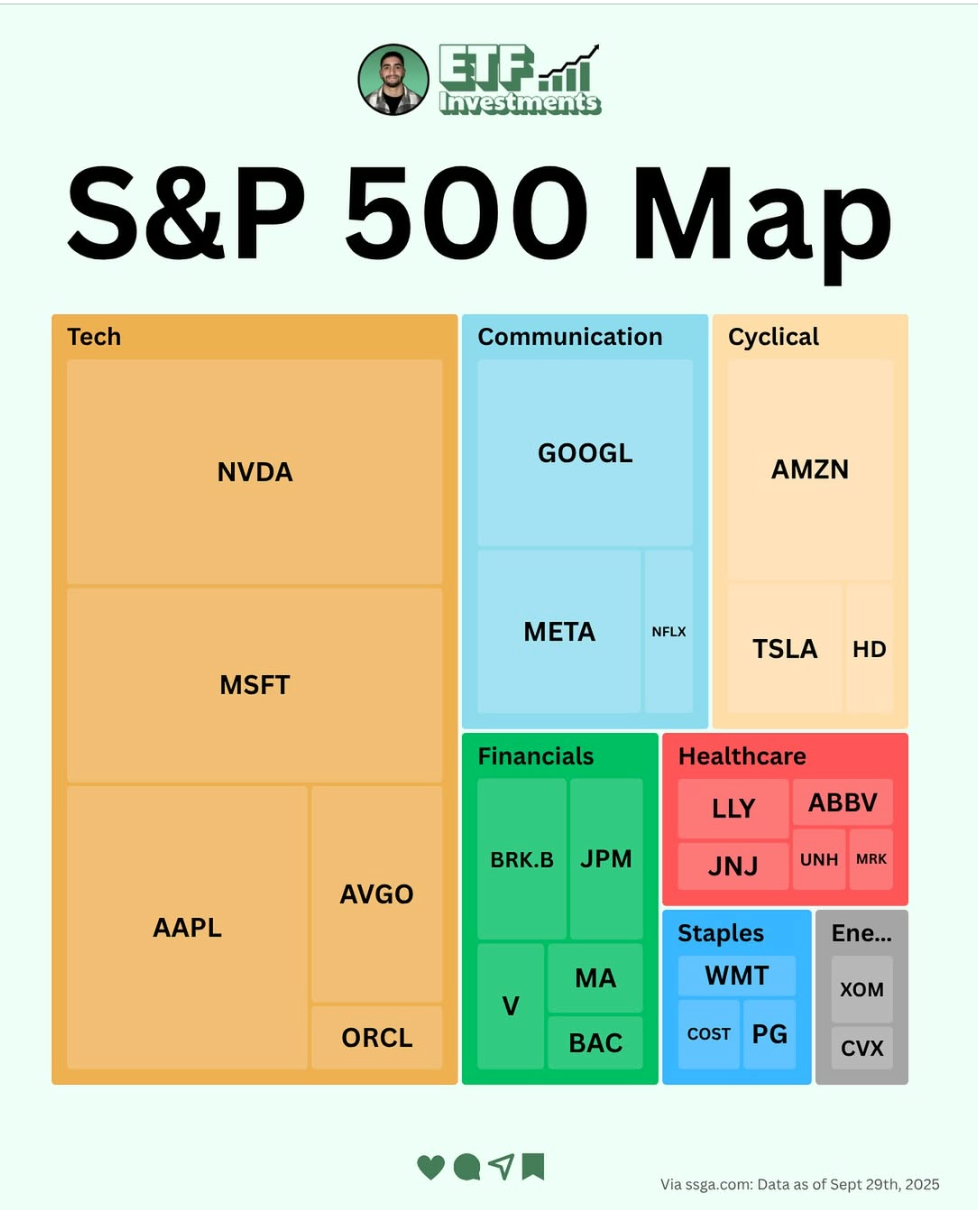
The S&P 500 Map: A Masterclass in Visual Clarity
This graphic from ETF Investments nails visual communication. One glance and you instantly understand where the biggest players sit in...

How to Tell If Growth Is Real or Just Hype
This chart comparing Cisco’s 2000s bubble vs. Nvidia’s current rise is gold for marketers. It’s not just about stocks—it’s about...
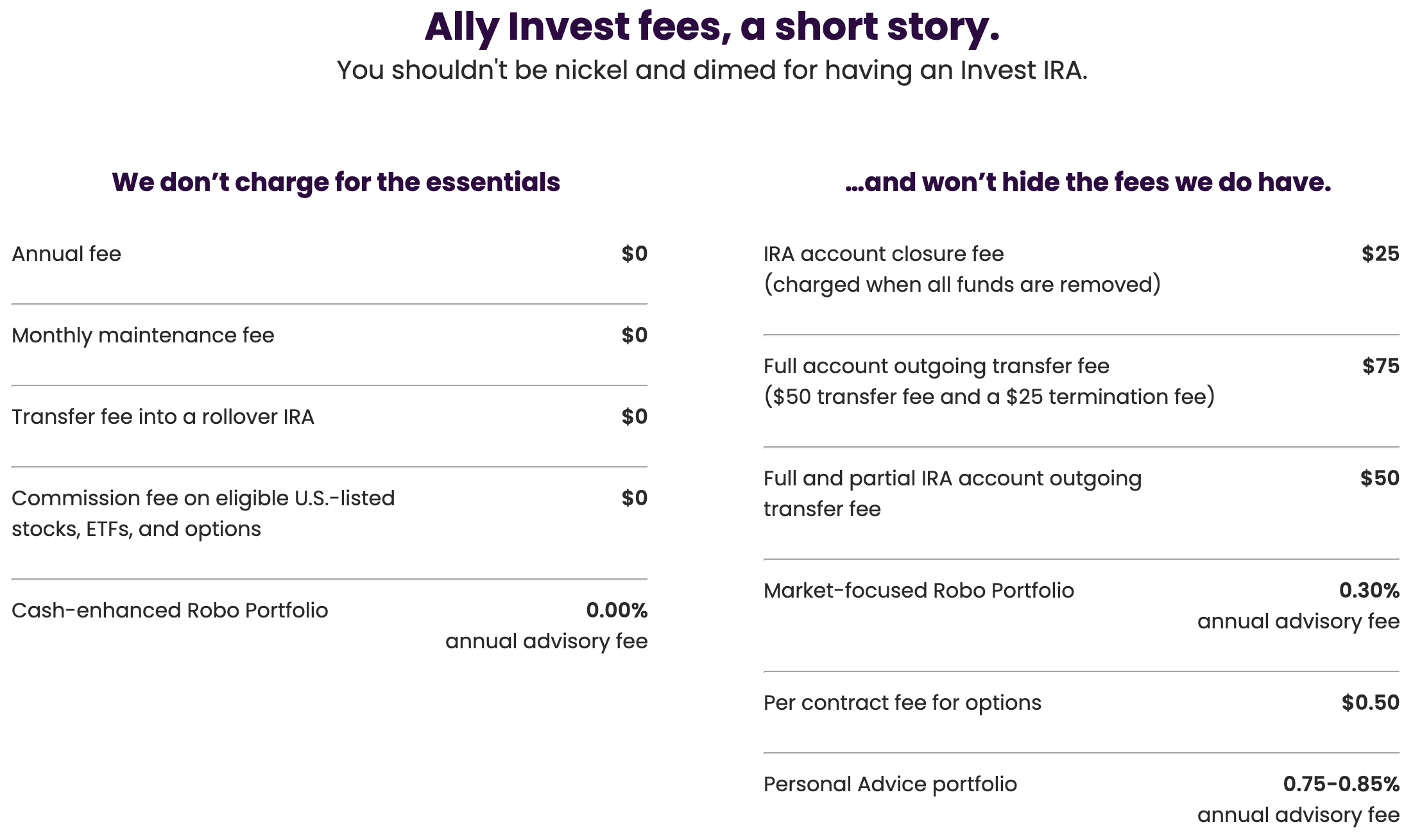
Ally Bank’s super honest fee copy
I love how Ally Bank on this page goes SUPER HONEST and upfront about the fees they do charge. Instills...
This is alarming.
Over 60% of VC money is now going to AI companies.
For reference, only 40% of the VC money went to internet companies in 1999.
If those AI companies don’t start generating real revenue soon enough, investors will...

What Marketers Can Learn From The AI Gold Rush
AI is sucking up over 60% of all venture capital dollars right now. That’s more than the dot-com boom ever...
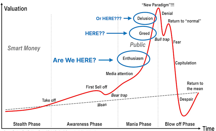
The Market Emotion Curve: A Mirror for Marketers
This classic “market psychology” chart isn’t just for investors. It’s a killer visual for any marketer trying to understand audience...

The Marketing Power of Emotional Timelines
This chart hits you in the gut. It shows how “time spent with children” peaks and then fades. That's emotional...
This graph looks like a handshake 🤝 “I’m gonna take over from here” https://t.co/dG58lypg5a

The AI-Human Content Handshake
That’s not just a graph. It’s the moment AI content shook hands with human writers and said, “I got this...
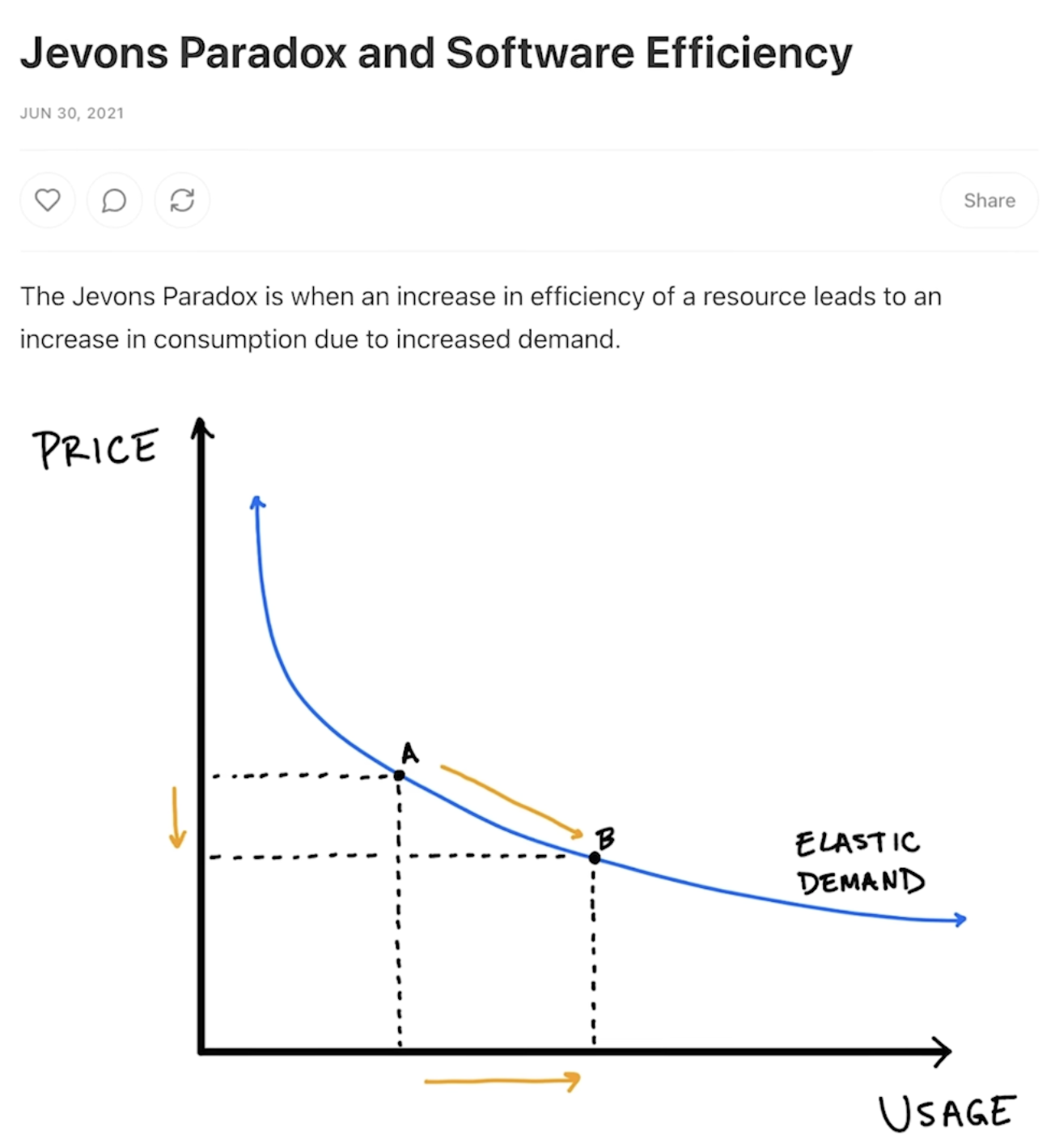
The Jevons Paradox: When things get cheaper, more people use it
Ever notice how faster software or cheaper ads actually make you use more of them? That’s the Jevons Paradox in...

The $1.26 Billion Marketing Lesson
This image is a wild reminder of how fast tech has evolved. In the 1980s, 32GB of RAM would’ve cost...

Why This “Perfect Weather Map” Is Perfect Marketing
This map showing which parts of the U.S. have the most “perfect weather days” is weather data with personality. It...

How Failure Braids Into Success
This image nails a truth every marketer learns the hard way: success is a tangled mess of failed attempts. Each...

Top 25 most unisex baby names in USA
This chart shows the 25 most androgynous baby names in the U.S. since 2000. The results? Names like Ryley, Frankie,...

The Double-Edged Sword of Easier Creativity
That pic nailed it: the internet made everything easier. Good and bad. Anyone can fill the feed with junk now—but...
The final milestone in Elon Musk’s pay package is completed when Tesla’s Market Cap reaches $8.5 Trillion.
For some perspective, this aligns with Cathie Wood’s $TSLA PT of $2,600 by 2030. ($8.4T Market Cap) https://t.co/Ae1hyT9UPt


The Power of Setting Wildly Ambitious Targets
Tesla’s last milestone in Elon Musk’s pay package kicks in at an $8.5 trillion valuation. Sounds wild, right? That’s exactly...