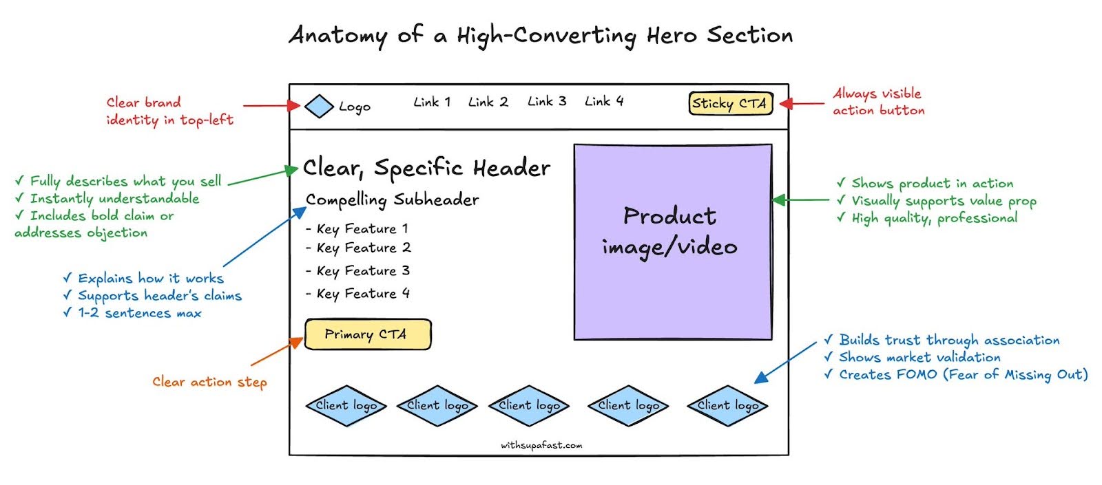
Anatomy of a hero section
Cool breakdown of a way to make a Hero Section on a website.
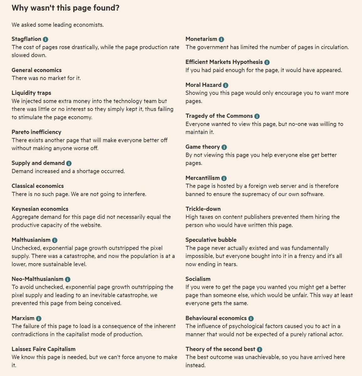
Financial Times 404 Page
Cool 404 page from the Financial Times with lots of economic definitions

Kreated sales page
Check out this awesome sales page - it's got everything you need: a clear blueprint, upfront pricing, customer testimonials, and...
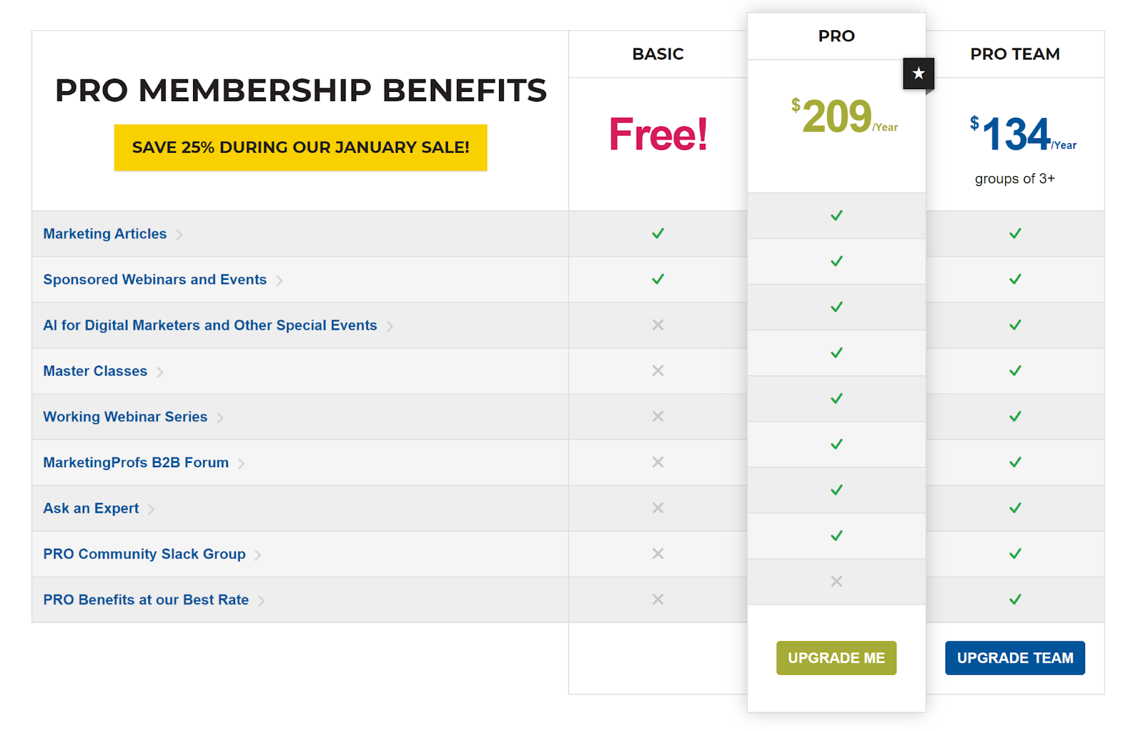
MarketingProfs Three-Tiered Pricing
Take a look at MarketingProfs' pricing structure. They use checkmarks to indicate the different benefits of the free, pro, and...
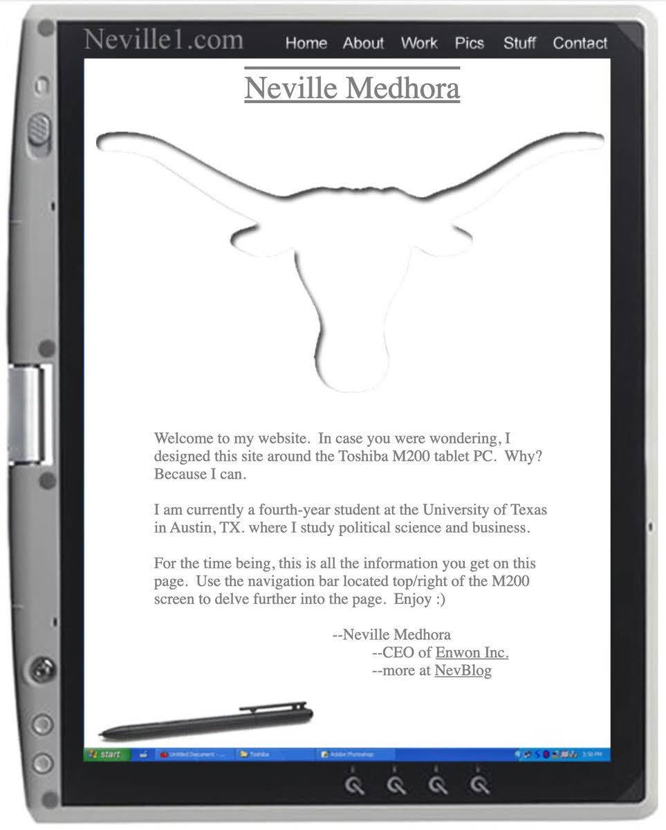
Neville college website
An early website created by Neville Medhora to showcase his talent as a university student. He even included instructions on...
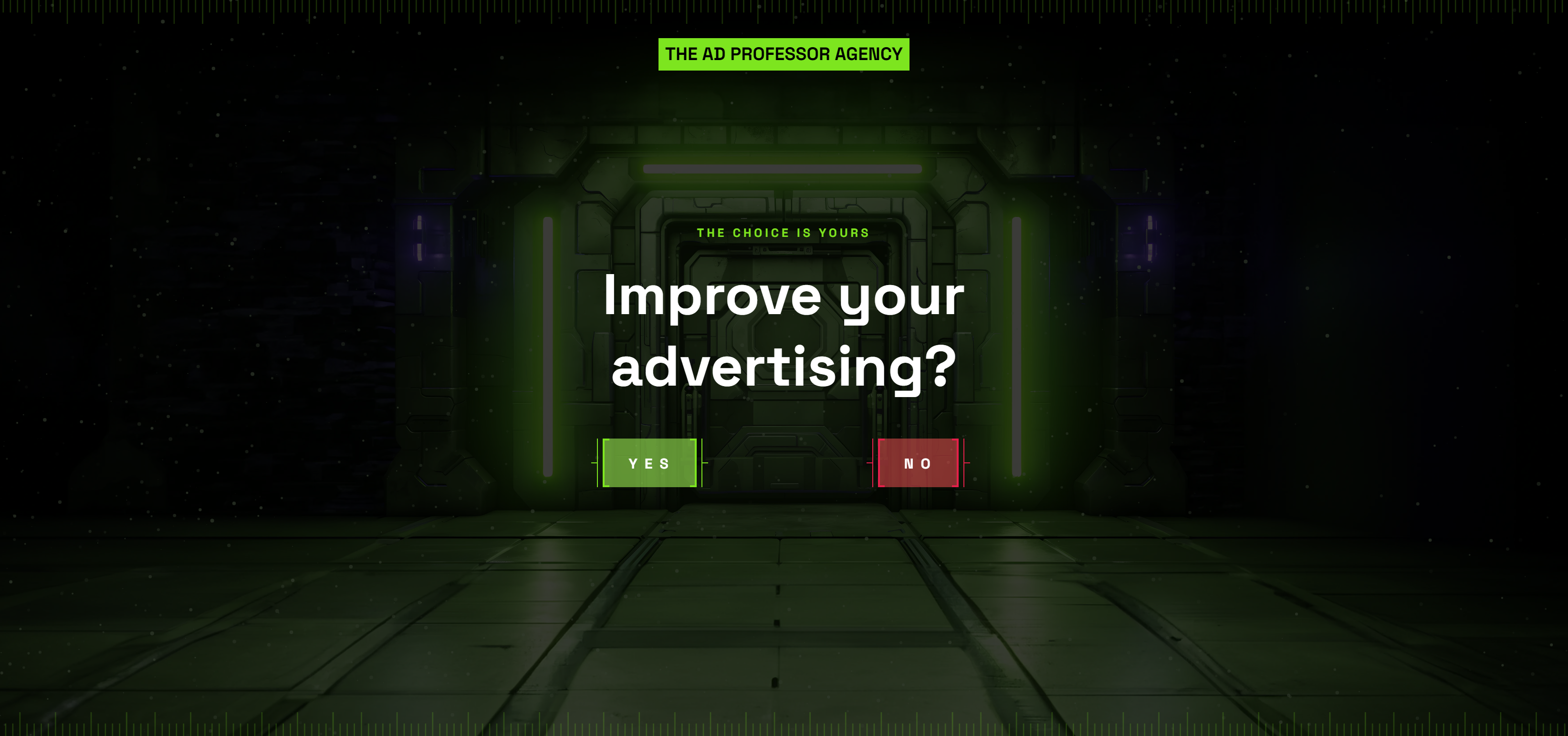
Ad Professor Agency Homepage
Very interesting and “vibey” homepage for an online ad agency.
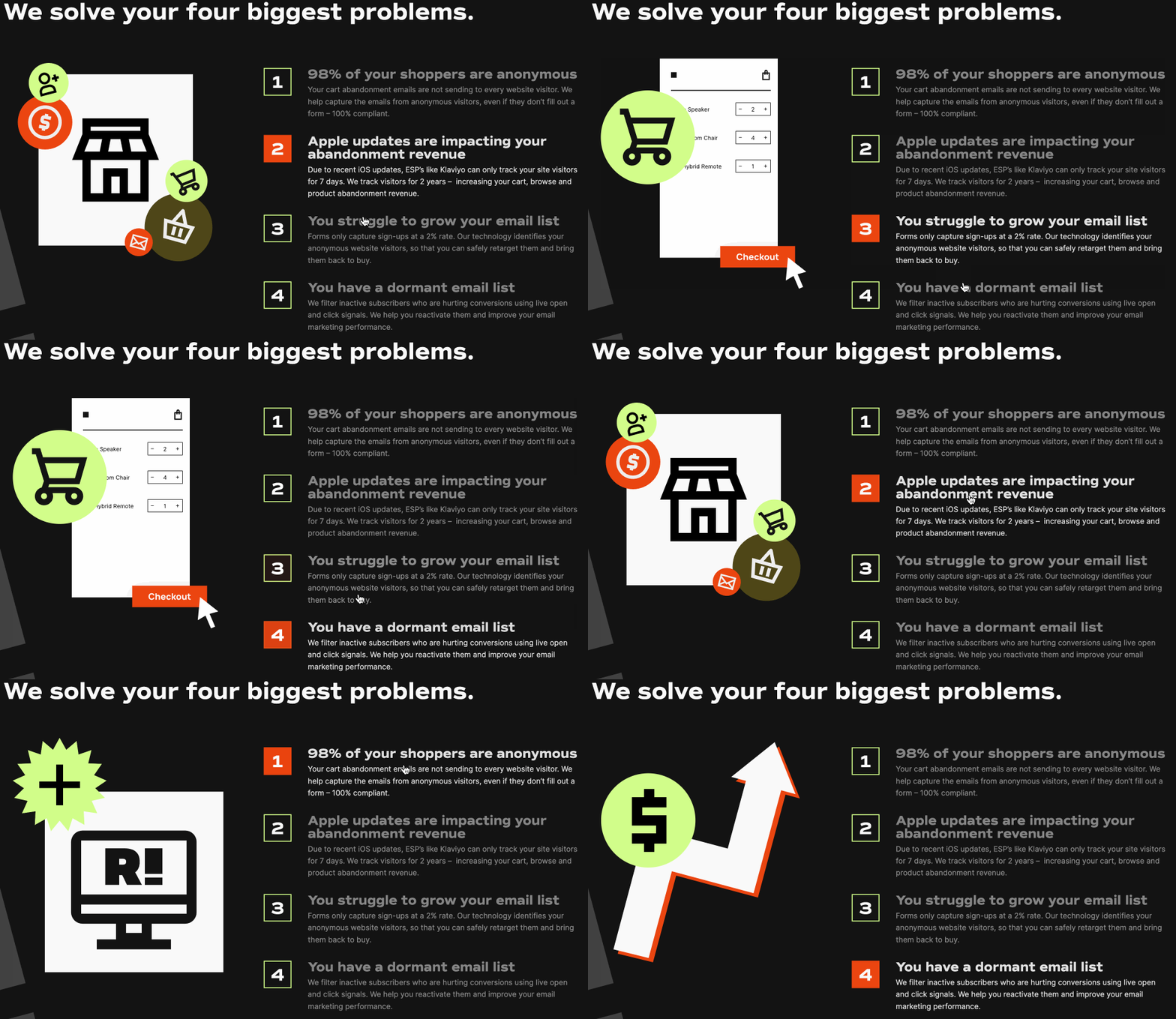
Retention.com’s Problem Explainer
I loved this cool hover-over “Problem Explainer.” In a few hover-overs a company will probably recognize a problem they have.

Canva product announcement
This Canva announcement for a product called “Magic” is very Apple-like, and even has a strong CTA to “add to...

Refer a friend program for Eufy home products
Instead of paying cash for referrals like most brands, Eufy awards Amazon gift cards and the chance to earn Eufy...
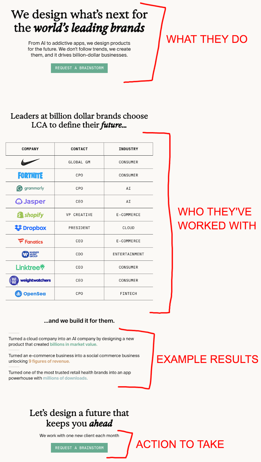
Latecheckout Agency great single-page website
A simple, easy to read, results-showing page that results in a TON of signups. Greg Isenberg at Late Checkout told...
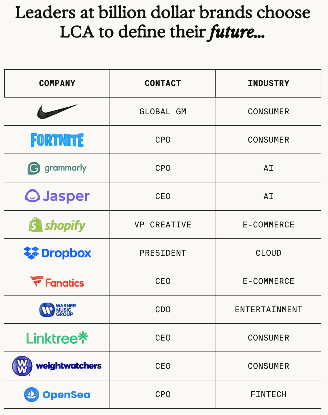
Late Checkout Agency Client List
Awesome way to display who an agency works for. Greg Isenberg at Late Checkout said listing this info out like...
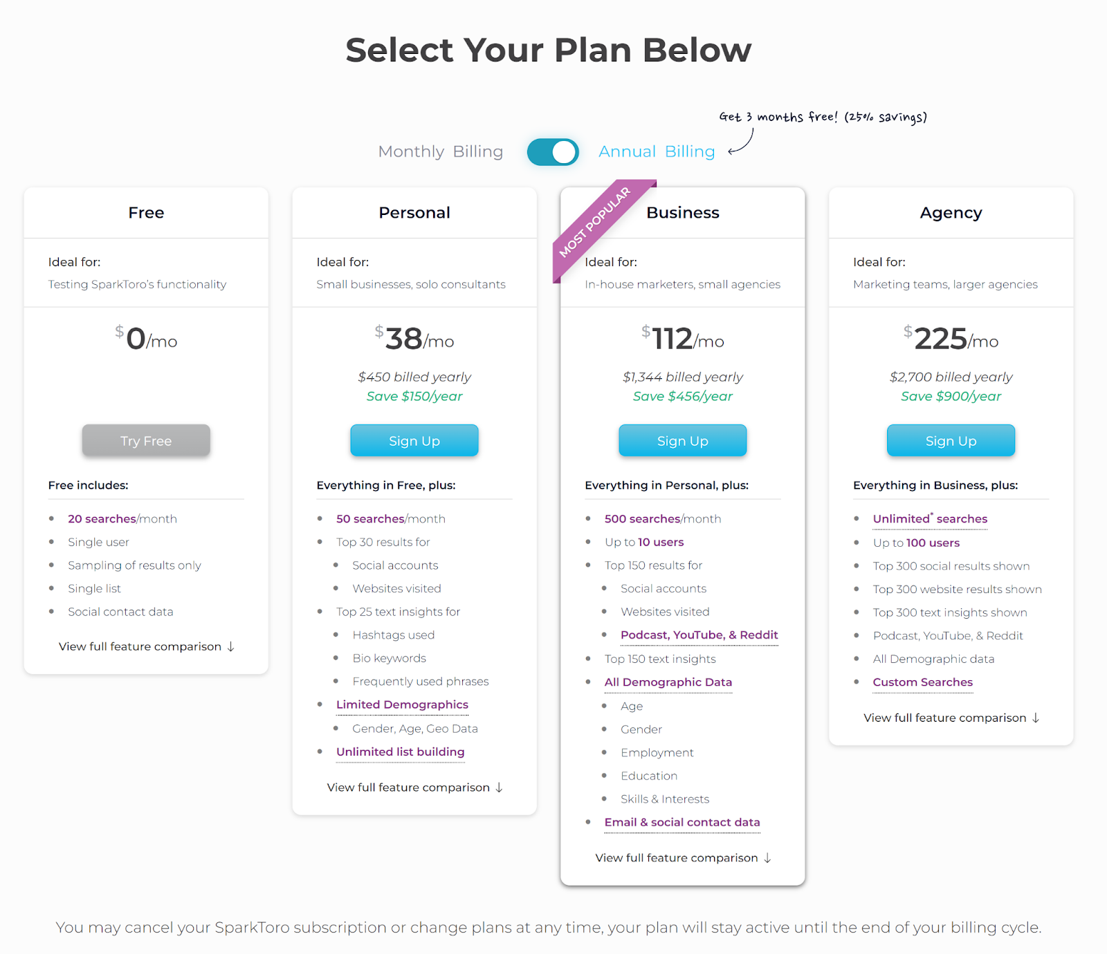
SparkToro Pricing Plan
Take a look at SparkToro's comprehensive four-tier pricing plan. The pricing chart displays a wealth of information. By opting for...
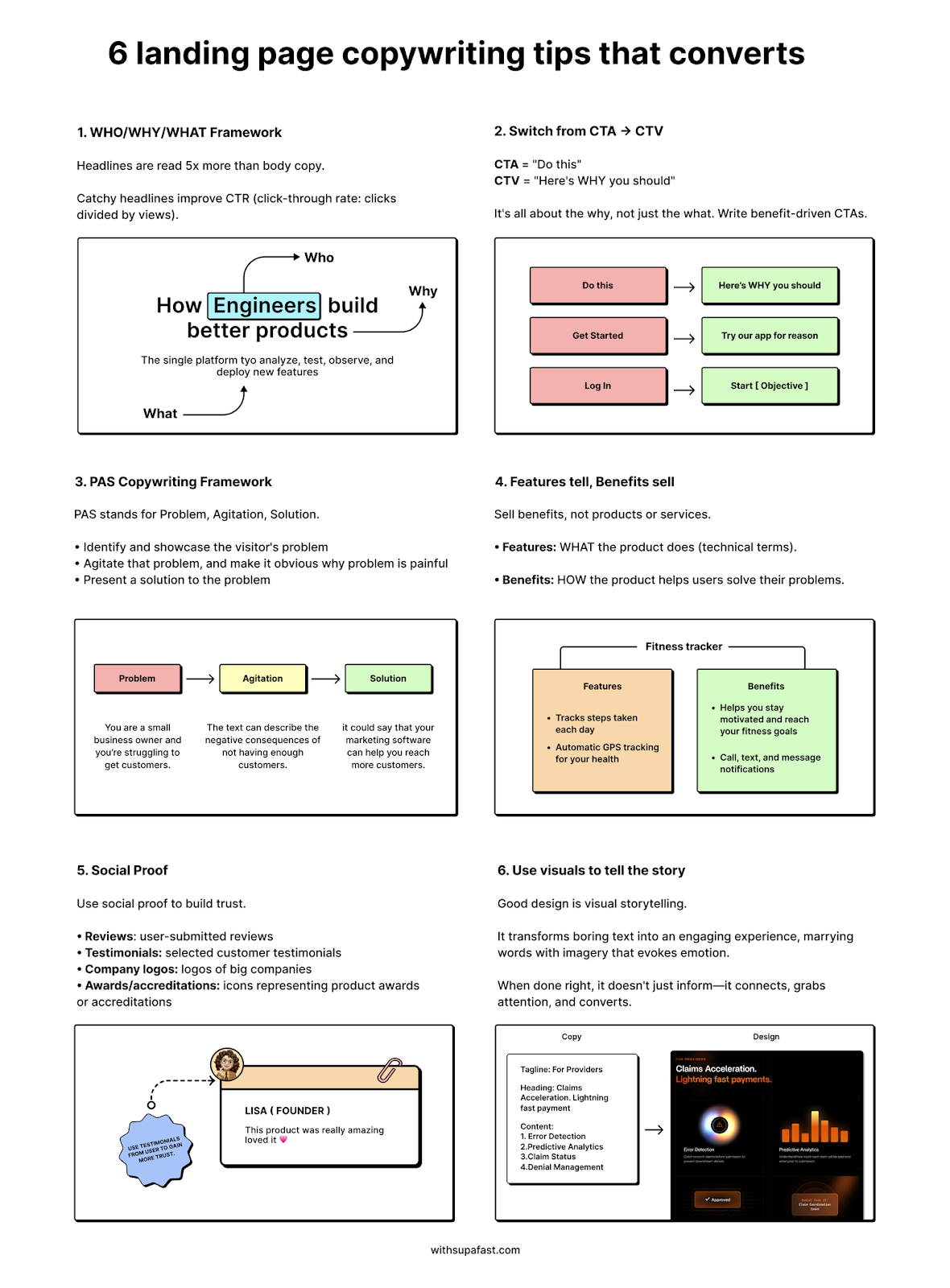
6 Landing page copywriting tips
This one-pager shows 6 easy tips to create better landing pages. Helping you boost your conversions.

Copywriting Course Landing Page Split Test
Which do you think will win in this A/B/C/D Split Test? Will report results at end of next week!
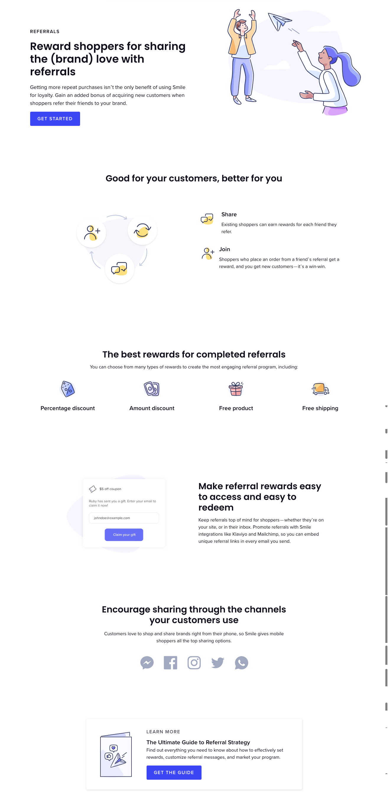
Landing for shopper rewards app has everything but a testimonial
Here we see most of all the elements for a great landing: Opening headline that describes the entire app in...
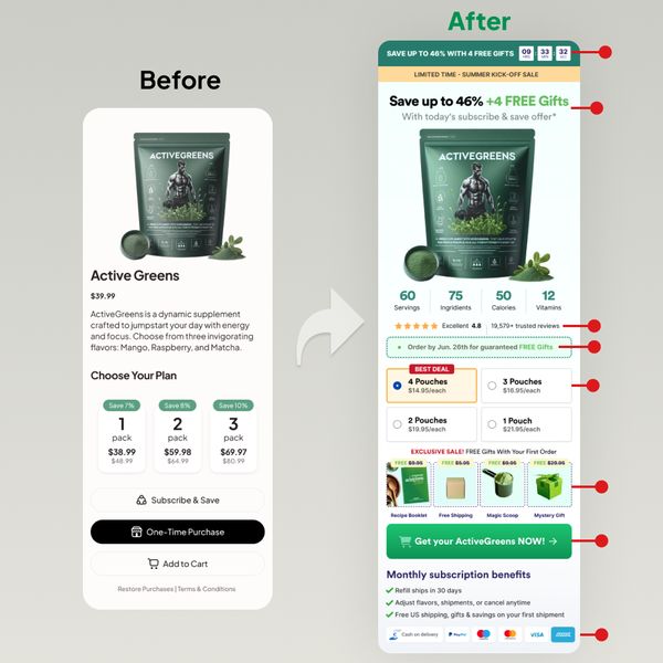
Before and after of product page
A fantastic method to highlight the changes made to the product page for Active Greens.

Hampton Before and After Website Design
This redesign of Hampton's website rephrased the content, switched to lighter colors, added more images, and emphasized social proof for...

Peterson Academy Sales Page For Beta Program
I’m impressed by the Peterson Academy beta program landing page. The countdown timer creates a sense of urgency, while the...
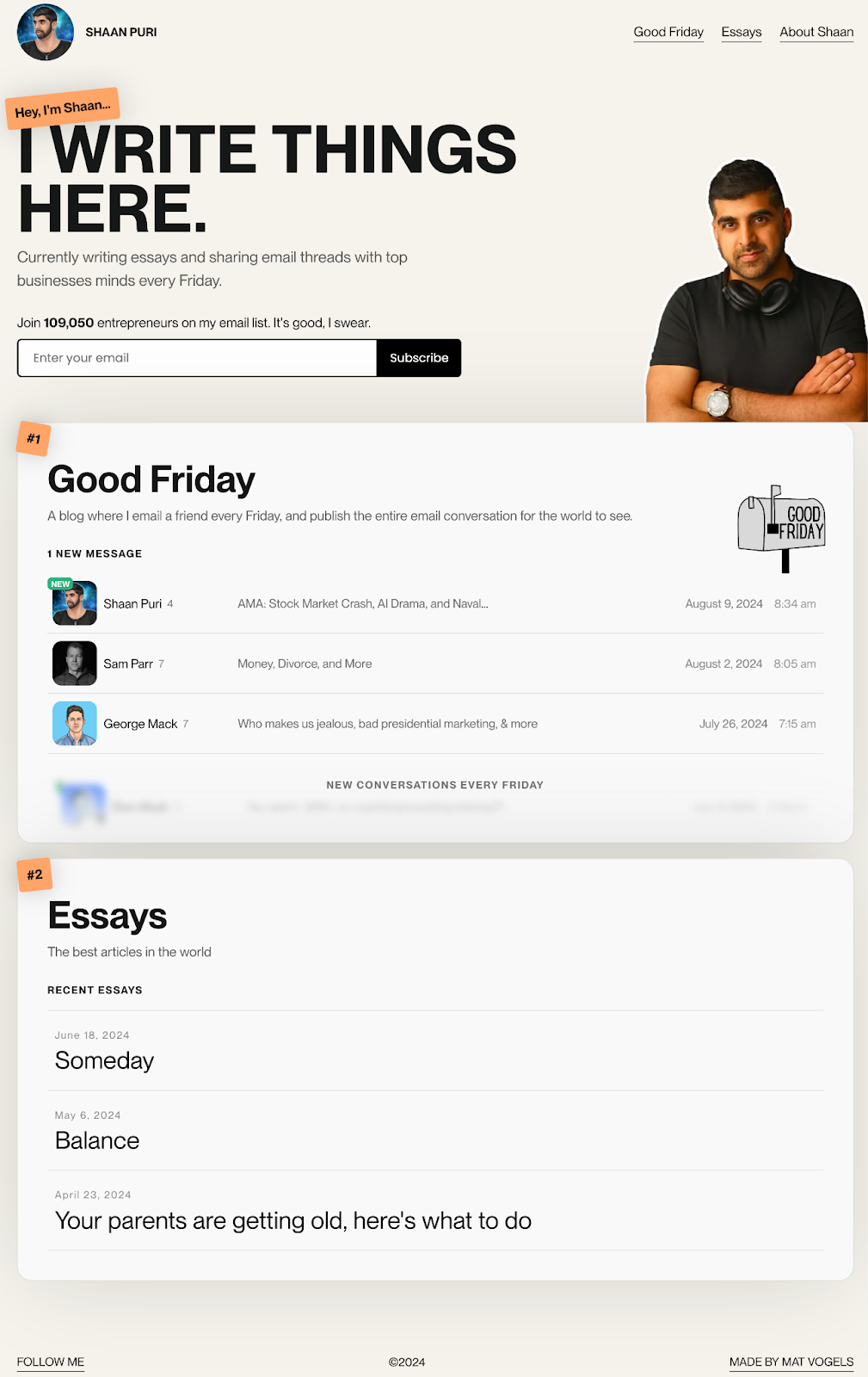
Shaan Puri Website
Shaan Puri's personal website is awesome! You can sign up for his email list to get access to his essays...

Before and After Website Redesign
This before-and-after image is the perfect way to showcase your redesigns. It’s perfect for sharing on social media to get...

DesignScientist Agency Homepage
Cool agency website that focuses on combining design and copy into one.
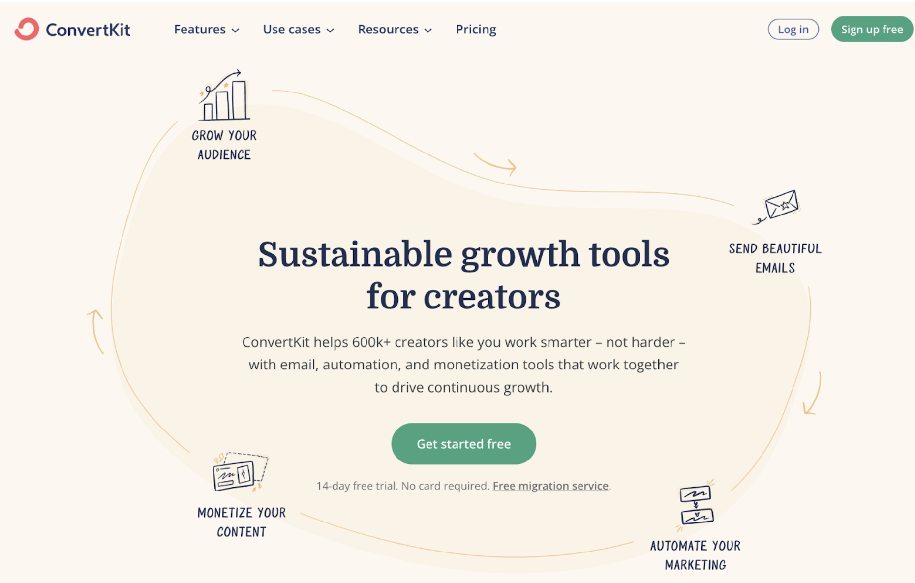
ConvertKit awesome home page graphic
I love this image on the homepage of ConvertKit which shows a “Creator Flywheel” surrounding the main headline and CTA!

Clear headline and great above the fold graphics
Unbounce homepages does a great job with a easy to read headline statement with a animated gif of smiling customer...

Landing page quiz does a great job of selling participation
The page does a good job of selling people on taking the quiz. Giving social proof by citing the studies...

.png?width=3840&quality=80)
