MarketingProfs Three-Tiered Pricing
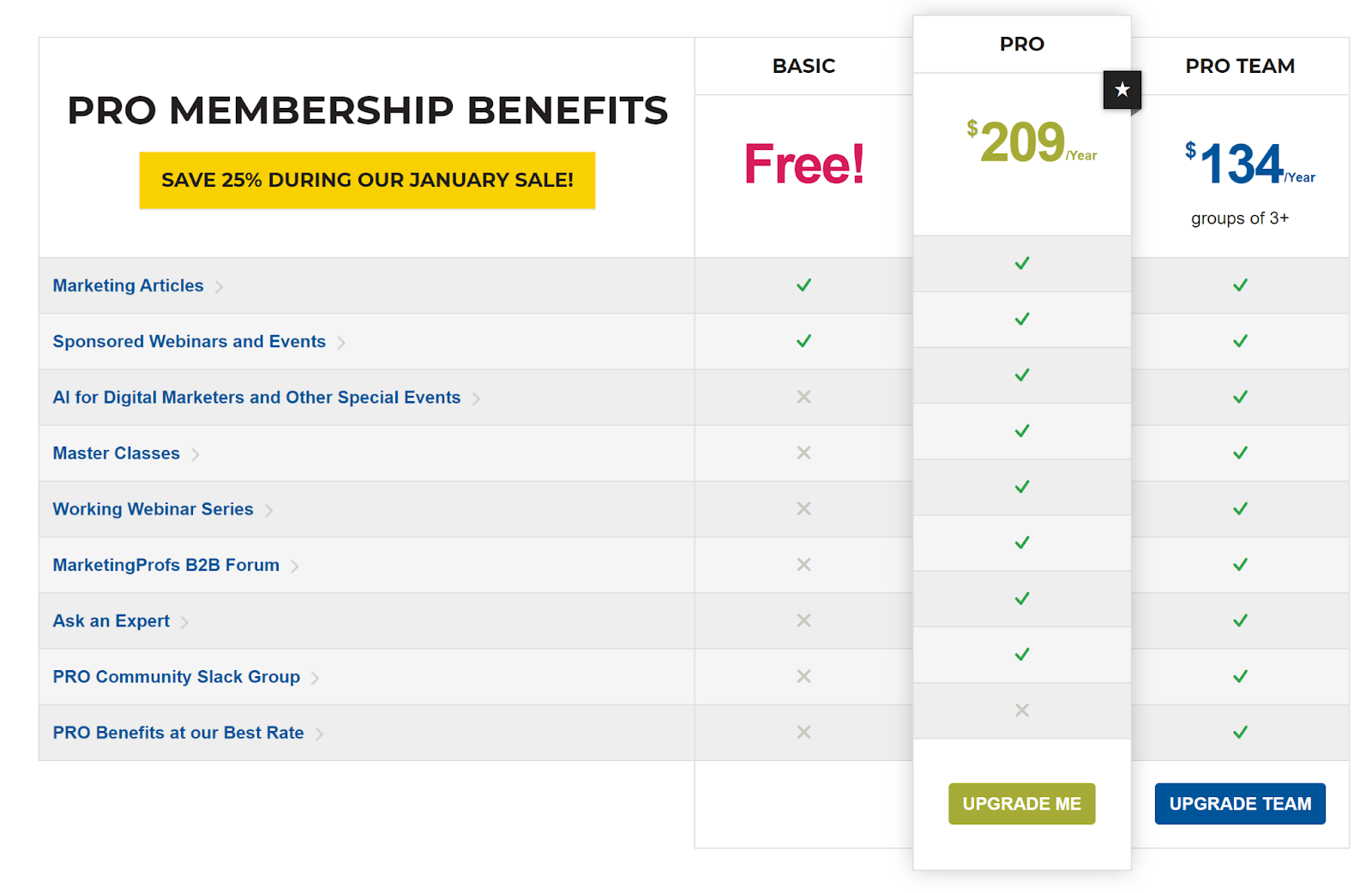
MarketingProfs nails their pricing table. It’s clean, simple, and makes upgrading feel obvious. Each plan stacks neatly next to the others with green checkmarks showing what’s included and a black star gently nudging you toward the “Pro” plan.
Why It Works
- Clear visual hierarchy: The Pro plan literally pops with a spotlight.
- Checkmarks make scanning instant—no heavy reading required.
- Color contrast drives attention to the call-to-action buttons.
- A “most popular” tag adds social proof without a single testimonial.
Real-World Examples
- Spotify highlights “Premium” with a colored background.
- Trello uses green ticks to show feature upgrades.
- Basecamp marks their middle plan as “recommended.”
- LinkedIn Premium does the same—starred and center stage.
Analyzed by Swipebot
Loading analysis...
