$1 Trillion Dollar Asset Holding Company Website: Berkshire Hathway
Updated on
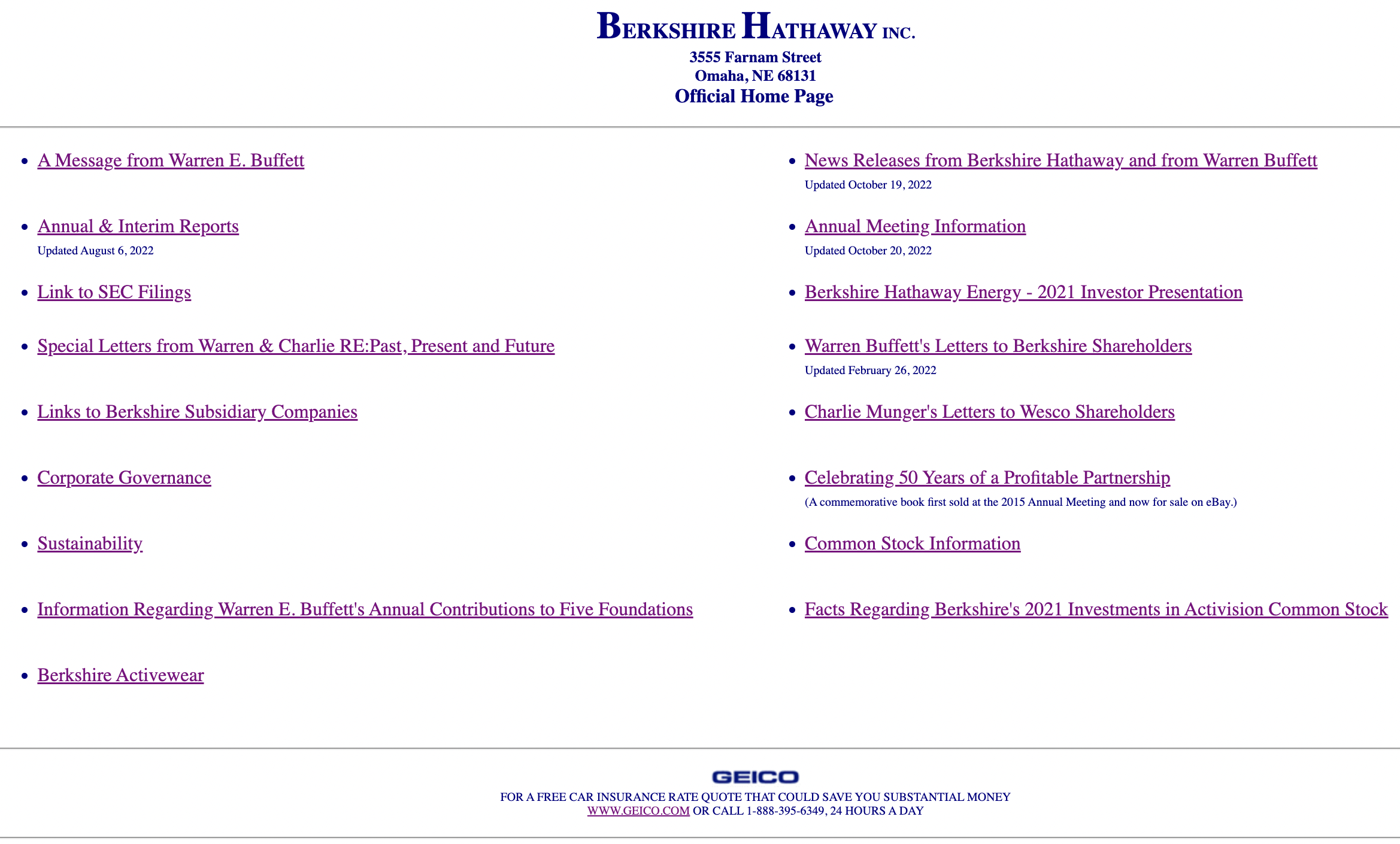
Berkshire Hathaway’s website looks like it time-traveled straight from 1999. No graphics. No design. Just blue links and Times New Roman glory. And yet, the company behind it manages nearly a trillion dollars in assets.
Why this works
- Signal of confidence: A “bad” site says, “We don’t need flash—we’re the real deal.”
- Simplicity sells: Every link has a purpose, nothing distracts.
- Brand alignment: Buffett’s minimalist site matches his reputation for substance over flair.
- Scarcity effect: It’s so different from modern sites that it feels authentic and rare.
Real-world parallels
- Craigslist makes billions with a website that looks the same since 1995.
- Drudge Report’s text-heavy layout hasn’t stopped it from pulling 1B+ visits yearly.
- Amazon’s early design was plain, but its performance and trust built the brand.
Analyzed by Swipebot
Loading analysis...
