Wacky Waving Inflatable Marketing
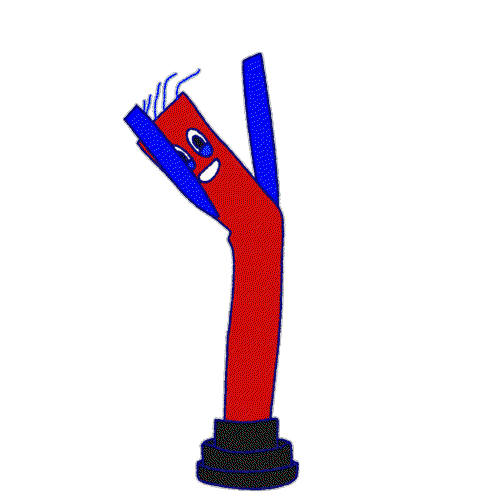
Yeah I'm talking about these goofy things!
You can buy a really big generic one (20 feet tall) for around $200 like this:

The price tops around $1,000 if you get them customized to your store:

A hookah bar saw a 15% bump in revenue with a $230 waving guy:
• Cost: $230
• Foot traffic: +40%
• Instagram followers: +22%
• Revenue Bump: +15% after 3 weeks
Reason it worked: Most people driving by the hookah bar simply didn't know it was there. The wacky waving inflatable guy got their attention!

A tire shop in Phoenix got 30% more revenue because of 2 wacky wavers:

• Cost: Under $1,500 total (2 wavers + feather flags + balloons)
• Tire units: +22% more
• Oil changes: +20% more
• Alignments: +34% more
Reason this worked: It's a plain old case of visibility. More people noticed the tire shop was there and decided to pop in or schedule a visit.
A real estate agent gets waaayyy more attention IRL and online with this one:


• Cost: $800
• Results: She admits it's hard to track actual revenue due to these signs, but online they get a lot of attention, and in real life they also get tons more attention which drives more demand for open house days.
Lesson to take away:
For physical businesses with road traffic, simply being VERY VISIBLE is like free advertising!
I first learned the effectiveness of these inflatables from when I consulted for a big veterinary clinic.
I drove to their location and realized.....I couldn't find it. It was a plain building, with a plain sign, and it just blended in.
I told them I'd recommend getting better signage, and they said this nugget:
"Funny you say that, because last halloween we rented a giant inflatable black cat and put it in front of the building. We got soooo many new patients coming in saying they live nearby and didn't know there was a vet here till they saw that big black cat!"

