Achieve "Inbox Zero" with Eye-Catching Visuals and Clear Messaging
Updated on
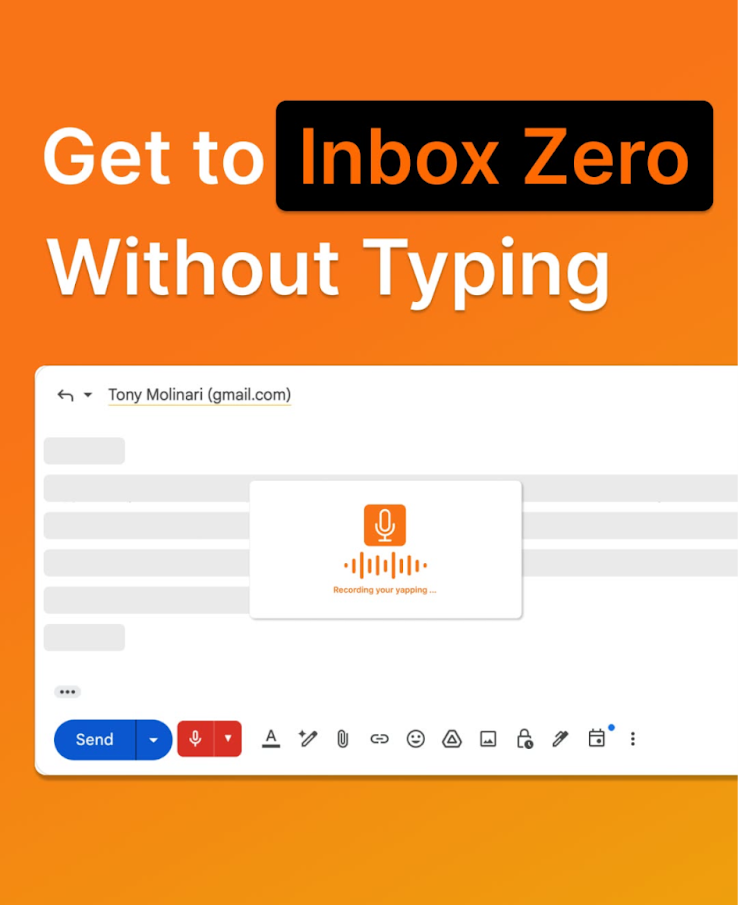
This ad hits you with a loud orange background and a crystal-clear promise: “Get to Inbox Zero Without Typing.” It’s simple, smart, and speaks straight to a daily frustration—drowning in emails.
Why This Visual Works
- Color grabs attention. Orange = energy, motivation, and innovation.
- The headline solves pain fast. Everyone wants fewer emails.
- The mock email reinforces context. Instant clarity: this is about email.
- Voice icon = futuristic ease. Visual proof of “no typing required.”
- Contrast creates focus. “Inbox Zero” pops in black, guiding your eye.
Real-World Examples
- Grammarly’s ads: green + clear copy improvement promise.
- Superhuman’s “Fastest email experience ever” tagline.
- Slack’s violet gradient with “Where work happens” context.
- Calm’s blue backgrounds promising peace in seconds.
Analyzed by Swipebot
Loading analysis...
