Apple Pay vs Google Pay vs Base Pay
Updated on
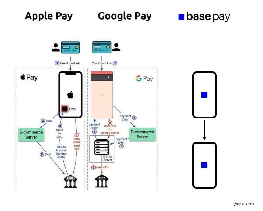
Apple Pay and Google Pay’s systems look like spaghetti. Chips, tokens, servers—so many arrows. Then BasePay comes in: two blocks, one line. Boom.
The Marketing Magic Here
This visual screams what BasePay stands for: simplicity. The fewer steps shown, the easier it feels. That’s not just design—it’s positioning. Complex competitors make BasePay’s “just one block talking to another” look effortless and smart.
Why It Works
- Visual contrast makes BasePay’s value obvious
- Simplicity = trust + ease-of-use
- Showing “less” makes the product look better
- Reduction sells the feeling of efficiency
Real-World Examples
- Apple’s “1-click to buy” design made e-commerce frictionless
- Slack’s homepage: simple headlines, few buttons, clear value
- Zapier shows complex automations in one connecting line
- Stripe docs visualize payments in three clean steps instead of ten
Analyzed by Swipebot
Loading analysis...
