Balsamiq Popup Wireframe
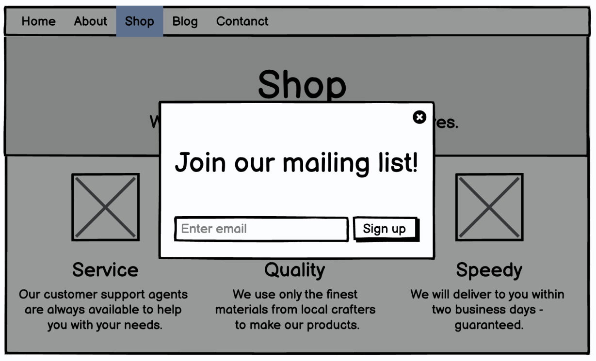
This Balsamiq wireframe nails what a good landing page pop-up should look like. It’s clean, direct, and impossible to miss — exactly what you want when capturing email leads.
Marketing analysis
The whole page fades into the background, forcing your eye to the pop-up message: “Join our mailing list!” No distractions. No fluff. Just one action. This layout follows one of the golden rules of conversion design: focus the user on a single goal.
Why it works
- Only one call-to-action (join the list)
- Minimal fields keep the barrier low
- Overlay effect captures full attention
- Big, readable headline draws eyes instantly
- Familiar layout reduces friction
Examples
- The Hustle’s pop-up adds 300k+ subscribers with a simple “Get smarter every day” pitch
- Beardbrand uses clean pop-ups with one action button, boosting signups by 20%
- Casper’s overlay offers 10% off for email — simple layout, high opt-ins
Analyzed by Swipebot
Loading analysis...
.png?width=3840&quality=80)