1,827 Images and Illustration Examples That Teach Things
Drawings and illustrations and photography can transmit more information from human-to-human than text can. This board is perfect for designers and marketers seeking visual inspiration.

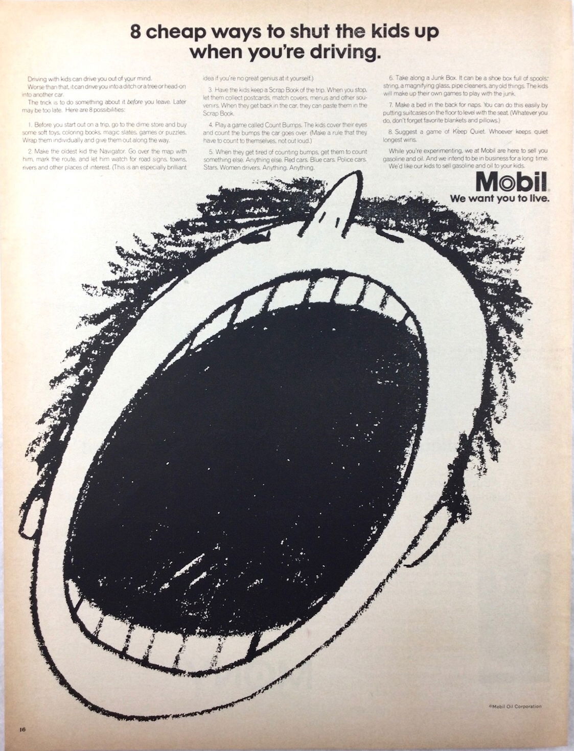
How Mobil Made “Shutting the Kids Up” a Safety Message
Nothing grabs attention like an enormous screaming face on a page. Mobil’s ad did exactly that. What looks like a...

The Visual Power of Simplicity: Why This “Hardest-to-Kill Houseplants” Chart Works
This chart nails visual communication. At a glance, you understand exactly which plants survive neglect, what light they need, and...

Simple Visual Ads That Sell Themselves
This ad from Tiny Visual Courses nails a key marketing truth: simplicity sells. Four pencils, four strategies, one clear winner....

How Humor Makes a Warning Stick
This zoo nailed the art of making people actually read a warning sign. Instead of the usual “Danger: Do Not...

How Nomadic Matt Made a Book Feel Like a Life Philosophy
Nomadic Matt nailed a simple marketing move: take a well-known book and connect it emotionally to his brand. This graphic...

The Reverse Psychology Billboard That Hires Attention
NomNom Comfort Food nailed attention marketing with this bold banner: “WE ARE NOT HIRING.” It’s loud, funny, and confusing enough...

The Billboard Cats Can’t Resist
This Dreamies billboard is next-level clever. It shows a bag of cat treats, but what steals the show are the...

Smart Marketing Knows When to Hold Back
This visual nails a key marketing truth: too much exposure can backfire. The image shows two candies—one unwrapped and crawling...

Your Spritz, Your Way
This ad pops like a summer day. Bright colors, bold text, and one clear promise: you can enjoy your favorite...

How to Make Packaging That Sells Itself
These milk cartons show a clever visual trick: when lined up on a shelf, each carton’s cat illustration connects to...

The Marketing Power of a Killer Data Visualization
This population forecast map nails what every marketer should learn: turning complex info into something instantly shareable and snackable. You...

Ice Cream Sales and Shark Attacks: The Correlation Trap
Ever seen two charts that line up perfectly and thought, “Aha! They must be connected”? This graph shows ice cream...

The Wrecking Ball Ad That Sells Reputation Repair
A single bad review can hit your brand like a wrecking ball. SOCi absolutely nails this idea with a visual...

Perfect Plan Comparison: How to Sell the Upgrade
This “Compare Plans” graphic nails the upsell. It clearly shows how much more valuable the paid plan is without overwhelming...

The Power of a "Hidden Problem" Visual
This Zerorez ad nails attention-grabbing design with one simple trick: showing what’s invisible. The magnifying glass revealing hidden dirt in...

How to Test Thumbnails Like a Pro
This visual from Mario Joos breaks down what really happens when testing YouTube thumbnails. Spoiler: it’s not instant results. It’s...

Everything Talks to Everything: The Battle Map of Signals
This image looks chaotic—but it’s genius. It shows how every battlefield system connects, overlaps, and competes for signal space. From...

The Idea Is Easy. Execution Wins.
This image nails a timeless truth: everyone’s got ideas, but only a few act on them. The crowd thins fast...

Earn Bigger: Gemini Turns a Wall into a Marketing Launchpad
Big, bold, and impossible to miss. Gemini’s “Earn Bigger” mural on Austin’s 6th Street does what great outdoor ads do—stop...

Tesla’s $1.4T Lesson in Category Leadership
This graphic hits hard: Tesla alone is worth more than the next 20 automakers combined. That’s not just a finance...

Make It Exist First
This image is a perfect reminder for marketers: perfection kills momentum. The top shows a rough start, the bottom shows...

How SpaceX Built a $10B Alumni Network
When a company breeds founders, not just employees, you know it’s doing something right. This chart shows that over 130...

The Most Difficult Cleaning: Clearing Mental Cobwebs in Marketing
This visual nails it. A person sweeping cobwebs inside a brain reminds us that the hardest cleanup is mental —...

Never Flip Your Pillow Again - Eight Sleep Headlin
This ad nails the art of turning a tiny annoyance into a must-have product. The headline “Never flip your pillow...