Swipefile
  • Database
Categories
Tools
  • Business Idea Generator
  • Product Pricing Calculator
  • Gross Profit Calculator
  • View All Tools
Resources
  • What is a Swipe File?
  • Popular Posts
  • I'm Feeling Lucky
  • Contact
  • Terms of Service
  • Privacy Policy
Sponsored by
Likes (0)0RandomDatabase
Swipefile

Command Palette

Search for a command to run...

Database
Categories
  • Ads2074
  • Advice2488
  • Before & After436
  • Business Ideas140
  • Copywriting3243
  • Data1237
  • Direct Mail78
  • Emails333
  • Images1986
  • Money100
  • Motivation419
  • Pricing228
  • Print Ads690
  • Quotes196
  • Sales Pages462
  • X
    Social Media931
  • SWIPES Email178
  • Testimonials111
  • Videos526
  • Wisdom245
  • All Categories95
Business Idea Generator
Product Pricing Calculator
Gross Profit Calculator
View All Tools
What is a Swipe File?
Popular Posts
I'm Feeling Lucky
Contact
Terms of Service
Privacy Policy
Random
Database

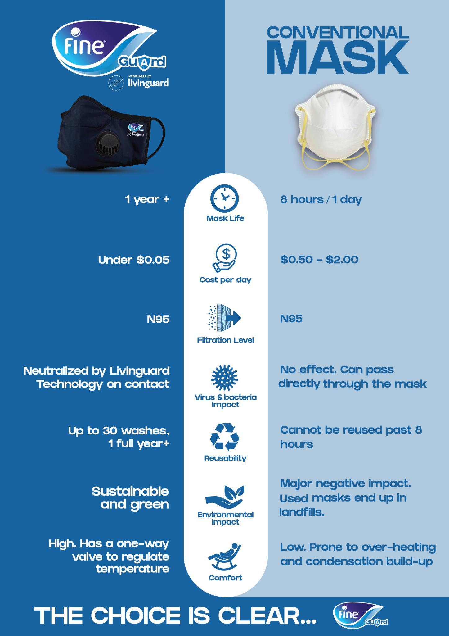
Coronavirus mask infographic

Ads
Copywriting
Data
Images
·
Updated on Nov 7, 2025
coronavirus mask infographic

Fine turned a boring mask comparison into a masterclass in visual persuasion. Their side-by-side infographic makes one product look like the obvious choice without a single salesy sentence.

Why This Infographic Works

  • Direct comparison: Seeing both options next to each other makes the “better” choice crystal clear.
  • Icons and color contrast: Easy to scan and understand in seconds.
  • Short copy: Distills benefits into bite-sized, high-impact points.
  • Emotional close: “The choice is clear” drives a confident decision.

Real-World Examples

  • Apple’s spec charts subtly highlight why their chip is faster.
  • Dyson compares suction strength directly vs. competitors.
  • Tesla’s range charts vs. gas mileage make EVs look like the future.
  • HelloFresh’s “cost per meal” charts beat the grocery store math instantly.

Analyzed by Swipebot

Loading analysis...

Ad