4 Types of Communities Chart
This is a cool graph by Jordan Godbey that shows the four different types of communities you can have and...
Learn copywriting in a year calendar
Calendars can be a great sales tool for showing customers WHY they should stick around for a year or more.

Unemployment "Book" Graph
A simple chart with unemployment and "underemployment" rates by college major makes this data visually interesting by making the bar...

Most popular grocery store by state
This is a cool way to show the data of most popular grocery stores by state. Rather than a bar...

App Store Rank vs Downloads graph
This graph illustrates the number of downloads needed to rank #1 on the app store.app store.

Public VS Private Sector Innovations
This is a poignant display of showing the innovation in the private sector versus the public sector. While we NEED...

AI sending over SEO traffic
This is something I'm seeing consistently as well, there's a decrease in organic traffic from many sources, but AI referral...
Unicorn club list - Private companies over a billion
This is a big ole list of 1,249 private companies that are currently valued at over a billion dollars.

Best TV Shows of All Time Graph
This is an awesome graph that takes all data from different ratings platforms and combines their scores to get the...
Raven or Crow cheat sheet
Simple cheat sheet sharing the characteristics to tell the difference between a Raven or a Crow.

List of Holidays for everyday of the year
Here's a big ole list of all those weird holidays, one for each day of the year!

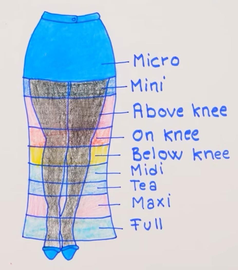
Skirt Length Chart
A simple hand-drawn chart shows all the different lengths and categorizations of different skirts. A cool way to display all...
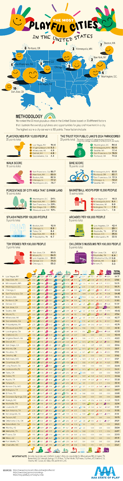
The most playful cities in the US
This pictograph illustrates the cities with the most playfulness by counting the number of playgrounds, splash pads, toy stores, walk...
.png?width=3840&quality=80)
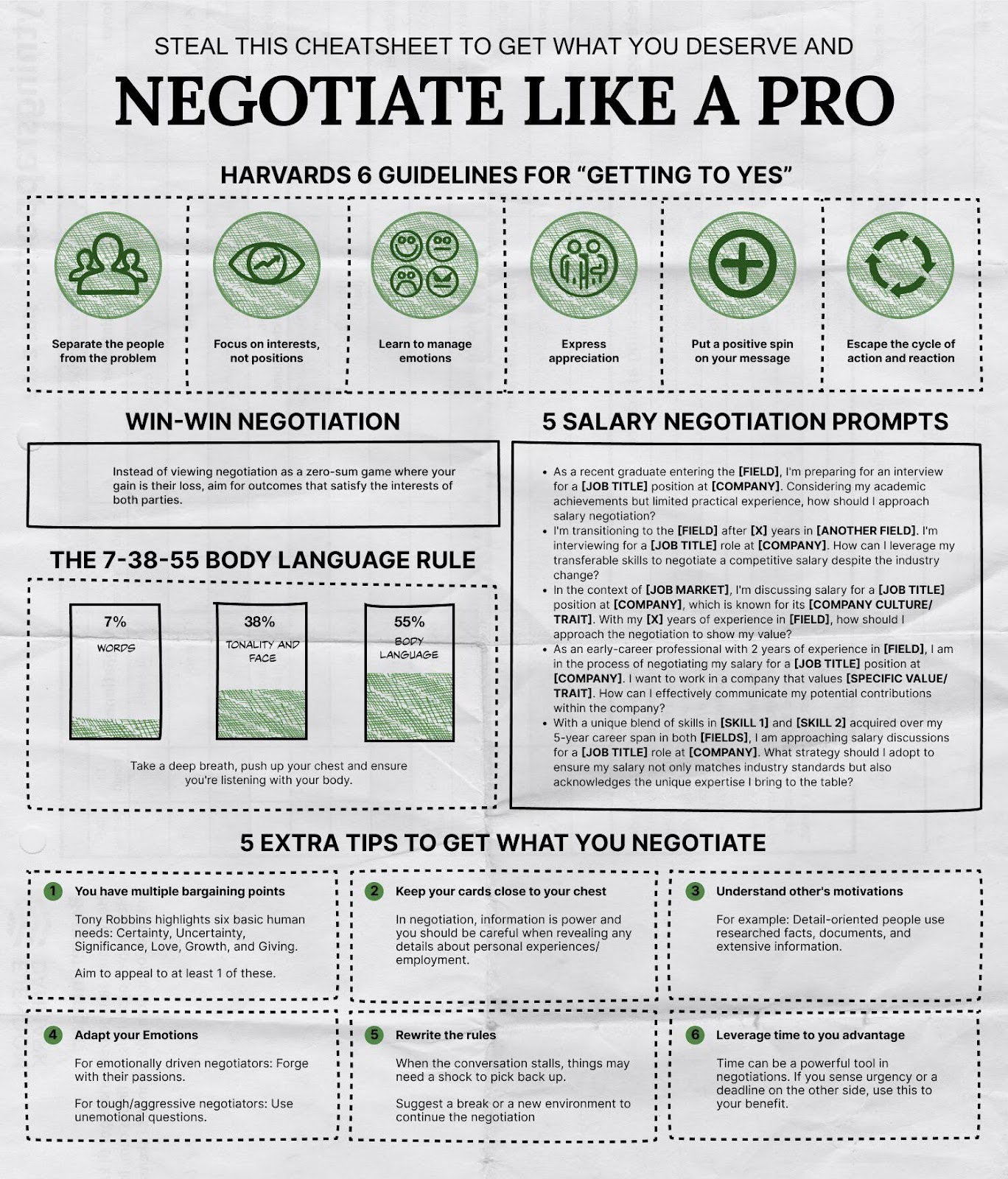
Negotiate Like A Pro Cheatsheet
.This one-pager provides step-by-step instructions for how to negotiating effectively.
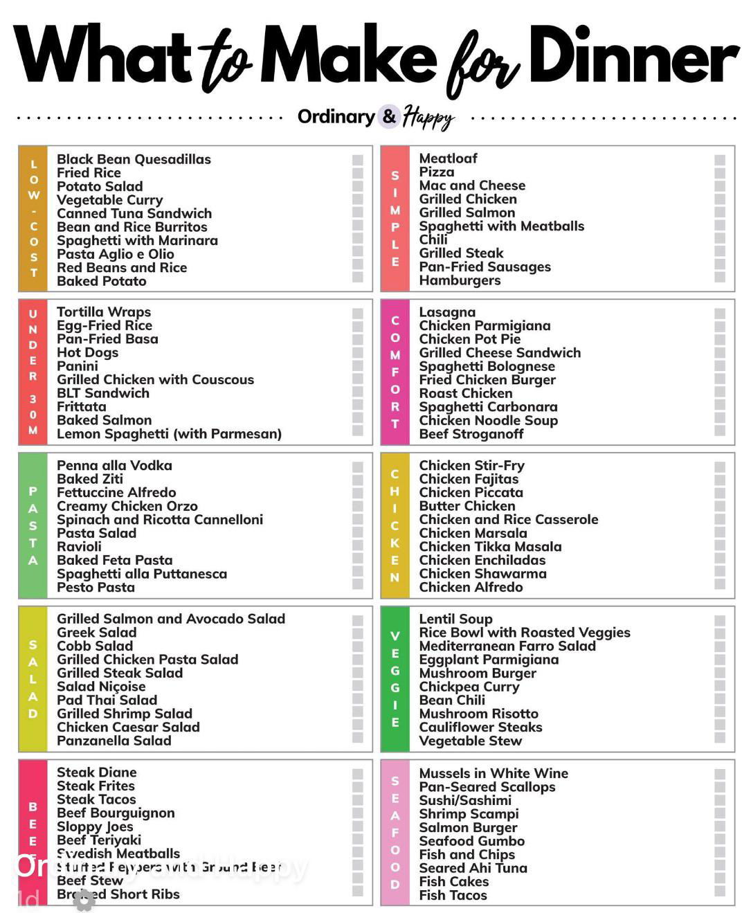
What to make for dinner?
This simple chart with no images gives a list of what to make for dinner based on different categories like...


Worlds Biggest Importers chart
Check out this chart to easily discover which countries are the biggest importers in the world!
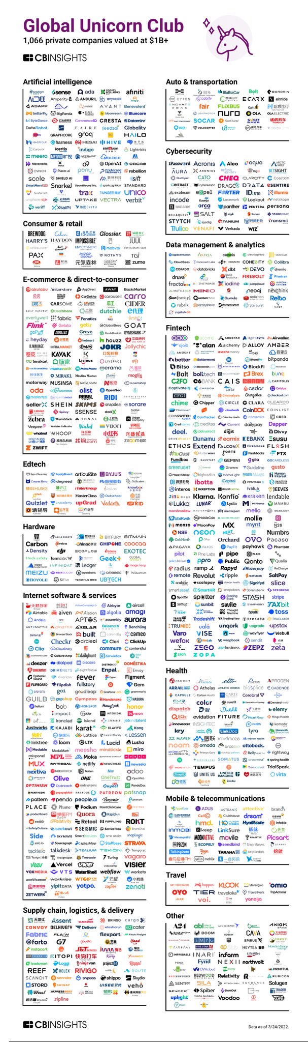
Global Unicorn Club update. 1,066 private companies valued at $1 Billion+
Here is a list of private companies valued at over $1 billion. Separated by industry, using logos makes it quick...
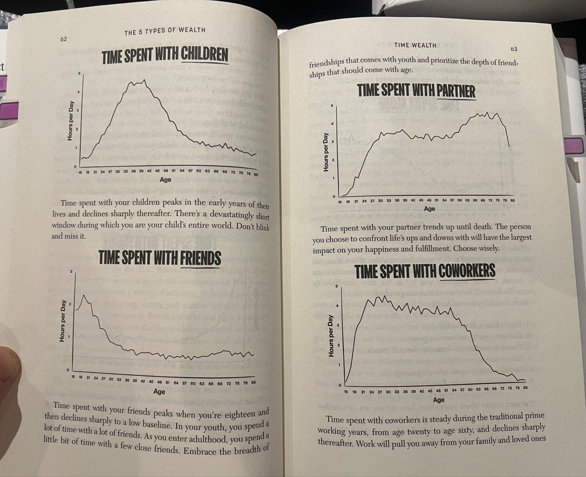
Time spent with ___ Charts
A couple of graphs that show the rapidly declining amount of time spent with children, partner, friends and co-workers from...
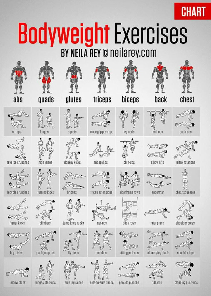
Bodyweight exercises you can do with no equipment
I love when a single image just has tooonnssss of information you can use on it.
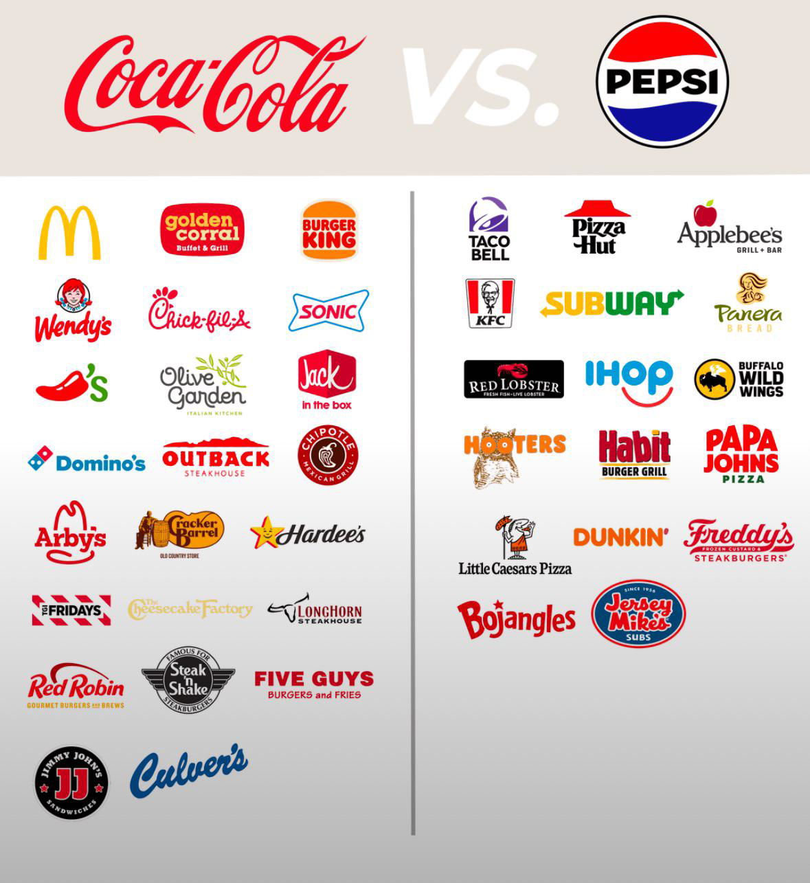
Coca-Cola -vs- Pepsi Exclusive Brand Deals
A major way Coca-Cola and Pepsi compete is by getting exclusive deals with different restaurant chains. It's why sometimes you...
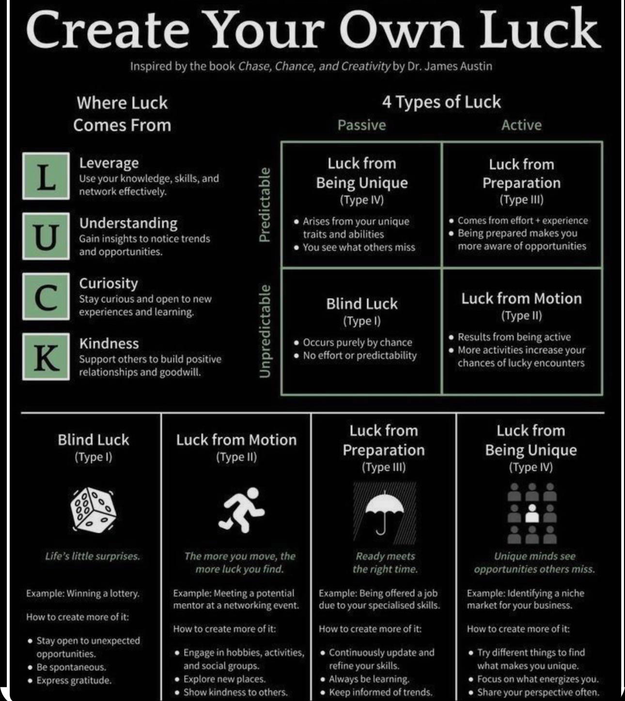
Create your own luck chart
This is a simple little "Luck" chart that shows the different ways luck is created, and you can see how...

Chocolate Exporters Chart
This treemap chart illustrates the proportions of chocolate exports from various regions around the world.
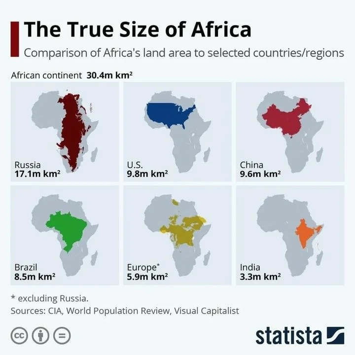
Comparison of Africa's Landmass To Other Countries
I love when a single graph or chart can update how you think about something. It's quite shocking to know...

Tesla Interior Refreshes and Simplicity
This is a cool visualization of the extreme simplification happening on Tesla interiors as the cars go from physical +...