Funny “Emoji” way of showing market cycles
Updated on
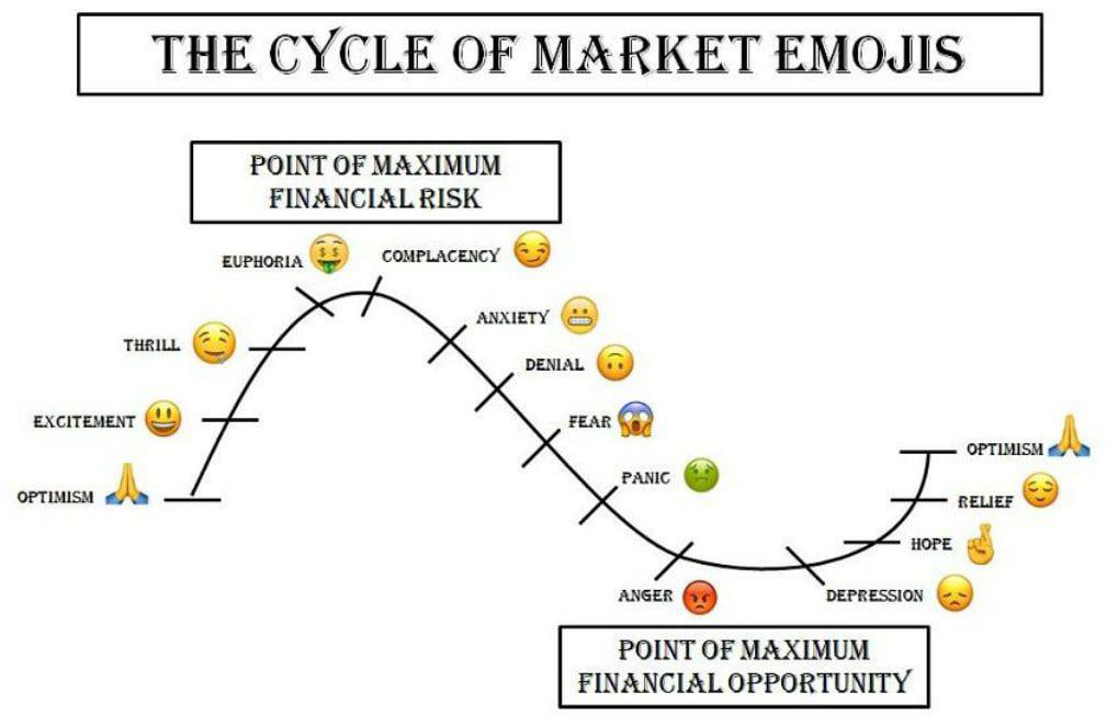
This chart nails how people feel through every stage of a market boom and bust. From optimism to euphoria to panic and back again—each emoji perfectly captures investor psychology.
Marketing analysis
This works because emojis make complex emotions instantly recognizable. It turns something abstract and data-heavy—the market cycle—into something you can feel with one glance. Simplifying emotion is powerful communication.
Why it works
- Visual shorthand: Emojis make emotion obvious and universal.
- Emotional storytelling: Maps logic to feeling, so it sticks.
- Pattern recognition: Helps viewers “see” themselves in the cycle.
- Contrast: Juxtaposes highs vs lows visually and emotionally.
Examples
- Robinhood uses emojis to make investing approachable.
- Coinbase tweets market moods using GIFs and emojis.
- Morning Brew headlines mimic emotional market swings for humor.
Analyzed by Swipebot
Loading analysis...
