Great 3-tier explanation of a sites offerings for sale.
Updated on
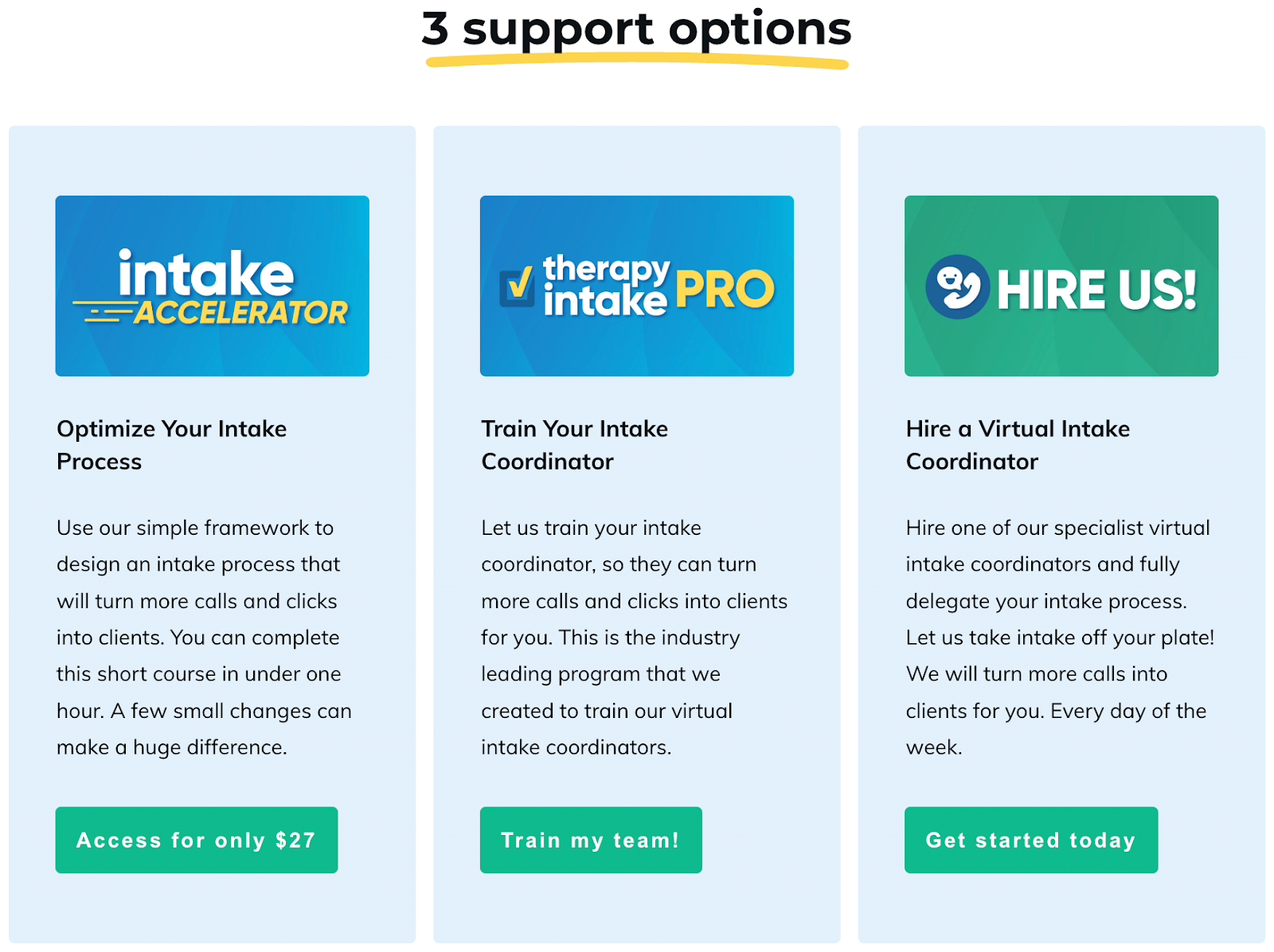
Productive Therapist nails the classic 3-tier pricing layout. It’s clean, visual, and instantly tells the buyer: “Pick the one that fits you best.” No clutter. No confusion. Just three clear options that move you up the value ladder.
Why it works
- Uses the rule of three — easy for customers to process and compare.
- Each tier solves a slightly bigger problem, nudging upgrades.
- Clear CTAs in contrasting colors guide your click.
- Copy focuses on outcomes, not features.
- Visual hierarchy leads the eye left-to-right, from lowest to highest value.
Real-life examples
- Mailchimp: Free → Essentials → Premium.
- Spotify: Free → Individual → Family.
- Slack: Free → Pro → Business+.
- Canva: Free → Pro → Teams.
Simple structure, smart psychology — and more sales.
Analyzed by Swipebot
Loading analysis...
