Iphone AIR clever ad
Updated on
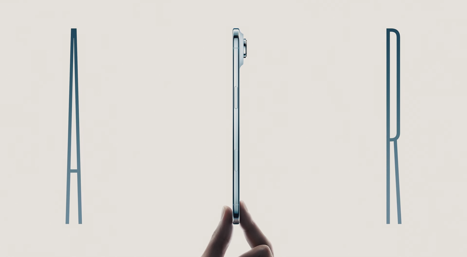
Apple doesn’t just say their new iPhone Air is thin. They show it — literally pinched between two fingers. No numbers. No jargon. Just a simple image that makes you feel how slim and light it is.
Marketing analysis
This is visual positioning at its finest. The whitespace, clean typography, and hand placement frame the phone like a piece of jewelry. It’s not about specs, it’s about identity — owning something effortlessly elegant.
Why it works
- Show, don’t tell: Visual proof beats technical talk.
- Anchoring: Fingers next to the device give instant scale.
- Whitespace focus: Minimalism draws eyes to the hero product.
- Emotional hook: “Lightness” connects to simplicity and ease.
Examples
- Dyson ads showing hands effortlessly lifting vacuums.
- Tesla’s “clean dash” design in promos to sell simplicity.
- AirPods launch visuals focusing on freedom, not audio specs.
- Coca-Cola’s “zero sugar” cans styled in thinner shapes to match the story.
Analyzed by Swipebot
Loading analysis...
