Magic Mind "Caffeine Free Energy" Email
Magic Mind took a chill approach to selling energy. Their ad flips the high-caffeine, high-anxiety model on its head with soft gradients, rounded fonts, and soothing copy that whispers instead of shouts.
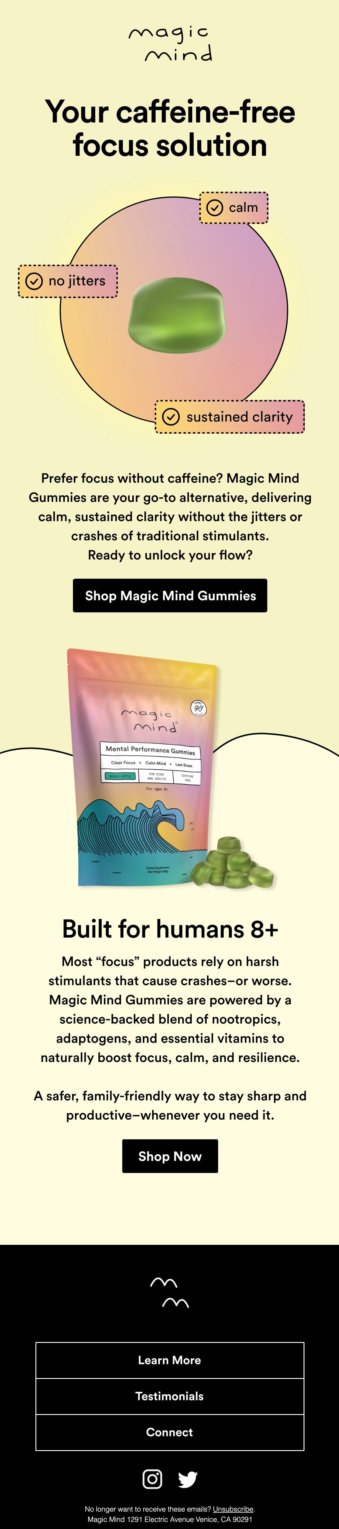
The Calm-First Design Strategy
This email ad uses muted yellows, greens, and pinks that feel calm. No flashy reds or extreme fonts. The product literally looks and feels “serene.” Even the benefits—“calm,” “no jitters,” “sustained clarity”—are framed around peace, not hype.
Why It Works
- Emotions first: Visuals trigger the feeling you’re selling.
- Clear positioning: “Caffeine-free focus” is both unique and memorable.
- Friendly language: Feels human, not corporate.
- Consistent tone: From copy to color, everything says relax and focus.
Real-World Examples
- Calm app uses pastel gradients and slow motion visuals to sell peace.
- Oatly’s soft typography mirrors its “non-dairy, no stress” vibe.
- Headspace ads keep colors light and messages slower-paced to match the brand’s promise.
Analyzed by Swipebot
Loading analysis...
