MarketingProfs About Page
Updated on
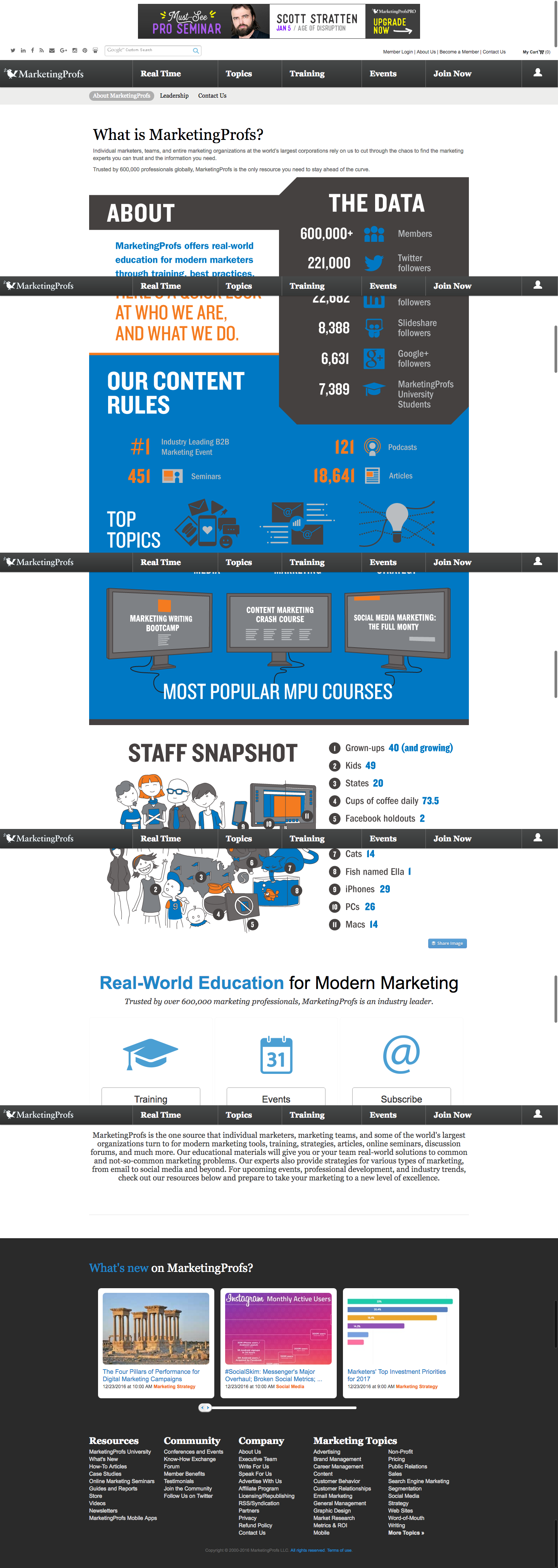
Most About pages are just walls of text. MarketingProfs flipped that script with an infographic-style page packed with stats, visuals, and personality. Instead of “Here’s who we are,” it feels like “Here’s why we’re awesome.”
Marketing analysis
They took a boring info category and dressed it up like a highlight reel—mixing numbers, icons, and playful staff stats to keep readers scrolling. It feels more like a sports recap than a corporate summary.
Why it works
- Turns dry info into eye candy
- Shows credibility with numbers
- Adds personality through humor and staff details
- Keeps attention with short, visual chunks
Real-world examples
- Mailchimp’s doodle-filled culture page
- Spotify Wrapped turns user data into shareable art
- Slack visualizes its story instead of writing a wall of text
- HubSpot packs data visuals into its reports for instant credibility
Analyzed by Swipebot
Loading analysis...
