Newsletter Template with formatting
Updated on
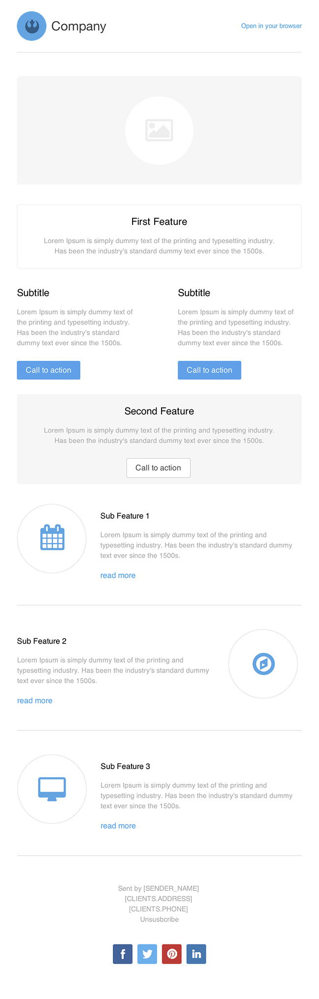
This email template nails the basics — clear structure, visual hierarchy, and obvious calls to action. It’s clean, repeatable, and easy to scan, which means more clicks and less confusion.
Why This Template Works
- Simple layout keeps attention where it matters: your offers.
- Consistent blue buttons guide readers naturally through the flow.
- Headline–subheadline–CTA pattern reduces cognitive load.
- Modular sections make it easy to mix product, content, or promo updates.
Real-Life Examples
- Canva uses a similar grid layout to highlight new features and tutorials.
- Shopify’s weekly email follows this simple structure to push blog content and free tools.
- Grammarly’s updates use clean blocks and bold CTAs to boost engagement.
- Notion sticks to clear headers and short blurbs to promote new templates.
Analyzed by Swipebot
Loading analysis...
