Non profit about page is really a sales page
Updated on
Most “About” pages are snoozefests. Omaze flips that script with a layout that feels more like a sales page—loaded with proof, graphics, and answers to objections.
Marketing Analysis
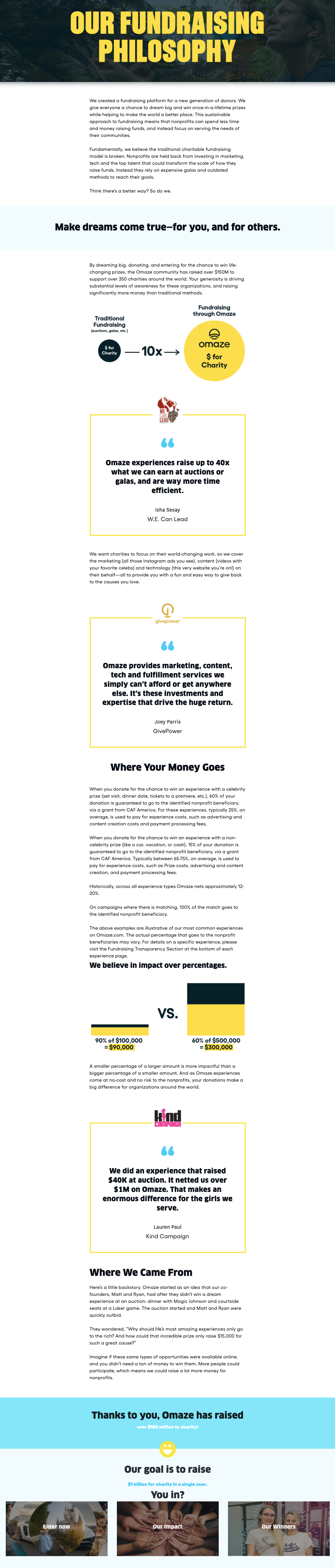
The opening visual instantly contrasts “traditional fundraising” vs. “Omaze fundraising.” That’s a quick, simple mental shortcut showing the reader why Omaze is different and better. Then they build trust with testimonials, handle objections with charts explaining where the money goes, and reinforce impact—with data. The only thing missing is a clear CTA at the end.
Why It Works
- Leads with contrast (old vs. new way)
- Answers objections before they arise
- Uses visuals for clarity
- Leans on social proof
- Keeps the focus on mission-driven value
Examples
- Dropbox’s homepage once used a simple video vs. “boring paragraphs” to boost conversions 10%.
- Basecamp compares their tool to chaotic email threads to highlight the “before/after” effect.
- Warby Parker shows side-by-side cost savings over traditional retailers.
Analyzed by Swipebot
Loading analysis...
