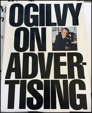
This book cover screams confidence. Huge, black, all-caps letters that practically yell “I know what I’m talking about.” Just like the man behind it—David Ogilvy, the godfather of modern advertising.
The Marketing Behind The Cover
The cover design itself is a masterclass in communication. It’s bold, clean, and instantly recognizable. There’s no fluff, no fancy graphics—just impact. It sells authority before you even open the first page.
Why It Works
- Big, simple typography commands attention.
- Clear hierarchy—title first, author second.
- Minimalism signals confidence.
- Recognizable face adds trust.
Examples
- Apple’s minimalist product boxes: clean, strong branding.
- Nike’s “Just Do It” ads: bold type, zero clutter.
- Chanel’s black-and-white campaigns: elegant simplicity that sells billions.
Analyzed by Swipebot
Loading analysis...
