
$30,000 minimum pricing page
Ever seen a price tag with three zeros and still thought, “That’s fair”? That’s the magic of smart tiered pricing....

Cool “Funnel” Image to show acquiring leads then closing them
This GoHighLevel graphic nails how to make a funnel visual and simple. Instead of pages of text, one slick image...

Good email outreach for a book authoring company
This cold email from Author Inc feels like it was written just for Neville. It opens with a personal idea,...

Promoting your products online
Even the richest man alive is out here tweeting about his product. Damon Chen reminds us that Elon Musk doesn’t...

GoHighLevel signup page gives 14-day free trial and free onboarding support.
Most SaaS trials flop because users never get started. HighLevel fixes that by stacking irresistible onboarding bonuses right into their...

Comfort is the enemy of growth
Rainy morning. Empty street. One runner. And a giant reminder painted on a wall: “Comfort is the enemy of growth.”...

Turns out many people aren’t depressed, they just don’t have something worthy to work on.
Dr. Nicholas Fabiano shared a study titled A Wandering Mind Is an Unhappy Mind with a great insight: people are...

GoHighLevel Software Comparison & Replacement Chart
This chart is genius. It doesn’t just say GoHighLevel replaces all your tools — it shows it. Every marketer knows...
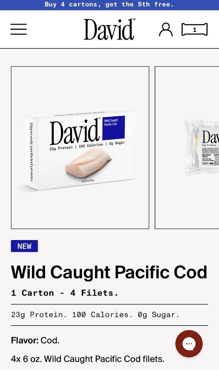
Next protein trend is…..cod fish??
David, known for protein bars, just launched… fresh cod. Yep, the same bold logo and clean packaging—but now with raw...

People don’t want tools they want a result
Maxx Blank nails it: people don’t buy dashboards or apps; they buy results. Tools are just the middleman. The future?...

Time to run an ad campaign comparison chart
Beehiiv nailed this one. Their ad uses a single chart to show how absurdly faster their ad network is compared...

Havnby Tesla Mattress Ad
This ad nails it: a “see-through” Tesla that reveals a family relaxing on a mattress inside the car. You instantly...

Massive shift in economy over 30 years
In 1990, America was powered by manufacturing. Fast forward to 2024, and health care has taken over nearly every state....
Focusing is important
Jay Yang nails it: lack of focus crushes more dreams than lack of talent. In marketing and business, chasing ten...

🎤 The SWIPES Email (Friday, July 25th, 2025)
Friday, July 25th, 2025 SwipeFile: Inspiration for your marketing.CopywritingCourse: Optimize all your marketing.Swipe:This A.I.D.A. Formula Video gives an under-2-minute...

Interesting BitCoin meme for HODL’ing
This meme nails a simple but powerful message: “We’re early.” It shows the evolution of Apple computers from the 80s...
Use the A.I.D.A. Formula for selling anything
The AIDA formula is one of those old-school tricks that still absolutely works. It turns any pitch into a smooth...
BTC marketcap > Gold
Dan Held dropped a spicy tweet: if Bitcoin’s market cap equals gold’s $23 trillion, each BTC hits about $1.15M. He...

Compounding growth happens slowly….then quickly
This Supabase growth chart looks like magic — four years of flat growth, then BOOM, it rockets up. But that...

Massive Palantir.com Airport Banner
You can’t walk past this without looking. Palantir’s huge black-and-white billboard dominates the space just like its message: “Software That...

Skinny Pop Packaging Redesign
SkinnyPop just flipped its look, and some fans lost it. The brand dropped its clean, “diet popcorn” vibe for a...

Hiive Buy Private Company Stock Reddit Ad
This ad from Hiive instantly makes you feel like investing in private companies is not just smart—it’s visionary. One glance...

Infraforge.ai "Stop landing your emails in spam" Reddit Ad
This ad nails clarity and emotion in one go. The bold line “Stop landing your emails in spam” hits every...

The Value Staircase Strategy
Ever try to sell a $2,000 product to someone who just met you? Tough. The Value Staircase shows you how...