Punctuation Saves Life Copywriter Ad
Updated on
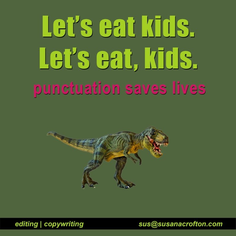
This ad nails the idea that tiny details—like a comma—can completely change your message. “Let’s eat kids” versus “Let’s eat, kids” is a funny (and slightly horrifying) reminder that words mean what you make them mean.
Marketing analysis
The design is simple: bold fonts, two lines of copy, and a dinosaur making the point visual. It’s instantly clear, surprising, and memorable. Plus, it perfectly frames the copywriter’s value—saving your message from disaster.
Why it works
- Humor grabs attention.
- The visual (dino!) makes the message stick.
- High contrast colors highlight the key line.
- It’s instantly understandable without context.
Examples
- Grammarly’s ads use humor to show grammar mistakes in real-life contexts.
- Oatly’s packaging copy turns editing quirks into personality.
- Dollar Shave Club’s script worked because every word earned its place.
Analyzed by Swipebot
Loading analysis...