Split Design: Dream vs. Reality
Updated on
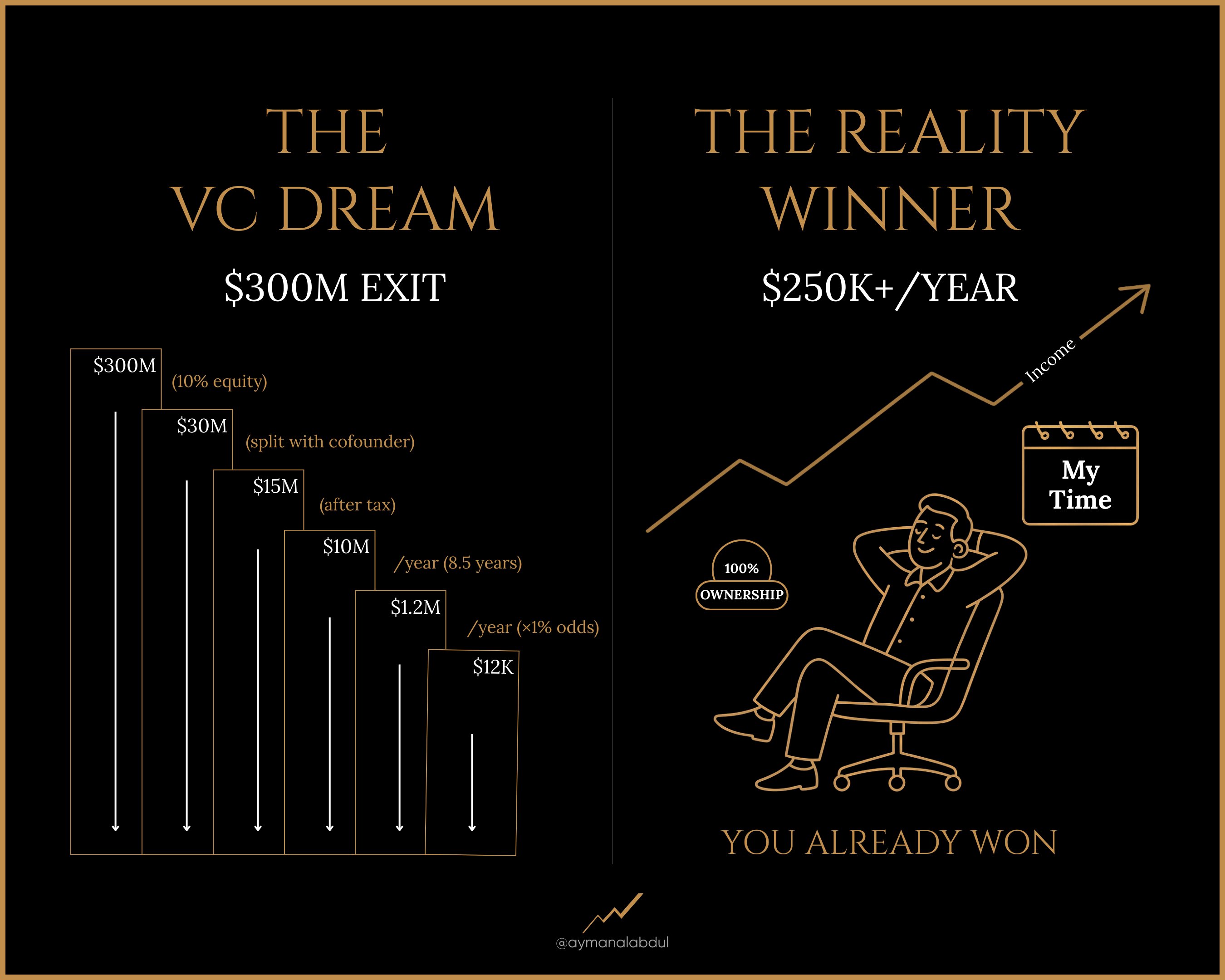
This image nails one of marketing’s oldest tricks: contrast. By splitting the screen into “Dream” vs “Reality,” it instantly shows two possible futures and grabs attention fast. It’s simple, visual storytelling that gets people to pause and think.
Why this visual works
- Contrast makes the message instantly clear
- Visual storytelling beats text walls every time
- Encourages self-comparison (“Which side am I on?”)
- Triggers emotion and curiosity in a single glance
- Works great in ads, landing pages, and slides
Real-world examples
- Gym ads that show “Before vs After” transformations
- Software sites showing “With vs Without” dashboards
- Financial planners showing “Retire Broke vs Retire Free” scenarios
- Productivity apps comparing “Busy Desk vs Clean Desk”
Simple contrast, powerful persuasion.
Analyzed by Swipebot
Loading analysis...
