Tiered Pricing Mockup 3 Column
Updated on
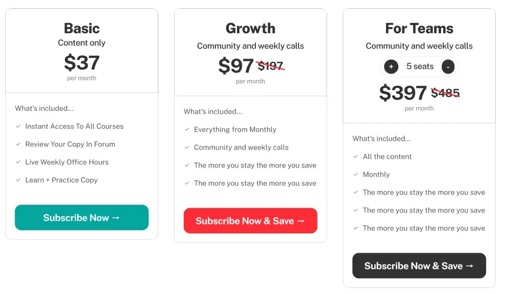
This pricing mockup nails a classic move: guide buyers straight to the plan you want them to pick. That bright red “Subscribe Now” button in the middle isn’t just pretty—it’s persuasive.
Marketing Analysis
The layout uses contrast, anchoring, and choice architecture to steer users. The “Growth” plan looks like the best deal thanks to color, placement, and a visible discount. Monthly and yearly toggles also let buyers feel in control while showing clear savings for longer-term commitment.
Why It Works
- Highlights the “Goldilocks” option (not cheap, not pricey—just right).
- Creates visual hierarchy with color and size.
- Uses strike-through pricing to anchor higher value.
- Offers flexibility (monthly vs yearly) to reduce friction.
- Keeps things clean and scannable.
Examples
- Dropbox spotlights its mid-tier plan as “Most Popular” to lift conversions.
- Spotify gives yearly discount prompts during holiday promos.
- Mailchimp’s pricing chart uses color contrast to pull focus to the Standard plan.
Analyzed by Swipebot
Loading analysis...
