Two Column Email Signup Form Template

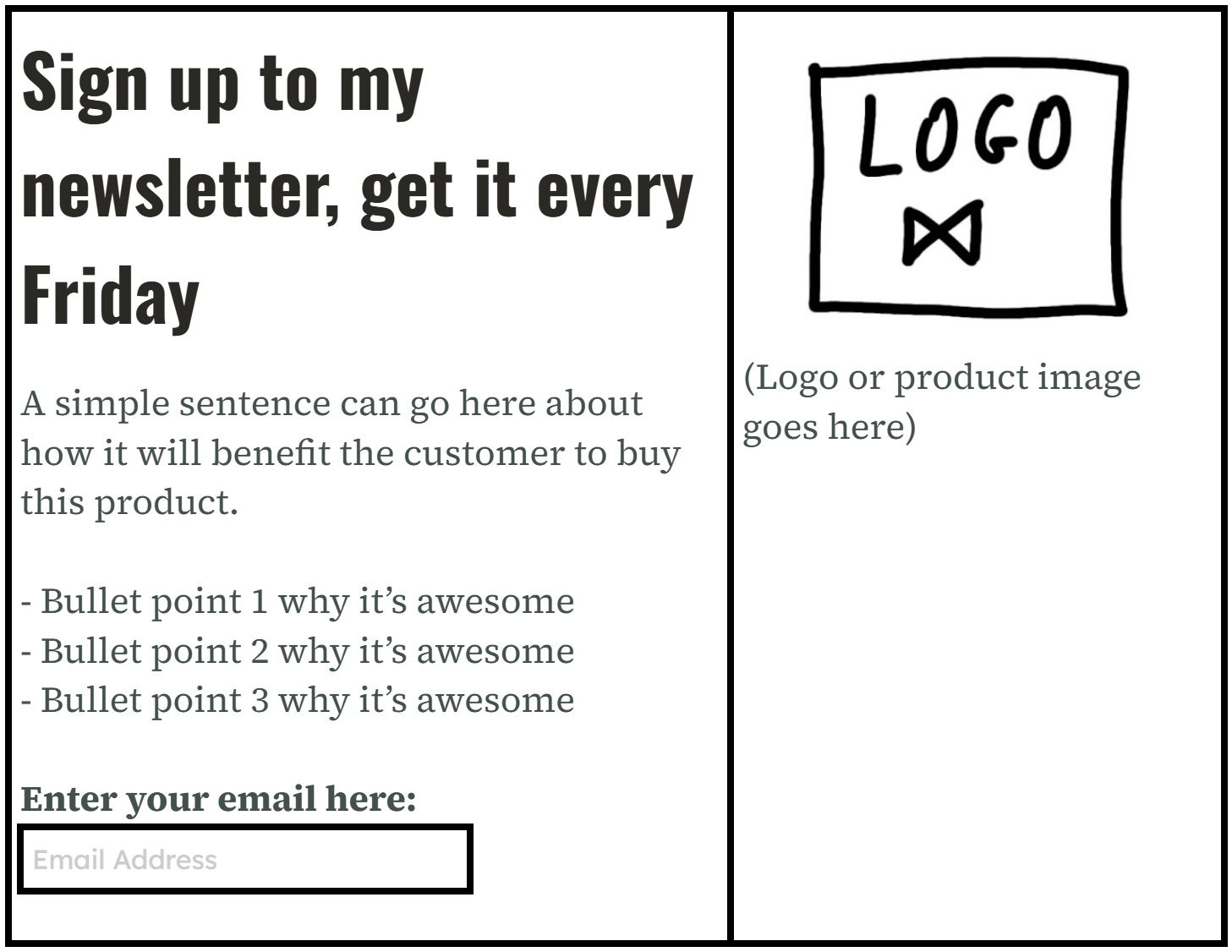
This simple two-column layout nails what every email signup form should do: grab attention fast and make signing up frictionless. It’s used by countless newsletter pros because it works like a charm.
Why This Layout Wins
- Left side does all the selling (headline, benefits, proof, form)
- Right side does all the showing (image, logo, social proof)
- Big bold headline tells you exactly what you’re getting
- Short bullets make benefits easy to skim
- The call to action is clear and visible
Real Examples
- Morning Brew: punchy benefits and a friendly graphic.
- The Hustle: bold copy on the left, founder image on the right.
- James Clear’s 3-2-1 Newsletter: proof-focused text plus a clean form.
- The Daily Upside: uses this exact layout and grew to over 1M readers.
Analyzed by Swipebot
Loading analysis...