Use Color to Sell Sound: Sony's 1979 Poster
Published on
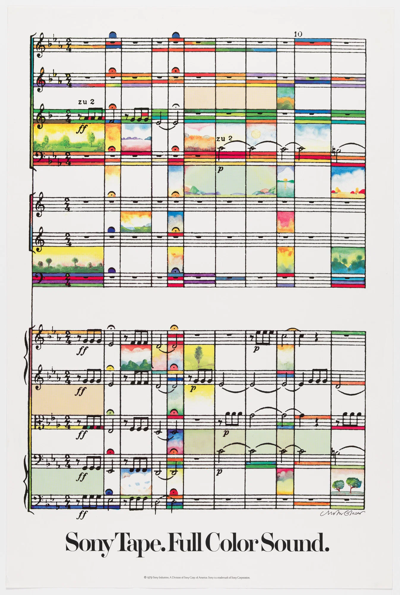
Milton Glaser. Sony Tape: Full Color Sound. 1979 | MoMA
In 1979, Sony didn’t show tape. They showed what tape *felt* like. Milton Glaser’s “Sony Tape: Full Color Sound” poster takes a black‑and‑white music score and floods it with watercolor skies, sunsets, and landscapes. No features list. No specs. Just a visual promise: this tape makes your music come alive. Let’s break down how he used pure color and concept to sell an invisible product—sound.
Your takeaway
If your product lives in the ears, don’t just show ears or waveforms. Map the experience onto something people already recognize—a score, a grid, a blueprint—and then explode it with color. One tight line of copy, one strong visual metaphor, and you’ve got a poster that still sells 40+ years later.
Why this poster still sells in 5 seconds
- Turns the sheet music grid into a canvas of tiny scenes, so every bar looks like a new “track” of experience.
- Uses bright, bleeding watercolors against rigid staff lines, visually saying the tape adds emotion to structure.
- Leaves plenty of white space so the chaos of color feels intentional, not cluttered.
- Anchors everything with the dead-simple line “Sony Tape. Full Color Sound.” that explains the entire visual joke.
- Makes the product benefit emotional (richer sound) instead of technical (signal-to-noise ratios).
How to steal this move today
Spotify could show a stark playlist grid gradually filling with vivid textures and scenes as the headline reads “Turn background noise into a world you can feel.”
Sonos could depict a blueprint of a house with each room flooding with different colors and micro-illustrations as the line says “One system, every room in full color sound.”
Adobe could transform a grayscale timeline in Premiere into a ribbon of painted vignettes with the headline “Edit in timelines, remember in living color.”
Creative Variations
Analyzed by Swipebot
Loading analysis...