Visualization of the $100 trillion dollar world economy
Updated on
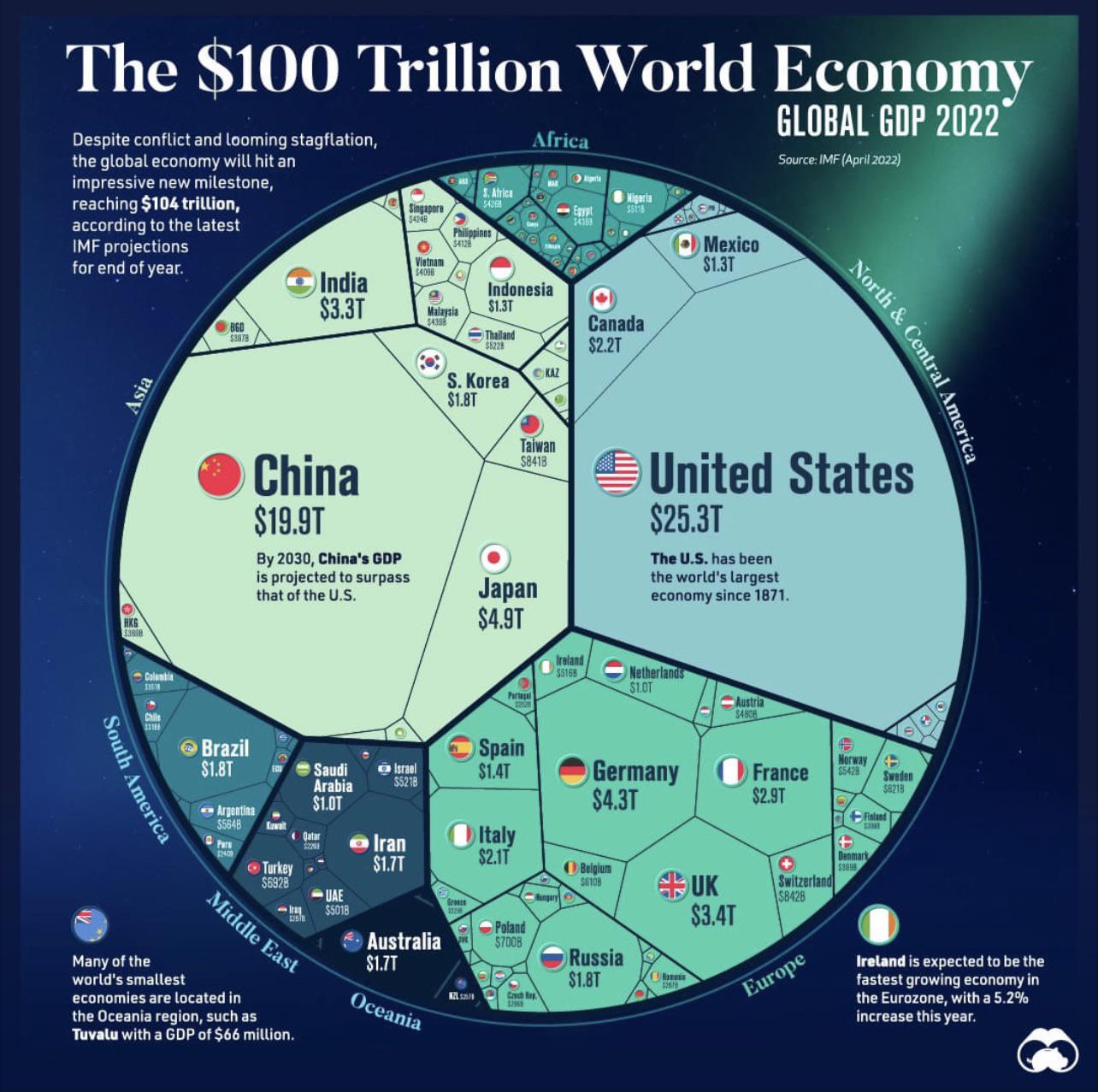
This infographic turns a mountain of global GDP data into something your brain actually enjoys looking at. Instead of rows of numbers, it uses shape and size to show who’s driving the $100 trillion world economy.
The Marketing Magic Behind It
The chart doesn’t just show data—it shows relationships. You instantly see the U.S. and China towering over others. That’s information you feel, not just read.
Why It Works
- Visual hierarchy makes comparisons instant
- Shapes replace spreadsheets—our brains love it
- Clear labeling adds context without clutter
- Big visual payoff for low cognitive effort
Examples
- Spotify Wrapped uses colorful infographics to summarize listening data
- The New York Times’ election maps visualize votes more clearly than tables
- Google Trends charts make search data instantly understandable
Analyzed by Swipebot
Loading analysis...
